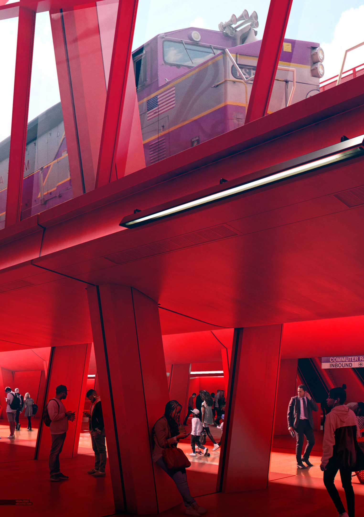
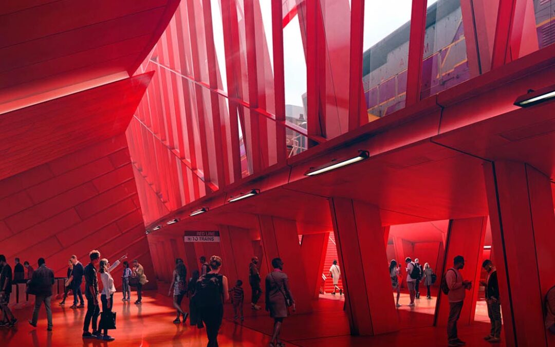
I am revisiting the Porter Square Station project because there was one more very important image that I needed to develop to finish telling this project’s story. It was an image that I had started several times but kept abandoning. The problem was that the space was complex with lots of unresolved detailing. I looked at so many views and tested out so many designs for this one but nothing was clicking early on. Finally last week, some ideas popped in my head that turned into a possible view that finally led to the image below.
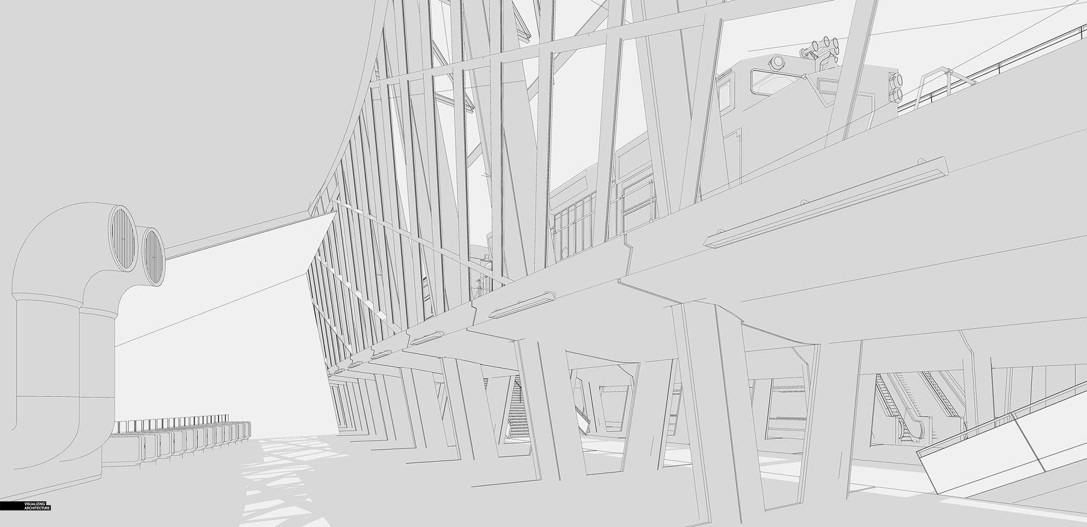
There are three main elements to this image that I was trying to portray: The ticket gates/entry portal leading down to the Red Line platform on the left, the “forest” of columns that visitors can meander through to access the commuter rail platform, and finally the floating commuter rail that places the train on display via large expanses of glass towards the top of the image.
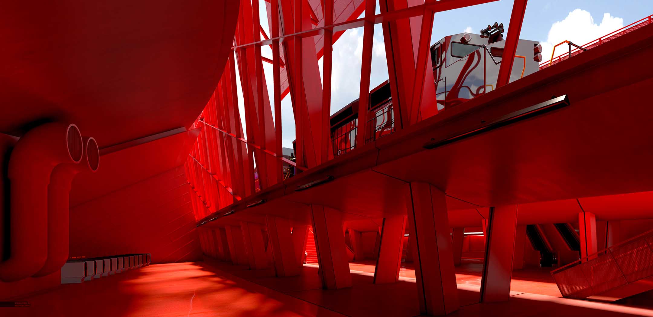
I wanted this space to be red. It turns out it is somewhat difficult to work with this much red. Light areas kept getting blown out and I was struggling to find the right balance of saturation. Too much red saturation and detail gets lost. To little red saturation and the images quickly feels grey and faded.
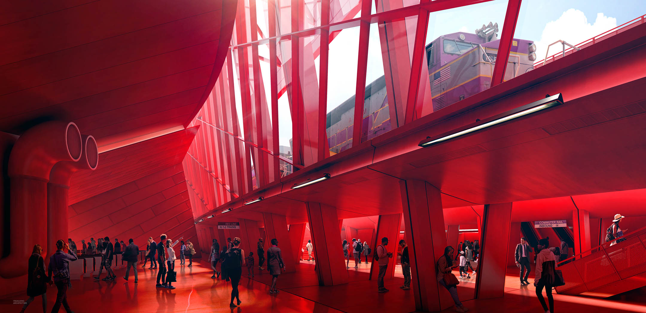
I spent some time trying to separate geometry with light and build some depth in the image. Again, because of all of the geometry going on in this view, I wanted to avoid the space feeling too cluttered and confusing. I used the light to help define edges and push elements back and forth in the image in an attempt to help organize and clarify the composition.
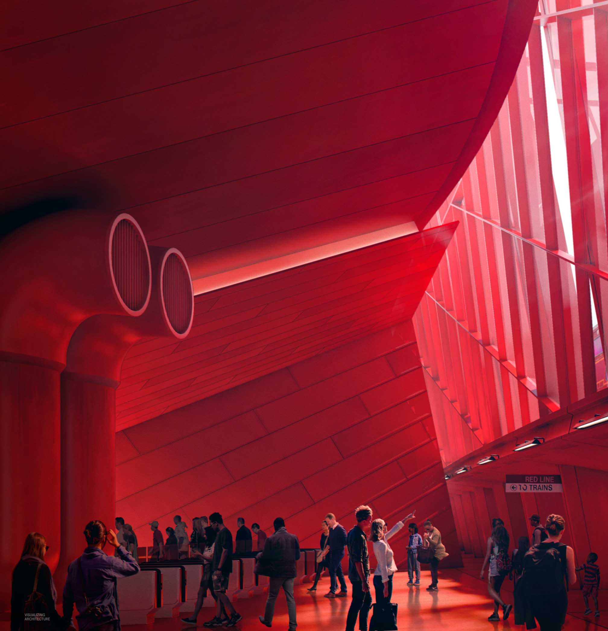
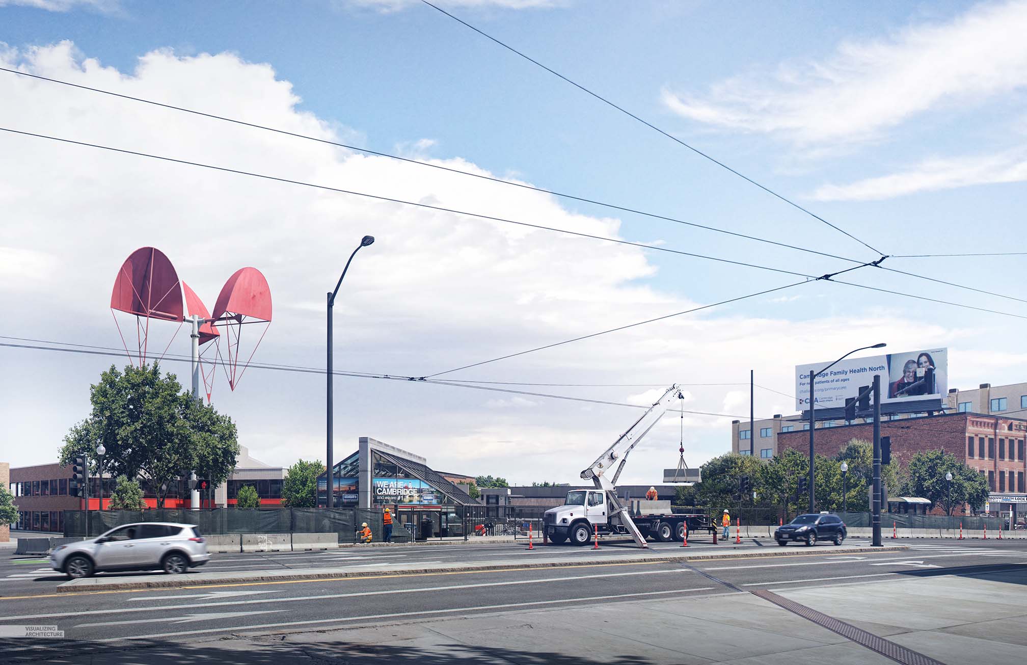
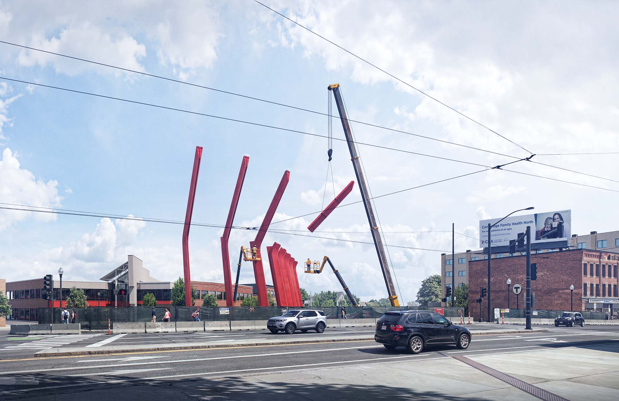
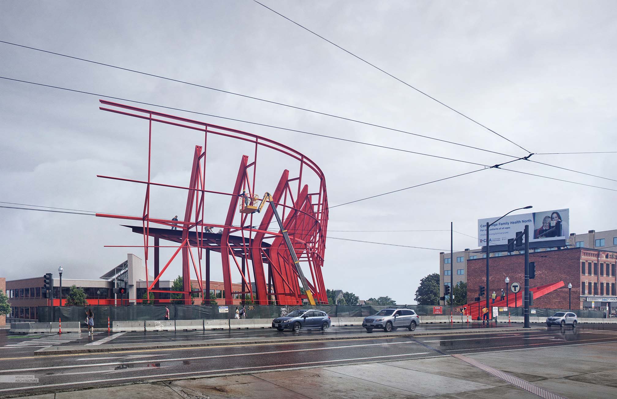
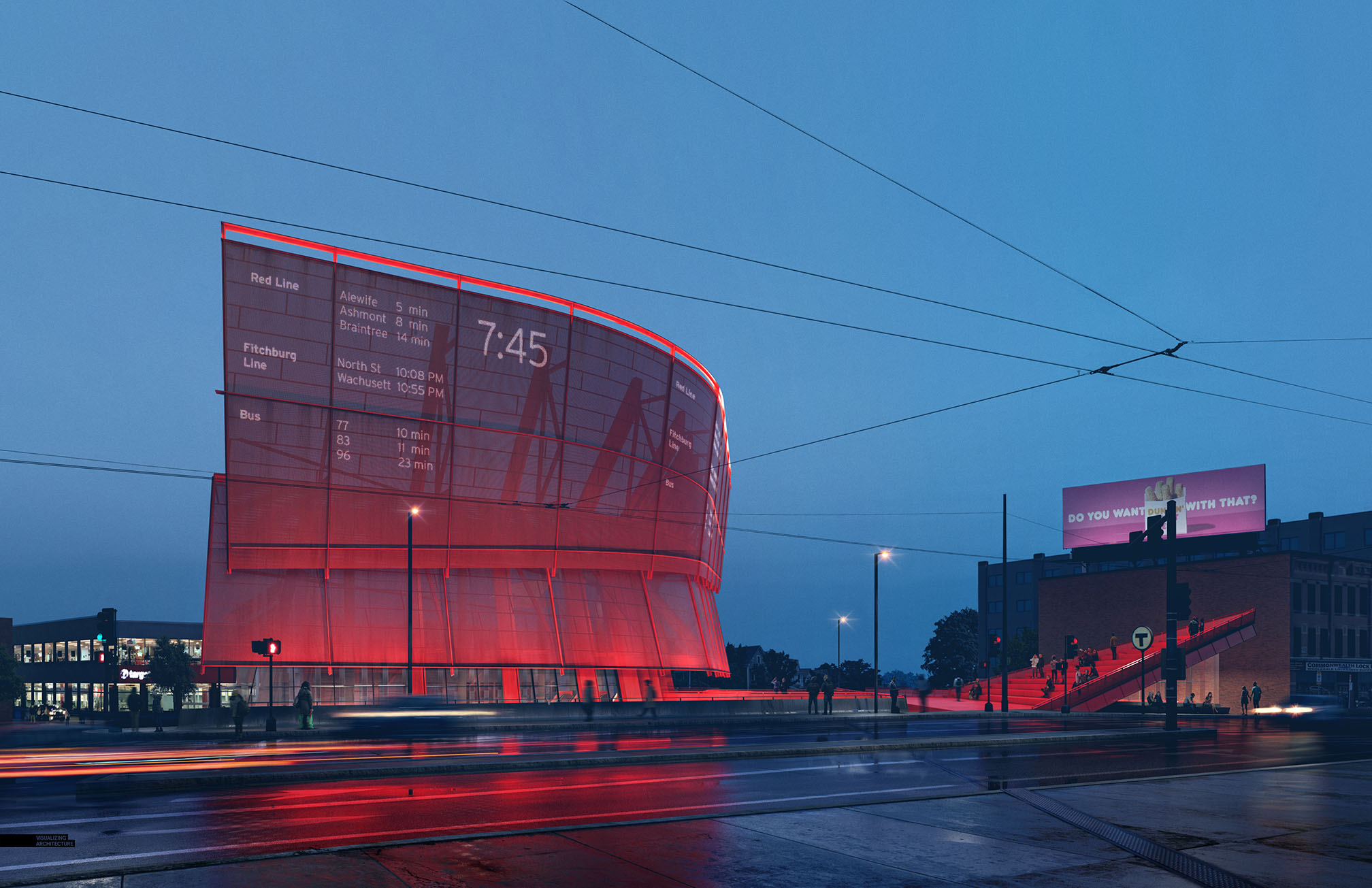
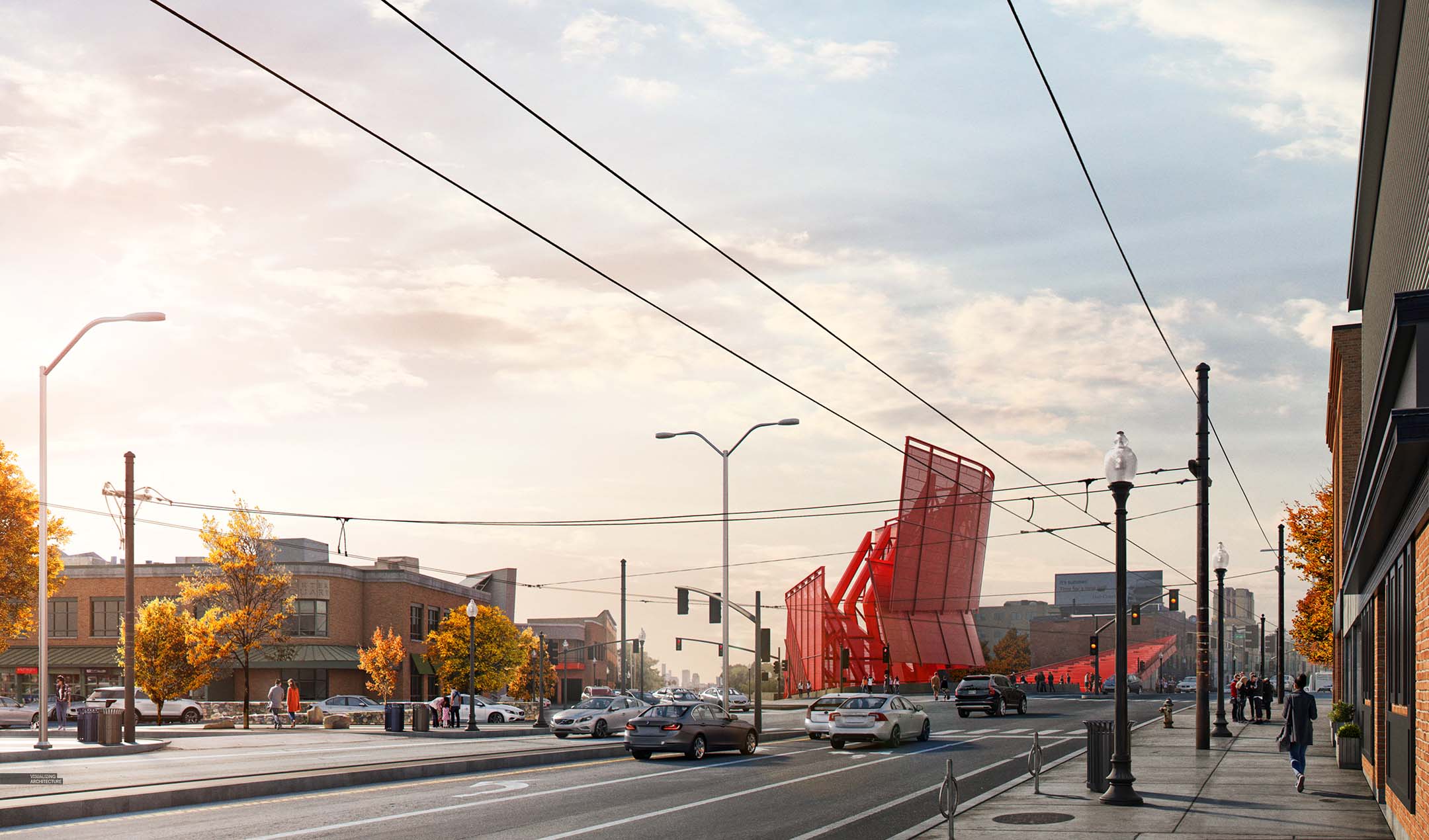
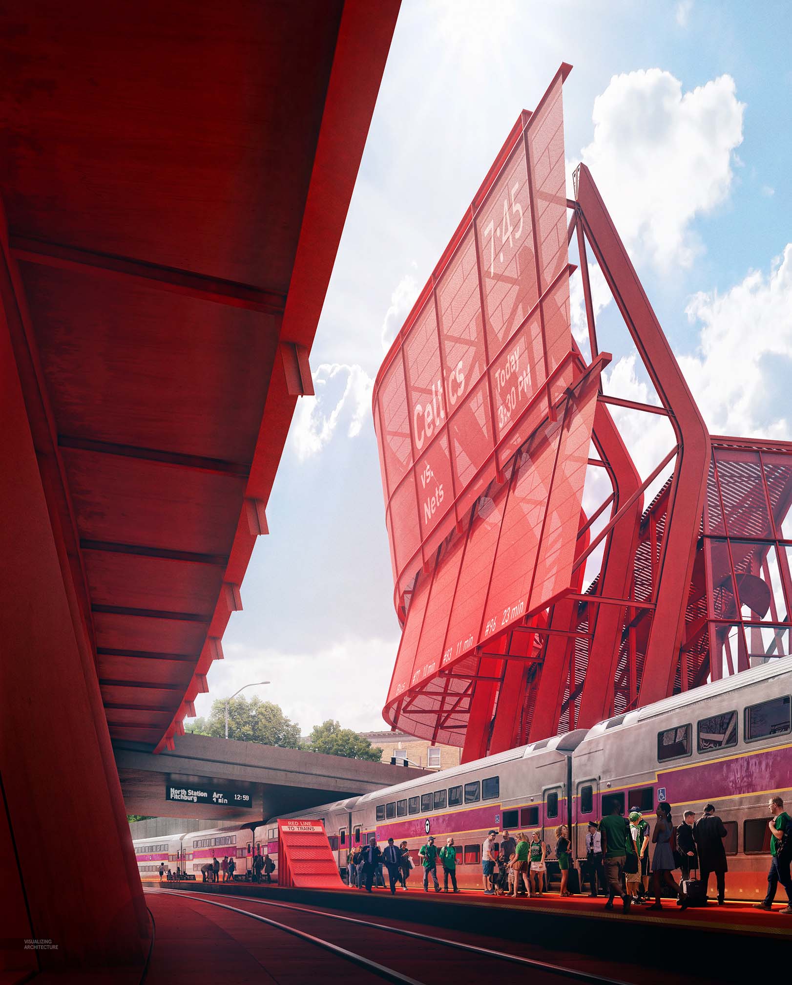
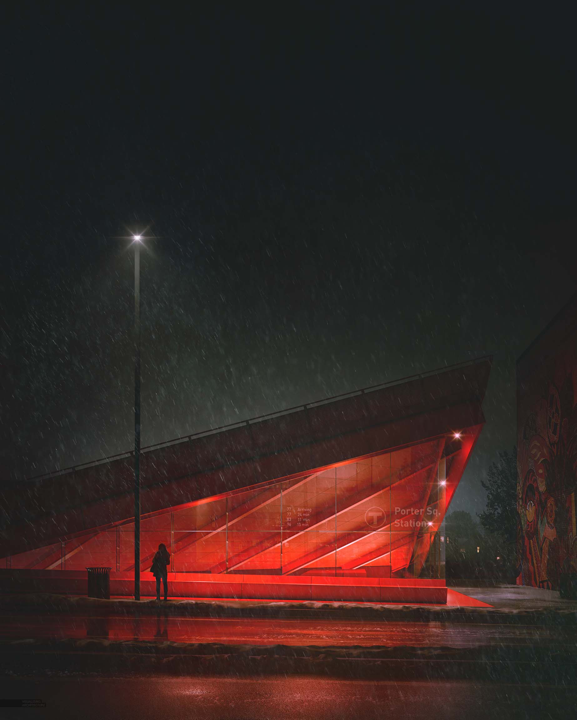
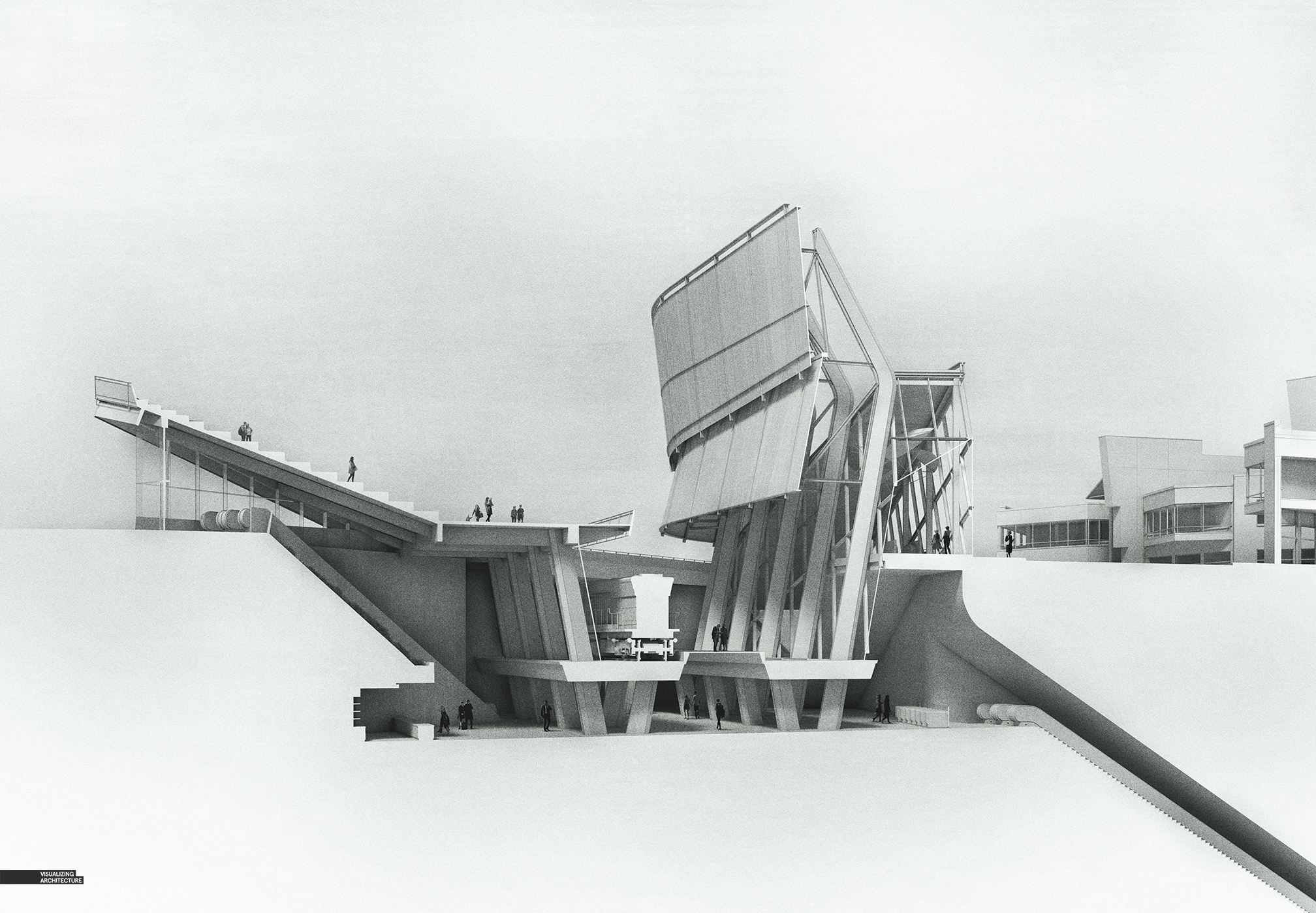
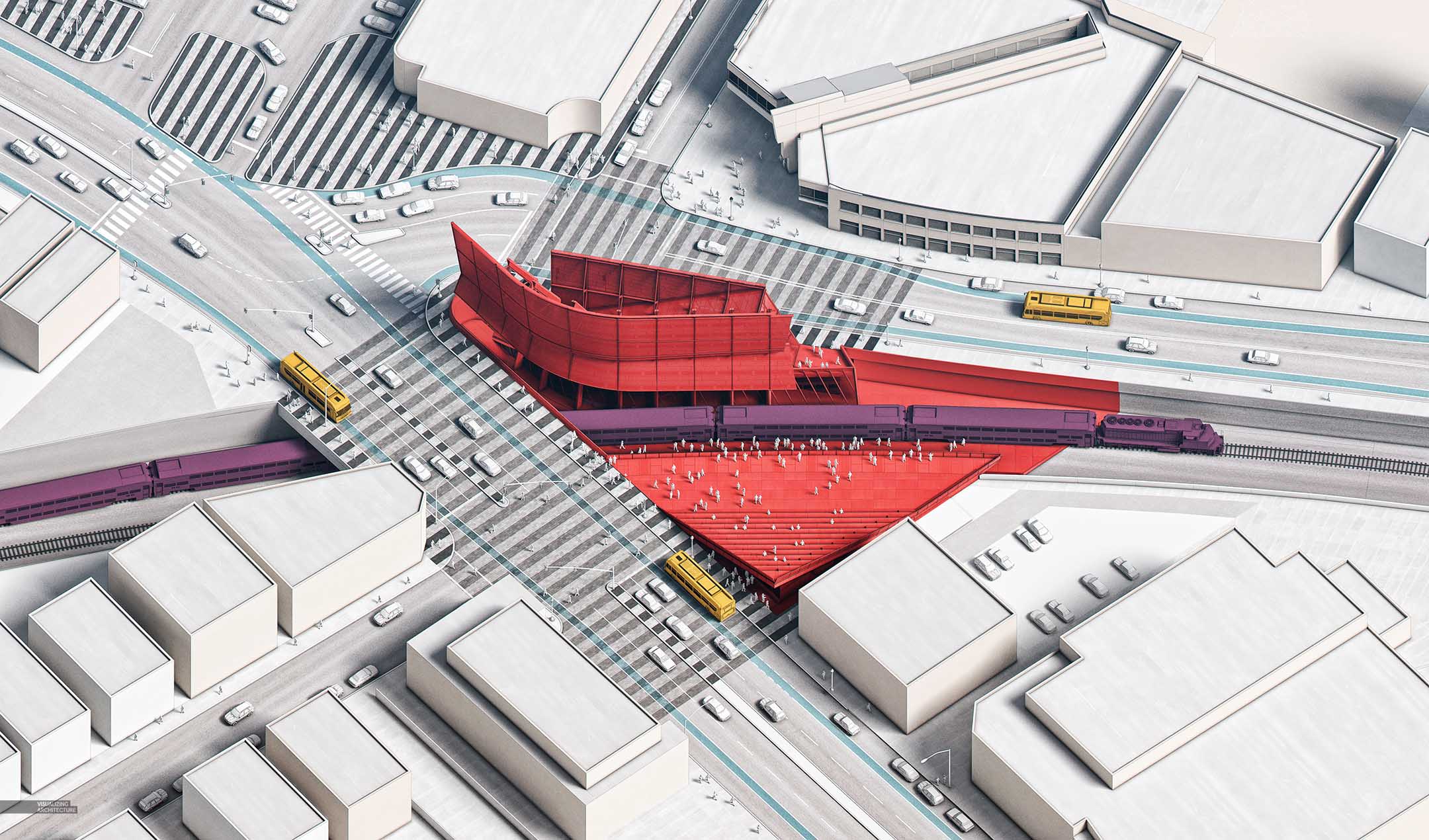
Since it has been a while, below is the entire series of images for this project thus far.



Site Analysis Diagram is very useful for all users. It shows a different view of the site. I am satisfied with your work.
Dream11 Fantasy League
Site Analysis Diagram is useful for all users. It shows a different view of the site. One of the best analysis website.
good