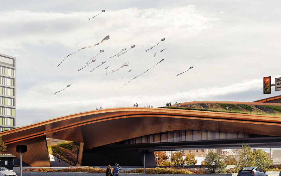
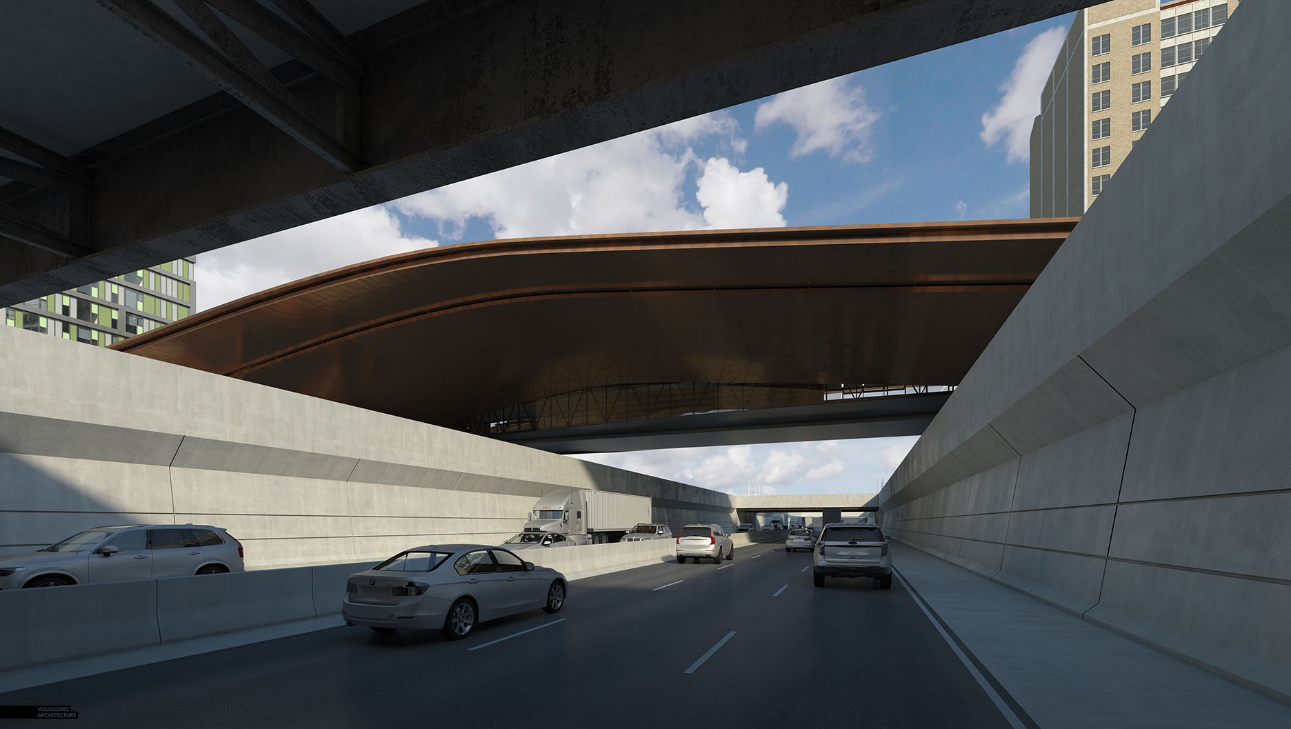
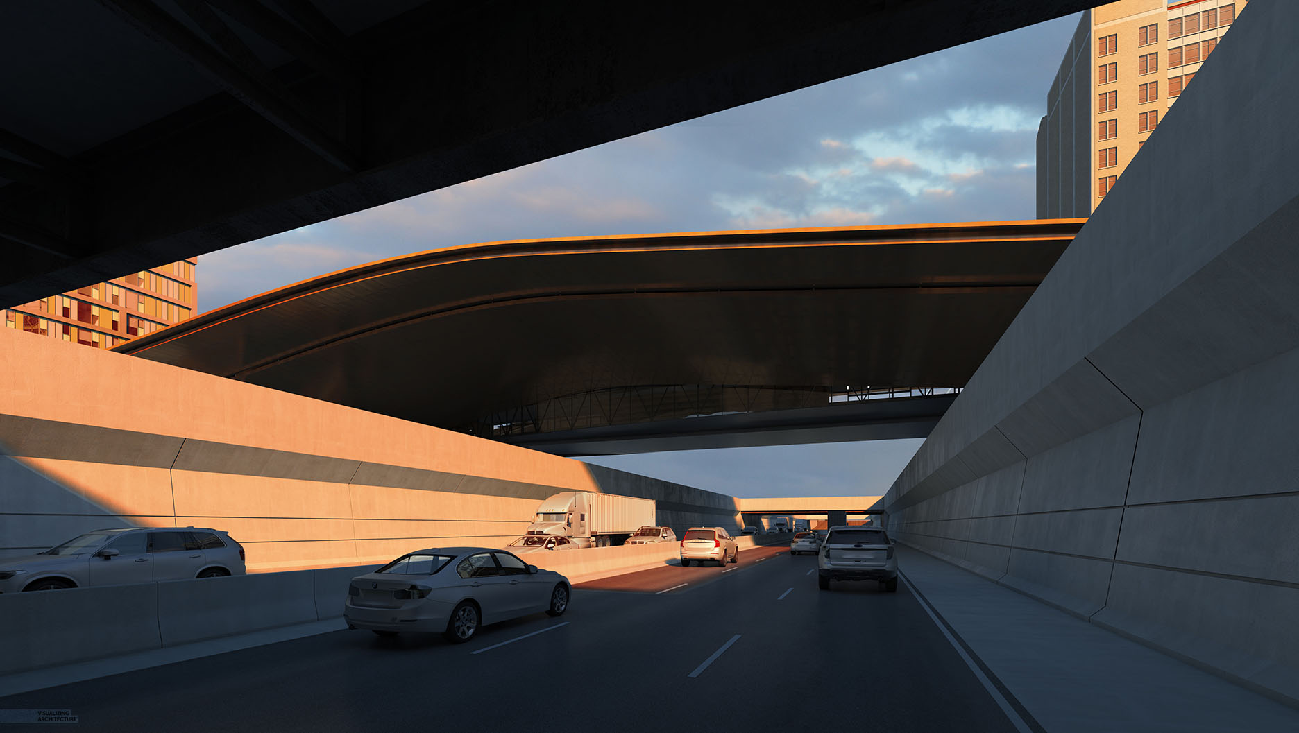
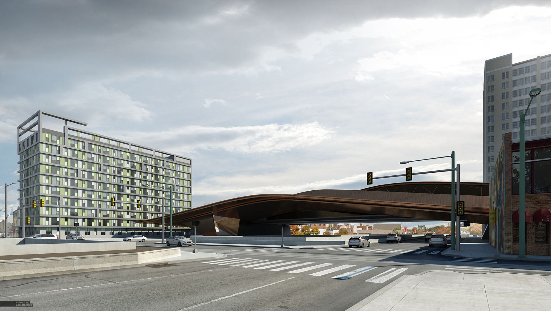
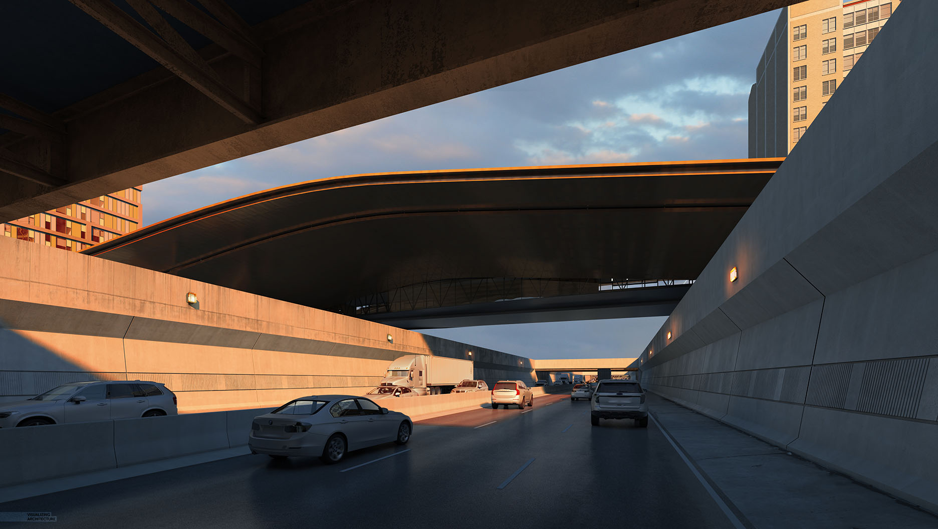
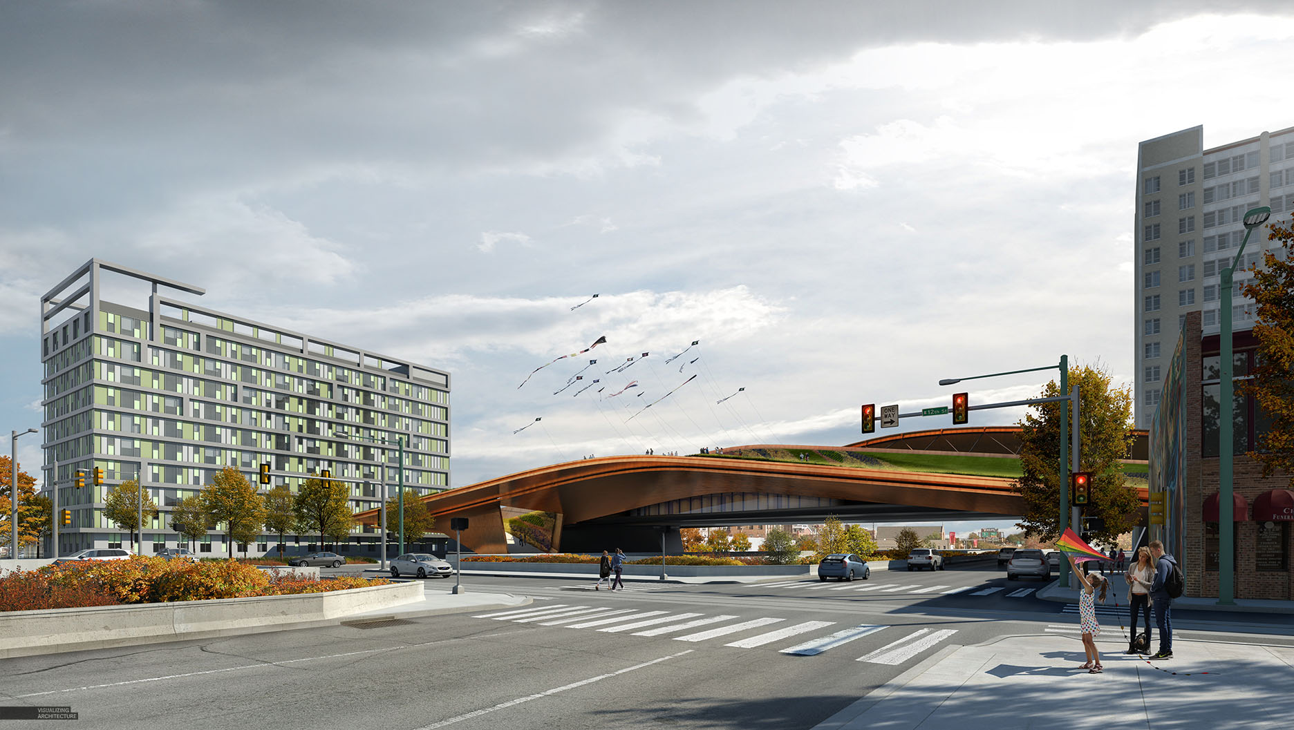
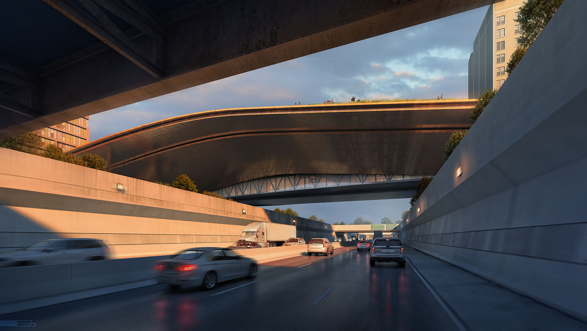
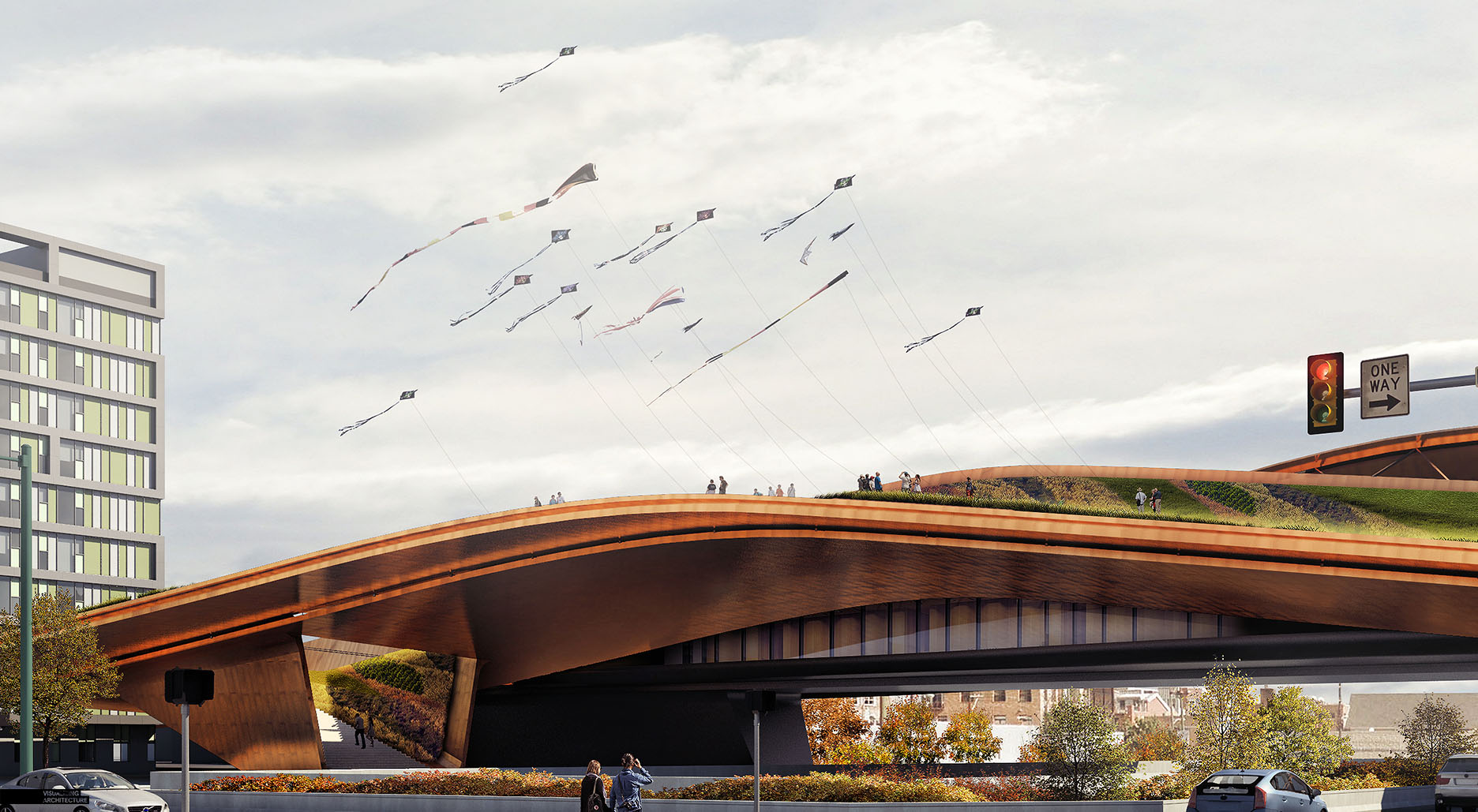
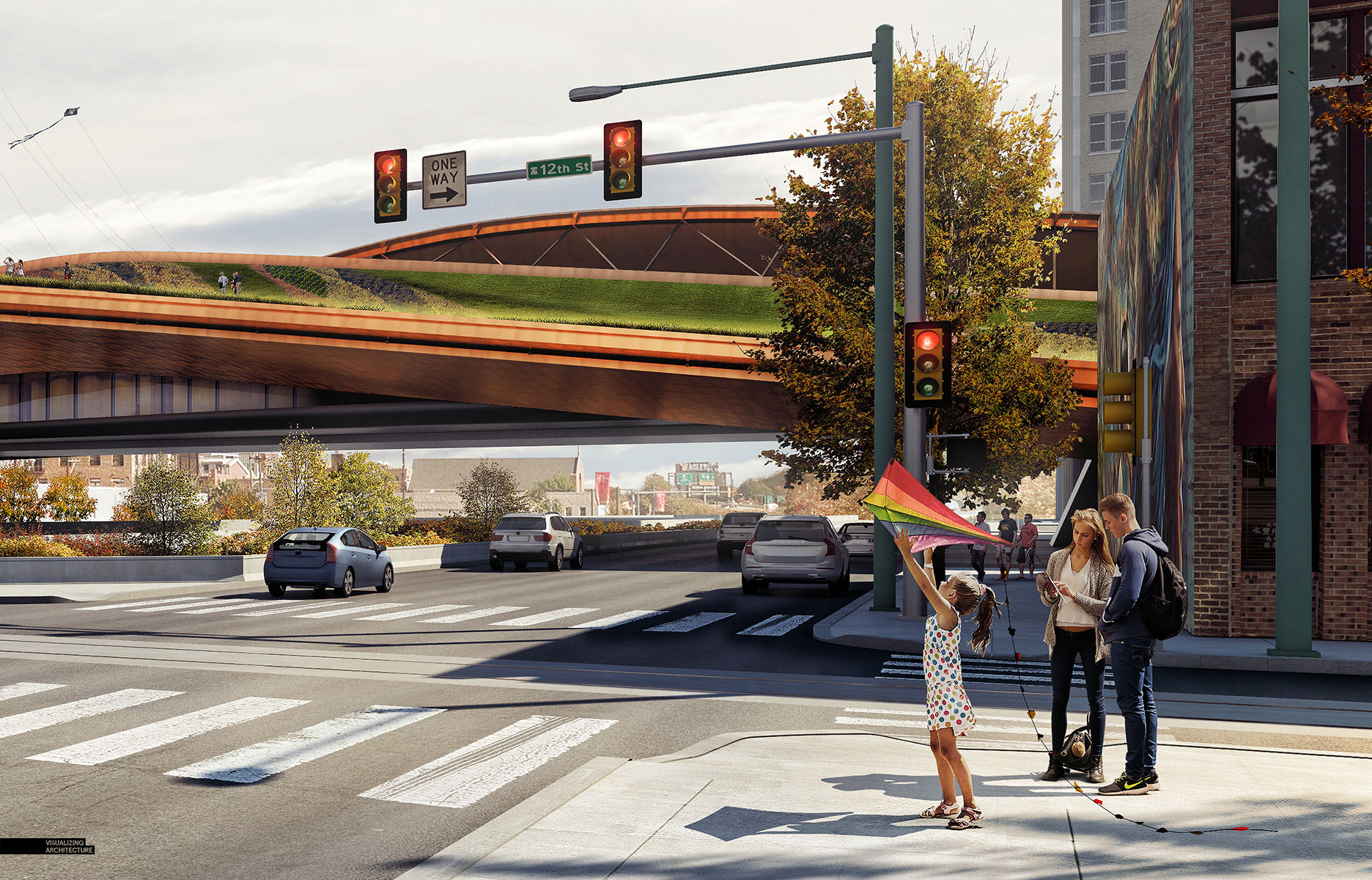
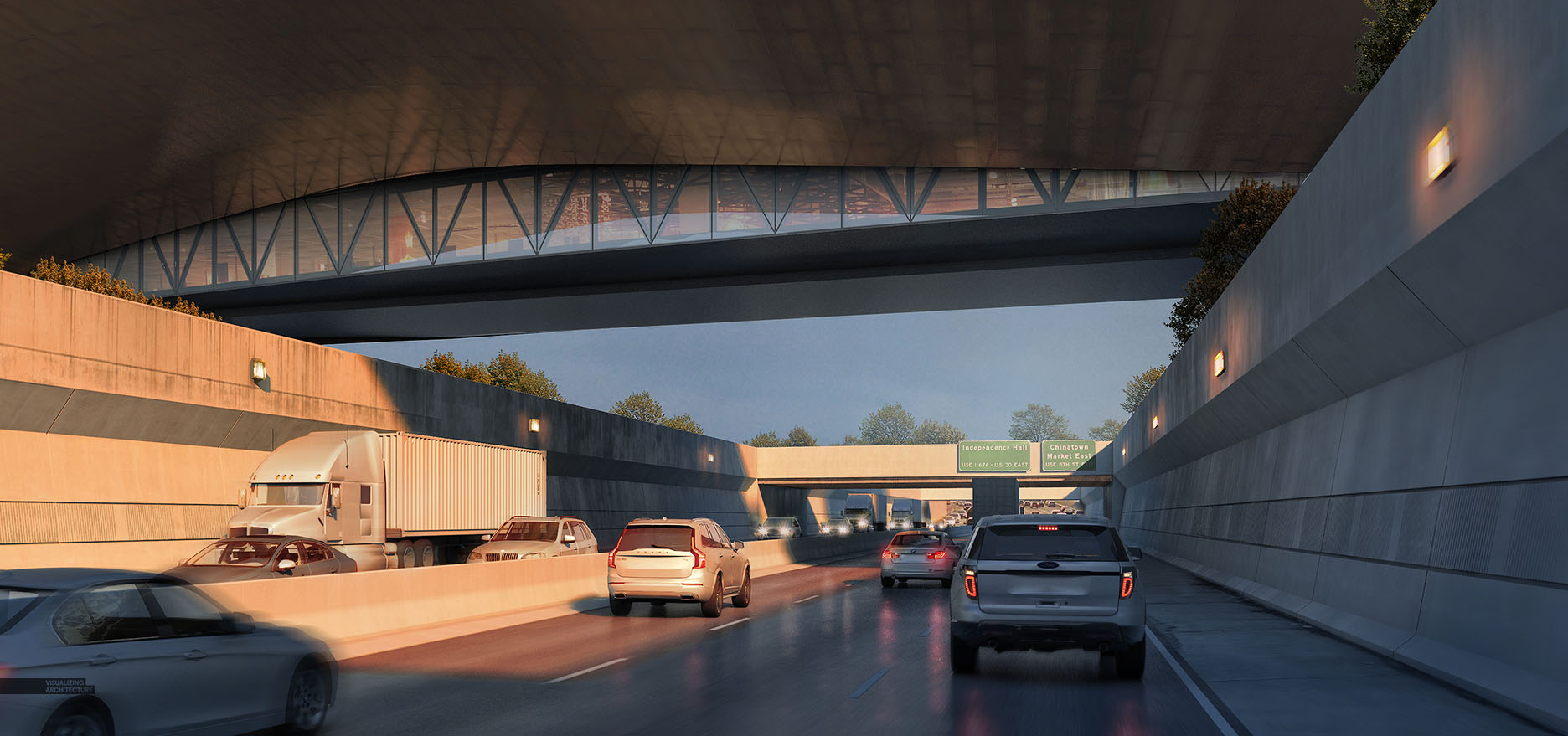
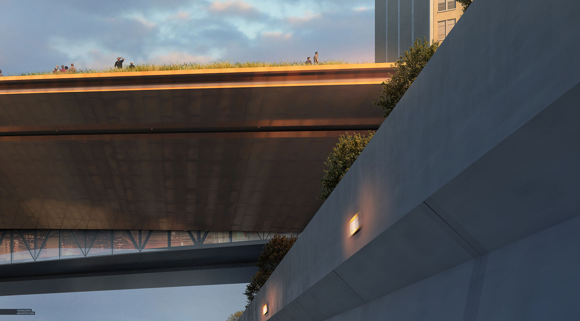
Below are some eye level perspectives that I created to get a sense of the pedestrian bridge design from the west side of the site. I had made some substantial changes to the form and wanted to study what the experience was like as you approach it both as a pedestrian and from the sunken highway. It’s hard to get a sense of drama and emotion through the simple graphic interface of Sketchup. These perspective illustrations early on in the project help me to see if the scale, material, contextual relationships and many other nuances are succeeding or failing.
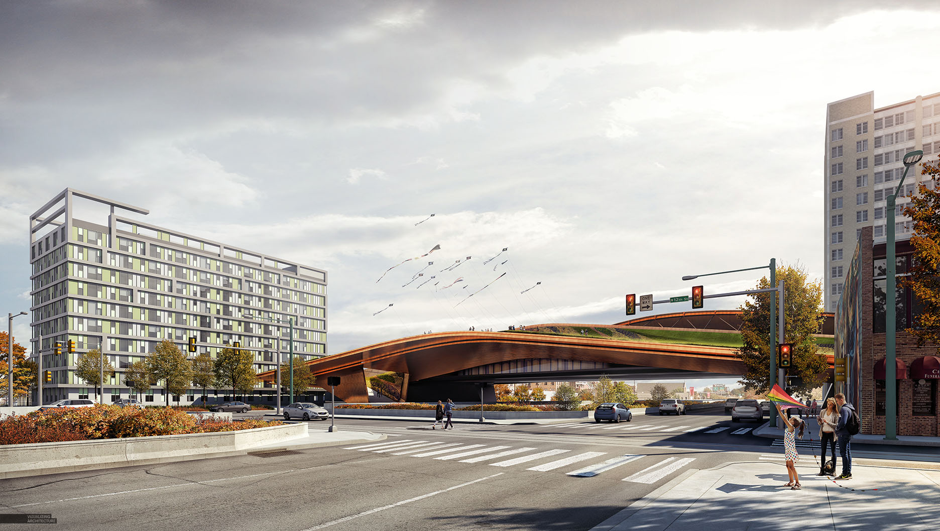
Since I created two illustrations, I figured I would break them down side by side. While the break down itself is brief, I still think they do a good job of showing the critical point where I stopped adding detail in 3D and began adding detail in Photoshop. Every image seems to have different modeling thresholds. I usually have limited time for these side projects so every minute counts. In the case of these illustrations, I opted to model a little more than I normally do knowing that other views will benefit later on from this extra detail.
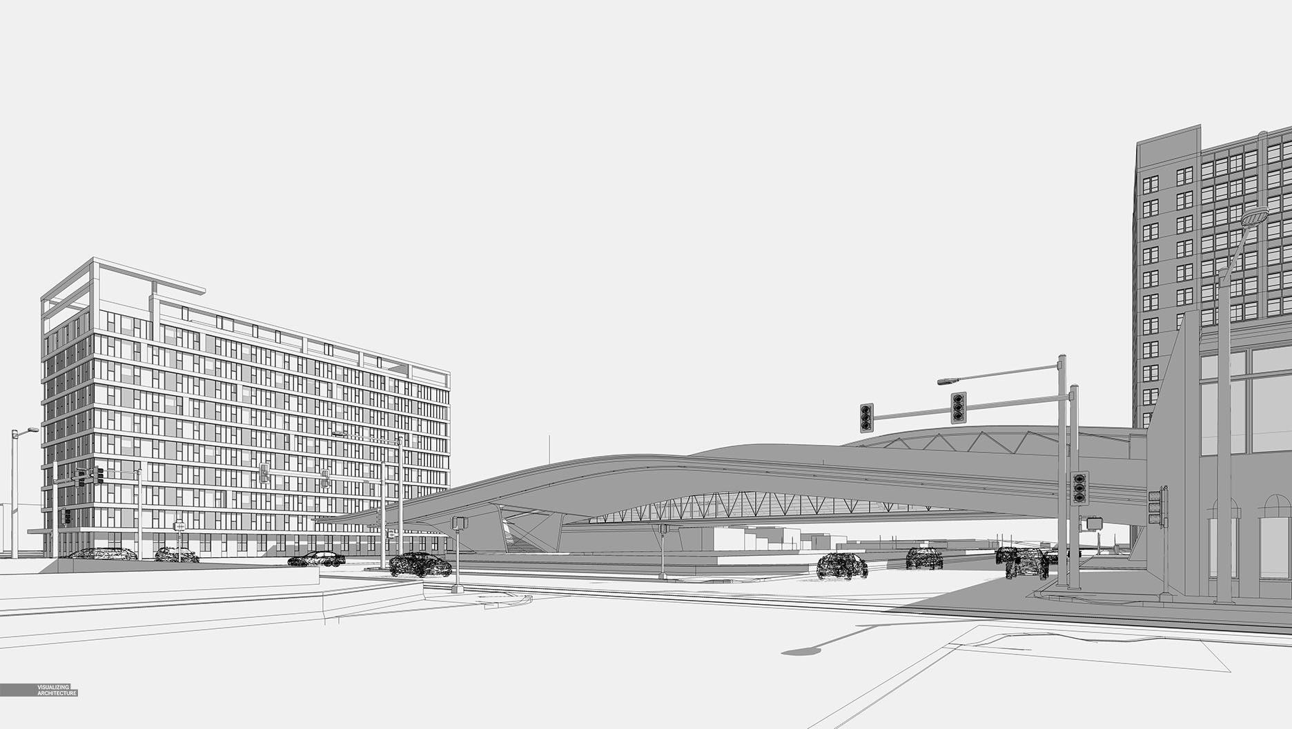
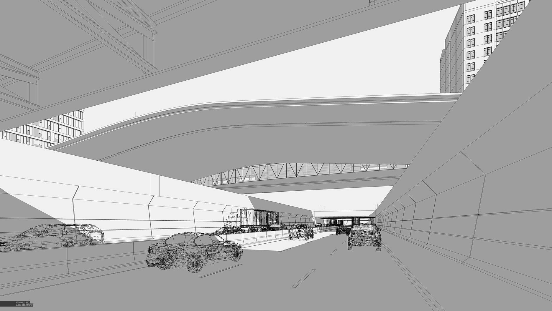
1. Sketchup Model
Like I said above, I spent more time than usual building out the context. Even though I planned on adding lots of texture via Photoshop, I still spent time modeling context buildings, curb cuts, correct street lights, bridge overpasses, etc. I wanted to make sure reflections and shadows were consistent in all parts of the images. Photoshopping in these elements often means you are stuck with the lighting and sun settings of the image that you are cloning from.
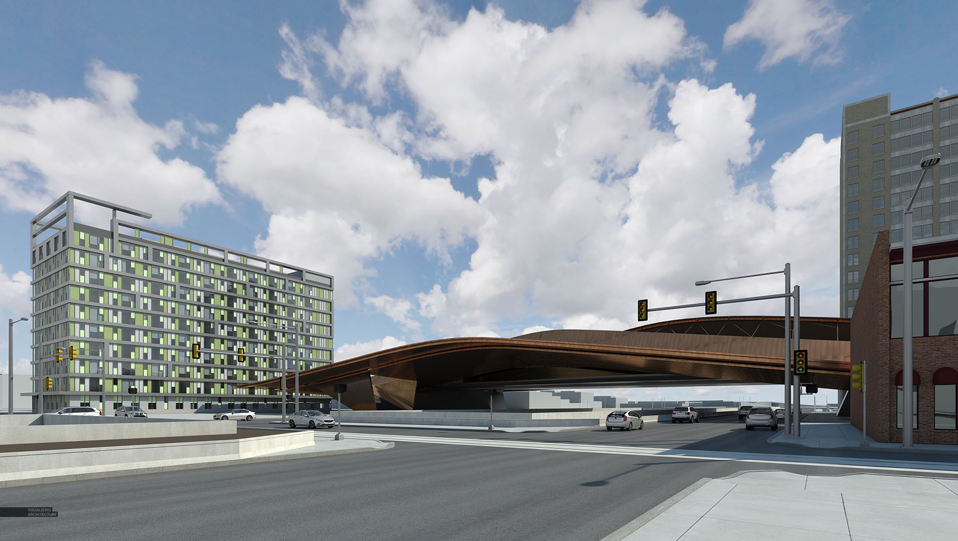
2. V-Ray Rendering
An aspect that I focused on in the base renderings were the textures. More specifically, I played up the subtle reflections in the concrete, metal paneling of the bridge, and other textures throughout the model. I knew that if I could get these close, then I could really dial them in once in Photoshop with additional texturing.
3. Early Color Adjustments
For the highway shot, I ended up really shifting the colors of the base rendering. I had been out to dinner the night that I was working on these images and saw some really beautiful warm sun highlights on nearby buildings. I then came home and began playing with the tones of this image to see if I could recreate this effect. I achieved this by pushing the shadows to a cooler blue tone and colorizing the highlights with a strong orange/red tint.
4. Photoshop Textures
One thing that is always difficult to create in 3D is imperfection. So while I tried to get the 3D textures close, I still rely on Photoshop to add the grunge, dirt, and real world flaws. This is most noticeable in the daytime road, crosswalk paint, concrete barriers.
5. Bridge Amplification
I envisioned the bridge having a vibrant metal panel and a glassy structure projecting out the bottom. I was still “designing” the glassy structure so I ended up Photoshopping quite a bit of that into both images. I then added some warm color overlays and punched up the reflections of the metallic paneling using the reflections channel from V-Ray.
6. Vegetation
Trees, shrubs, and grass were introduced at this stage though I am still working out the design and location of certain elements. My focus here was to make sure the vegetation matched the lighting of the scene. This meant in the dusky highway view, shifting the tree highlights to very warm tones.
7. People, Lights, and Details
Little details go a long way in adding emotion to the images and building narrative. Entourage, lights, and signage were all used to add points of interest and encourage the viewers eye to keep moving around the illustration.
8. Color Adjustments
I didn’t go as crazy as I normally do with color adjustments, but I used this step to add a hint of warmth to the daytime shot and pull out some more detail from the shadows in the dusk shot. I also painted in some haze in the distance to promote the feeling of depth. Finally, a radial blur (zoom) was applied to the dusk shot and then masked away towards the center of the image.
I am hoping to generate several more perspective illustrations for this project since there are lots of little moments throughout this design that I think warrant similar studies. Especially the experience of crossing the bridge that should yield some interesting viewpoints.
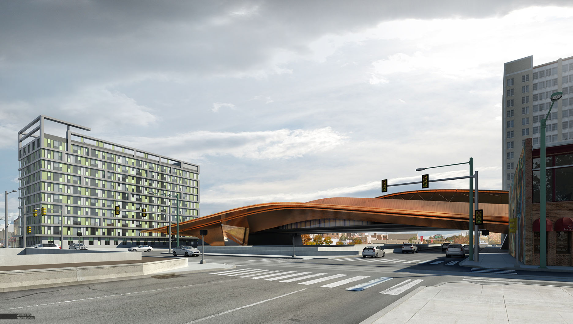
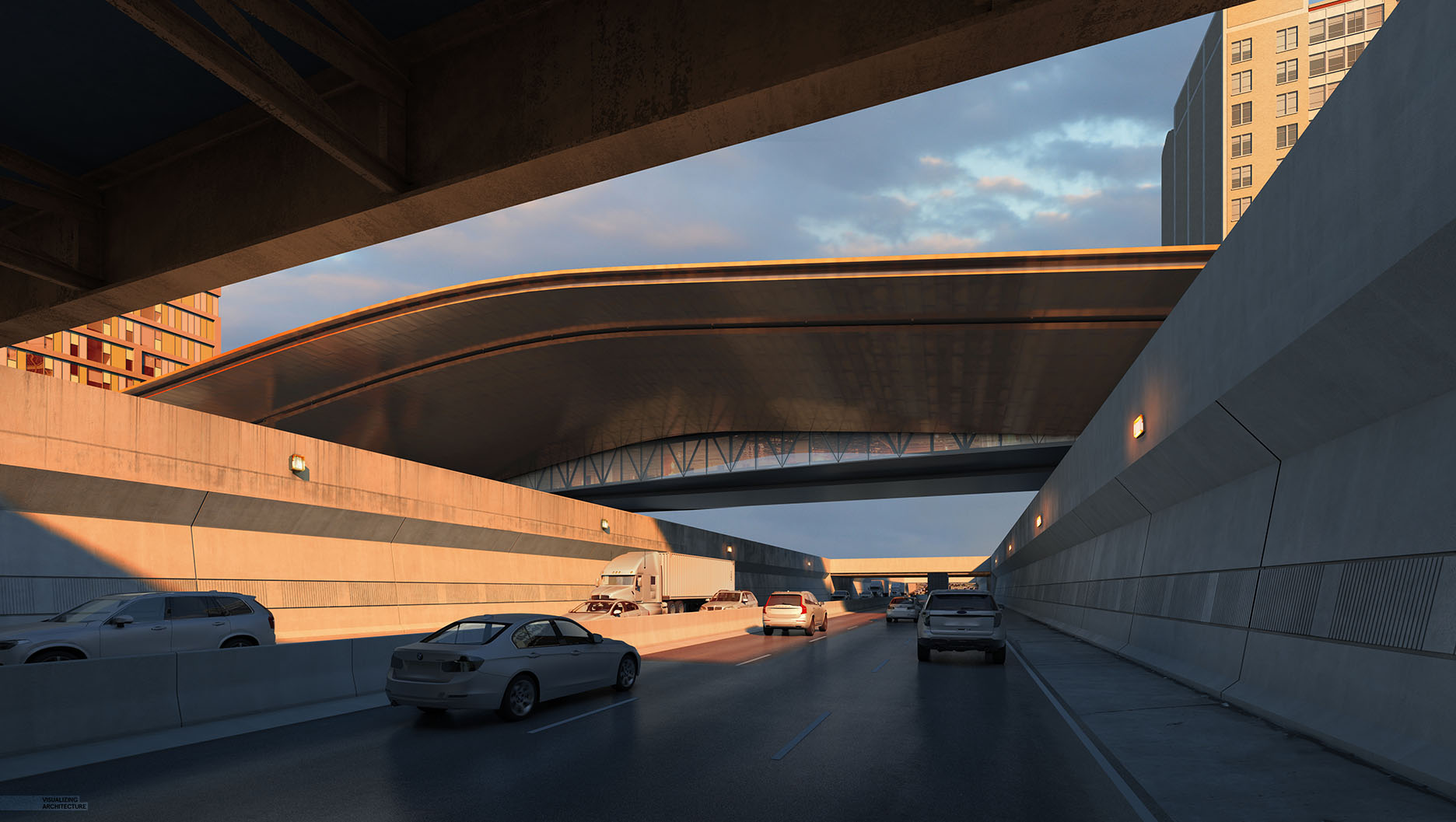
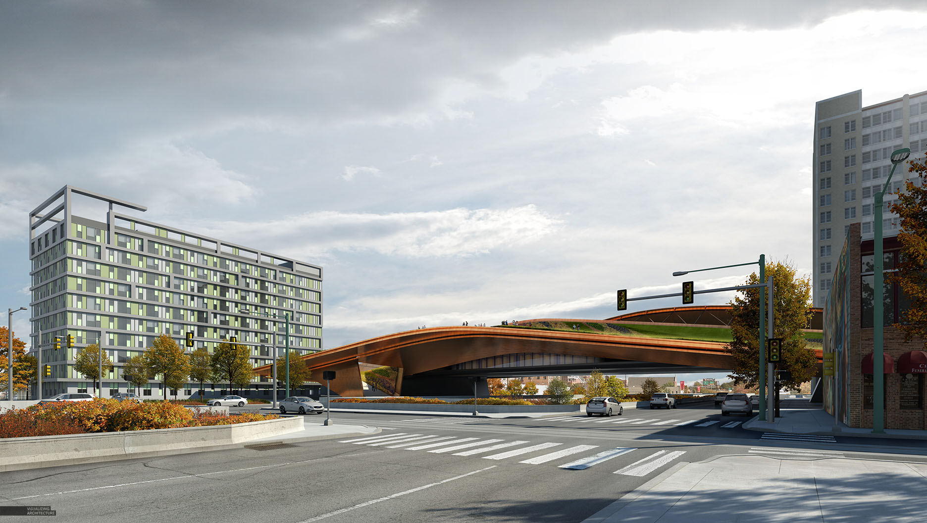
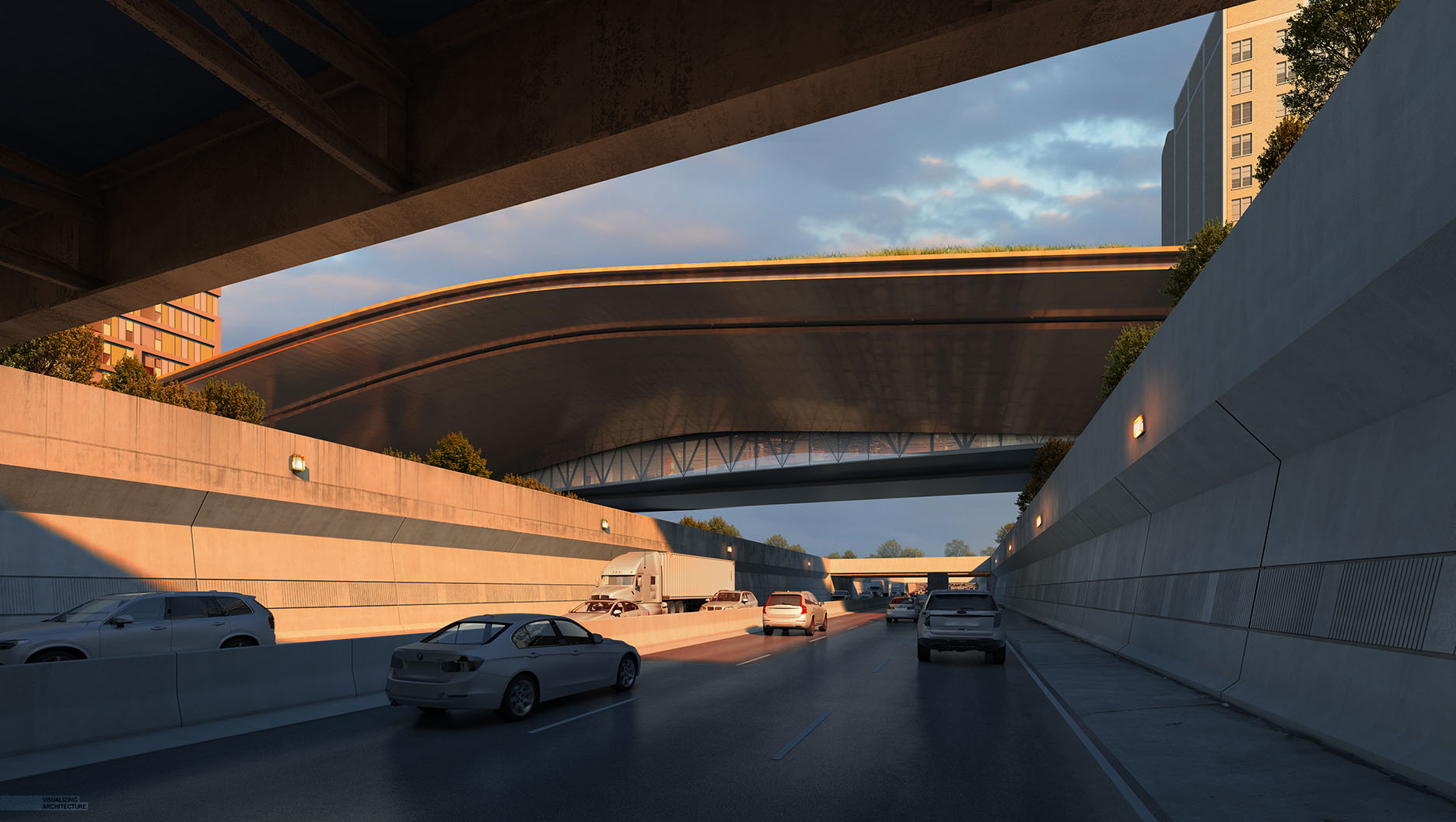



Hi Alex,
Will U renew the amazing video tutorial at certain point?
Thank U.
Hi Pegeon,
The videos were quite time consuming to make. Maybe at some point I will revisit them, but for now I need to stick to written tutorials due to time constraints.
I find the written tutorials easier to follow than the videos. Although I appreciate and love both! Thank you for this entire website.
Hi Alex, just wondering, where did you get those cars? or did you created the proxies?
Great work as usual, keep on going.
Hi Daniel,
They were downloaded from sketchup warehouse, reworked a little and re-textured, then turned into proxies using V-Ray.
Thanks for answering Alex, I´m working on my portfolio and your tutorials have been the best guide.
Hi Alex, I’ve followed your blog and learned a lot from it for years and it’s the first time to make a comment, thank you very much. This is a great work as usual, and the beautiful reflections of the cars on the road remember me that you said years ago in the tutorial video of making wet street that you had updated your method to do that and you would make time to share it with us. So really expect for this tutorial if you could have time to do it.
Hi Bing,
Yes I remember. It is a process that I used for the “Day to Night All Photoshop” post. For the renderings in this post, I did not use the photoshop method. If I end up using the workflow again in any upcoming images, I will try to break it down into a tutorial.
I’ll wait for it:)
Hi Alex, I.m your Chinese fan.
I hope I can acquire that your vedio course , I don,t know where can I find it ? thank u
You can get some in YouTube
Alex,
Great work as always. Your vray textures seem great. Did you create these textures yourself? If so, could you describe the process? If not, would you be willing share where you have resourced these from?
Hope it still helps
https://visualizingarchitecture.com/favorite-architectural-cutout-and-texture-resources/
great
Hi, Alex! Now your work is totally beyond normal people can understand exactly how to do it! Could you please show the project processing step-by-step?
When you do your Vray proxy objects, do you save them as separate files to use in other projects? If so, how do you go about texturing them as they do not carry materials?
Thanks
Hi Alex, amazing work as always.
If you could prepare a short tutorial explaining some clues about Topaz and how you add HDR effect with it, it would be really nice.
Thanks a lot!
i want to learn 🙁
Hi Alex, How did you create the buildings on the left and right of your bridge? I’m assuming those were existing building? Did you get the floor plans?
Thanks
is there a video tutorial for this?
Great work as usual! The vray textures seem great.
This is very educational content and written well for a change. It’s nice to see that some people still understand how to write a quality post.!
what fantastic images!
Hello Alex Hogrefe,i’m a chinese student,
i wonder where did you get these textures
which is so match with your scenes.
I also want to konw when you render your scene ,
what channel did you choose.Thank You!
Hey Alex, This is really good tutorial. I just wanted to know that, did you build the entire thing in sketchup or did you build the bridge in rhino and then build the rest in sketchup. If not, how do you build curved surfaces in skecthup?
Hey Alex, just wanted to know that did you build the curved structure in sketchup or rhino ?
Great work as usual! this is very useful to us….Thanks for sharing this articles…https://bit.ly/2sL4gIf
I have had a lot of harvest after watching this article from you! I feel it interesting, your post gave me a new perspective! I have read many other articles about the same topic, but your article convinced me! I hope you continue to have high quality articles like this to share with veryone!
a very detailed and meticulous lesson, it really has a lot of values, I will learn a lot thanks