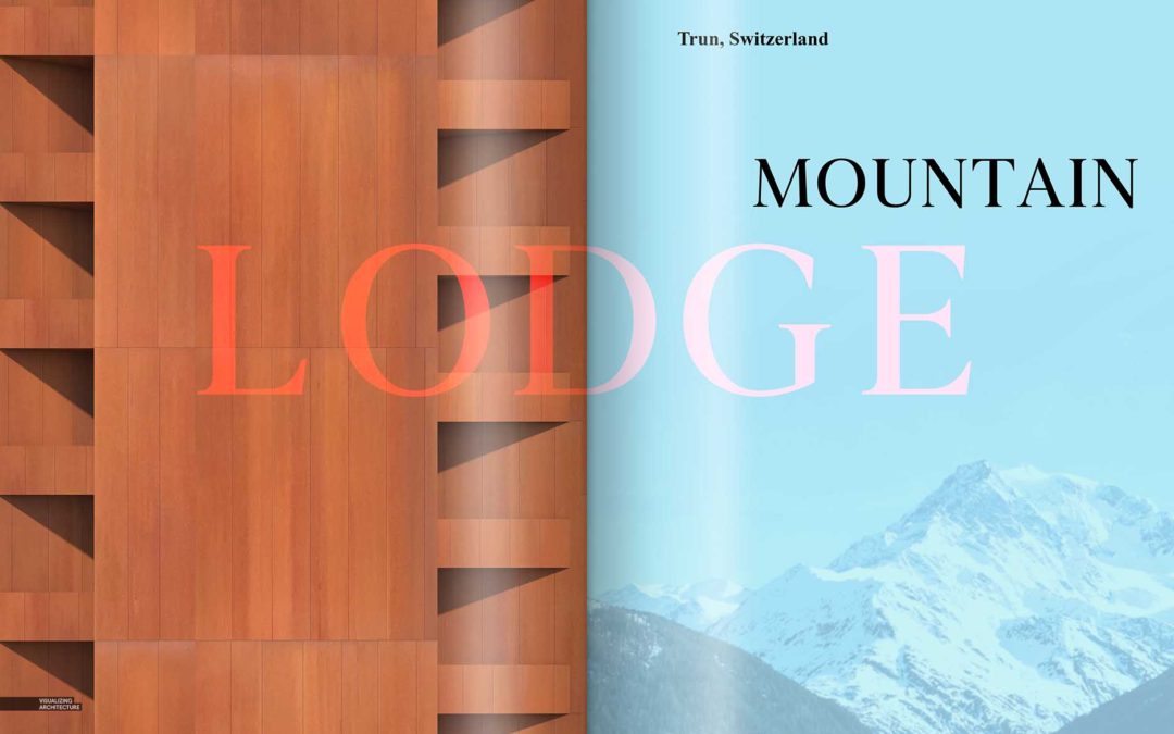
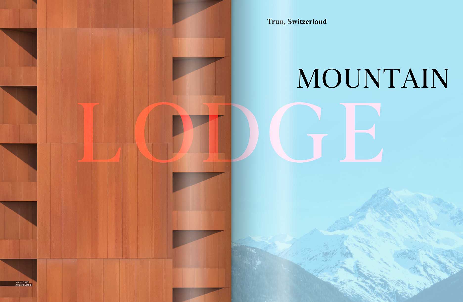
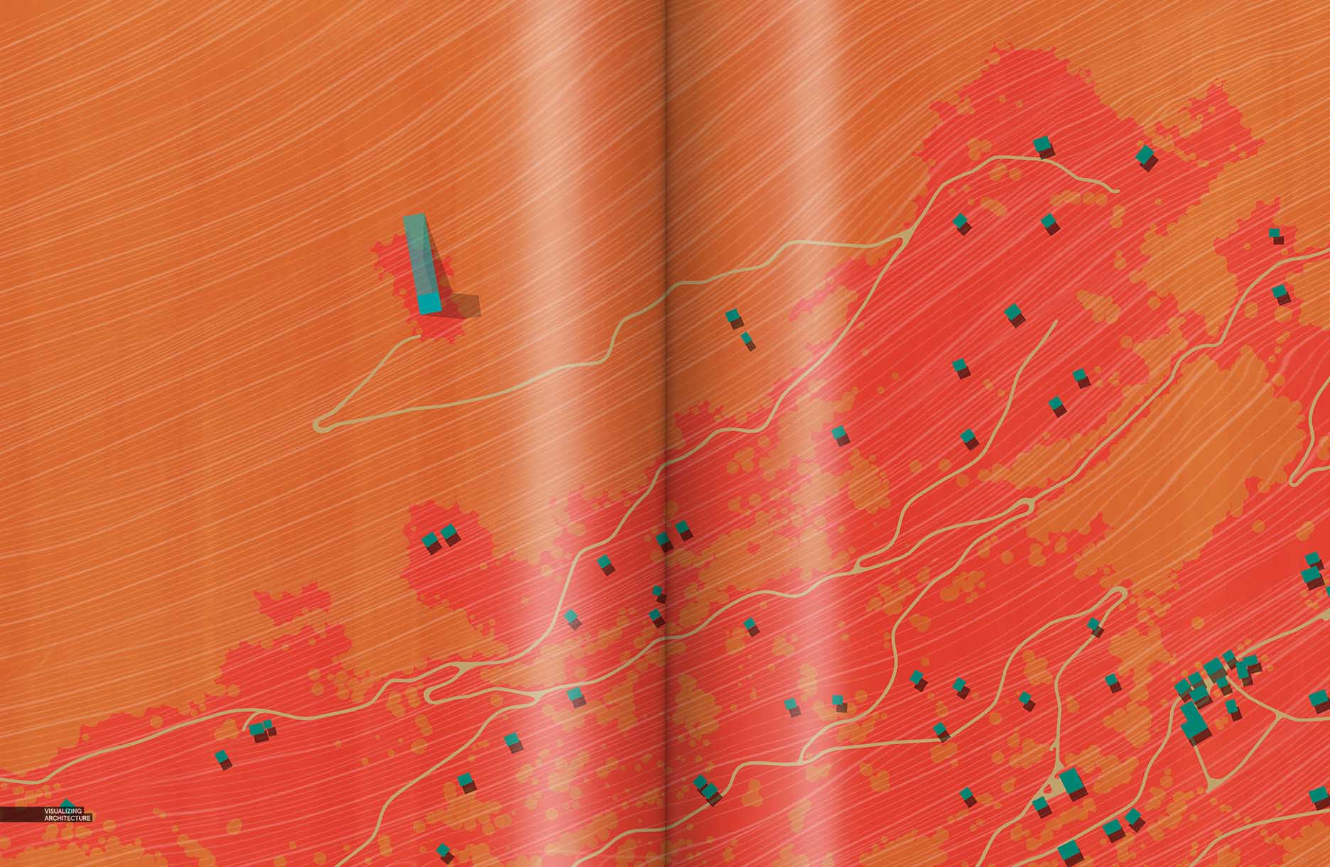
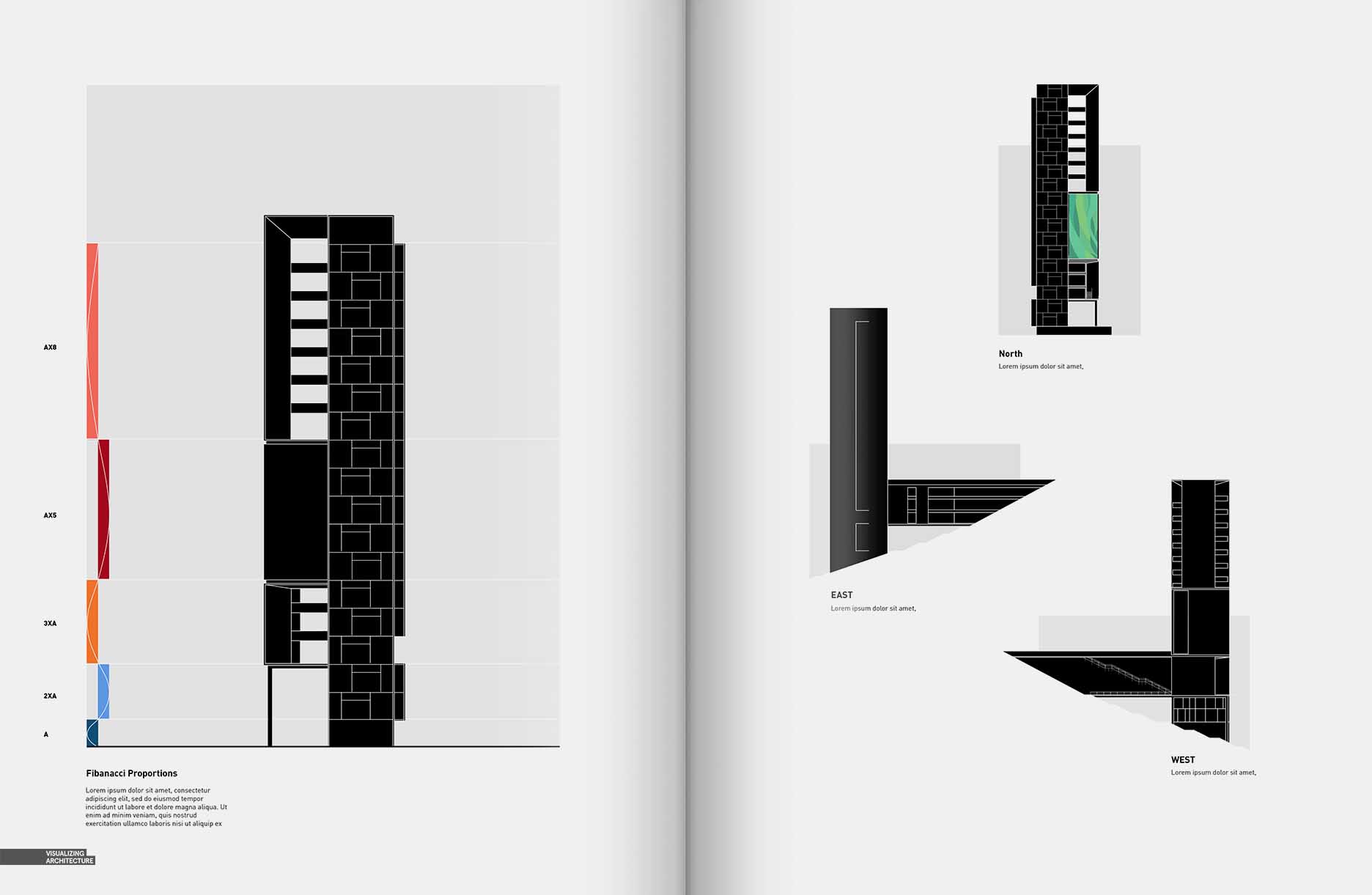
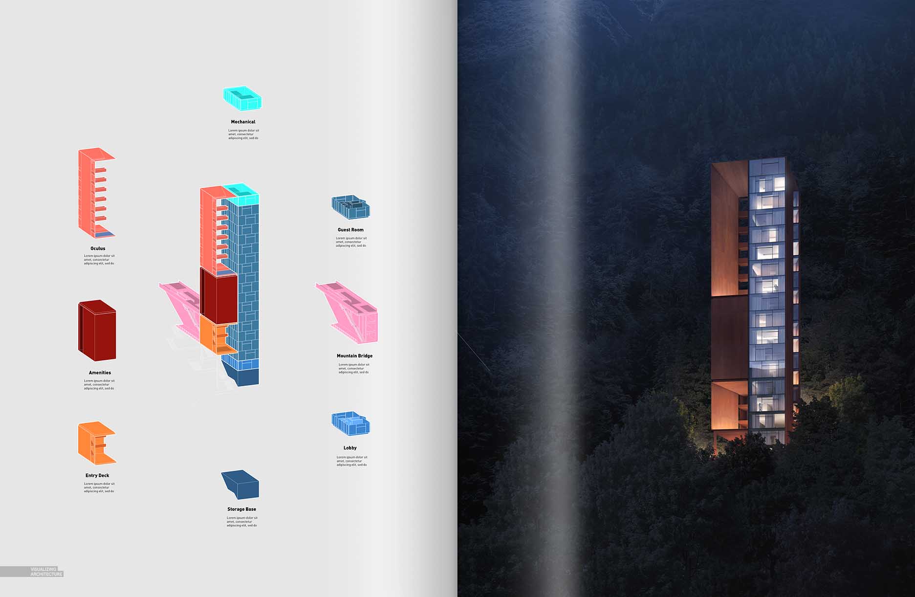
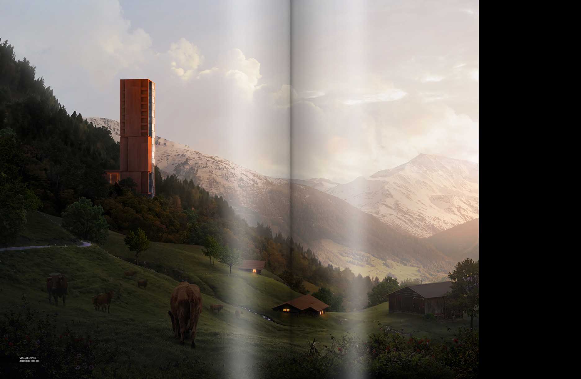
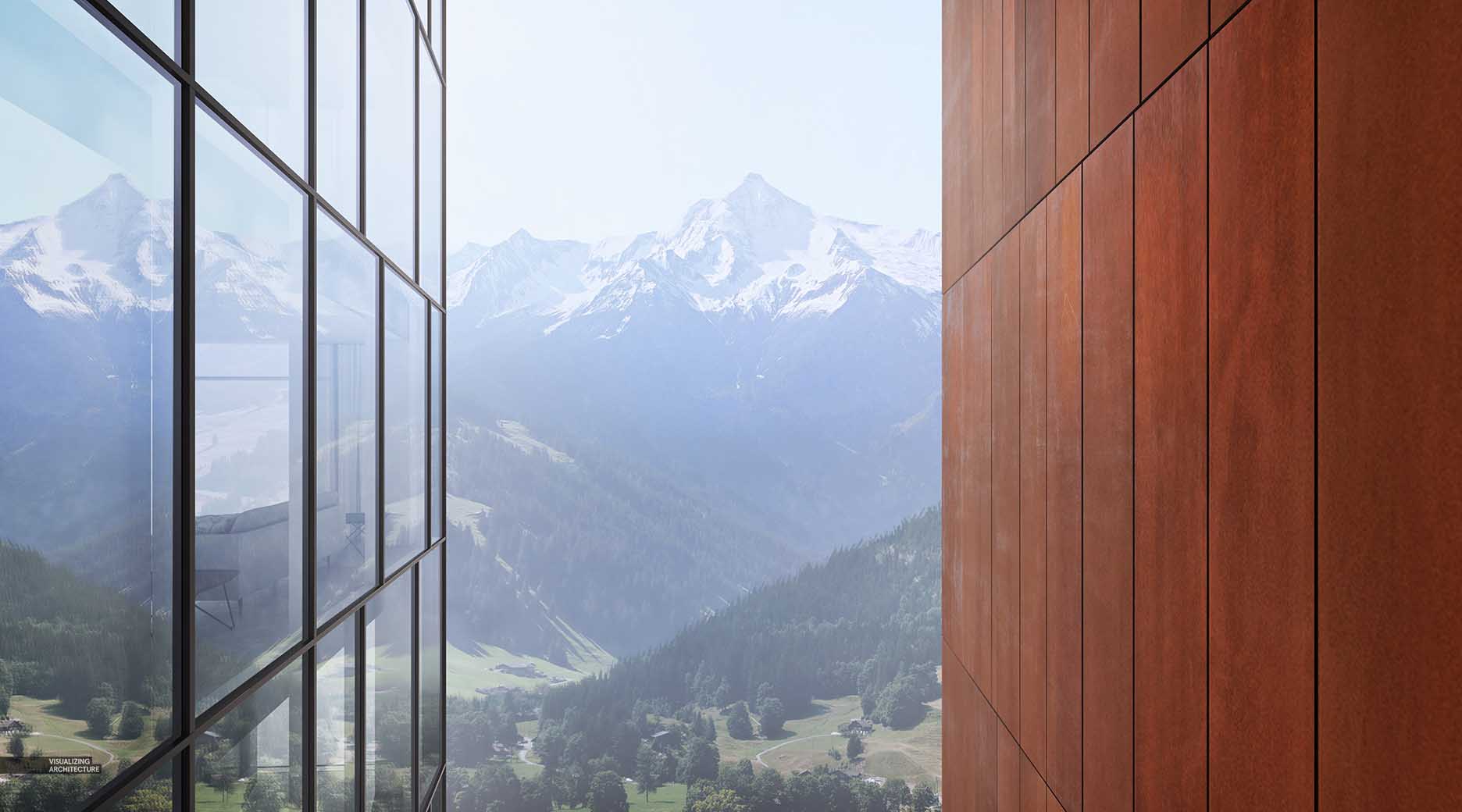
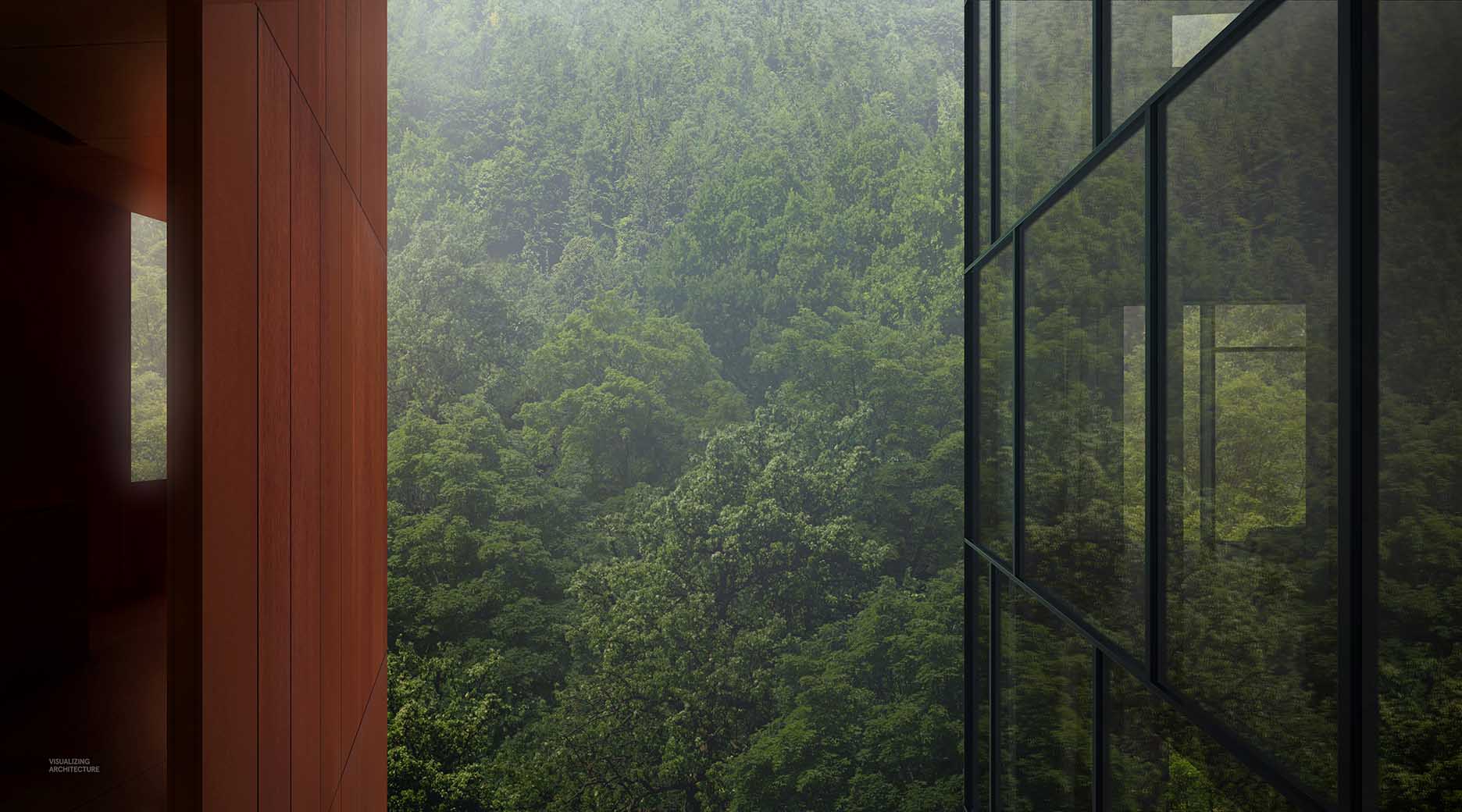
I have begun thinking about some of the spreads for the Mountain Lodge Project and what kind of tone I want to set. The images consists of simple and minimal diagrams paired with heavily textured and vegetated perspectives intentionally creating a contrast between the two. I have carried over orange and red tones of the Corten Steel into several of the spreads via background and accent colors to help tie the pages together and give an overall warmth to the project. After assembling some of these spreads, it was clear that there were a few moments missing from the narrative that I needed to go back and clarify. One of the most important moments is when one is standing within the large oculus. The concept of the design was to have two very different experiences depending on which direction the viewer was facing. Looking south gave a big and expansive view of the landscape and mountains while looking north out of the oculus provided a more intimate view of the mountain side, trees, and nature. Several illustrations in past posts hinted at this idea, but I needed a new set of images that clearly explained this idea. I spent about a half of a day generating these two images that now have turned into one of the more important spreads of the project.
There are about half of the spreads missing in this post that I am still experimenting with, primarily floor plans, site plans, and some more exterior and interior perspectives. One thing that I have talked very little about on this site and something that I will be exploring much more in depth with the upcoming portfolio is the topic of fonts. I will be collaborating with an expert in this area and hope to create several posts on this and other graphic design topics very soon. Stay tuned.
Framed Views Closeup




Amazing as always, Alex!
can’t wait to hold ist printed in my hands
amazing! will be ordering this soon!
Very helpful article, Thank you for sharing. I love you
………………………………………………………………………………………………………
Nice, inspirational work as always, Alex.
visualizingarchitecture.com what I need. bookmark
Fantastic spreads Alex, I love the full-bleed renderings paired with the smaller drawings/diagrams. I apologize if you have already answered this question somewhere else, but where do you find the beautiful background images for all the renderings? Are they many images spliced together?
I don’t remember which post he explained it, but I believe most of his backgrounds are collages of many images.