I have been traveling quite a bit lately which means it has been a while since my last post. I figured I would ease back into this with some mapping studies that I have been experimenting with. I have always liked the idea of locating a project at the beginning of the portfolio with a series of maps or diagrams to help orient the viewer.
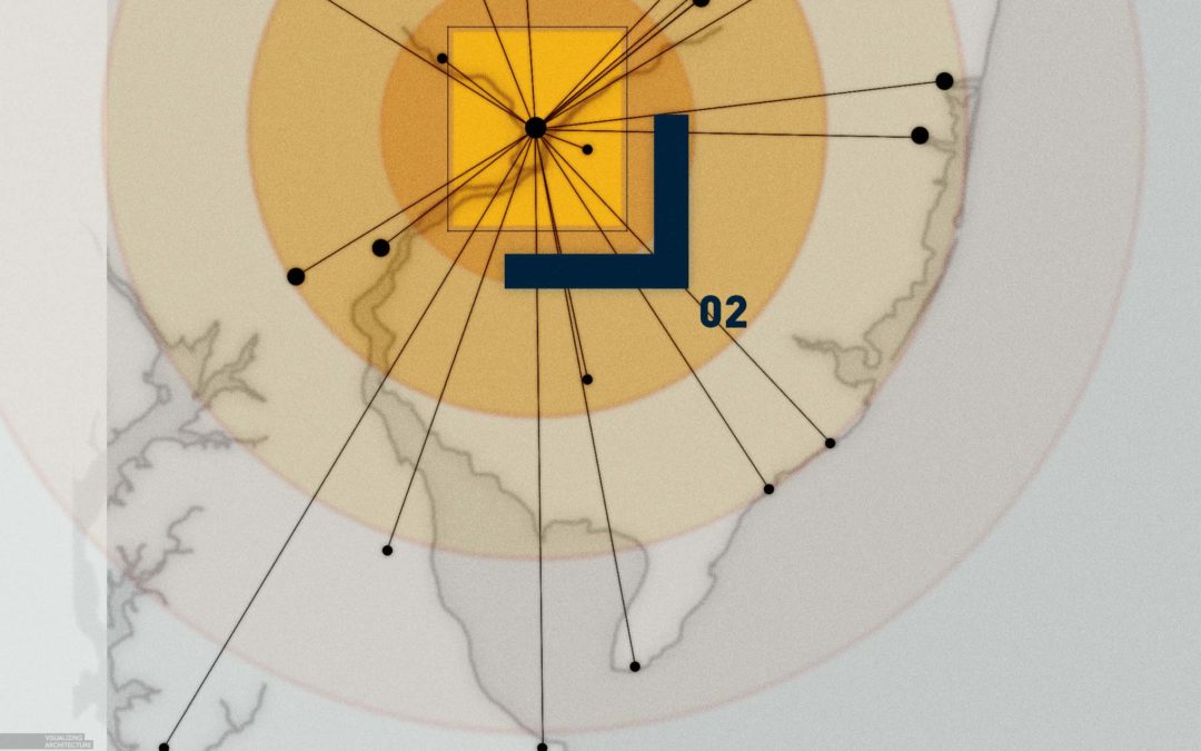
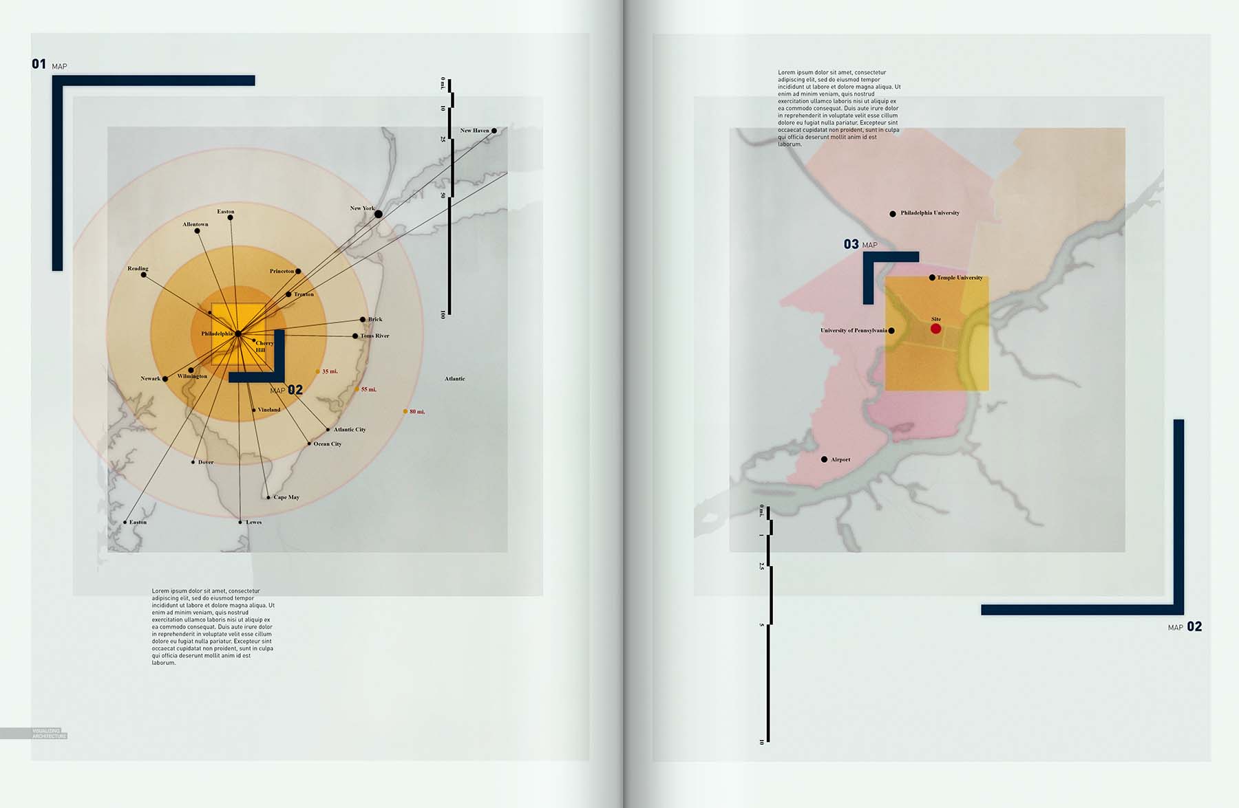
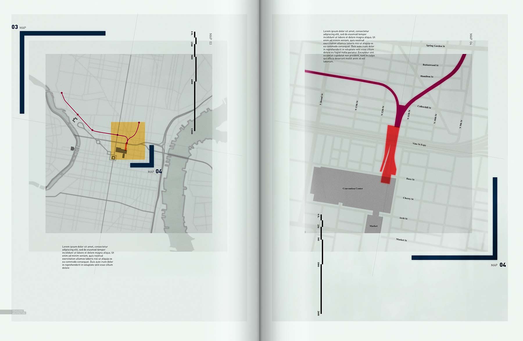
The first starts with an extremely pulled out view of the East Coast and slowly zooms in with each addition map. Graphically, I played around with blurring as a hierarchy tool which ended up leading me down a path of creating a look similar to layers of trace paper. I still need to add much more text and information overlays, but the foundation is there for each map. Below is a quick explanation of how I created the “trace paper” look.
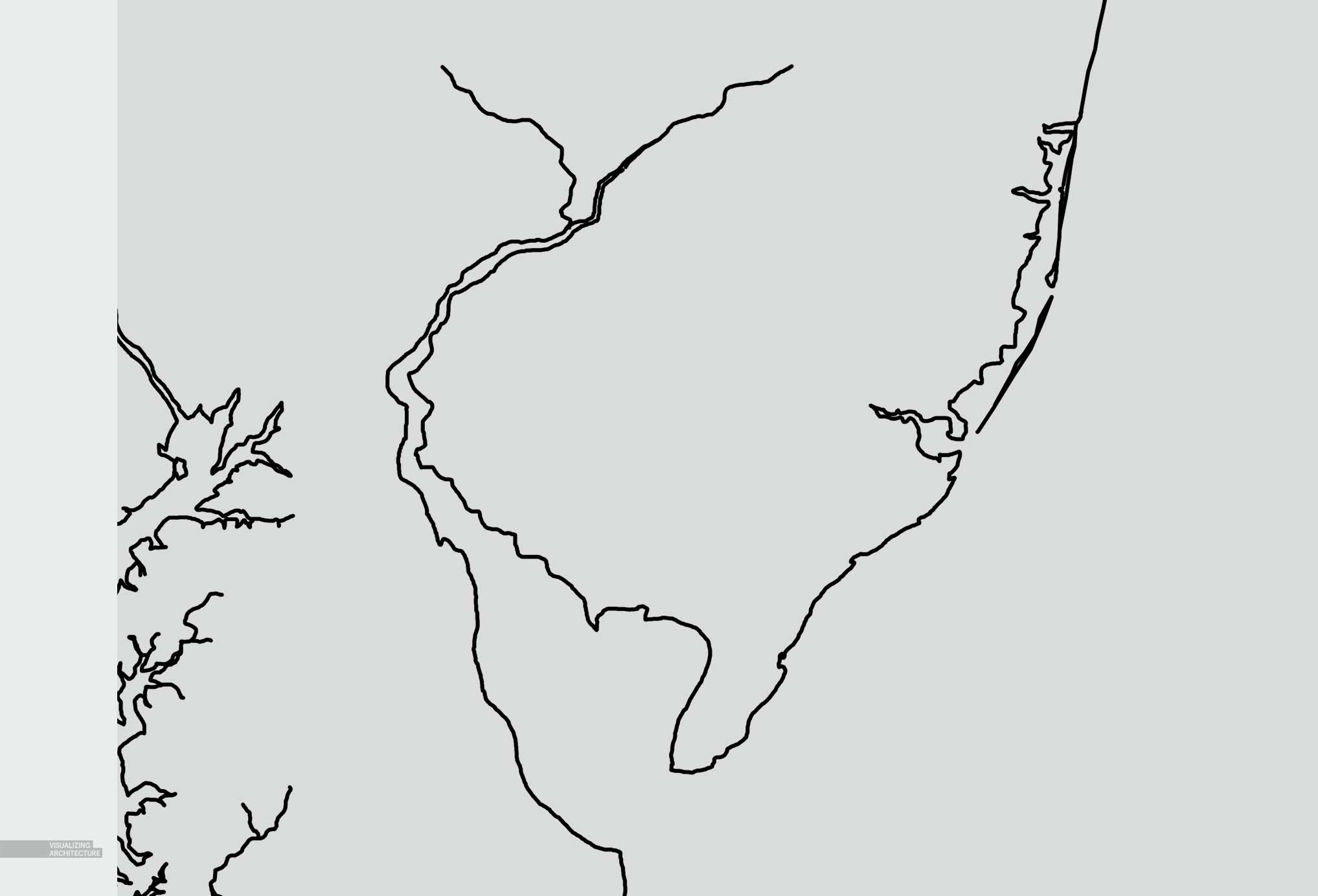
1. Trace the Edges
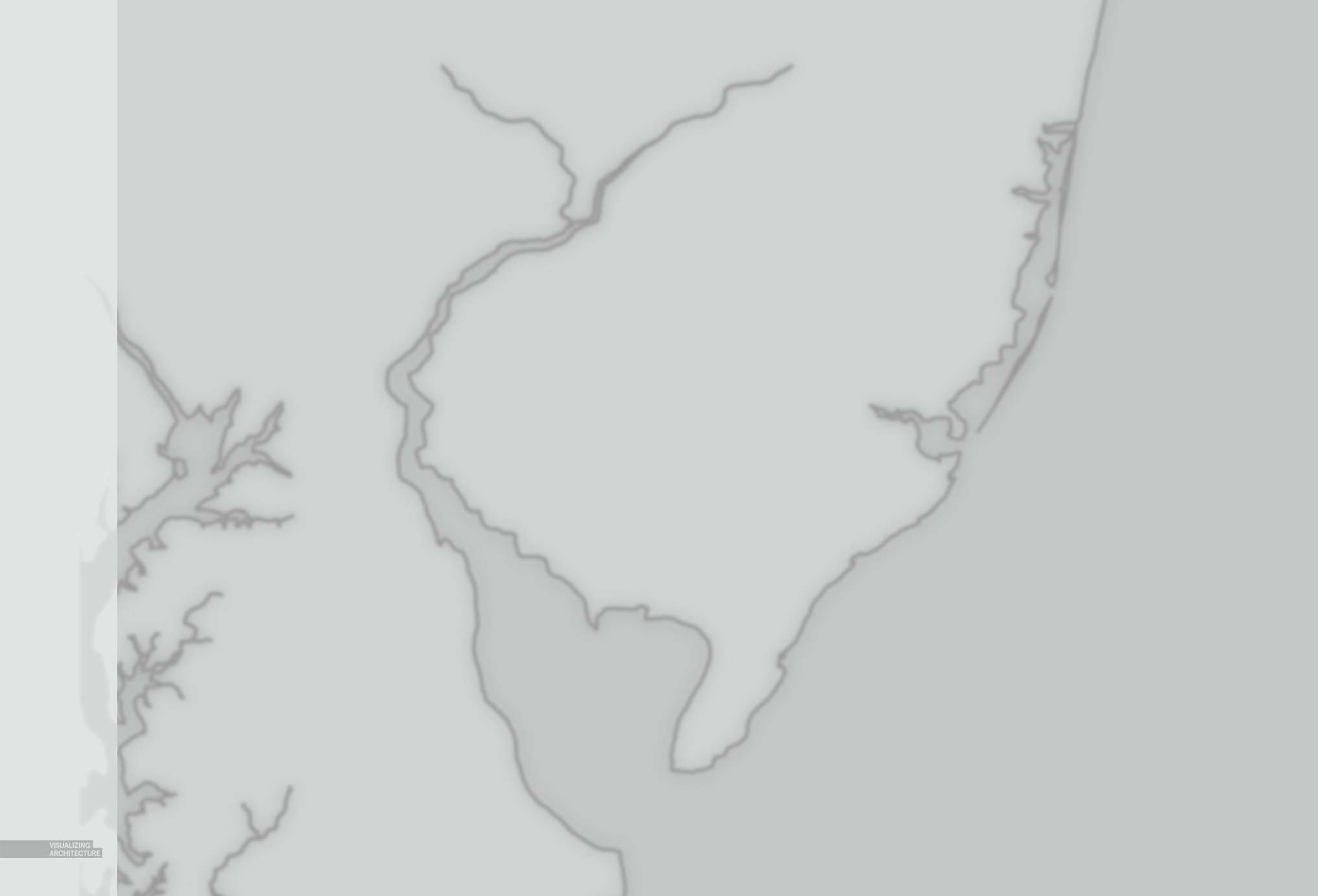
The first step was pretty straight forward. I traced a map using the Paint Brush tool and black paint. The line work was mostly done free-hand since I knew I would be blurring later and therefore didn’t need to be super precise. Be sure to keep the line work on its own layer.
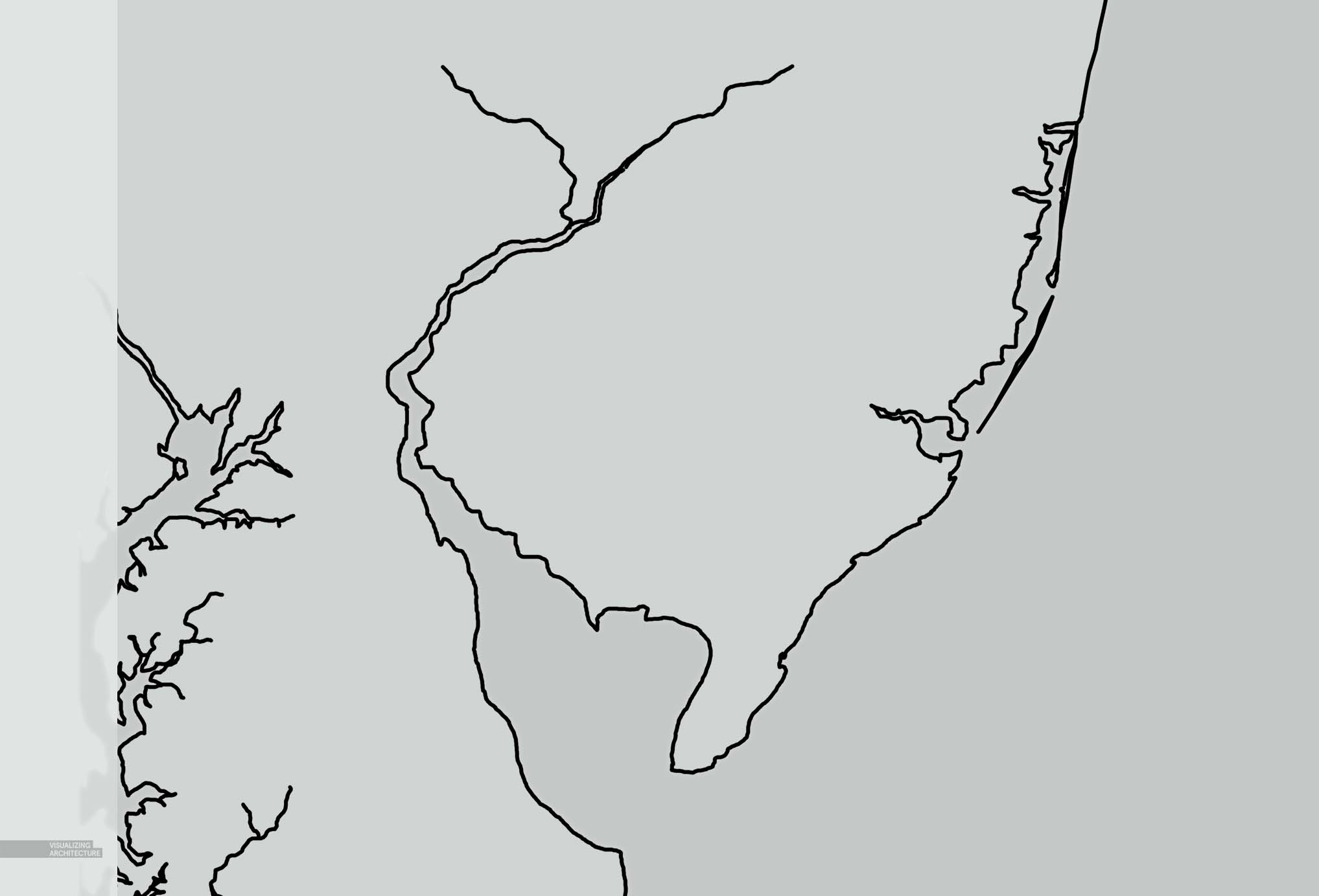
2. Water Tone
To define the water from land, I poched the water with a subtly darker shade of grey.
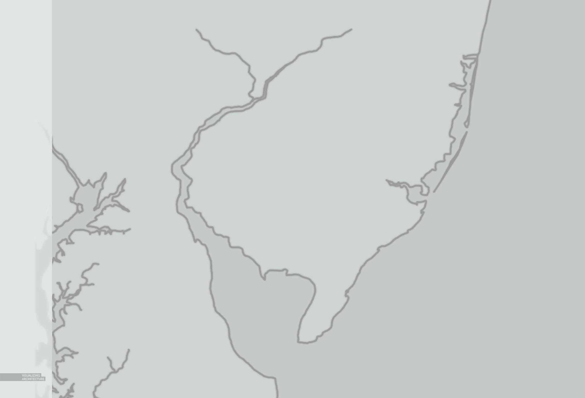
3. Lighten and Blur
To start creating the effect of having the line work below several layers of trace paper, I first lighten the line work to almost a 50% grey. I then went to “Filter>Blur>Gaussian Blur” and blurred the line work with a radius setting of about 2 pixels.
4. More Blur
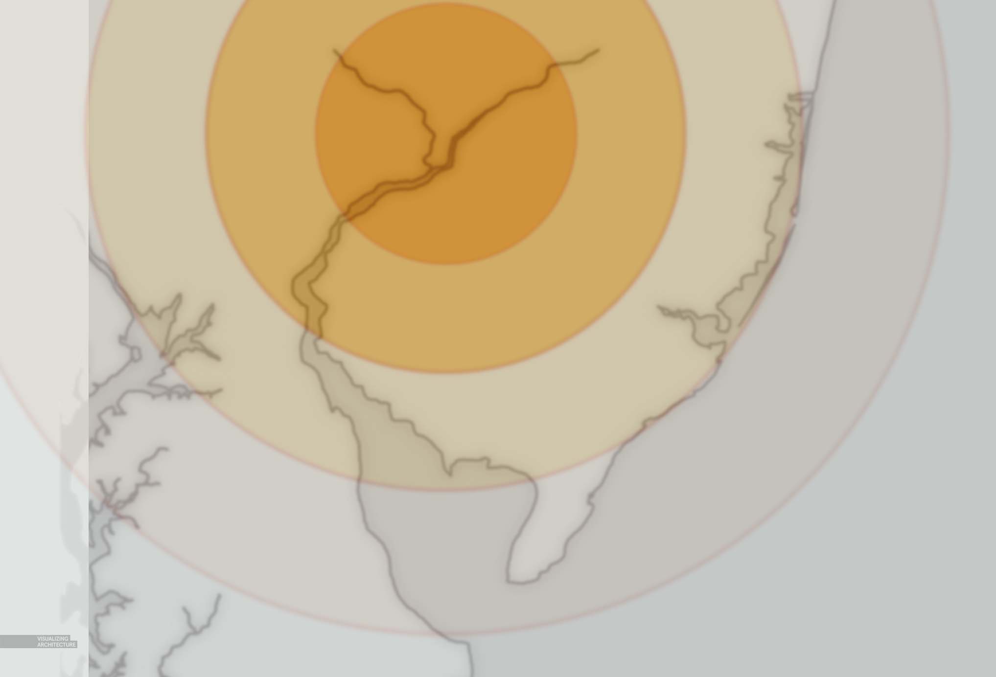
Next, I duplicated the line work layer and blurred this new layer by again going to “Filter>Blur>Gaussian Blur” and setting the radius to 8 pixels. I then lowered the opacity of this layer to 50%. This move will give the line work even more softness while maintaining some definition.
5. Some Color
I had some more information that I wanted to overlay onto this map, but I still wanted to keep these elements soft like the line work, so I repeated these steps for the yellow circles.
6. Sharp Contrast
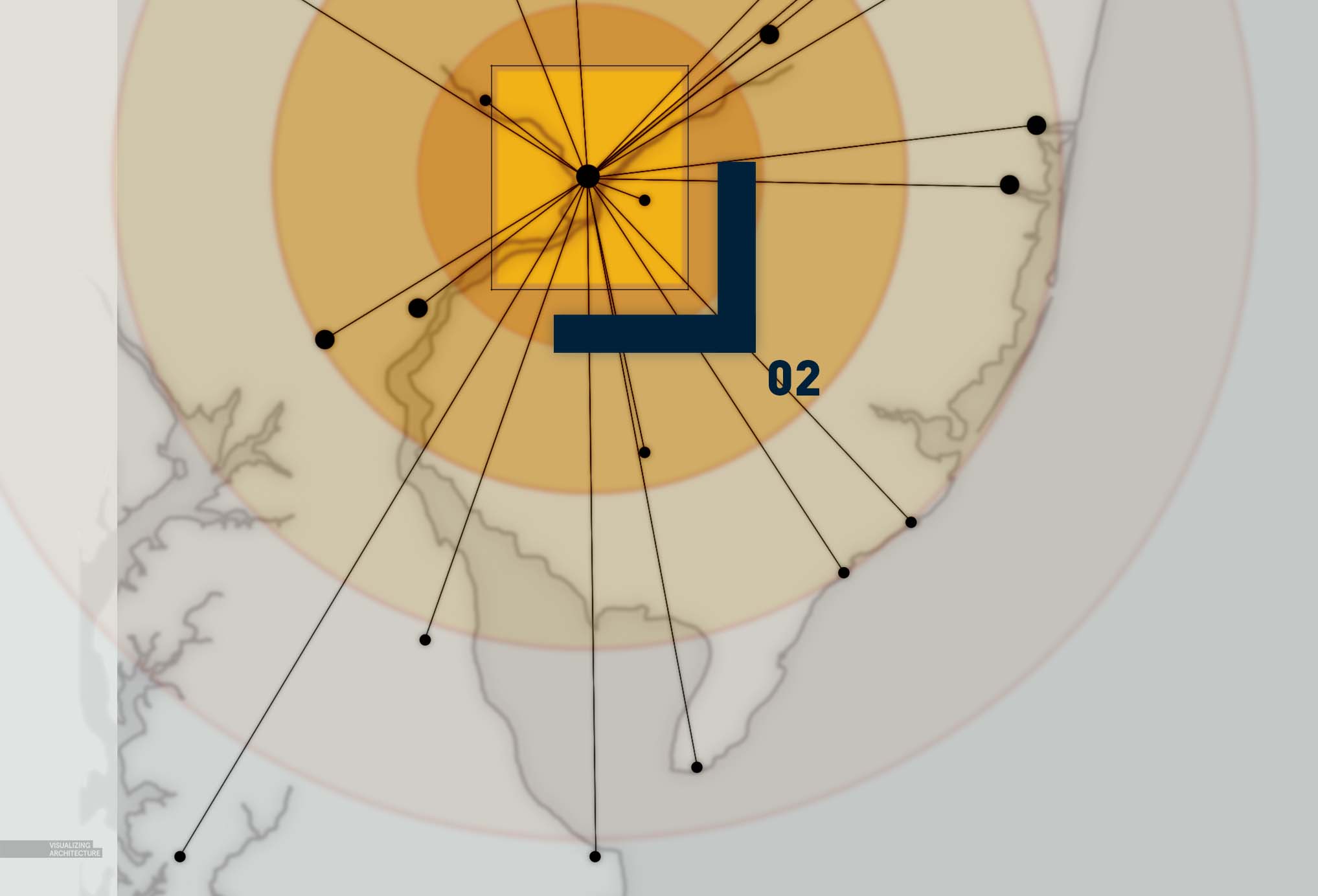
For the “trace paper” effect to work, there needs to be some really sharp and saturated elements to contrast the blurred desaturated elements. I therefore painted in some markers representing important towns with some line work connecting them back to Philadelphia.
7. Noise
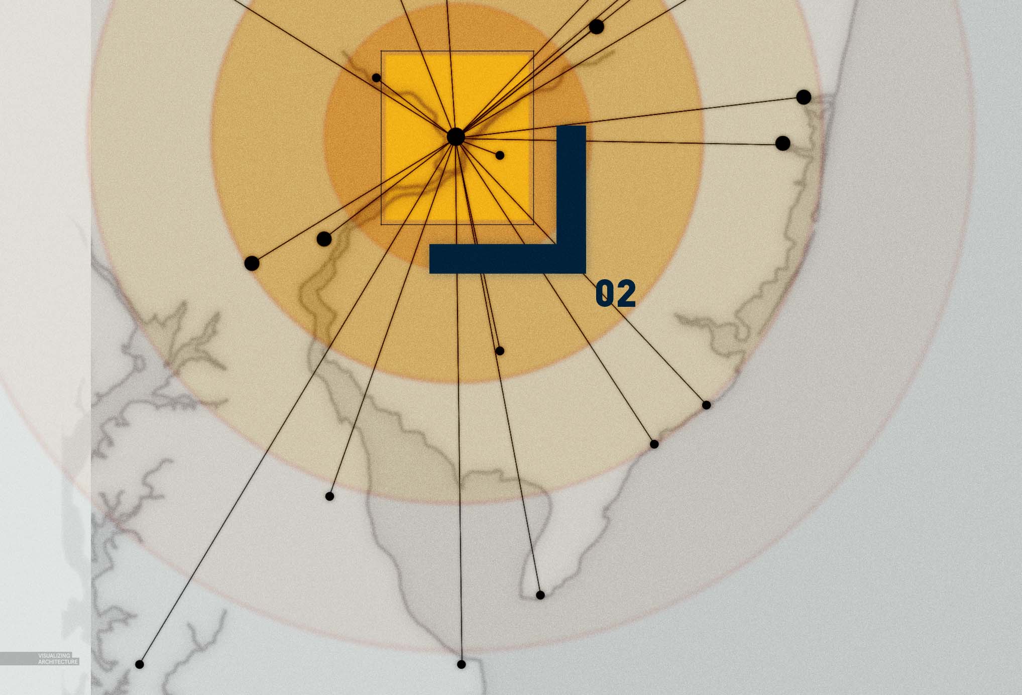
To finalize the “trace paper” effect, I added some noise. I created a new layer at the top of the layer stack and filled it with 50% grey. I then went to “Filter>Noise>Add Noise”. In the Add Noise dialogue box, I set the Amount to “9”, the Distribution to “Gaussian”, and checked “Monochromatic”. Finally, I set the Blend Mode of this layer to “Overlay”. This gives the subtle effect of paper fiber and one more layer of blur.
8. The Works in Progress
Like I said at the beginning, there is still a lot of information to be overlaid on top of these maps, but the foundation is in place with each map building off of the others information. I am also going to experiment with possibly placing all 4 maps on a single spread or keeping the two spread layout I have now. More to come later.




fabulous, like always.
i really love your work Alex, thank u so much for share your work, that really inspired me. 🙂
Sorry for English, i’m Indonesian.
Oh,Yes! I want to try this in my Portfolio! And you are so generous to share the skills with us!
Hi Alex, with all respect but if you don’t have time isn’t better to wait and show us something really interesting? You have promised to show us how you use topaz, vray and many more but this is not happening!
We can all be a little more appreciative here, good things are worth waiting for. This IS really interesting to me although it might not have been for you.
Happy thanksgiving!
lighten the line work to almost a 50% grey
When i try this Alex, it makes entire canvas in to grey even after applied Blur no changes.Please clarify.
Thanks
Very nice Alex for inspiring us and letting us access your work and i thank you for your hard commitment to illustrate all the process
Genius!
This move will give the line work even more softness while maintaining some definition….
I’m happy that I found this post, thanks so much!
Nice. Thanks for all the help!
I love to read your article and get so much information through your blog and learn new thing about blogging
Your article is very useful, the content is great, I have read a lot of articles, but for your article, it left me a deep impression, thank you for sharing.
Your article is very useful, the content is great, I have read a lot of articles, but for your article, it left me a deep impression, thank you for sharing.
Thanks for the valuable information and insights you have so provided here