As I continue to develop my Mountain Lodge Project, there are a couple of areas that I am using visualization to study the design a little more closely. One of the key moments is a bridge that connects the tower to the mountain side. I had envisioned this space to be an intimate and contemplative place. Picking the viewpoint was difficult because I am trying to narrate several ideas such as the procession from the clean and minimal architecture to the wild mountain side. The bridge landscape needed to strike a balance somewhere between the two to soften this transition.
For an image like this, light ended up being the primary driver to manage hierarchy and eye movement. Below is a little breakdown of how I used light to place the focal point exactly where I wanted it to be.
1. Model and Base Rendering
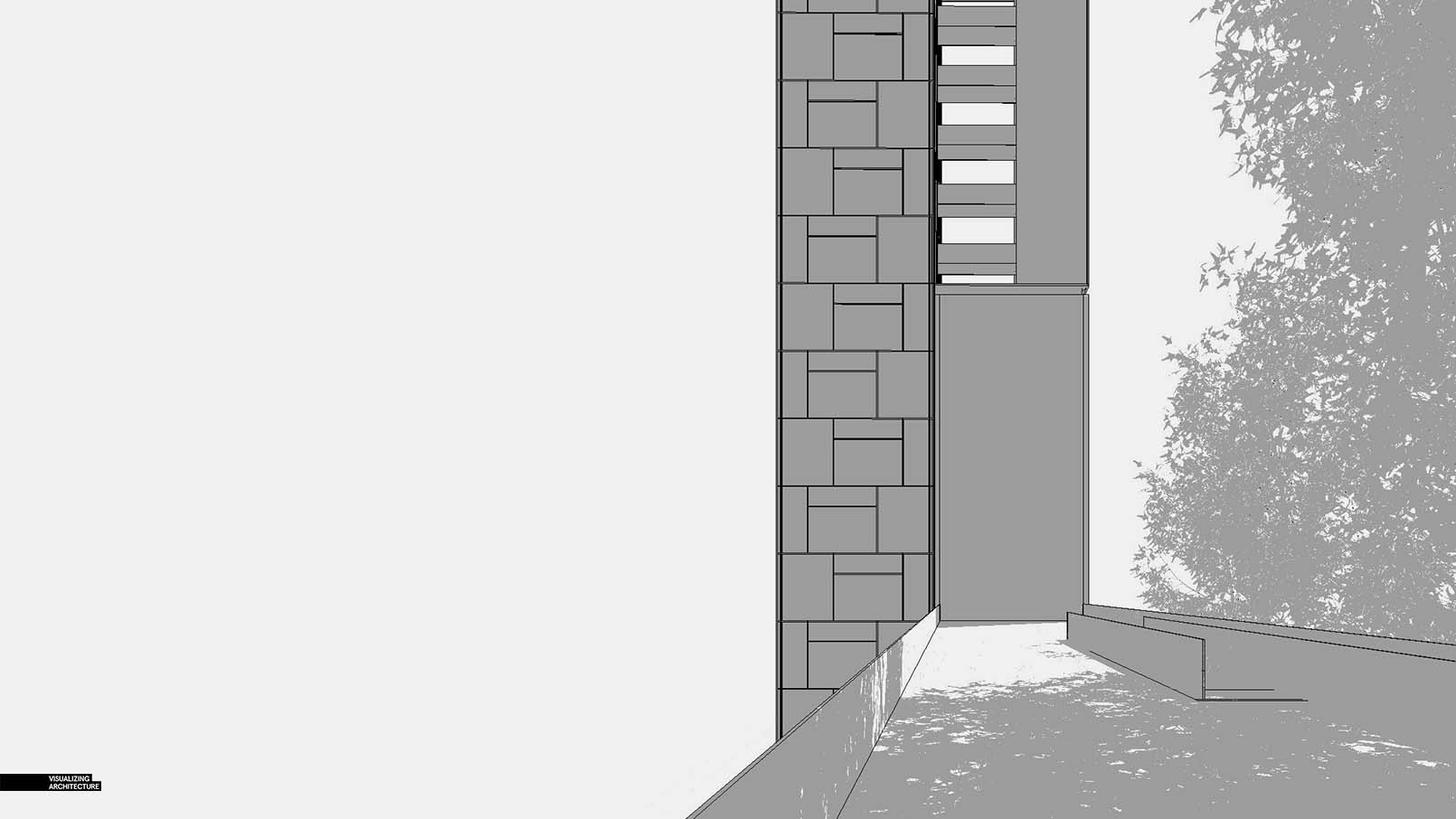
Above, a screenshot of the Sketchup model. The model itself is simple and much of my time went into building some textures.
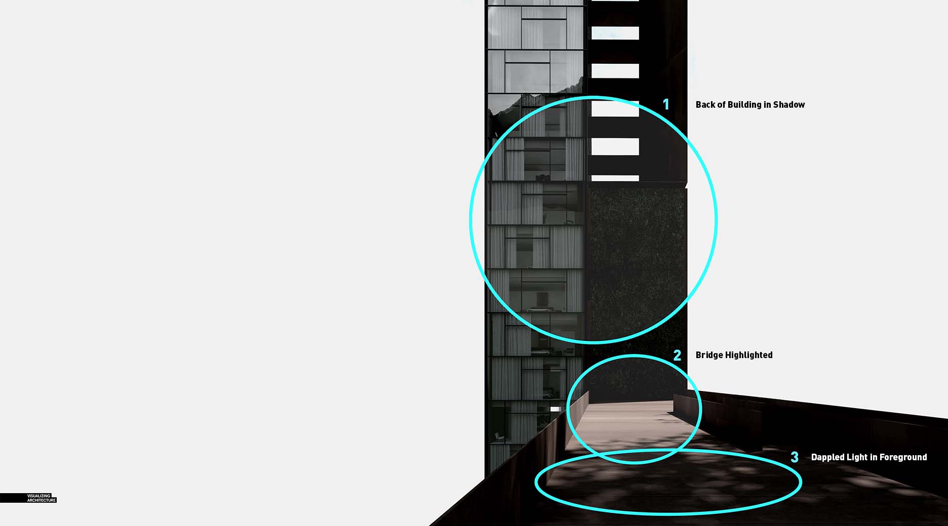
Above, the V-Ray base rendering shows the dappled light effect obtained by adding some simple, light low poly trees. I knew I would be replacing these out with Photoshop trees, I was only concerned about getting the shadows to read properly.
When setting up the sun location, I was focused on drawing attention to the bridge. 1- Therefore, I placed the back of the building in shadow, 2- left a portion of the bridge directly in the sun, 3- and then slowly fading the bridge back to dark using the tree shadows.
2. Inserting some Context
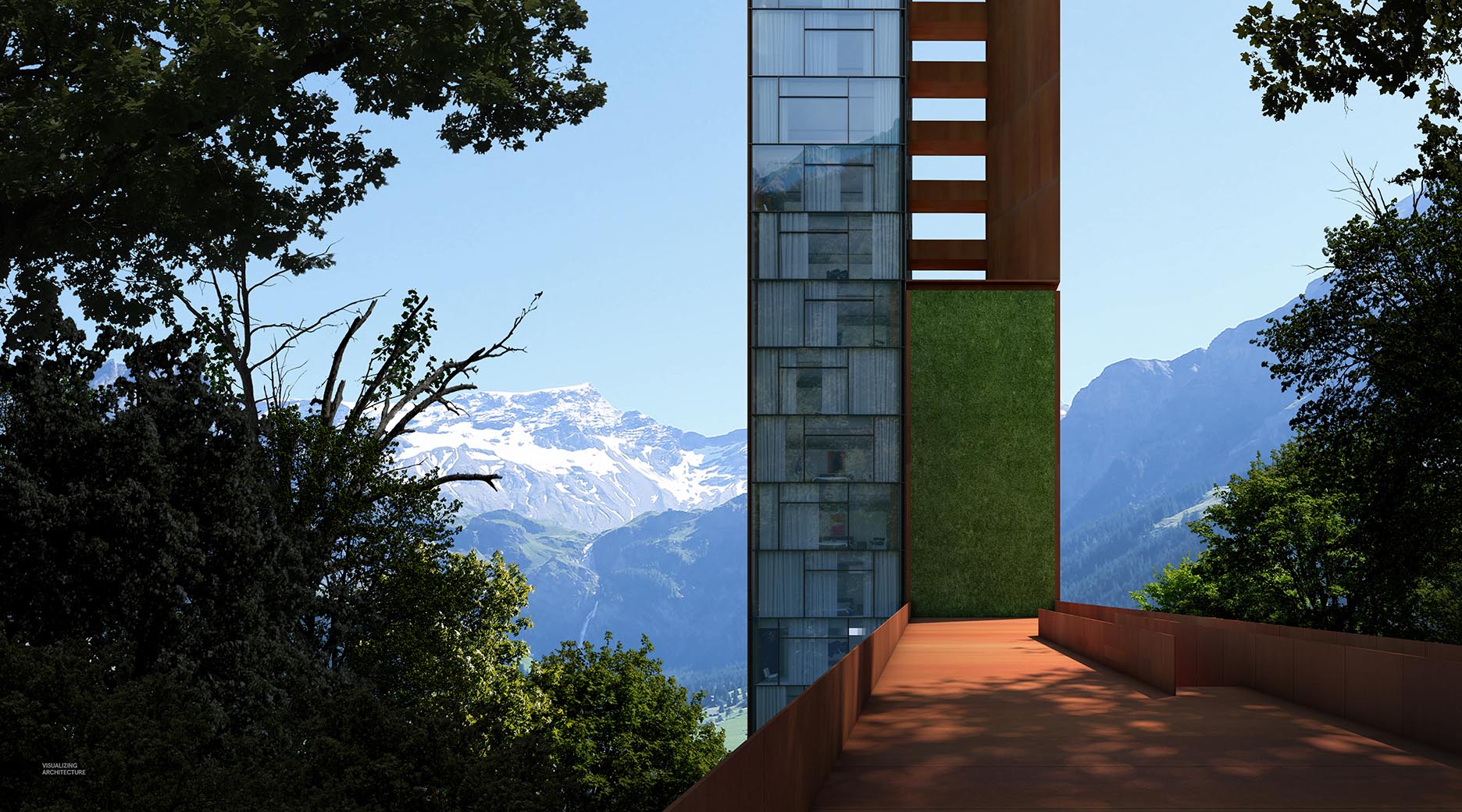
Next I added in some context. I stitched in some mountains and followed that with trees flanking both sides of the bridge.
The context trees are crucial to this image because they provide the frame that help draw attention back to the bridge. 1-The trees themselves were darkened considerably so that the bridge and background mountains remained the only objects in direct light. 2- I also used the trees as a way to create some strong diagonals in the composition to help naturally draw the eye back to the bridge in the center of the image.
3. Vegetation
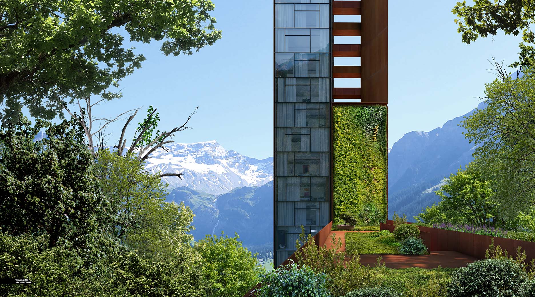
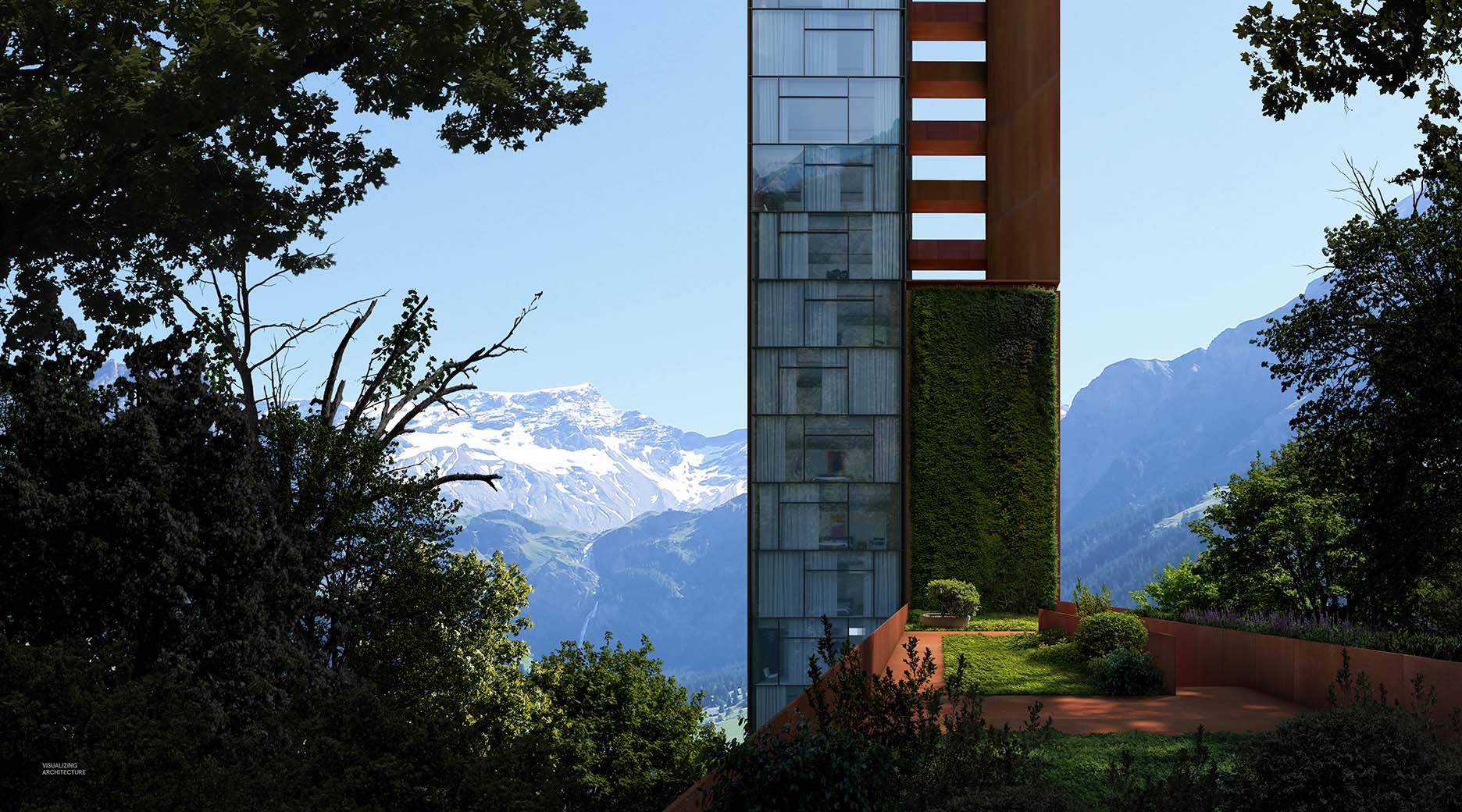
I am showing the image with all of the vegetation in place, but no toning done to the individual layers. I wanted to show just how much some of the colors, contrast, and levels were adjusted from the original tree and shrub textures. More than anything, it shows how flat an image can be if time is not spent thinking about light and shadow in vegetation.
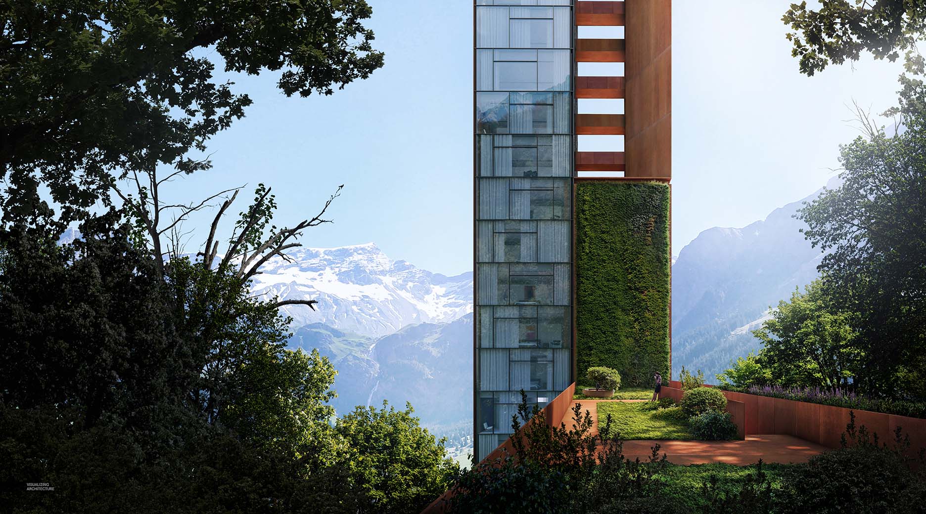
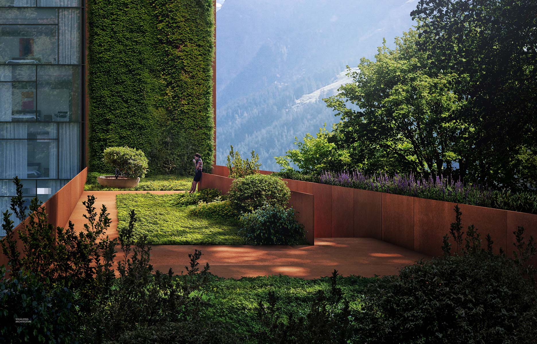
Above is the exact same image, but now with the vegetation fully toned. Some of the trees moved to almost pure black, with just a little detail. Little things like adding small highlights along the edge of the green wall give the vegetation dimension, but also add to the cozy feeling of the early morning bridge experience.
4. Simple, Subtle Final Effects
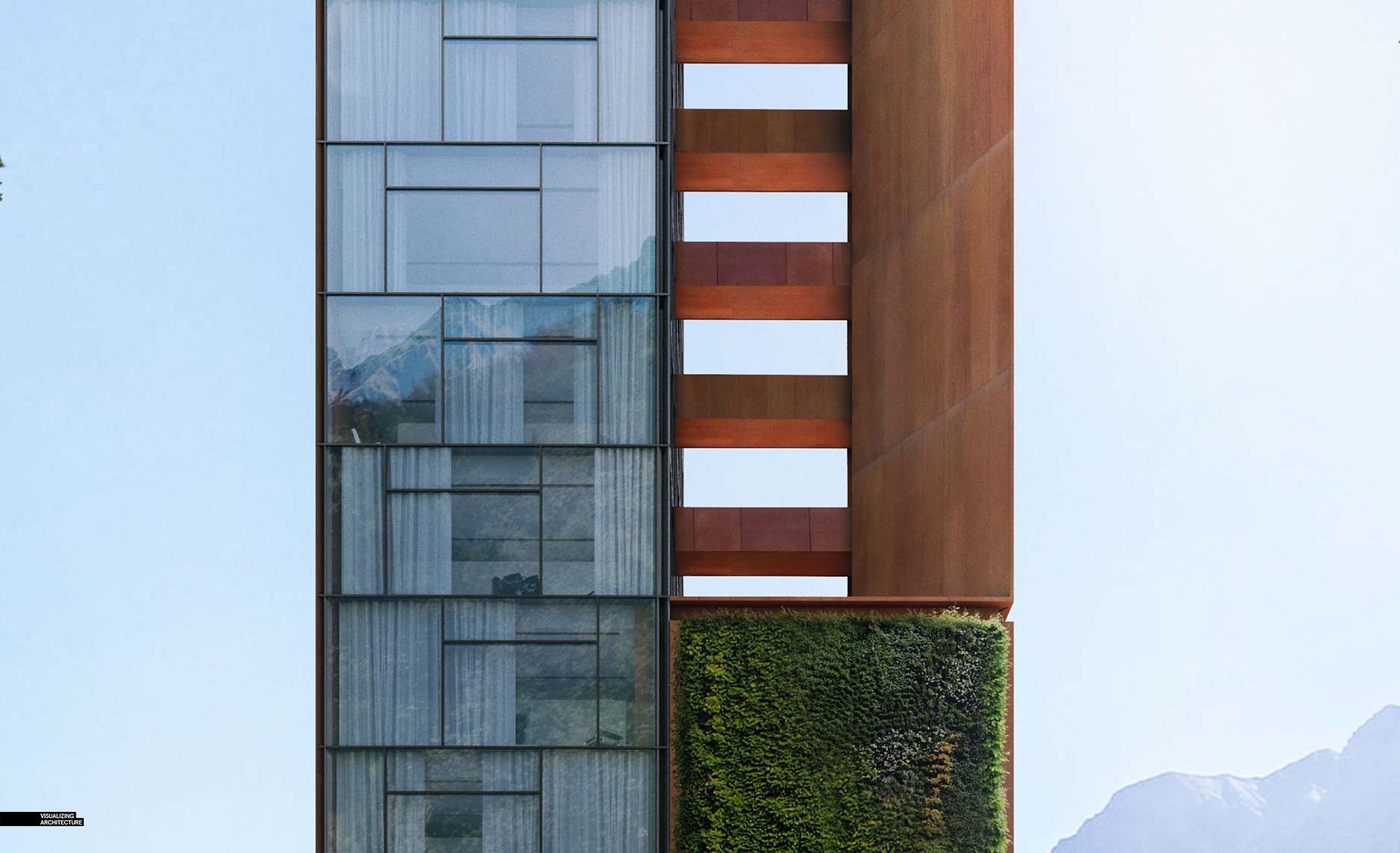
Finally, I added just a few small effects at the end. I amped up some of the highlights on the bridge and vegetation, and added a touch of glare to the right side of the image. I also lightened the top of the tower and increased the saturation to avoid the architecture feeling too heavy and uninviting. The best thing about the image is it helped me make quite a few decisions regarding the direction of the design and some of the materials that I wanted use. Most notably, I ended up using Corten Steel for much of the project which brings in a ton of warmth and also works well with all of the green tones of the surrounding landscape.





As usually… excellent work!
astonishing, as often your work are.
Thanks for sharing.
Wonderful, I learnt something new from your page today !! Thank you
Did v-ray give you the mountain reflection in the building or did you do that via photoshop?
I added an image into the model so that V-Ray would pick it up in the reflection. Normally I just photoshop in the reflection, but in this case, I opted to bake it in using V-Ray.
Stunning Alex. Really appreciate the effort of explaing the making process. Great and concise way. (Numbers work well 😉
Congrats from Spain. Keep it up.
Useful information. Lucky me I discovered your website accidentally, and I am stunned why this twist of fate did not happened in advance! I bookmarked it.
Its really good work….. thanks for sharing this work…https://bit.ly/2sL4gIf
How did you insert your vertical vegetation and grass?
Love how you showed the difference between the bright/flat image and the toned/contrasty version.
Genial, super interesante el tratamiento de las luces y sombras, me a encantado la direccionalidad de la imagen y el enfoque de sujeto uff fantástico trabajo
ur textures are different from the base render to the final post production .how did u do it
?
I added some Corten textures on top of the base rendering in Photoshop. These were just in the foreground though, where the detail was more important. I set most of the textures to Overlay to keep the shadows and toning detail.
This is pure art! I’ve been following you for a few years now. I discovered you by accident with my then school mate and what a discovery! You changed my way of producing renders which improved dramatically!!!
Thank you for sharing!!!!
I use Rhino, as that is all I have been taught at uni so far, is there a way to replicate the tree shadow effect you have in Rhino? Is the tree just an object in sketch up?
Nice….! https://goo.gl/VsfmCc
A simple blog tutorial but so much fun to read
Nice tutorial, as always! I really like how you showed us the context between the vegetation and the project in this post, creating attention to specific elements which are crucial for your design. It’s a great way to learn and then reflect to my own work later on (I always had difficulties with this kind of composition as many of my visualizations turned out to be very random and dumb).
May I ask how much time you invest between the base render and the final image? I always wondered how much time is appropriate to spend on these stages.
Hello where you got the texture corten steel, it would be good if you can share us, I like your works
Remarkable!
Hi , very nice article,
thanks for sharing blog keep up good work. Really you shared blog is Amazing, I like it.
oh, this place is so beautiful, it’s great to be here with family.
Very helpful advice in this particular post! It’s the little changes that make the largest changes. Thanks for sharing!
Wonderful post. It sounds quite interesting to read this blog. It is quite informative.
Appreciate it for your knowledge.
thank you for sharing this is workfull information. this is very helpfull .
Hi Alex. Thank you for your images and your posts. You don’t know how you helped me and inspired me to create my own channel on YouTube for architecture called (surviving architecture). Could you please check it out and give me your feedback. I also did a video about you hehehehe.
I have come across all your blog. The content is such amazing. Please our official website too for the architectural related content… http://www.archi-cubes.com
Nice work! I really appreciate you sharing your methods.
uau ! It.s gorgeous <3
a very detailed and meticulous lesson, it really has a lot of values, I will learn a lot thanks
a very detailed and meticulous lesson, it really has a lot of values, I will learn a lot thanks
Master, thanks for sharing.
Thanks for sharing
Thanks for sharing the info! Cheers 🙂