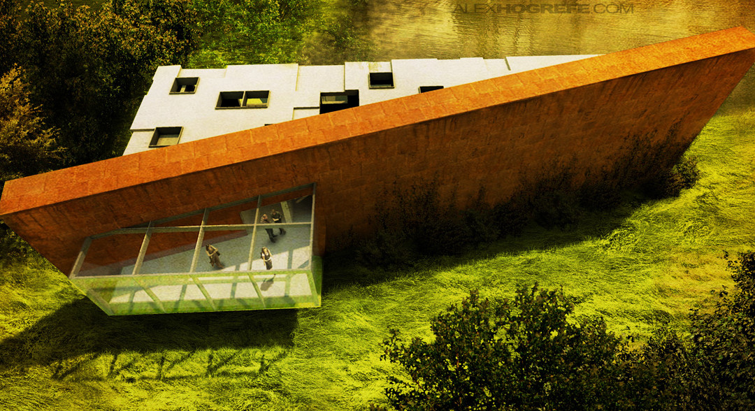
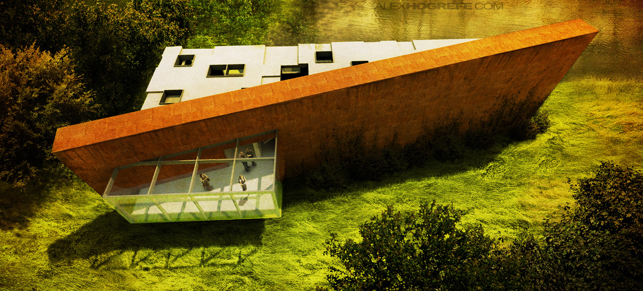
I put this illustration together this morning in hopes of showing how crucial landscaping is to an architectural illustration. This is something that always seems to be overlooked by a lot of students, and something I didn’t take seriously until grad school. I never left enough time for adding landscaping, focusing more on making the building look good. However, I have come to realize, especially from projects at work, that just as much time should be put into the landscaping as the architecture. From the set of images below, you can see how much the atmosphere changes from adding a few trees, water, and ivy growing on the facade. It sets the building into the site and gives it the feeling that it belongs there. In a few occasions, these subtle moves have changed the clients perception of the project in a positive way.
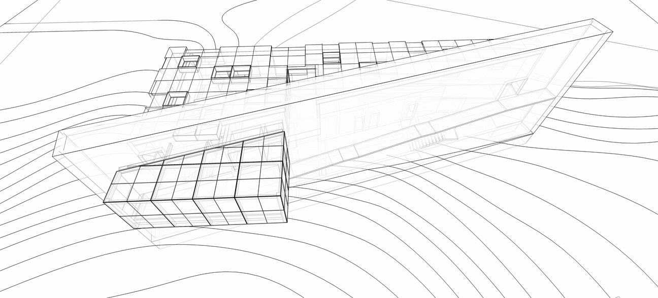
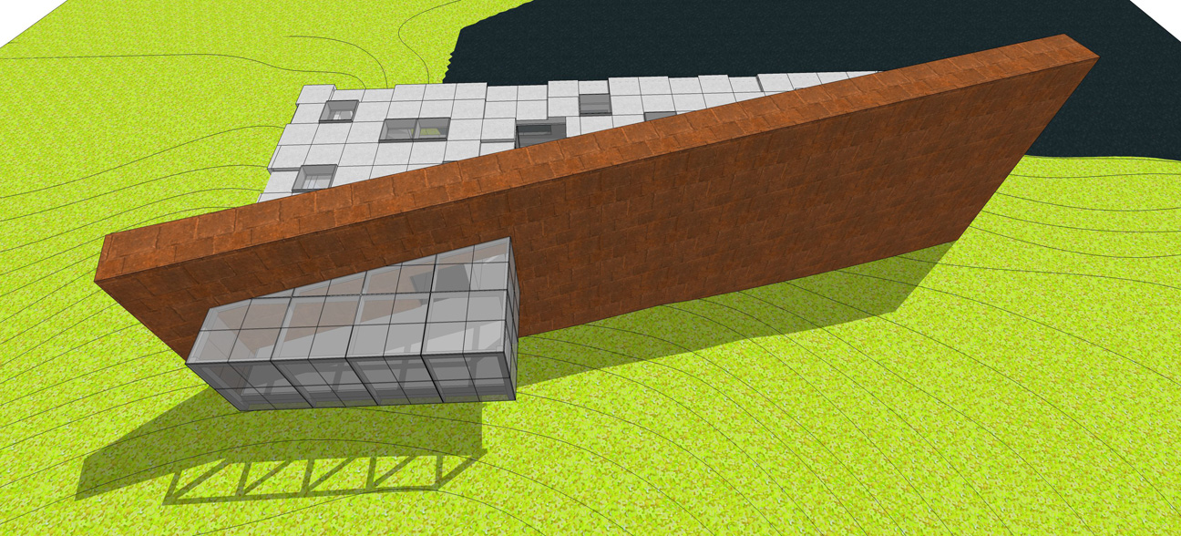
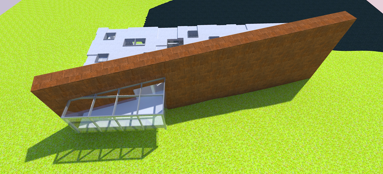
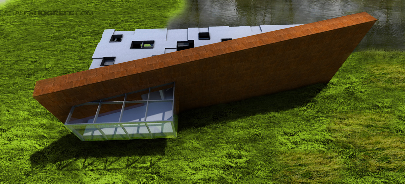
Below are some images outlining the progression of the illustration; from the Sketchup model to the final Photoshopped image. I started the image about 9:00 this morning and finished it 4 hours later (including rendering time). I was hoping to have more of a tutorial explaining how I added the landscape elements but ran out of time. I will see if I can put something together at a later date.
Sketchup Model line work export
Sketchup Model image export (not used in the actual rendering but better shows what the SU model looked like).
Kerkythea rendering (About 15 minute rendering time).
The base rendering with some tall grass Photoshopped in. The water is from a photograph of the actual pond on the site.
Finally, some trees and ivy added. A little color was overlaid to unify all of the different Photoshopped elements and give warmth to the image.


How you do it!!? haha, its excellent, love your representations! Very inspiring! 🙂 Thanks for shareing!
Alex, Is there a specific website you get you pictures from? Or do you just google it? I feel like finding a good picture is one of the hardest parts about post processing.
nice work
it's realy amazing
i can't say any more
Nice!! for me the "magic" happens in the last picture. what transperacy mode do you use? soft light? overlay?
Alex i totally agree with you about this "importance of landscape".
Offtopic:
What was the blog contest result?
Did http://www.alexhogrefe.com win? 🙂
hi,
can you to some tutorial about photosop postproduction of this image…
this is amazing 🙂
thanks.
@ Chris, Its true, I spend much of my time searching for images (google) for the post processing. I have begun building up a library of images that I use often to save time (skies, grasses, etc.). I also get quite a few off of CG textures.
@EJ, I set the layer with orange color to the blend mode "overlay"
@ Joao,
hey Joao, unfortunately, I didn't win. Thanks for checking in and voting though. Better luck next time I guess.
I’ve been exploring for a little for any high quality articles or blog posts on this sort of area . Exploring in Yahoo I at last stumbled upon this website. Reading this information So i am happy to convey that I have an incredibly good uncanny feeling I discovered just what I needed. I most certainly will make sure to do not forget this website and give it a glance regularly.louis vuitton stephen sprouse