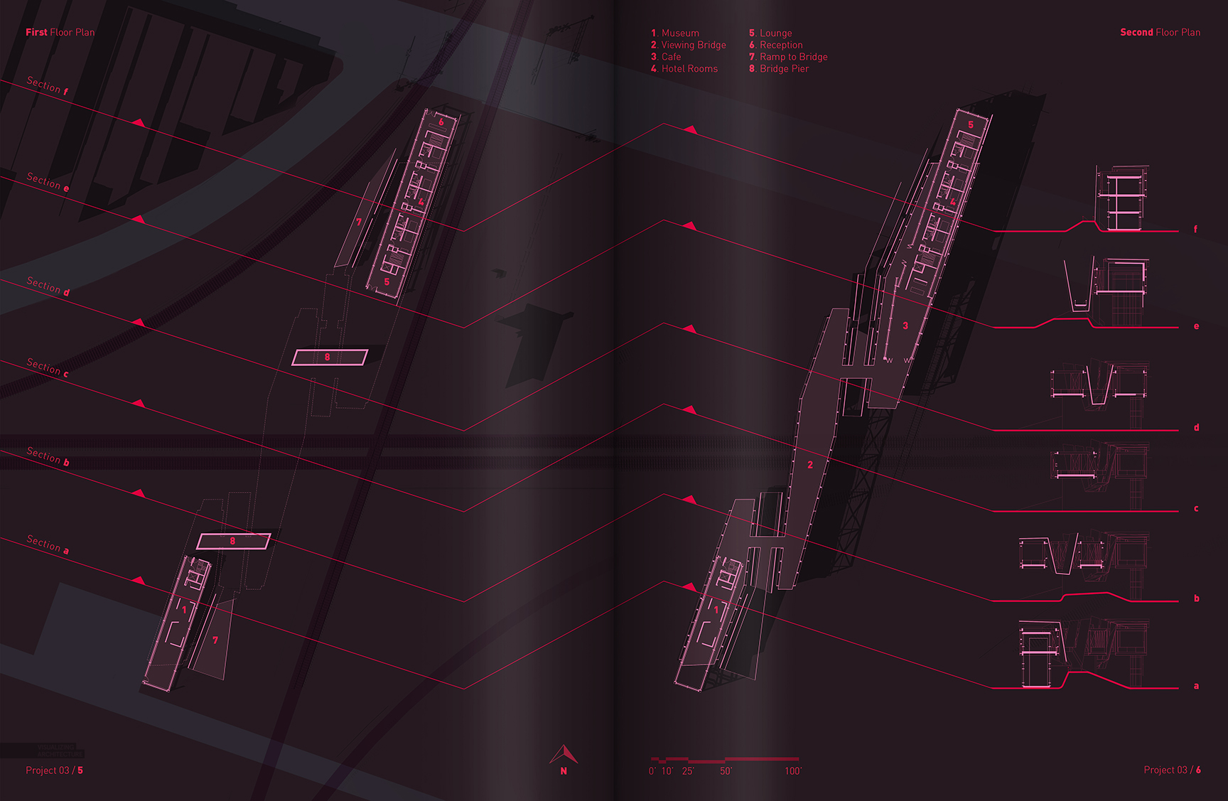
This week, I have begun piecing together the floor plans of the Train Pavilion Project. When it comes to visualizing floor plans, I have always leaned towards a simple representation. Maybe it is because I have spent so many years working in offices where the construction drawings are plastered with call-outs, dimensions, and notes, but I like my plans to read more on the diagrammatic side. This means simple poched walls and minimal details such as furniture so that the reading of the spatial relationships is hierarchically strong.
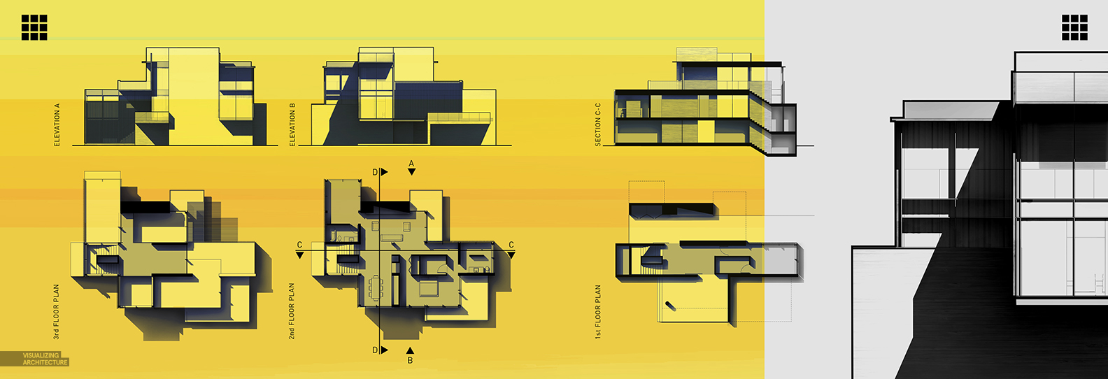
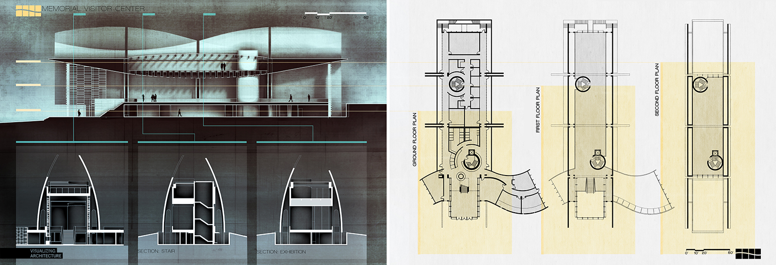
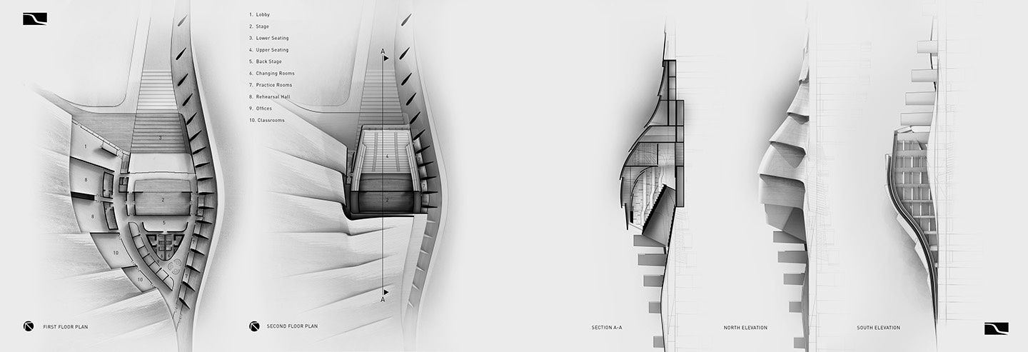
I have posted several floor plan illustrations over the years on this site and they all have a similar style. The walls are filled in solid and are usually the darkest or lightest elements on the page depending on the background. I also like to give a slight change in tone of the background color to differentiate between the extents of the floor plan from the surrounding site. Finally, I add a slight shadow to give some depth and help define wall vs glass. It is a simple set of moves that lead to clear, easy to read plans.
Below are some floor plan layouts from my Portfolio Vol. 3
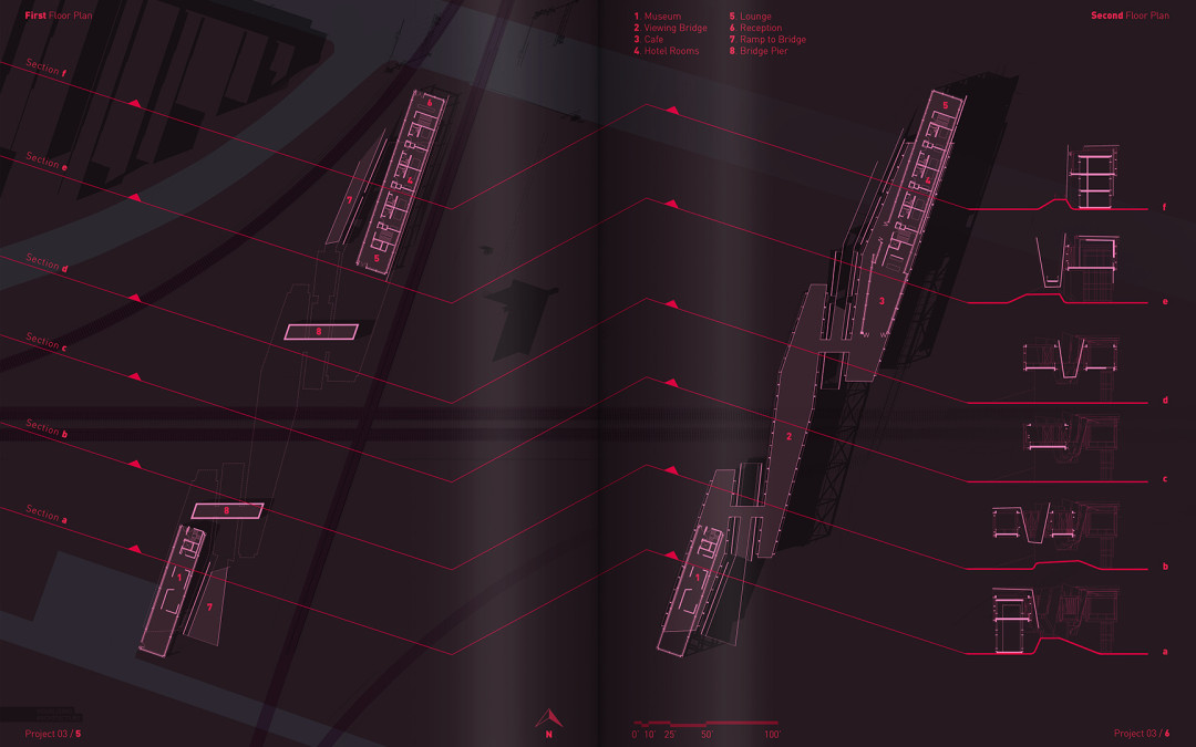
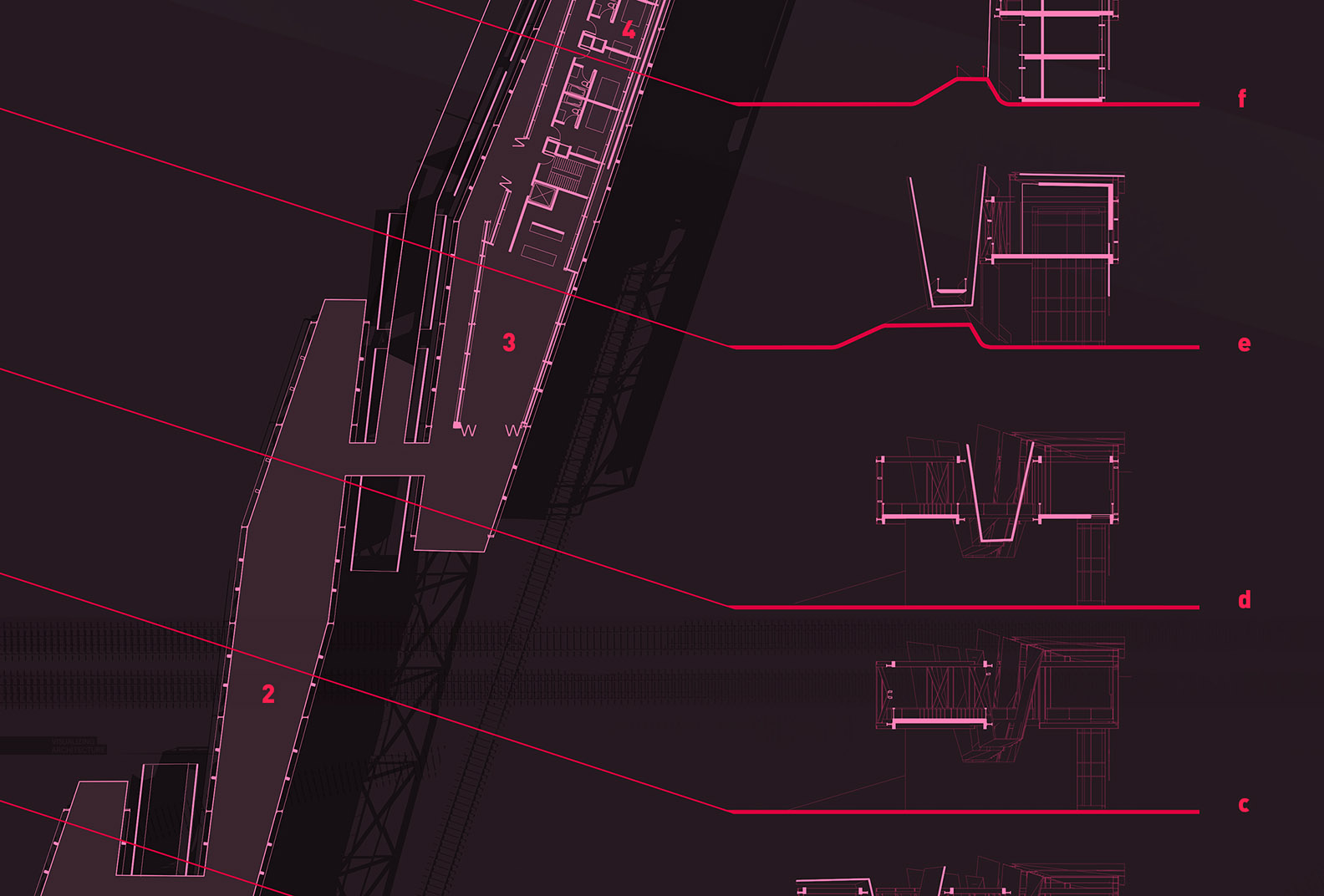
I also like to combine section cuts with the floor plans when setting up portfolio spreads. It is an easy opportunity to relate the two types of illustrations to one another. If you do a little thinking before hand about layout, the sections and floor plans can start to engage one another and actually increase the readability of each. In the case of the train pavilion layout, I placed the transverse section cuts along the floor plan in the corresponding locations that they are cut, making it easier to reference back and forth between the two. I then turned the section cut lines into a graphical move that stretches across the fold into the other plan, again showing where the sections are cut, and then bleeding off of the page.
The floor plans and sections were first generated by exporting section cut line work from my Sketchup model and then opened in AutoCAD. Once in AutoCAD, I cleaned up the line work and finalized the floor plan layout. I then exported as a pdf and opened in Photoshop where I added color and shading. I also exported shadow information from Sketchup and brought that into Photoshop as an overlay.
As with all the portfolio spreads, the goal is to engage the viewer and draw them into the project. Little moves like connecting the sections and floor plans graphically help to make both types of illustration more interesting and easier to read. Incorporating graphical moves like the section cut lines across the spread encourages eye movement and gives me more control of how to tell the story.



Would you recommend to add textures in floor plans as well or do you generally stick to more clean looking plans. I tried this at a work on my university and an advantage is that it gives you information of the material thats been used.
How do you think about it?
Hi Alex, love the hoe you have dedicated yourself towards educating other people essentially for free in your own time. My question is this; as a lover of the natural environment, I try to duplicate the beauty of nature in the images I create for our built environment, however achieving realistic visualizations of dense shrubs and trees is not easy. I believe people should really try to integrate the natural environment back into our built environment as much as possible, and therefor wish if you ever had to time create a tutorial on the steps you would follow to create perhaps a living/green wall. Thanks again, much support from Beijing, China!
Hi Alex,
Have you tried Illustrator in post-processing AutoCAD drawings? I found it very handy in tuning line-weights and adjusting the scale, since AutoCAD layer informations can be inherited in AI.
I have also found this very effective in editing line weights as well .
Hello Mr. Hogrefe,
I saw once a video you have posted on how to make blurry shadows, and i saw you exporting the shadows only from sketchup, due to an extension you added, can you please let me know what’s the name of this feature ?
Thank you.
I love all of your productions! Thanks for sharing!
Question, as you imported the AutoCAD file to Photoshop did you alter the scale of the file, assuming that the AutoCAD is to scale? I attempted this and had issues with the scaling in Photoshop. Please advise. Always great work by the way.
awesome!
I am pleased to peruse this post and I get a kick out of the chance to peruse this sort of enlightening post
I adore the greater part of your preparations! A debt of gratitude is in order for sharing!