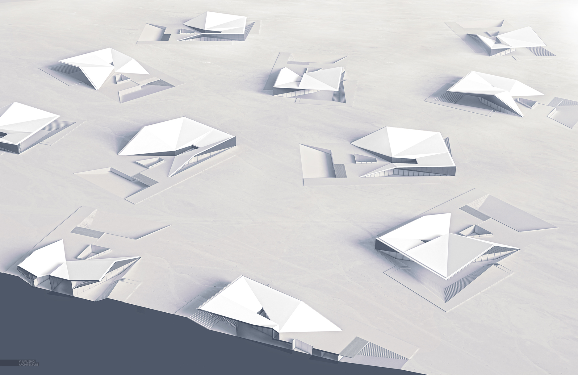
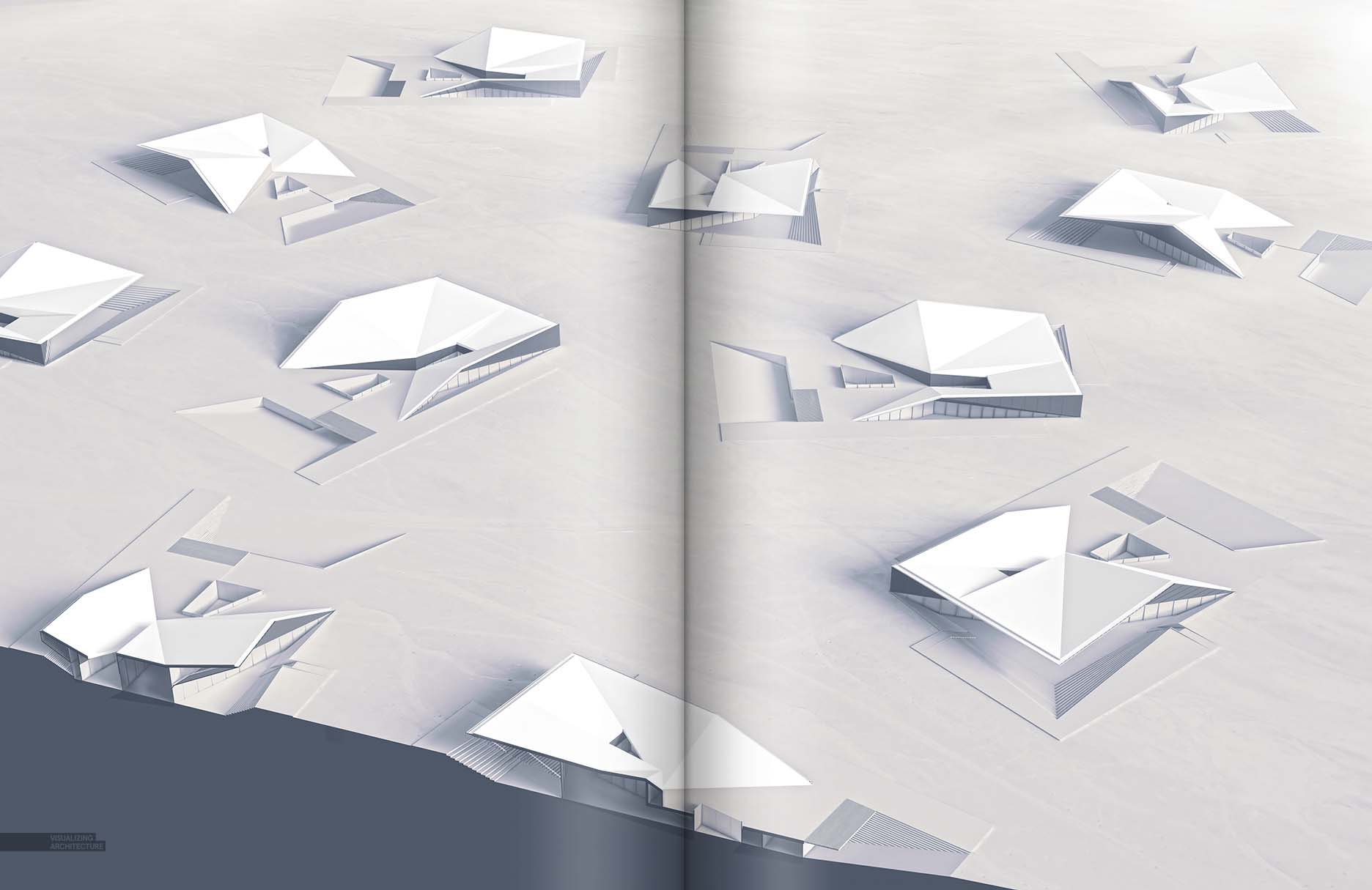
After a few more weeks of studying, iterating, and modeling, the design of the desert house has been more or less finalized. I have now begun thinking about the visuals and how I want to present this project. This has been difficult at times because the form can be confusing to explain through single still images but also because the location is in an empty and vast environment with little vegetation and environmental entities to engage the architecture with. Concerning the form, I have looked at sections, exploded axons, and even x-ray images to explain the geometry. At one point, I had the building copied and rotated many times to help me think about views. I realized this idea of having the building copied and rotated all on a single page explained the form well because you are then able to relate the different angles quickly to each other. You could see how one facade wraps the corner to another side and then another through multiple angles, but also how a slight shift in the view angle clears up a confusing part of geometry seen in another angle. I also dropped in some section cuts and will probably annotate the entire image sometime in the future for the final portfolio.
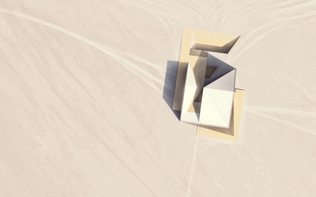
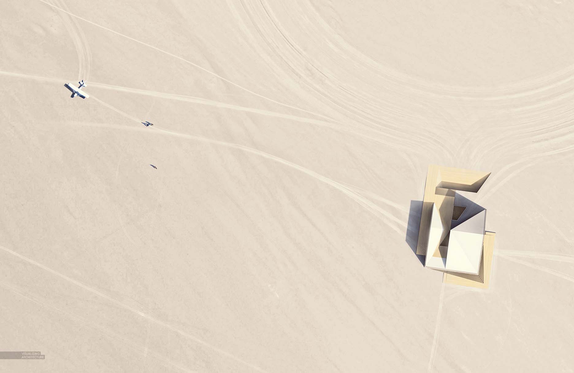
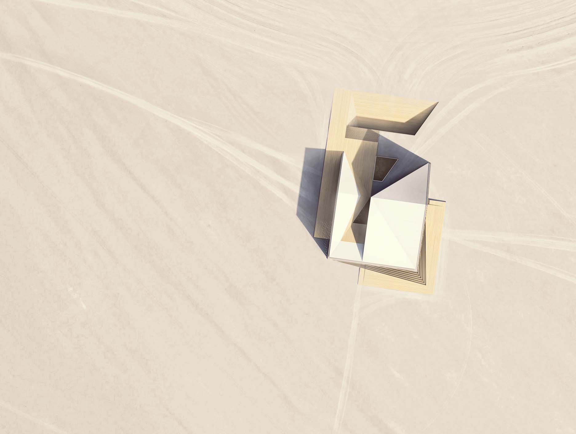
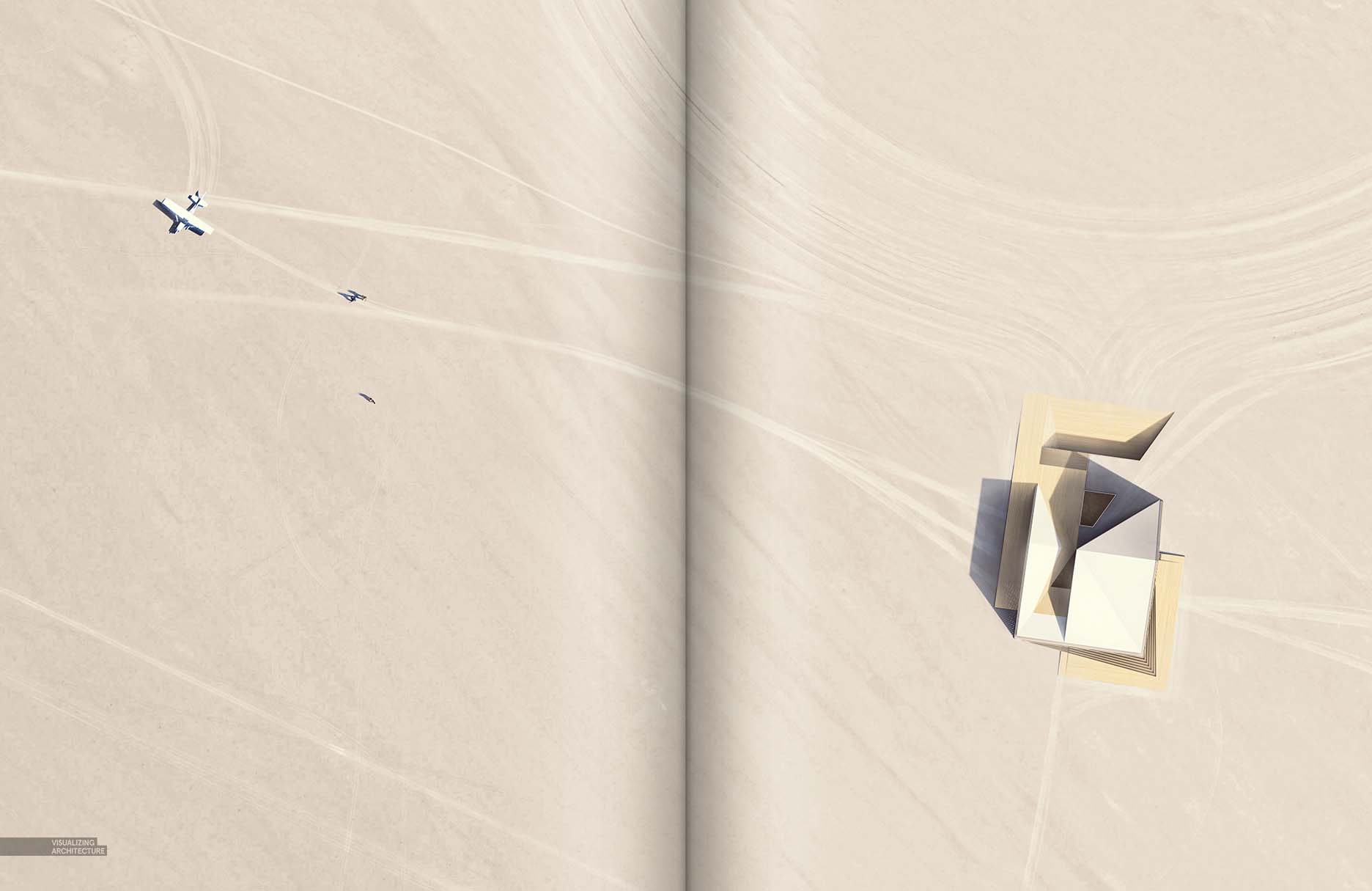
Finally, I pieced together a site plan of the project. Since there is very little vegetation and landscape geometry, this image relied heavily on subtle textures such as the car and pedestrian tracks in the sand. What started out as a very quick and simple site plan turned into what I thought was an exciting and narrative filled image. Below is a quick breakdown of the illustration:
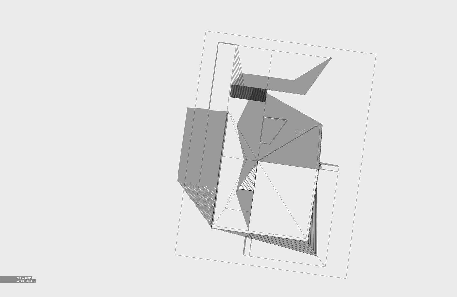
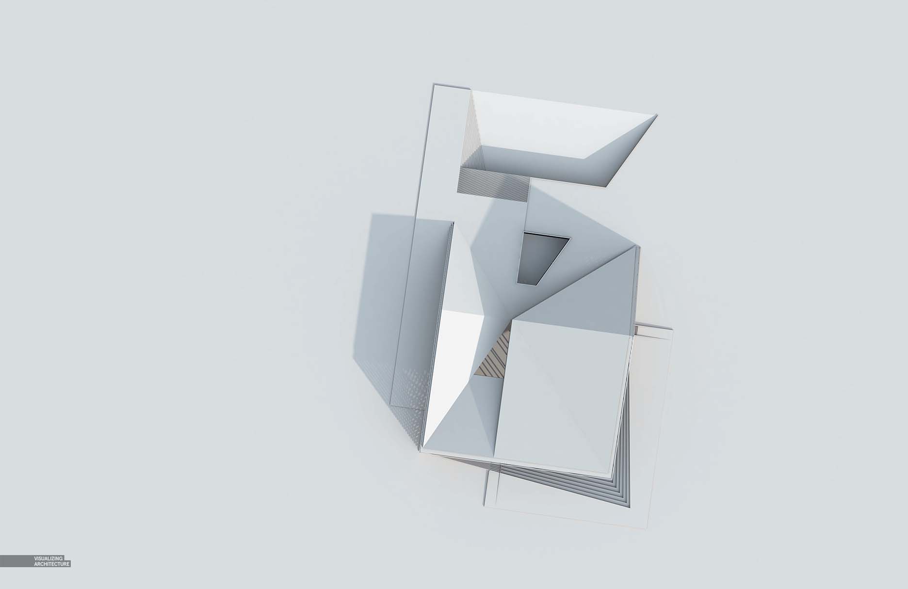
1. Quick Clay Rendering
Above, Sketchup Screenshot
V-Ray Clay Model rendering. I am still thinking through materiality and didn’t want to have them baked into the rendering giving me some flexibility to experiment in Photoshop.
2. Adding Textures
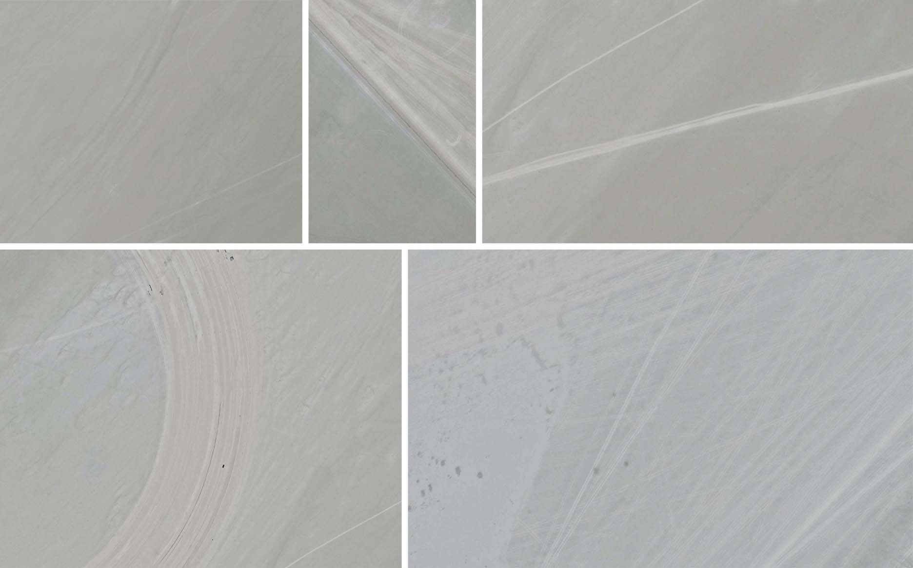
I first needed to compile a library of textures that I could quickly pull from. Google Earth screenshots ended up being the best resource for this.
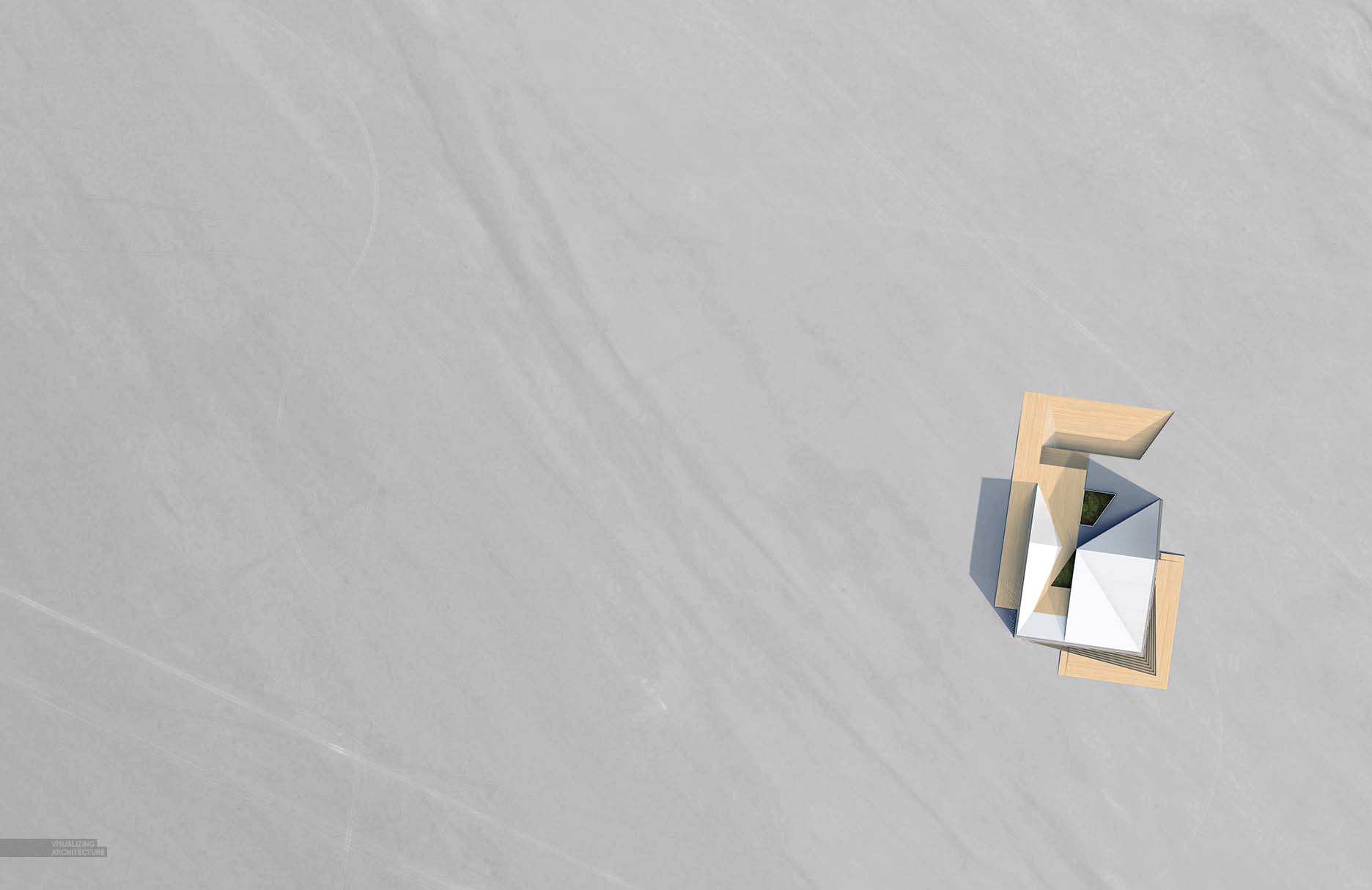
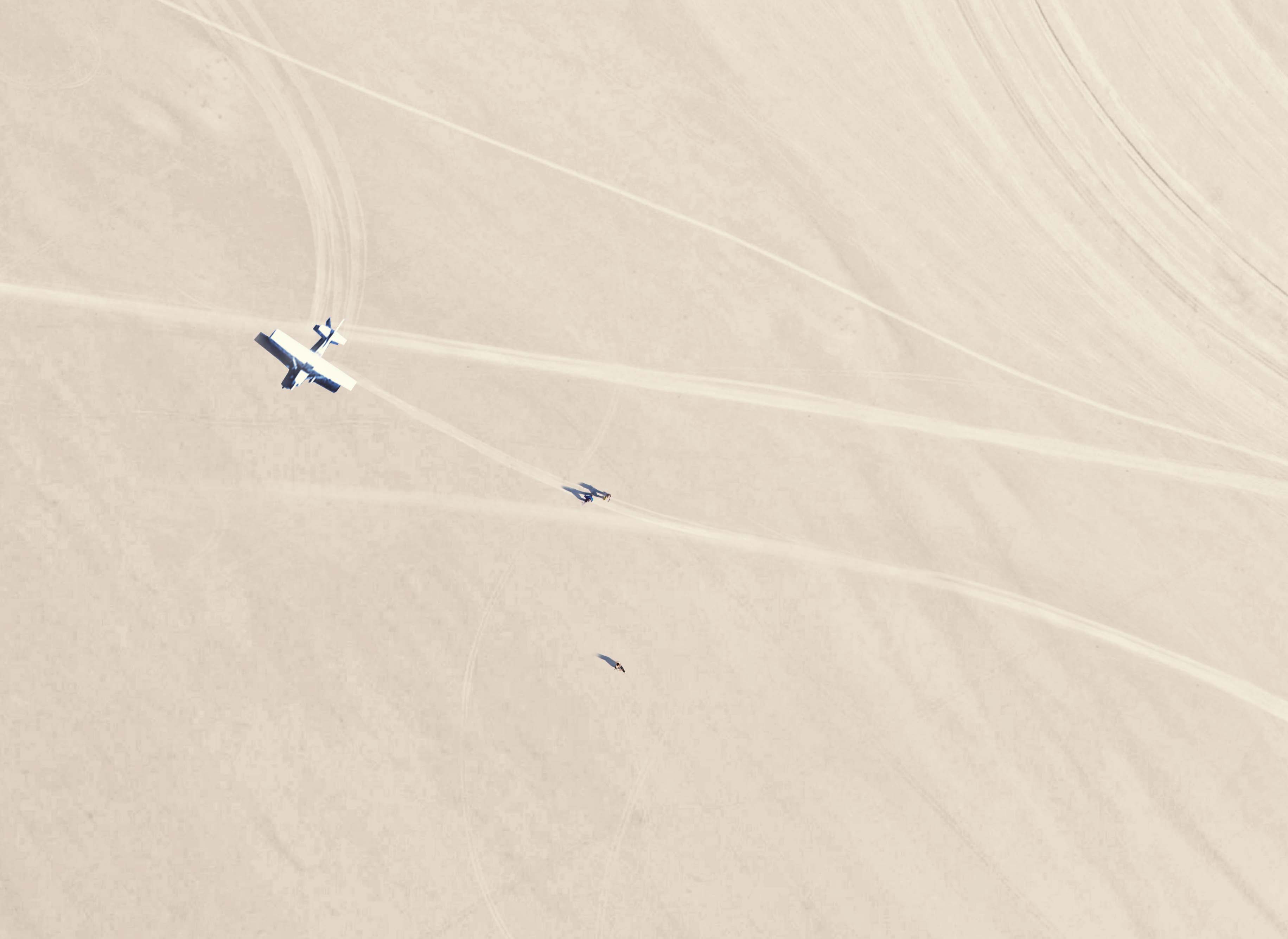
I then layered in the textures starting with a base texture covering the entire image. I purposely chose something with a little directionality to give some movement to the illustration.
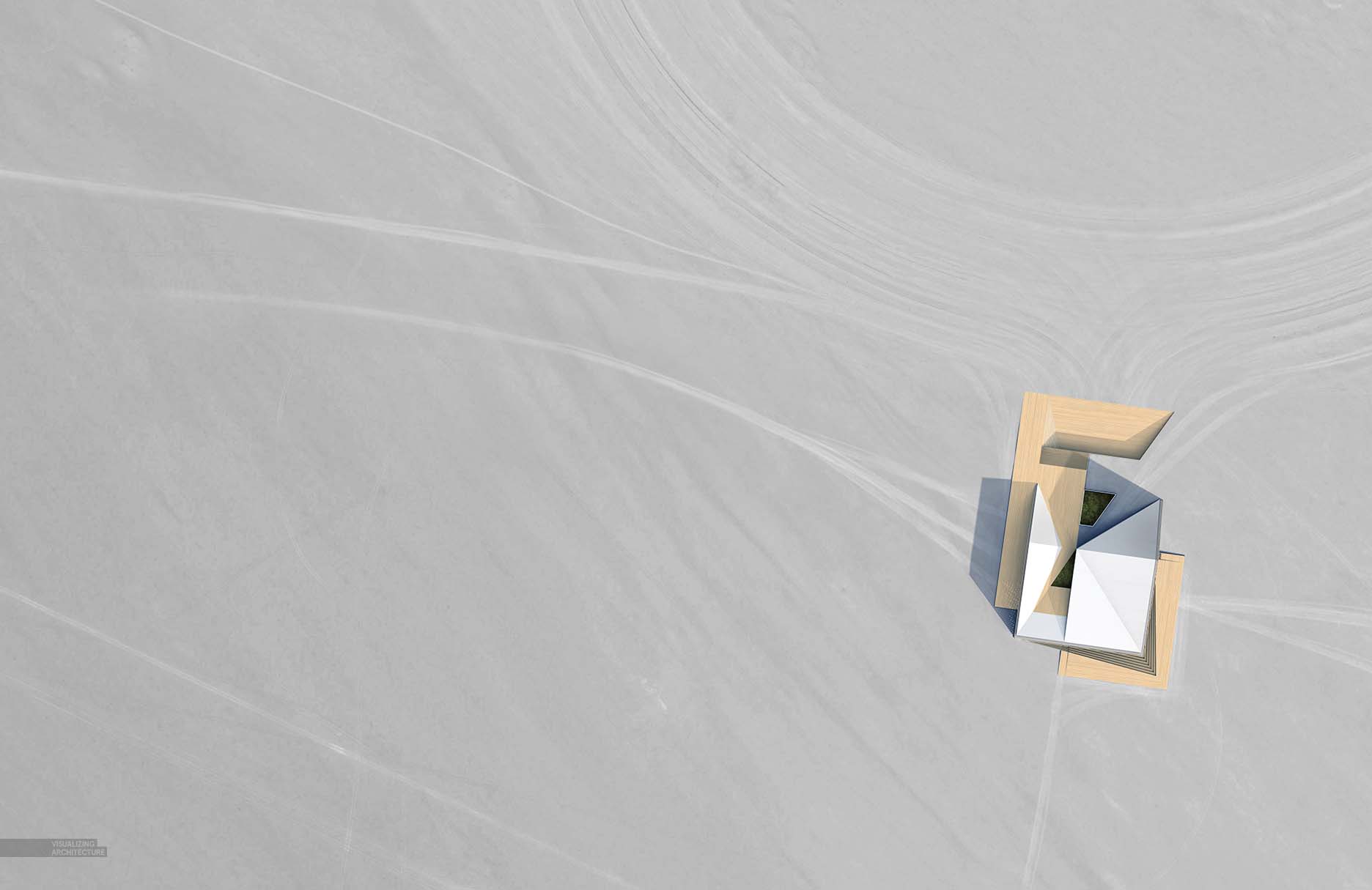
Next came tire tracks from cars and worn paths from pedestrian traffic.
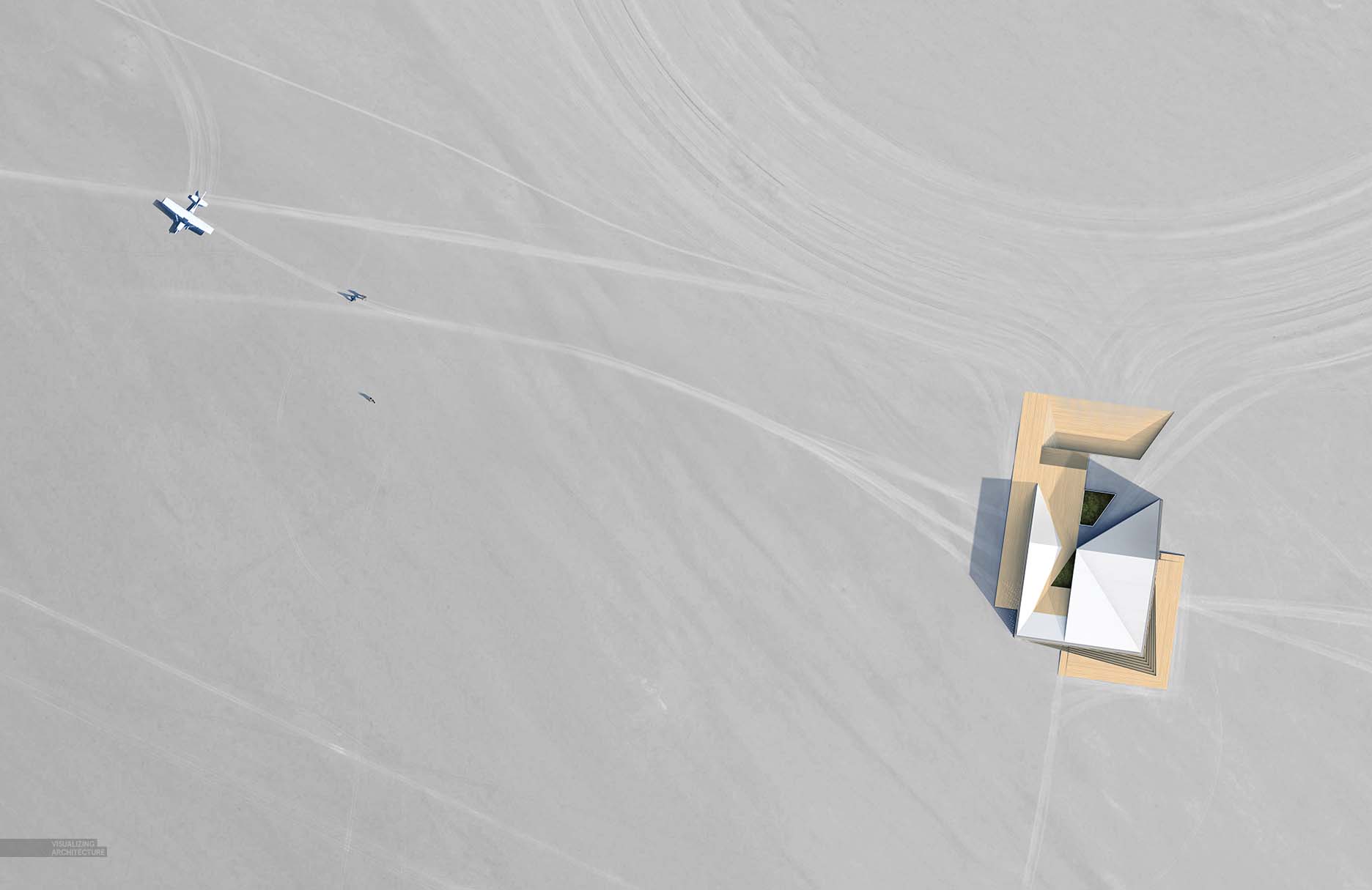
Finally, I introduced a little narrative and scale by dropping in a plane and people crossing the desert to get to the house.
3. Color
The image was coming off too desaturated so I warmed things up a bit with color overlays and adjusted the levels of the image.


Another solid post Alex ! I’m still waitin’ for lights tutorial though 😉
Best regards
Alex, another great project and I’m excited to see the direction these visuals take. The desolation of this project is quite fascinating as it puts even more of the focus on to the building itself and how it integrates in to the environment. The approach reminds me of Antoine Predock. Keep up the great work!
Alex,
From an architect working in the high desert of Taos New Mexico much appreciation for the sharing of information.
My architectural education did not include information on the rendering techniques you so graciously lay out for others to view.
It is so cool to sit out here in the remote southern rockies and be able to view such online content!
Alex, another awesome task and I’m eager to see the course these visuals take. The devastation of this undertaking is very captivating as it puts considerably a greater amount of the emphasis on to the building itself and how it coordinates in to nature. The approach helps me to remember Antoine Predock. Keep up the colossal work!
Great Article and useful tip this blog gives people good information.
You really mention here some great points,Good job,very helpful post.
interesting post!
Came back to see what you’ve been up to. Again pretty impressive, your work is so meticulous. And strangely alluring. Keep up the good work.
I’ll be returning to see your work from time to time. It inspires me! Thanks.
Do you accept trainees? Your work inspires me.
I had the building copied and rotated many times to help me think about views…