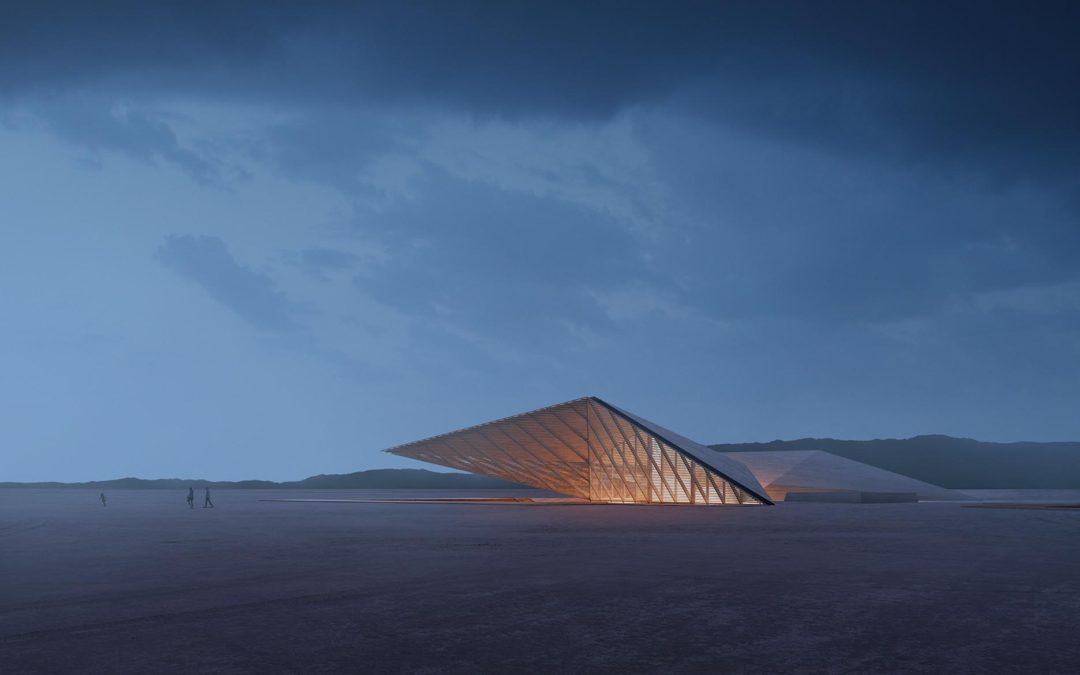
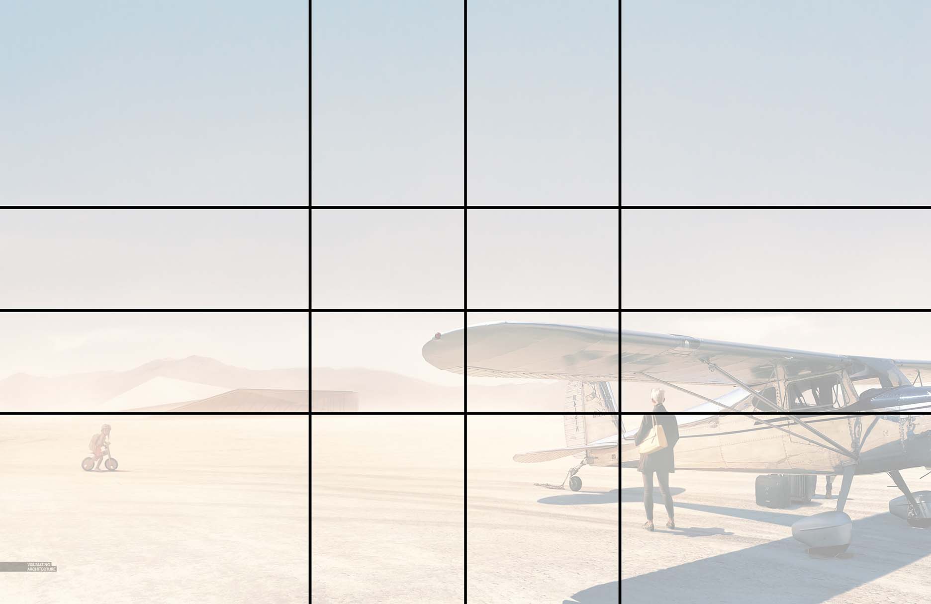
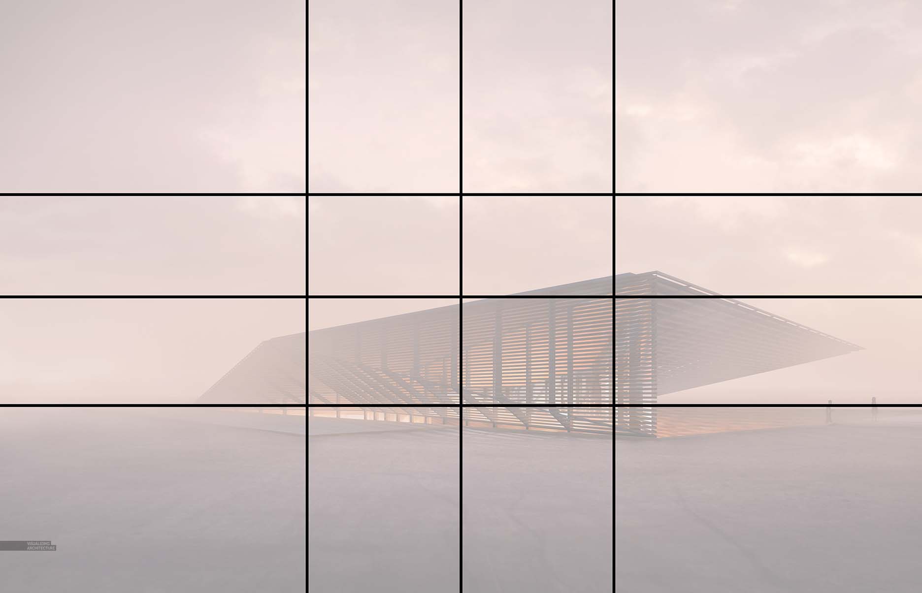
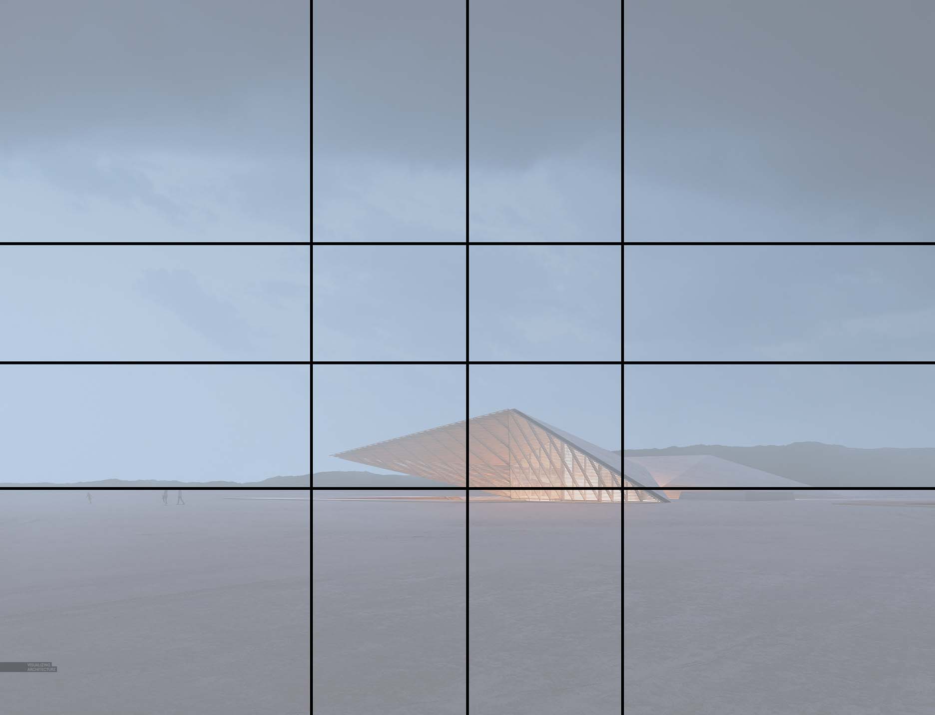
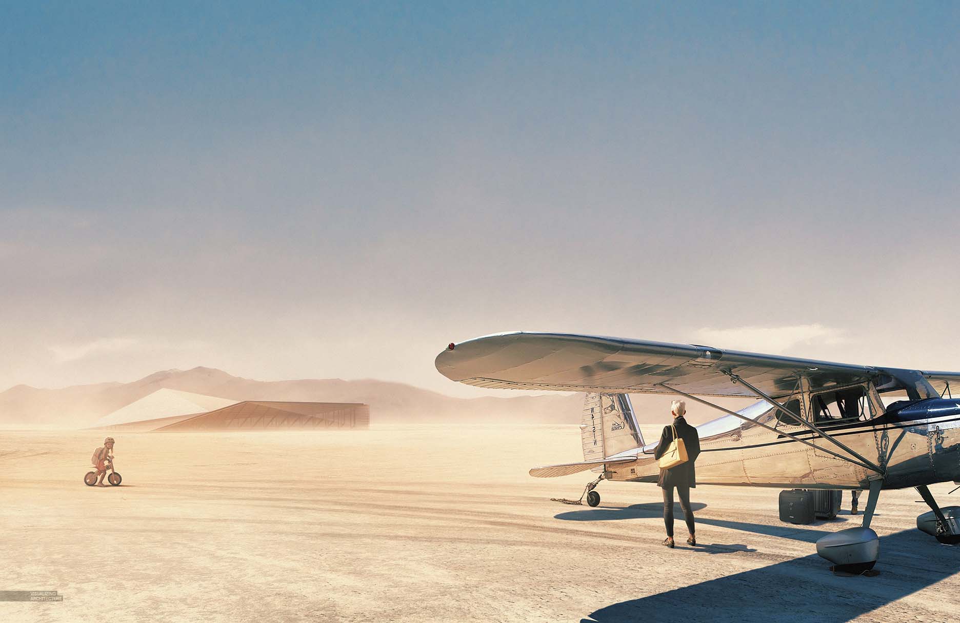
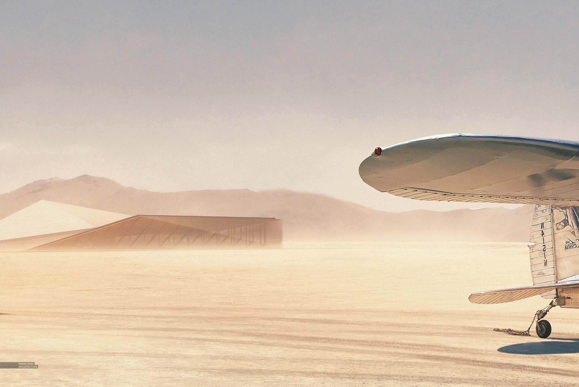
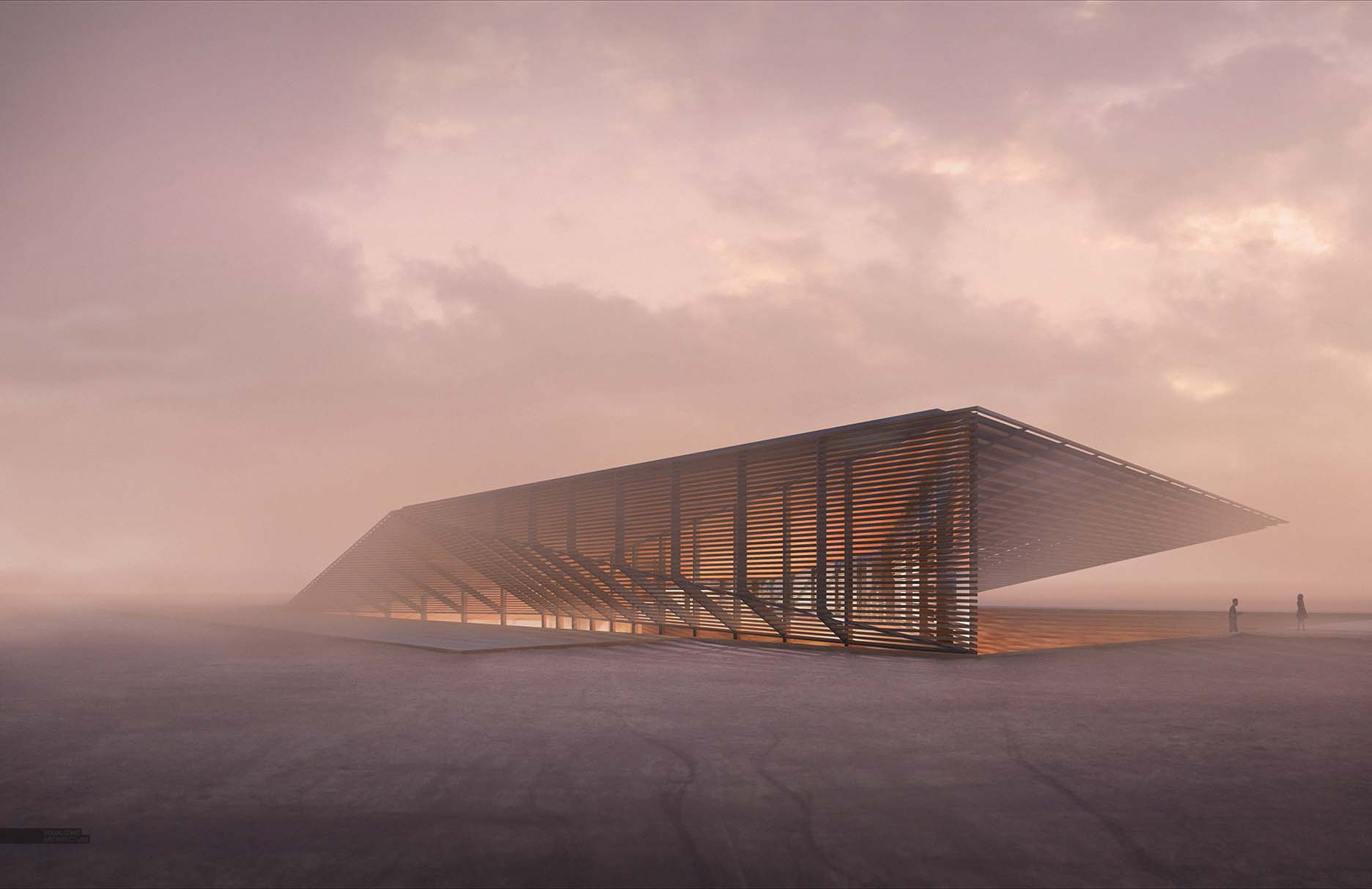
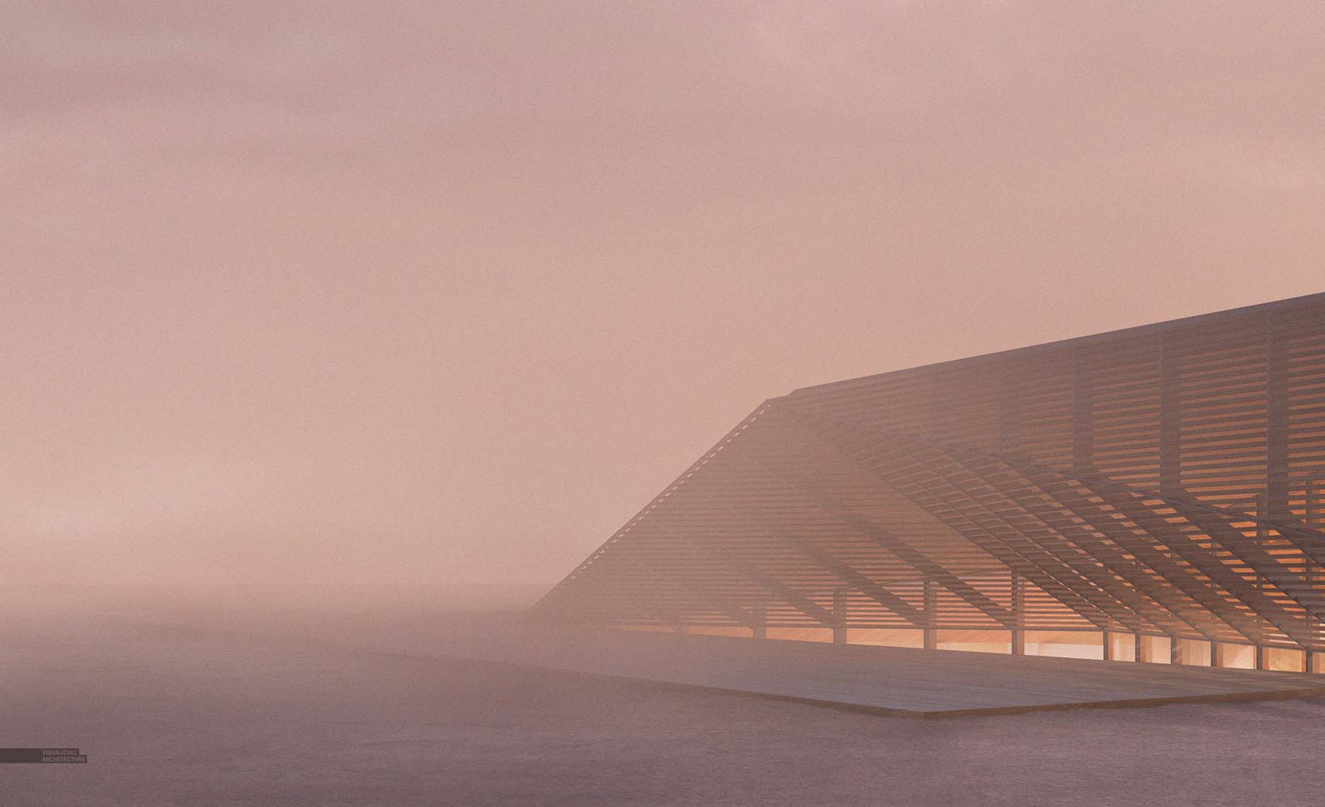
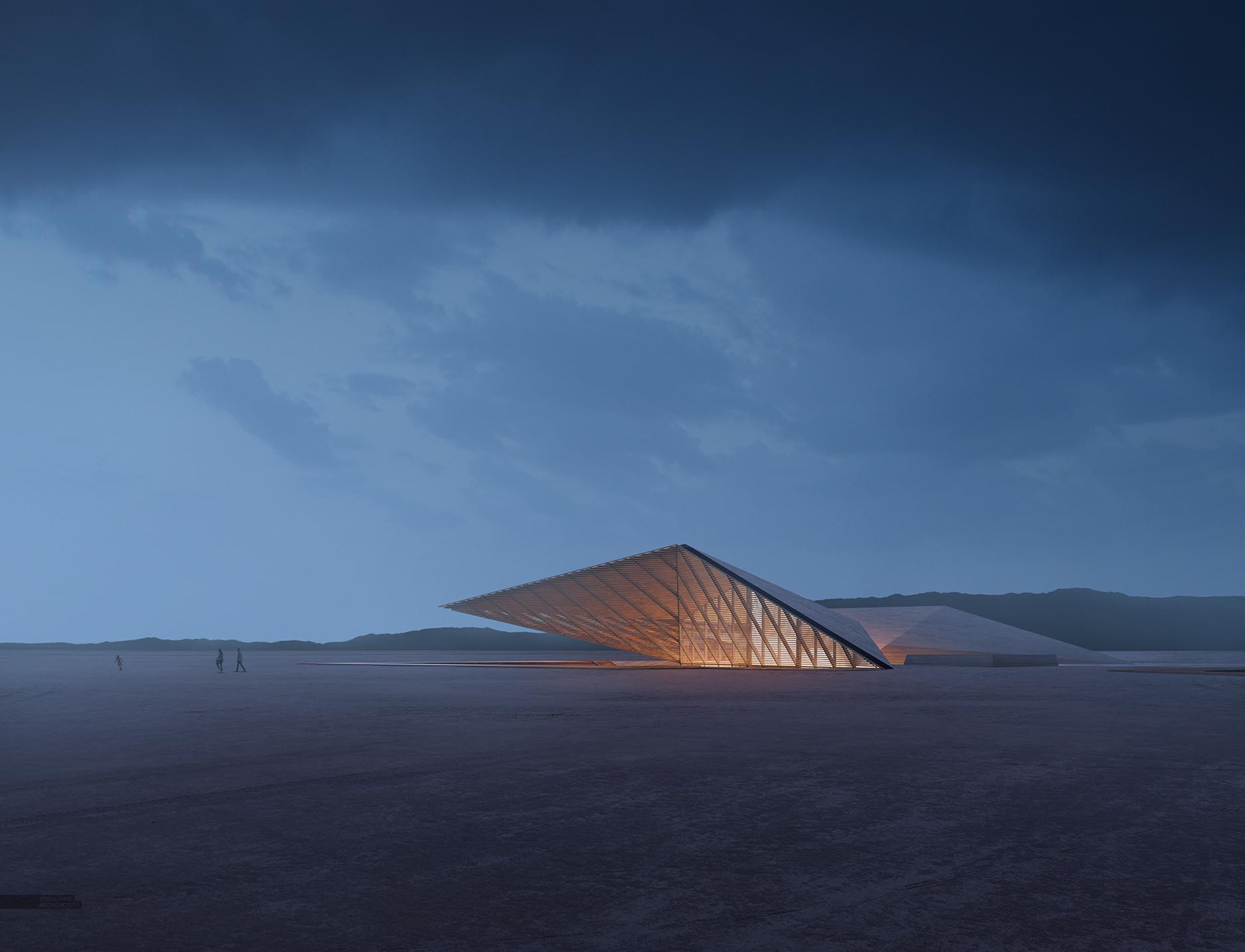
This week, I got back into the Trench House project by generating some exterior vignettes. I wanted to use these images to emphasize the vastness of the context and also to explore some color combinations. Since this project sits in the middle of a desert in Nevada, the time it takes to Photoshop the surrounding environment is minimal which allowed me to generate several illustrations quickly and spend a little more time on the exploring the art side of things. Below, I explain some of the concepts and reasoning behind this set of images.
1. Camera Distance
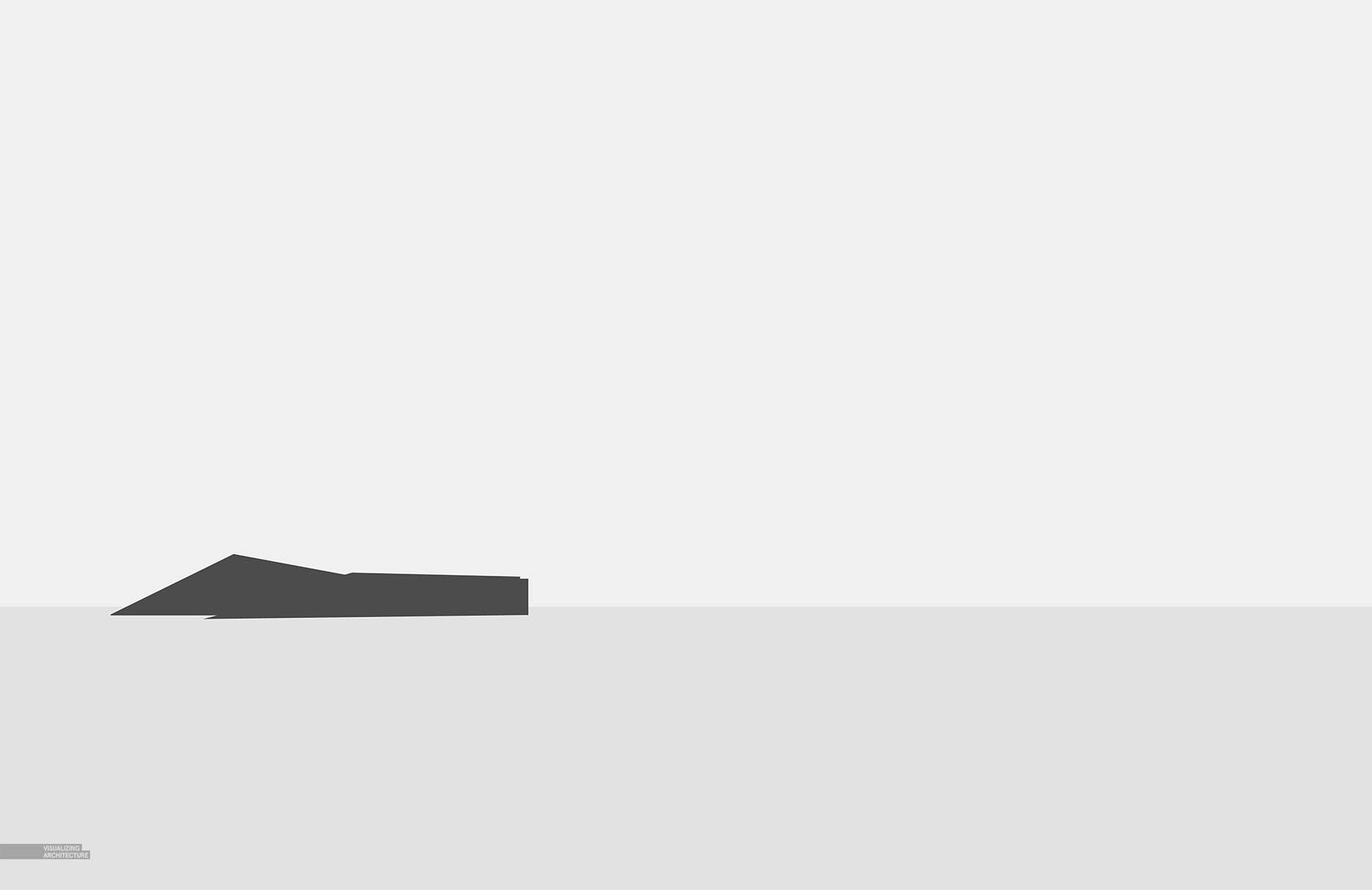
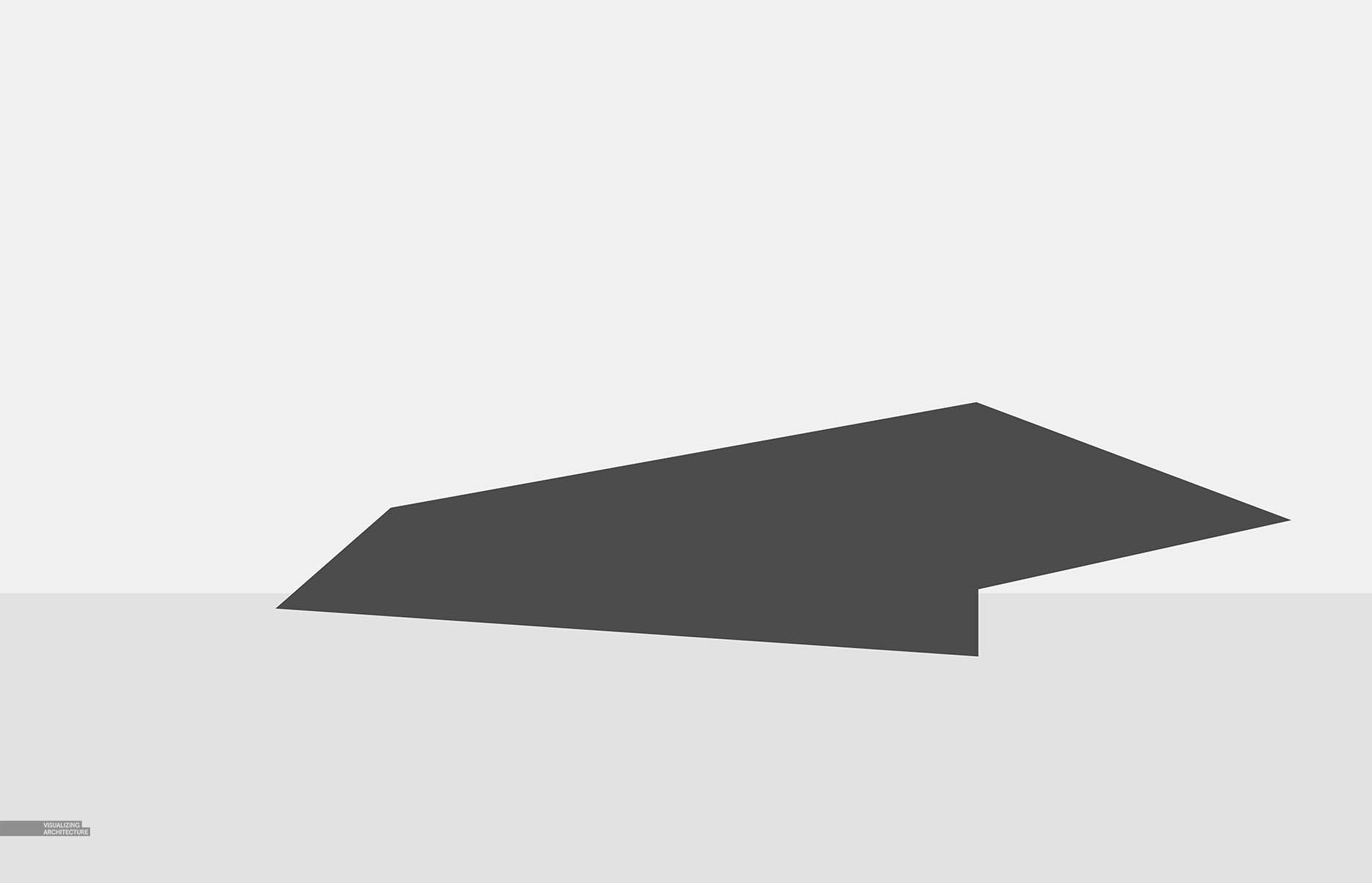
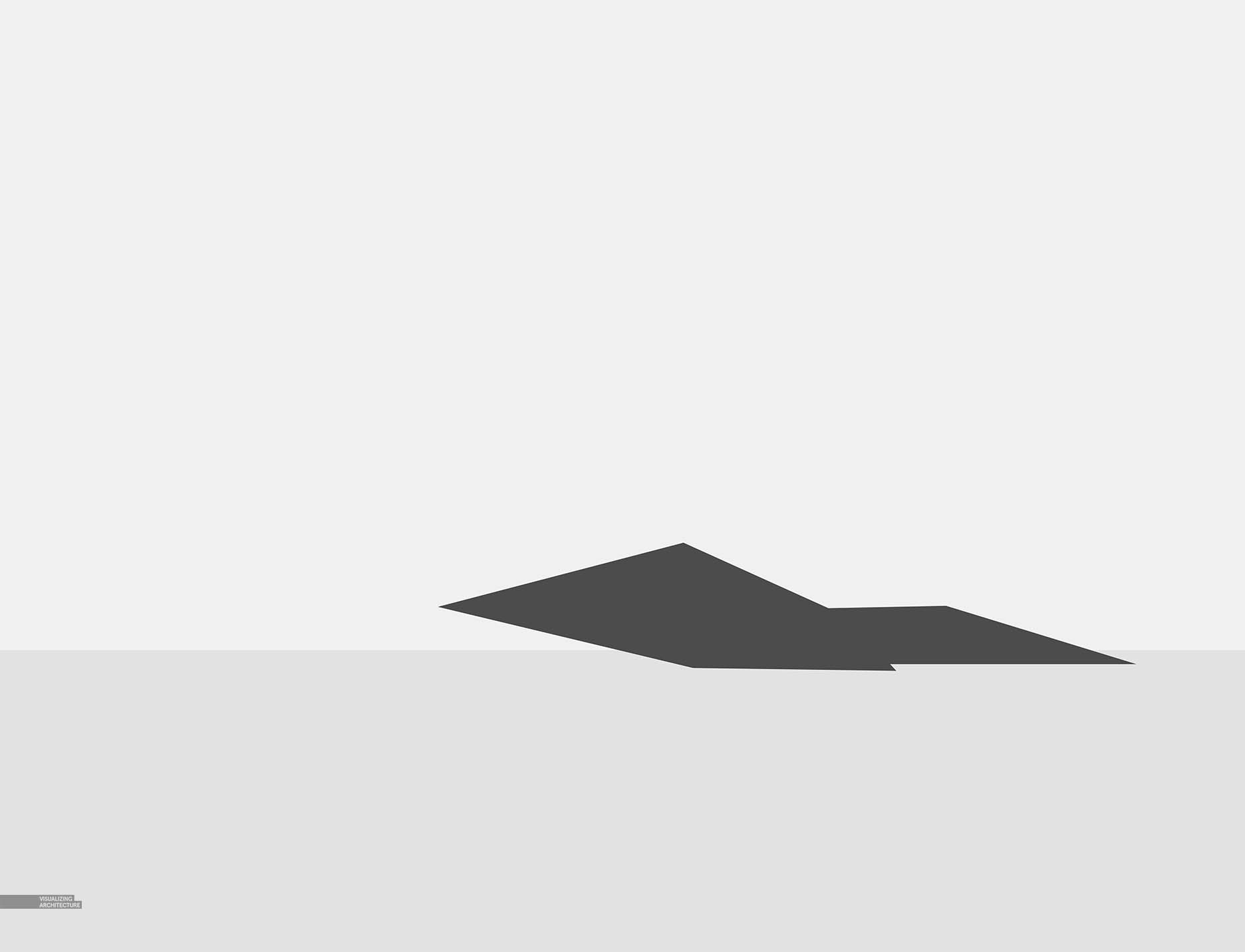
As I mentioned above, one of the goals of these images was to reveal the vastness of the surrounding site. I did this two ways. First, I pulled back the camera so that the architecture only made up a small portion of the image. Going through school, I was always afraid to make my design so small in the image because there was always a sense that I needed to show as much detail as possible in the architecture. Making the building so small within the image meant a lot of the detail was getting lost. However, now I realize that this move is in many ways advantageous. Since the detail is abstracted, it forces the viewer to focus on other elements such as the profile of the architecture or in this case, the landscape around it. I also played up the vastness of the site by letting the sky and ground textures do a lot of talking in the images by using some dramatic cloud formations and strong directional elements like the tire ruts in the ground.
2. Composition
I kept things pretty simple and safe with the composition. Again, I wanted to play up the landscape, so I kept the horizon at the lower 1/3 of the images so that the sky would take up more real estate. I eye-balled a lot of these camera setups, so there are several near-misses in terms of where geometry and focal points are landing on the 1/3 marks of the image (corner of the the building in view 02 and placement of the woman in view 01).
3. Color
With the location being in the desert, it is easy for the scenes to get somewhat monotonous, so I gave each scene a primary color to start with. In each case, I used dust and dirt in the air to reinforce the arid climate atmosphere with the night scene getting a little more clear and cold feeling. As I mentioned above, there wasn’t a lot of time needed in Photoshop adding in texture and detail which meant I was able to spend more time experimenting with color.
4. Final Images
I had a lot of fun making these images. I would say all of these images hit my sweat spot in terms of balance between time spent modeling, Photoshopping in detail and texture, and experimenting with color and atmosphere. In terms of difficulty, these were actually quite easy. I am thinking one of these may be a good candidate to break down further into more detailed explanations of each step of the process. Stay tuned.



very nice projects….!
You never disappoint, Alex. Great visuals as always 🙂
Great work Alex as always! Are you planning image breakdown for any of this renders?
alex, how do you make the fog effect?can you make a tutotial about that?
I Believe in This. Well done for articles.
Cool design. Nice atmosphere.
Just love.
nice!
stunning as always
Are you still using Sketchup for these models? I’m about to do a rendering and I really want it to turn out as incredible as yours.
So I was wondering about the plane – model or photo…?
Then I found my answer.
https://www.skytamer.com/1.2/2007/7399.jpg
Great cutout & re-toning job!!! 🙂
These ones are gorgeous Alex!! You totally accomplished your will of enforcing the vastness of the location. The last two ones gosh! The quality of the renderings is amazing… Good job!
Thanks for sharing a very nice blog post.
Its really good..! thanks for sharing this articles…https://bit.ly/2sL4gIf
Its Amazing….. ! thanks for sharing this articles..https://bit.ly/2sL4gIf
Thanks for sharing a nice article.
Wow. Amazing house project. Very interesting!