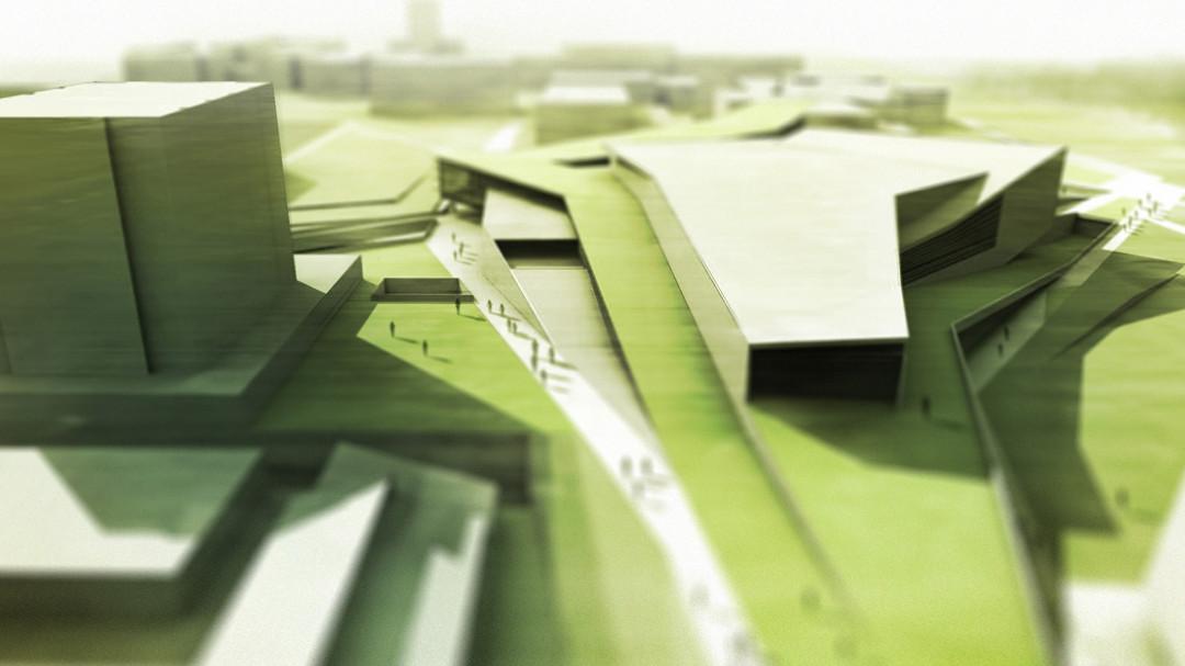
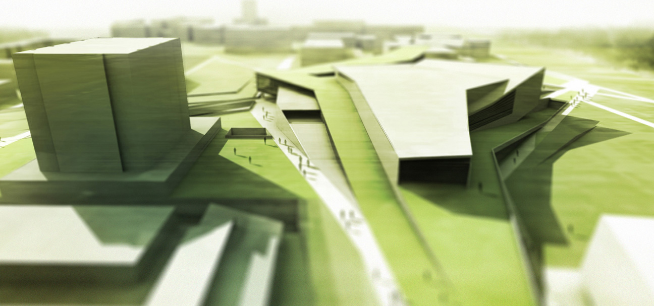
Adjusting the depth of field is an easy way to punch up many types of architectural renderings. I have been using this technique for a while now and have applied this concept to final presentation illustrations, model pics, and my graduate portfolio. There are probably better ways to do this, however, once you get use to the concepts, this technique can be applied in a matter of a few minutes. For those interested and using Sketchup, there is a tutorial on YouTube called “Sketchup and Photoshop: lens blur.” This tutorial uses Sketchup and its fog settings to create the layer mask. While the work flow is pretty creative, it’s a little overkill for me and one more thing to set up in sketchup and export into photoshop. The final results will be so similar, it doesn’t seem worth going through the extra effort to set everything up in sketchup.
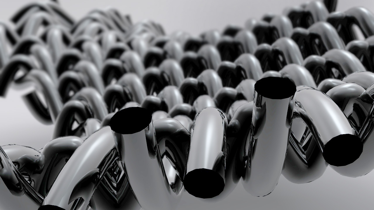
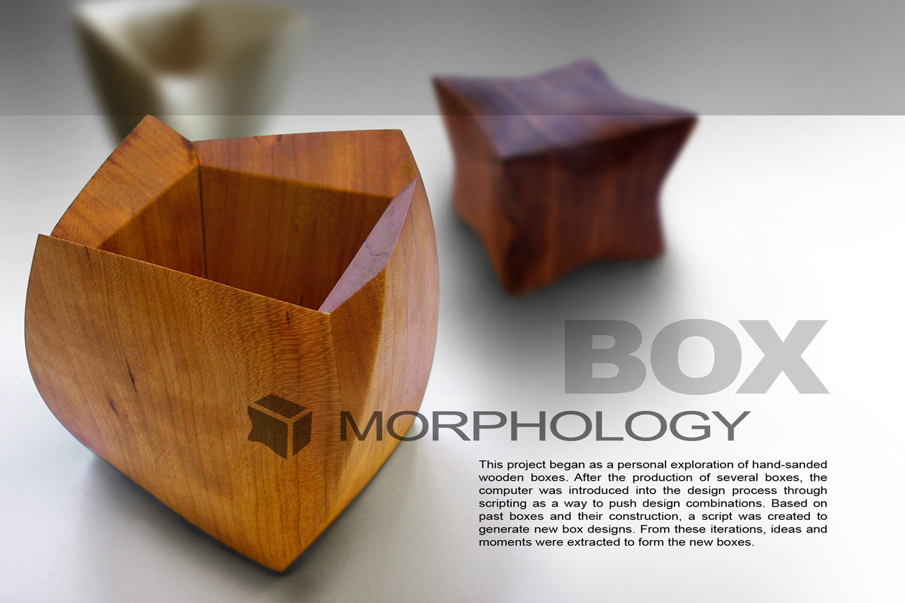
Below are some examples that I have applied this technique to in the past. One thing to notice, when this is applied to a large scale building site, the final result looks more like a small-scale physical model instead of a full scale 1:1 building. Still, I think it’s a cool look.


Thanks Alex. Great stuff as always!
Alex thaks for sharing your knowledges and it would be great if you share some tutorials about grasshopper … many greetings from Peru
Christmas gift <h1>coach bags outlet</h1>
The most fashionable cheap <h1>coach outlet online</h1>
Christmas Specials <h1>authentic nfl jerseys</h1>
Beautiful and unique <h1>coach outlet online</h1>
2011 most unique design <h1>wholesale designer bags</h1>
Buy want to buy products <h1>coach outlet store online</h1>
Professional design <h1>coach handbags on sale</h1>
Single product sales <h1>coach bags on sale</h1>
Cheap and good-looking <h1>coach outlet store</h1>
With top design <h1>authentic jerseys suppliers</h1>
Male friend love <h1>nfl jerseys from china</h1> Very glad that you buy
nice post that your share. you are really a master