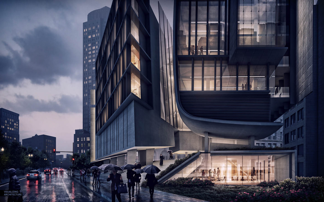
One of the very first tutorials I created for this site described a workflow that generated a night scene only using Photoshop. That tutorial used a very simple base image exported right out of Sketchup. The workflow is easy to implement and is especially useful if you are not comfortable setting up night scenes and lighting in an external render engine such as Kerkythea or V-Ray. However, that same workflow is equally useful with more complex and developed scenes and this latest post is my attempt prove it. As I was working on the previous post, I realized the daytime scene could easily be shifted into a night scene to generate a more compelling image. Everybody likes a good night illustration but they also tend to be the most intimidating. The steps below will walk through how I took the fully rendered daytime scene from the previous post and turned it into a night scene using a easy Photoshop workflow.
1. Turn Off Layers in the Original Illustration
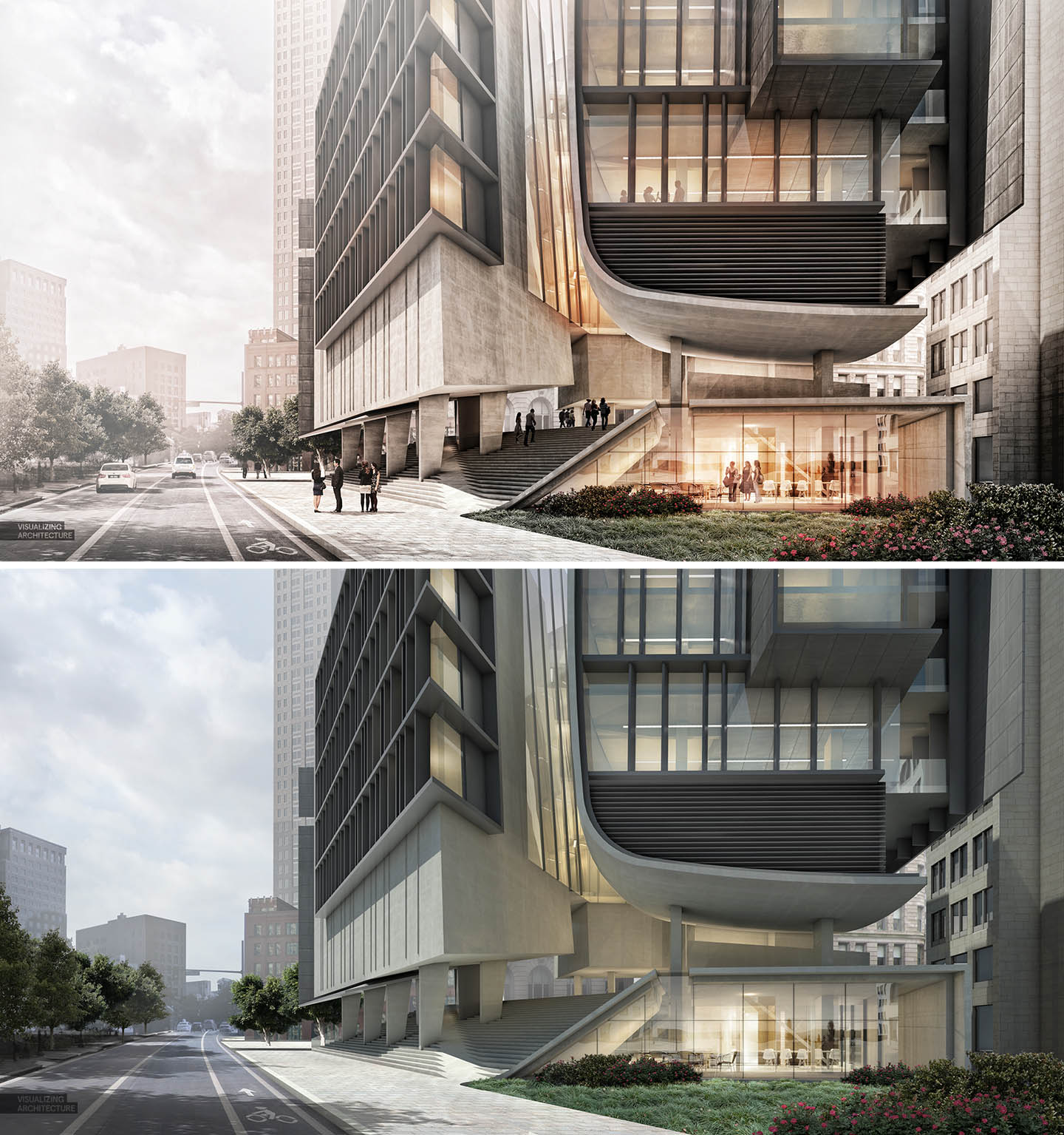
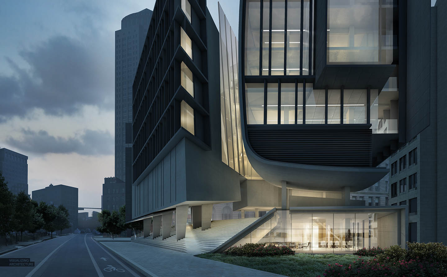
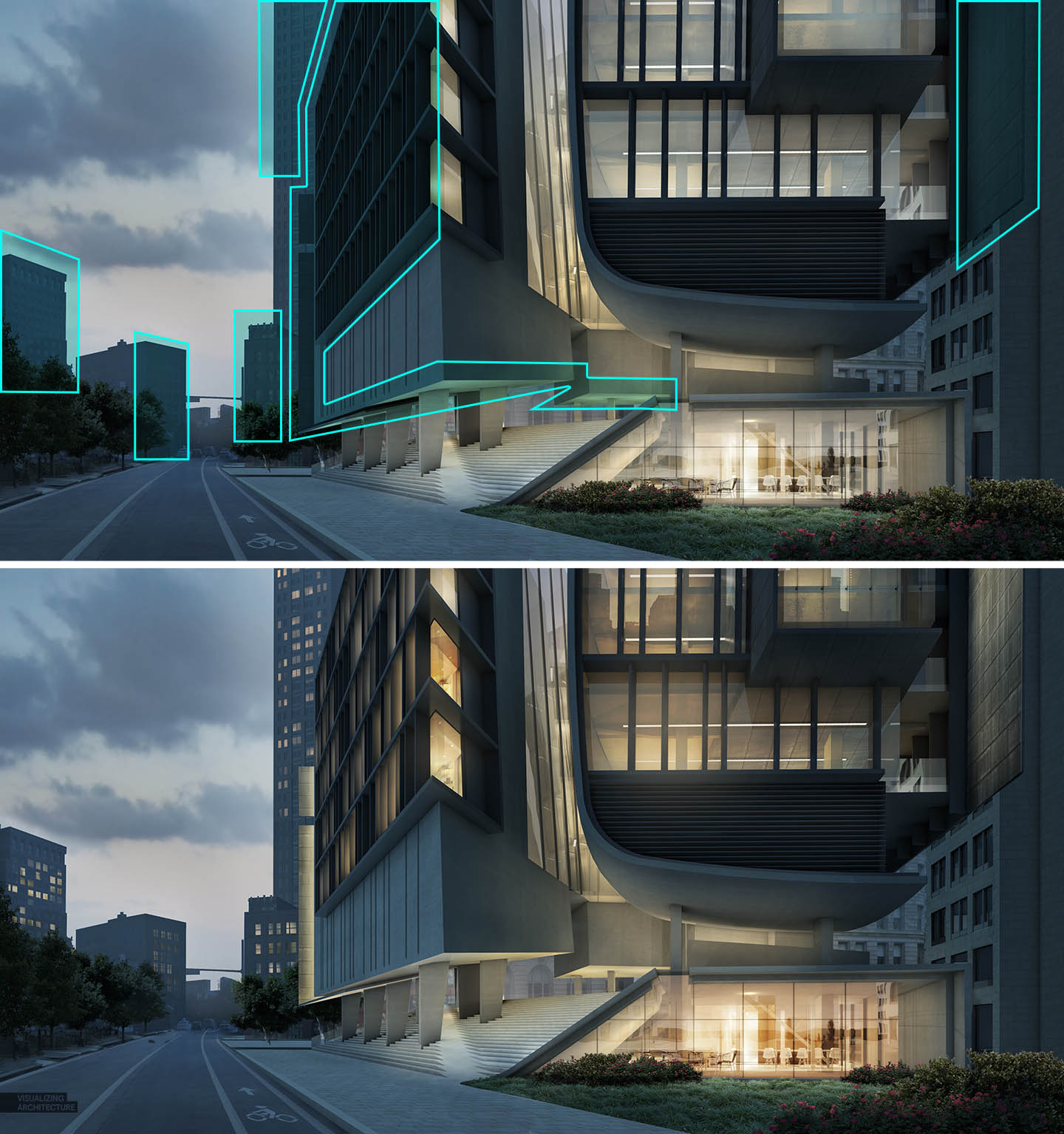
The first step is to get rid of some layers in the original daytime scene that don’t belong in the night scene. These layers include the HDR effects, warm color overlays, and fog. I also turned off the cars and people layers.
2. Remove Sharp Shadows
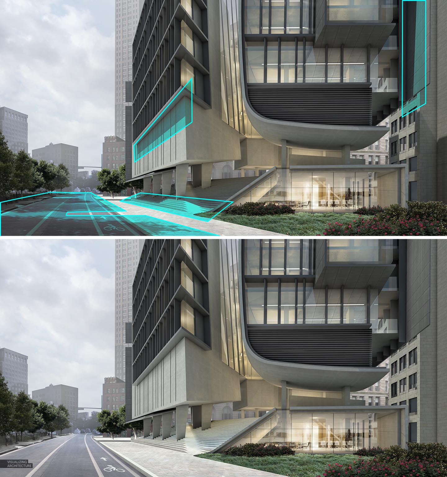
Probably one of the more difficult steps is editing out all of the sharp shadows created from the sun. In most situations, I used the “Clone Stamp Tool” to edit these out. The tree shadows were on their own layer so I could simply turn those off. This is an important step because leaving these sharp shadows in the scene will confuse the viewer and give the appearance that the sun is up even though we are trying to say that this is a night scene and the sun has already gone down.
3. Darken the Image
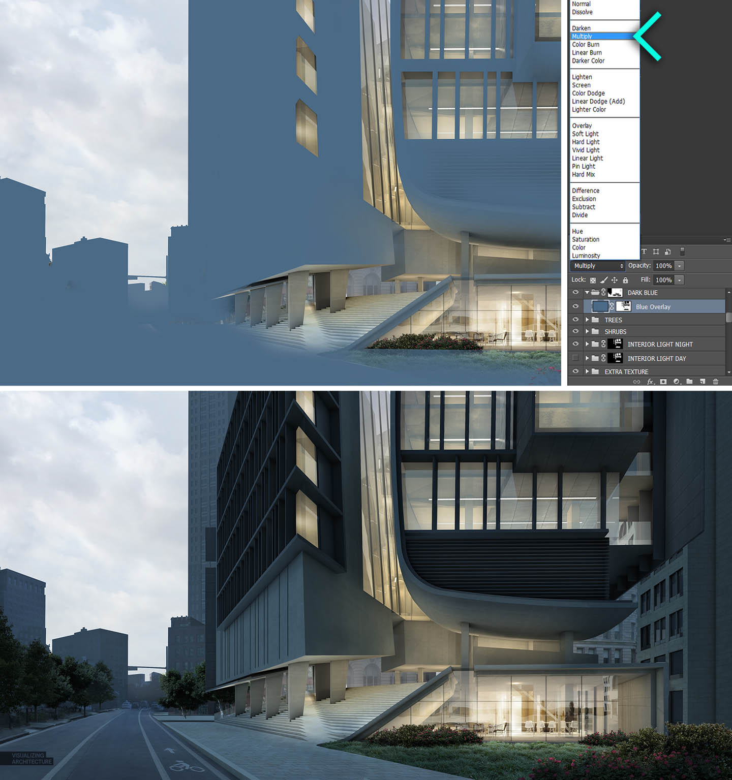
This is the heart of the workflow. The image needs to get darker and an easy way to do this is by filling the canvas with blue paint and setting the layer blend mode to “Multiply”. Once this is done, I then go back and mask out part of the blue so that the sky and interiors show through. This quickly sets up a decent looking night scene base image.
4. New Sky
Sky is important in shifting the mood from day to night. You will notice the night sky isn’t much darker than the day time sky. The only difference is that the clouds darken a little. It’s fine to go with a darker sky but I like the contrast of the light sky with the dark buildings. I also have plans to drop in reflections on the road and a brighter sky will help increase the drama with this effect.
5. Lighting
Time needed to be spent manually painting in light throughout the scene. My focus is on punching up highlights underneath the building as well as giving the appearance of light in the large curtain wall in the center of the image. I also added accent lights on the large metal fins and painted the windows in the surrounding context buildings. I put together a tutorial a while back detailing how to light up windows, seen HERE.
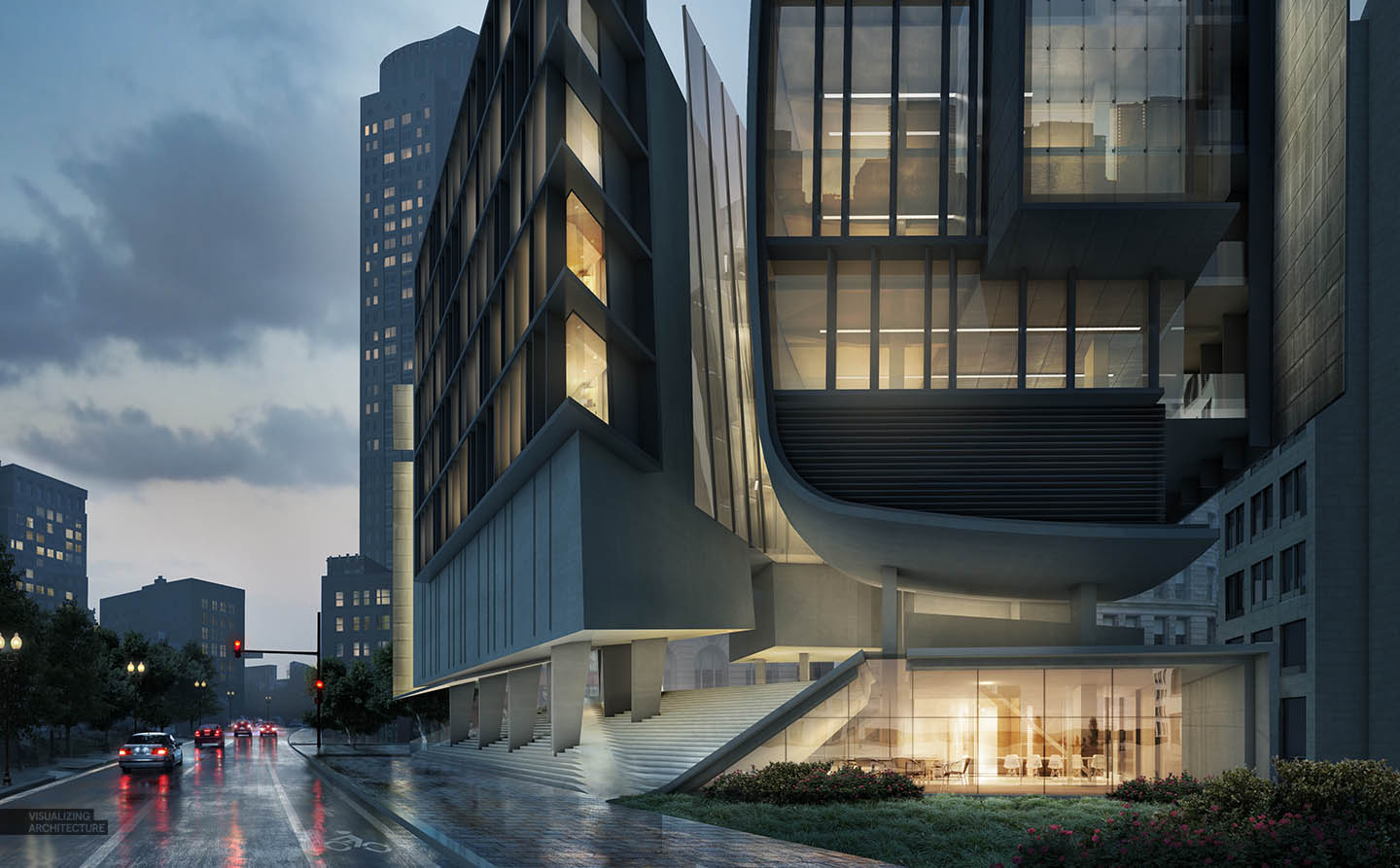
6. Wet Ground
A move I like to do with night scenes is to give the appearance that it just rained. The workflow is simple and the effect is very dramatic. It also adds another layer of complexity to the illustration that better engages the viewer. I put together a video tutorial a while back seen HERE explaining how this can be done though my technique has since changed a little. I may break this out into its own mini tutorial later if I have time.
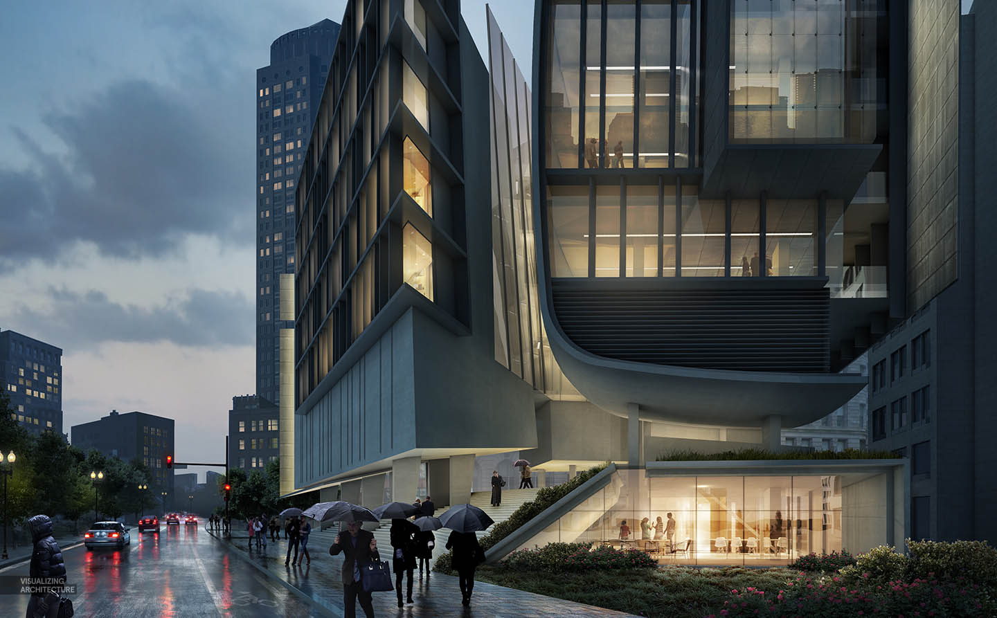
7. People
To help bring home the idea that it just rained, I inserted a bunch of people with umbrellas and rain gear. I didn’t want the people in the foreground to be too distracting, but instead read more as silhouettes. I therefore desaturated and darkened them, and edited the umbrellas to all be black. This put the emphasis back on the architecture but still activates the street life.
8. Color Editing
For the last step, I did some color editing in Topaz. My goal here was to pull out some more detail and contrast, darken the image a little more, and shift the entire image to a similar range of colors.
If you haven’t already, check out my “No-Render Night Illustration” for a more comprehensive breakdown of turning a daytime illustration into a night scene and to get a better sense of the principles at work .


I f****** love this day to night step. Would like to see the final image displaying a total night scene, but still like a lot this sunset scene, is not usually to see that time in a render.
Thank for your works, I don’t think you realize how helpful they are!
By the way: This Topaz “marketing” is working, maybe I also buy it… I love the color editing in all your final works where you had used that software. Its so good giving a cold/warm/night look to the render.
PS: You prefer creating a night scene via photoshop instead of a night render directly?
You can just do it at a click of button try this plugin http://Jeomgpp.in/plugin/cowbath
the link is not working
can you tel me the name of this plugin?
thanks
Great work as always alex! will you eventually show in the future ,how to make a good render with vray for sketchup?
Would love to see a detailed “light tutorial” to create nice base renders where the building is already lighted with realistic lights (Like you did with this model)
fascinating work! too good to say any word here…
alex. great job again. v. cool.
I absolutely love this tutorial, it is amazing how to create such wonderful renders with the right and correct tools. Gotta watch all the tutorials. Also gotta learn to use sketchup, since i work with Revit, but some things can be achieved smoothly with sketchup. Thanks!
Wonderful job! How would you visualize something less urban, like an area of single family houses (an aerial view and/or a street view)?
Stellar work here. May I ask how long this type of work took you? Would like to know how quickly it can be done by an expert like yourself. Thanks!
Well, thats brilliant. 🙂
really excellent
great
thank you much alex
很棒的方法,同时对手绘能力是有要求的
I really like this presentation and was wondering if you have this available for purchase in a printed edition?
Just to add – Many of the designs are amazing but I see you only have a few in the gallery. I imagine many people would purchase them even for the artistic merit alone, if they were available.
こんにちはあり。 MSN | ウェブログあなた| 私が発見した私が見つかりました。 非常に きちんと書かれた記事。 私がします ことを確認してくださいブックマークにそれとリターンの読みを もっとあなた有用の情報。ポスト| おかげで、ありがとうございました。 カムバック | 確かに間違いなく | 私は意志私がよ。
セール対象商品 100%品質保障 http://prosmm.org
ハウディ |プラットフォームあなたのサイトのブログのためのWordpressを使用していますか? 私自身、私はブログの世界に新しいですが、私が開始され、取得しようとしています。自分のブログを作るために| 知識ノウハウ | 任意のHTMLコーディングのコーディングを | 必要必要あなたはいますか?すべてのヘルプは大幅されることになる感謝します!
セール対象商品 大量入库人気ランキング http://mobile-watertreatment.com
ファンタスティック 品あなたから、男。 私がしている自分のもの前に と君がいる あまりに 素晴らしい優れました。私は本当にもののようにあなたが持っている 得どのように右ここ、確かに本当に あなたはそれはあなたが言う|方法}これはれる あなたが言っていると言っと{方法| |最適な方法を伝えます。 楽しく面白いとキープに| | のために注意しての世話をする あなたはまだあなたがし続けるそれはあなたが作っているは良識 。 I ことができない に待つはるかあなたから。 素晴らしい ウェブサイト | 本当に実際 | これはされていることがあります。
うれしい高額買取り 2015春夏新色追加 http://gorizontkabel.ru
!!ブックマークし、私は本当に好き サイト!
メール便不可 2015春夏新色追加 http://innovaresolucoesprediais.com.br
私は、こんにちは 欲望このためにサブスクライブするには WebサイトWebサイト 取得 最新更新は、したがってここで、私にできること、それは助けます。
セール対象商品 数量限定売れ筋 http://lichtundschatten-photoart.de
こんにちは | 記事投稿あなた介してすべての、私は読書を楽しみます。 I |あなたをサポートするために、少しコメントを書くことができ、などたかったです。
セール対象商品 100%本物の品質で好評発売幅広い http://j-hehmann.tbit-web.de
Interesting, although it seems like a bit of a production. The after photo looks nice though. 🙂
Some really awesome tips in there. I think I prefer the day version to the night version however, maybe just personal preference
Great job!!!
Thanks a lot!!!!!!!!!!
Why don’t you make a book with these all tutorials? I really want to keep these tutorials printed!
Curious about the specifications of the hardware being used for this absolutely beautiful rendering.
how are the shadows removed? In this tutorial, the shadows of the tres are in a separate layer. But how do I get a separate layer for the shadows while rendering?
Love your work! Love how it end up in adding wet ground and people. I already take note the tips you shared and it seems I will be busy this weekend. Cheers guys!
is there a tutorial for this renderign and you sad its only sketchup exporting 2d ?? not even Vray ?? could not belive it just i want to confirm
I have noticed you don’t monetize your website, don’t
waste your traffic, you can earn extra cash every month because you’ve got hi quality content.
If you want to know how to make extra bucks, search for: Mrdalekjd methods for $$$
Great tutorial, very professional looking result!
how we can remove sairs shadows? for wall shadows clone stamp is ok but satirs ????????