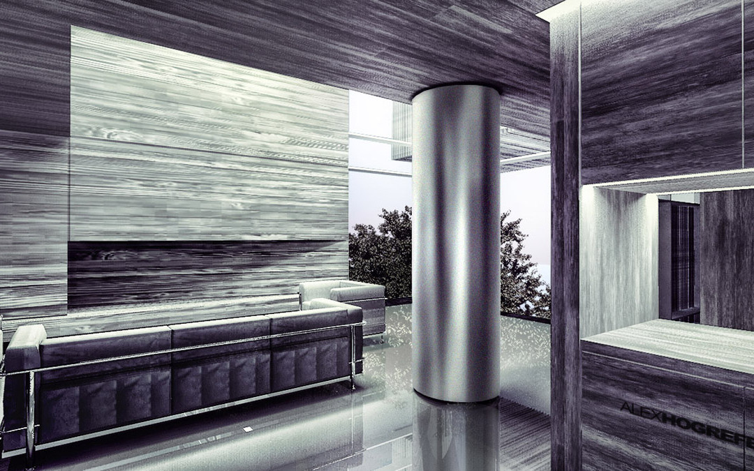
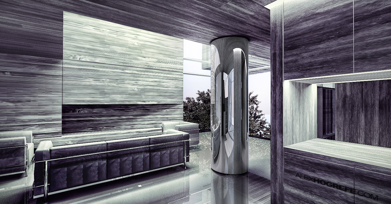
Every so often, there comes a time when I need to illustrate a brushed stainless steel finish like the column in the above image. In my experience, adjusting the “shininess” settings in any rendering program to get that brushed look dramatically increases the rendering time. On top of that, it can take multiple test renderings to get the result I am hoping for. So… I created a work around. The process is simple, but powerful. The basic workflow involves rendering the material as a simple mirror reflection. Rendering as a mirror reflection adds almost no time to the total render time unlike adjusting the “shininess” settings. Once in Photoshop, I apply a motion blur and Gaussian blur to give it that soft, brushed stainless steel look.
Most rendering software can create reflective surfaces easily. For those of you who use Kerkythea, I have added some quick steps to show you how it’s done.
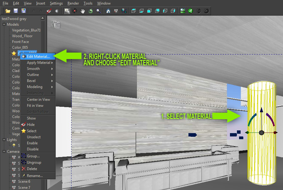
1) In Kerkythea, select the material you want to have the brushed finish. In the left panel, a star will highlight the material selected. Right-click on that material and choose “Edit Material”.
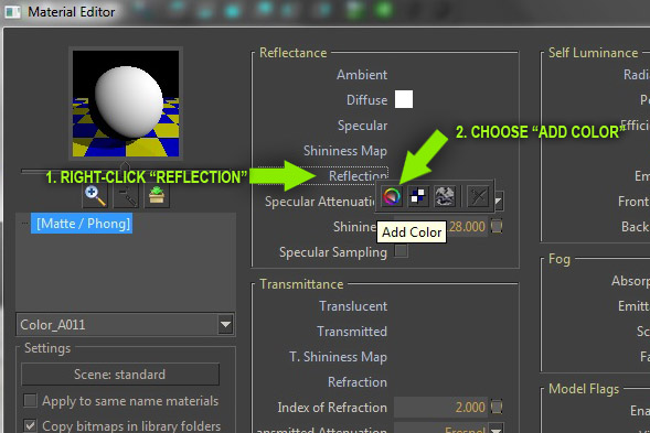
2) Once in the “Material Editor” dialogue box, right-click on the work “Reflection” and choose the “Add Color” icon.
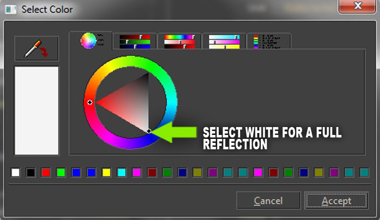
3) In the “Select Color” dialogue box, choose a white color. Then choose “Accept”.
PHOTOSHOP POST PROCESSING:
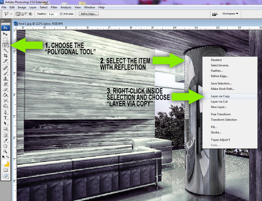
4) With the materials setup, render the geometry and open the rendering in Photoshop. Once in Photoshop, choose the “Polygonal Lasso Tool” and select the mirror reflection items to be softened. Once selected, right-click inside of the selection and choose “Layer via Copy”.
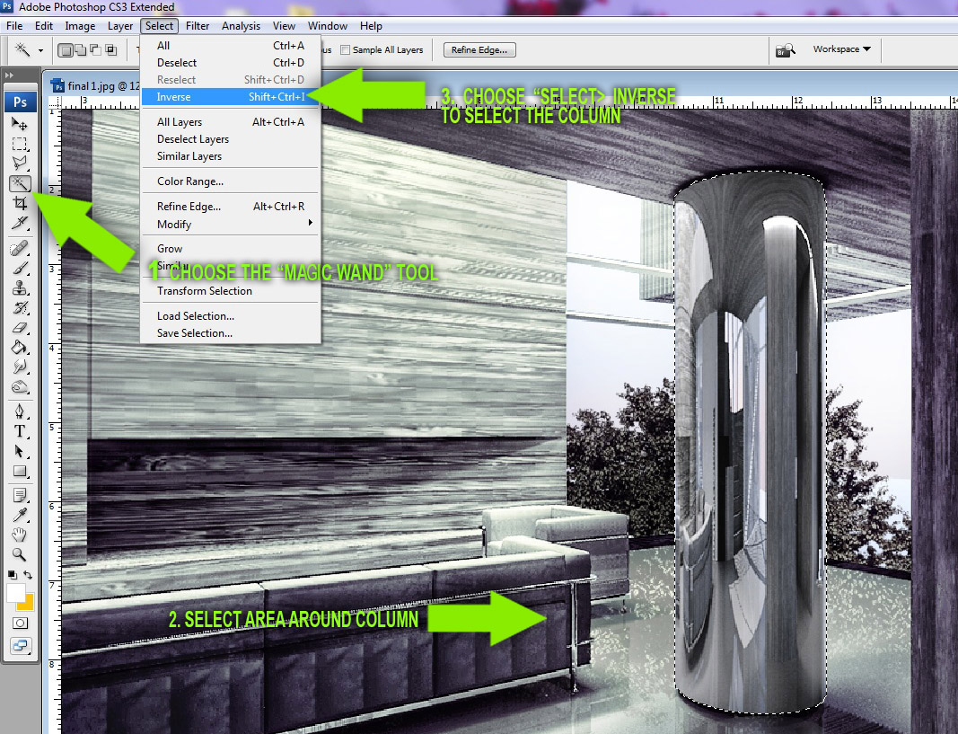
5) I now want to reselect this new layer so that when I blur the layer, it will maintain crisp edges. To do this, choose the “Magic Wand Tool”, and select the area around the new layer. Next, choose “Select>Inverse” to flip the selection to the metal material in the new layer.
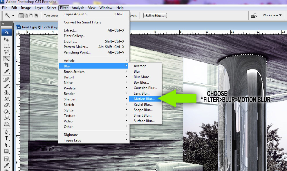
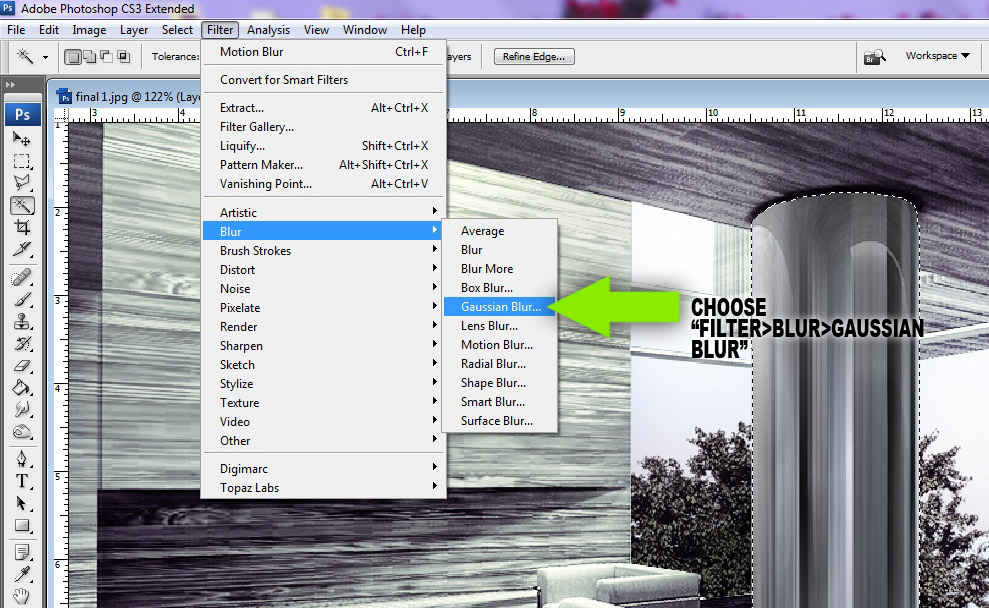
6) At the top, choose “Filter>Blur>Motion Blur”.
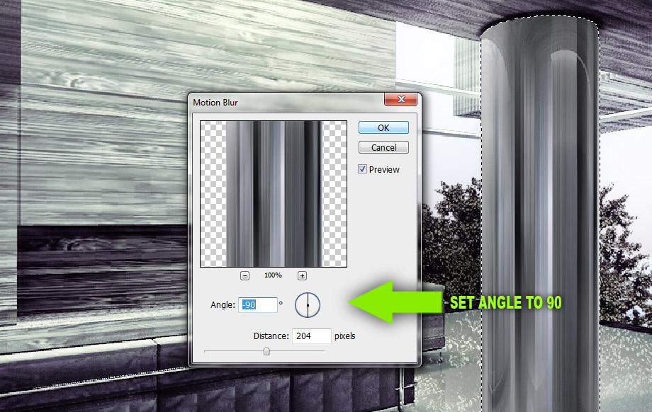
7) With the “Motion Blur” dialogue box open, go to the box marked “Angle”. Since the column is a vertical element, I want the blur to move vertically as well. Therefore, I am setting the angle to 90 degrees. The distance will vary from illustration to illustration. It seemed like 200 pixels worked best for this image.
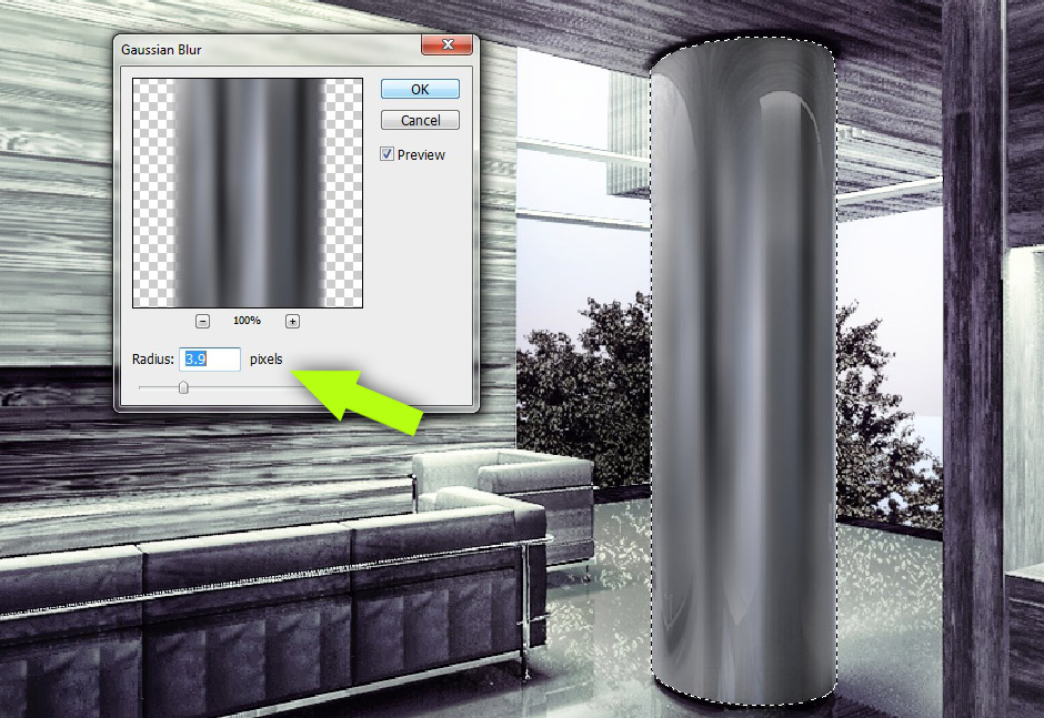
8) The vertical streaks are still too sharp. With the column still selected, I am going to give it a Gaussian Blur. Go to “Filter>Blur>Gaussian Blur” to open the dialogue box.
9) In “Gaussian Blur” dialogue box, adjust the radius to soften the metal reflection. It’s easy to overdo it in this step so make sure you don’t lose the definition of the light and dark areas of the reflection.
10) As a final step, sometimes it is necessary to duplicate the brushed metal layer to get more definition around the edges since blurring may cause the edges to be somewhat transparent.
I use this technique all the time and the results almost always come out great. Although it may seem complicated at first, in reality, it is a very simple workflow. I just went into great depth in each step in hopes of answering most questions that may come up.
Above: The column before the Photoshop softening technique.
Above: The column after the Photoshop softening technique.


good job alex
nice tip
just a few advices :
– step 5, right click + CTRL to automatically select the area of the layer.
– be careful to the reflection of the new brushed stainless steel column on your ground 😉
cheers, you brought me a lot with your blog!
I'll agree with the above comment – powerful technique, but the column's reflection wasn't altered to match.
left click instead right click, sorry :p
for the furniture, Alex, do you have the textures of the furniture already rendered or did you add them in with photoshop?
Don't forget to adjust the reflection in the floor as well!
@b-in
Thanks for the tip and good call on the reflection. I completely forgot to alter that as well. I would probably just copy the column down, flip it, and lower the opacity rather than going through the blur process again.
@jrew,
in this case, the furniture was rendered as is with no Photoshop textures added later. The couch already had a textured applied in the sketchup model. I did however experiment with HDR post processing which increased the detail and contrast of the furniture and wood textures.
HELLO ALEX
YOUR IMAGES IS ESCELLENT, CONGRATULATION FOR YOUR WORK
ALEX, AN QUESTIONS
¿ how I can change the size of the brushes from photoshop CS3
I combine that key?
thank
Great post! Just one question,
what is Kerkythea like as a render programme?
Did the scene take long to render? I could imagine this scene taking ages to create and render if used with Vray and some other programmes
hi alex,
wicked interior visual!! how did u produce this really intense interior visual??? obviously modelled in SU then imported into kerky and photoshopped, but how was the monochrome feel and colours produced?? was that certain settings in kerythea or adjustments in PS. any advice on this would be much appreciated because this visual and its style is just incredible, and i would love to how its done!!
many thanks
A really beautifully finished design. I have only recently began learning how to use Photoshop and had no idea of the potential and how well a picture can turn out. Absolutely love it!
Really beautiful interior, especially the texture of the wall, How did you accomplish that result? can you talk a little about that, i am really fancinated with that!
Can you tell me what porogram is
the second image
Kerkythea
Can you tell me what porogram is??
Hey column reflects the floor is still there
I still love Kerkythea, but is there any other one who uses it?
It is still a powerful tool for free and is part of my daily process.
I love your Blog.. you have inspired me to keep pushing myself to a new level every time.
look at the reflection of the stainless steel on the floor. shouldn´t it also be blurry?