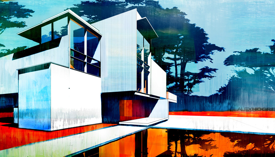
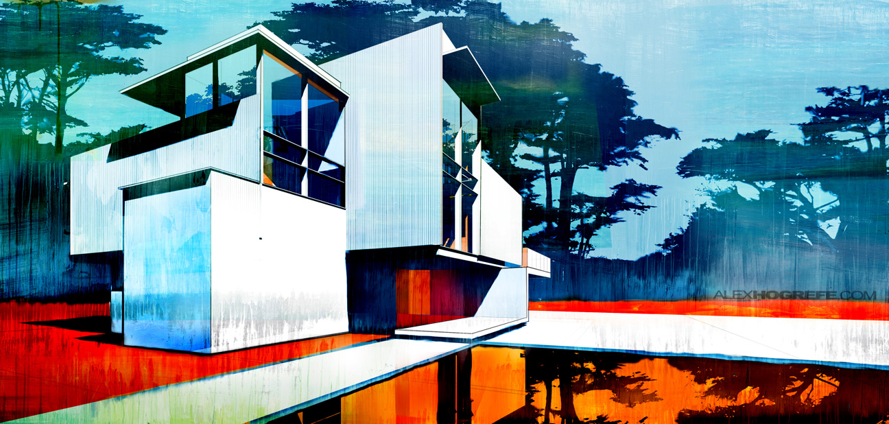
Every once and a while, there comes a time to produce an illustration that is a little more abstract in style. Such cases in the past included situations where the design wasn’t developed to the point that a full blown rendering could be produced, or where I really needed to grab the viewers attention such as with lecture series posters or website graphics. I find abstract illustrations to be the most intriguing and fun to work on because essentially anything goes. I can be more creative with the color pallets and not be so precise with the Photoshop work. I came across some paintings by Paul Davies that really had a beautiful quality and texture to them (would love to have one of his works hanging in my apartment). The guy uses amazing color combinations and the compositions of his paintings are spot on. I wanted to see if I could achieve a similar “attitude” by simply using shadows from a Sketchup model and a little Photoshop wizardry. While I’m not trying to fake my illustration to look like a painting, I find myself on this quest to experiment with representing the subtle nuances that paintings like Davies’ have and that computer renderings will never have. Some sort of hybrid that is on the fringe of both hand made and computer generated.
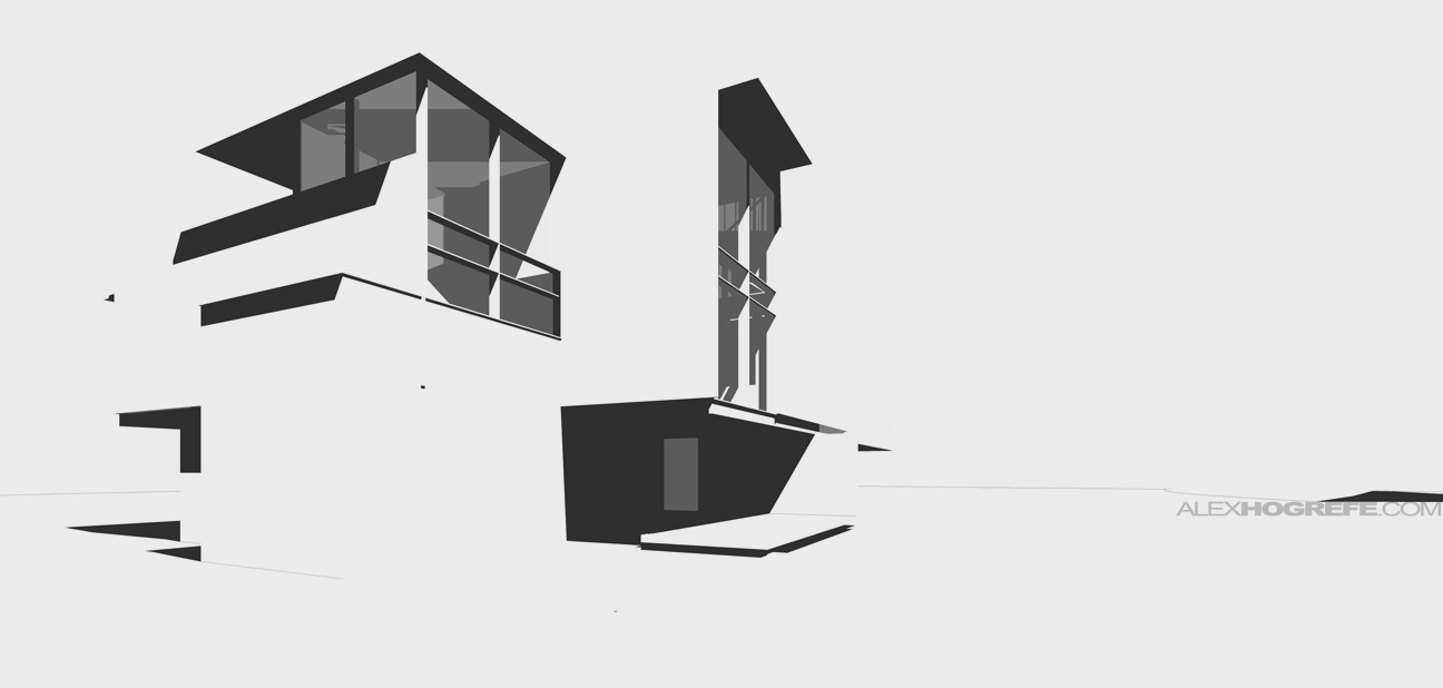
Above: Sketchup shadows export. In this case, the shadows were the only thing I needed from the 3d model. everything else would be done in Photoshop
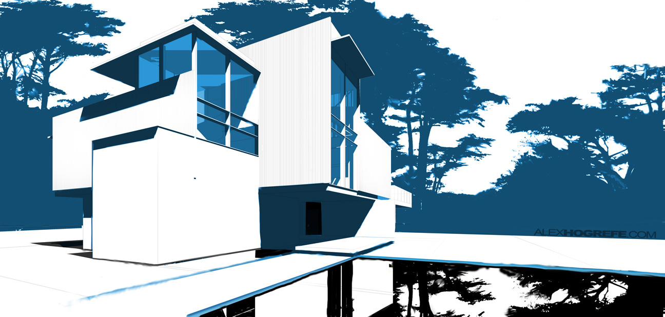
The background is the most important part of this illustration. The tree silhouette is comprised of four images of cypress trees I found in a google search. I adjusted the level of the images as well as used the burn and dodge tool to get the silhouette look. I then mirrored the trees for the reflection.
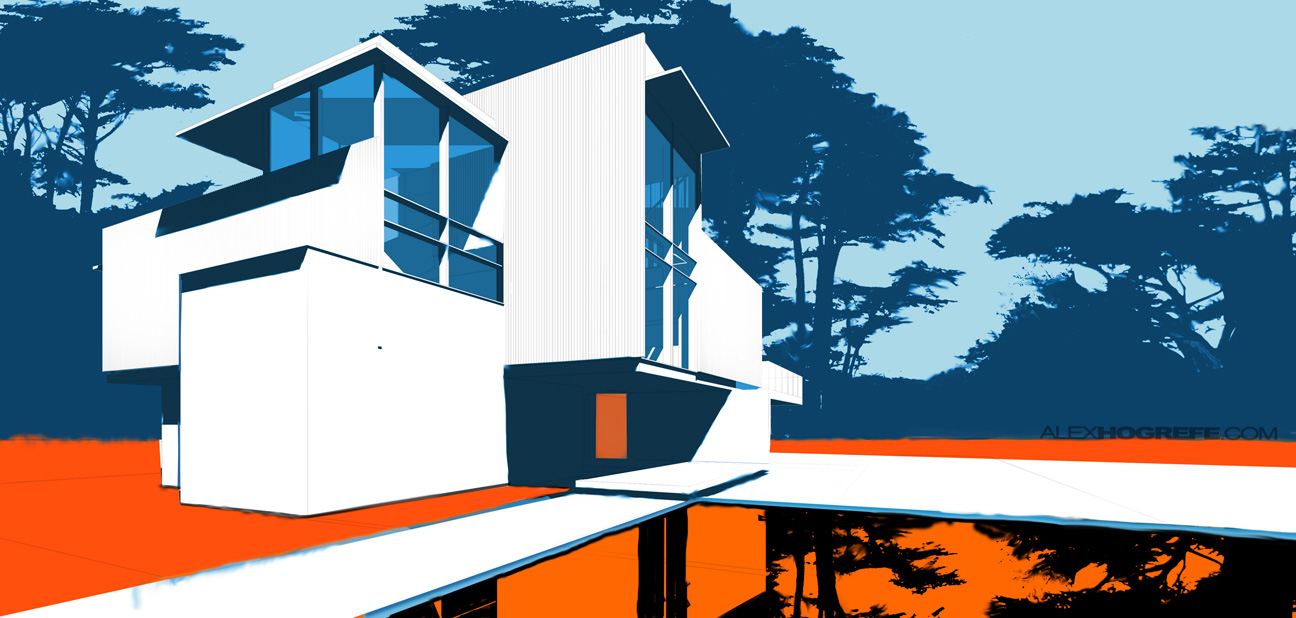
Once the overall layout was setup, I experimented different color combos until I found what I was looking for.
The final step involved adding textures, lots of textures. I let different textures overlap one another and really played them up in some areas, while not as much in other areas. I also spent some time with the smudge tool getting rid of perfectly straight lines and roughing up random areas of the image. I could have spent the whole day on this image. It’s one of those things that are never finished. Expect to see more posts on this topic later on down the road.


excelent!!! please a video for see your moves
your great….
good job again alex and good color selection.
You're a pretty genius guy. Your work is really inspirational, even as weird as it may sound to you.
Keep up the great work, because I can't wait to see more.
Just out of curiousity, do you use a digital drawing pen & pad when you work in pshop? Or just a good ol' fashioned mouse??
i think if you add people its more better
alex the image is excellent preceded me that did it a touch and a language of color and unique textures would believe that you can upload this video tutorial? thanks
Hi Alex again: congratulations! cool effect. This looks more simple than you other tutorials, because it don't have to be realistic (because this is abstract). But it isn't that simple to get this result I guess ;-). If I may give one comment (a little one :-)) … I don't like the 'water', in my opinion the water in the front demands all the attention instead of the modern building… but as i say this is my opinion don't worry it to much 🙂
Hi Alex I just wanted to say thanks for this tutorial. I teach sketchup and I love the creativity you have and I am planning on integrating photoshop further into my lessons because of your work. Your techniques are so useful and immediate. some of them are really magical Thanks
Hello , i recently found your blog and it is fantastic !
i`m actually studying Photoshop techniques for architecture illustration and you helped me a lot . I wanted to ask you something : Can i use your BASE images to develop them in my style and use them in my portfolio ? I will of course mention that the base projects are yours .
Thank you.