I have been really excited to do this post because it has been a long time since I have printed a portfolio and I have always been curious to see the quality that print-on-demand companies could produce. As much as I enjoy to work digitally, nothing beats seeing work in printed form. Pinups were some of my favorite times in studio and getting my portfolios back from the printer was always exciting.
I decided to test out several online p.o.d. companies and compare the positives and negatives of each. There is something really nice about being able to design a portfolio, upload it to a website, and have it delivered in the mail in about a week without ever leaving the computer. But with this convenience brings some limitations.
1. Sizes are limited. Not only are they limited but each company varies between the sizes they offer. I can understand the difficulties of offering custom sizes for print on demand services, but I had to reformat my portfolio twice just to test out the prints between the companies. Working with a local print shop, you can typically print any size and shape you want which is a big plus.
2. Paper and Cover Options. Most of the affordable p.o.d. companies only offered one type of soft cover, hard cover, and dust jacket. While the quality was not bad, options such as gloss versus matte were limited if not non existent. Changes in paper types and weight often meant large price increases.
The two companies I tested out were Lulu and Blurb. I wanted to test a third, Createspace, but the largest landscape book they could do was 8″x6″ which was just too small. I went with Lulu and Blurb mainly because of their pricing and well established history. During my research, these two companies were consistently at the top in terms of cost and usability. So with that said, here are my thoughts on the two companies:
LULU (Softcover)
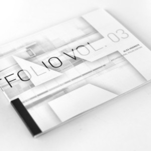
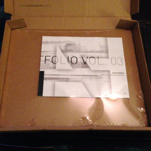
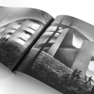
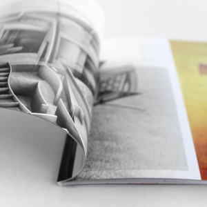
Lulu offered one landscape size, 7″x9″ that would work for the proportions of my portfolio. The paper that comes with this size is 80# semi gloss with a gloss 100# soft cover. There is no opportunity to use a heavier weight but they do give you the option to choose between perfect bound or saddle stitch. If you have over 60 pages, you need to go with perfect bound which is the better looking option in my opinion anyways. Because I am creating a 7″x9″ landscape, I am limited to these options but other orientations and sizes do offer more opportunities for customization.
RESOURCES: Lulu has its own software to create the portfolio or you can upload a PDF for them to print from. The PDF upload is what I needed to be able to completely design and customize my portfolio using the InDesign workflow described in the previous post.
QUALITY: The paper used in the book seems extremely high quality and had a nice matte finish. The cover has a gloss finish which grew on me over time but I would still prefer a matte finish on this as well. With that said, everything felt high quality and durable.
TRIMMING: There wasn’t any issues with the full bleed printing. The page trimming was consistent and accurate from page to page. The margins all appeared to be the correct size. The spreads aligned nicely though occasionally some were off about 1/16″ of an inch but not enough to cause concern.
COLOR: The Lulu book printed a little more saturated than expected. The oversaturation helped some images to pop, while over darkening others. This meant some detail was lost in the dark areas and in some cases printed black where I was actually showing gradients. Greys also printed with a slight warm tint. This was most noticeable on the cover that was designed to be completely desaturated. The color issues could probably be solved by tweaking the contrast/saturation and ordering more test prints. However, this can get expensive and waste a lot of time waiting a week for each test print to be delivered. For the most part, the quality of printing was well within reason and most would find the colors to be more than acceptable. The text in the portfolio printed very crisp even at such a small eight point size.
The cost for my 60 page book was just under $20 (not including shipping) which is, in my opinion, a good price for a high quality 7″x9″ all color, perfect bound portfolio.
BLURB (Softcover)
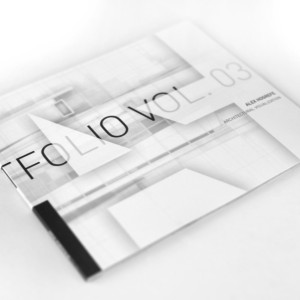
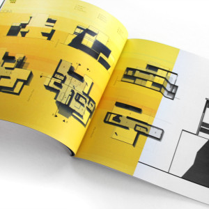
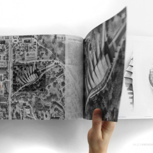
The Blurb book size I used was the 8″x10″. Compared to the Lulu 7″x9″, this feels a lot bigger and more substantial. Blurb defaults with 80# paper but gives options to use heavier weight if needed.
RESOURCES: Blurb provides a plethora of resources, the best being their InDesign plugin. This plugin generates the perfect size template with all the proper bleeds and margins based on the size and number of pages you choose. They also have their own software to create portfolios or you can upload a PDF document generated from InDesign or other software which allows for complete customization.
QUALITY: As with the Lulu book, the Blurb book had a similar high quality feel to it. The interior pages had a semi-matte finish as well as a gloss cover. Blurb has options to upgrade to premium papers but the price increases substantially with these options. Unfortunately, they don’t offer any other finishes for the soft cover. Overall, the construction of the book looked good and seemed like it could hold up well over time.
TRIMMING: The full bleed design looked great, but trimming was off vertically by about an 1/8″ on some pages. It’s something most people probably would not notice. I designed the portfolio to have some tolerance for trimming movement, but it’s something to be aware of if you are expecting the pages to be cut perfectly. There were also minor misalignments between spreads by about an 1/8″. With this said, the hardcover book that I will be talking about next was trimmed almost perfectly. I’m not sure if this had to do with the book binding or if it was simply because it was a different print job.
COLOR: I was pleasantly surprised with the color. Everything was almost dead on. The darks showed all of the detail and saturation was spot on. The greys did not have a hue to them but read as a true desaturated grey. Blurb provides a color profile that you can load into InDesign which allows you to calibrate the colors and preview before you send it off to print. I think this played a big role in allowing me to fine tune the colors exactly how I wanted them.
The cost for the Blurb soft cover 60 page book was right at the $30 price point. With the increased size, quality paper, and extremely accurate color reproduction, this seemed more than reasonable.
BLURB (Hardcover)
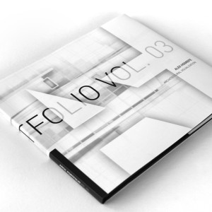

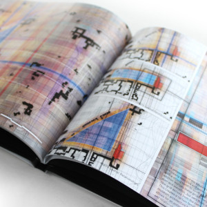
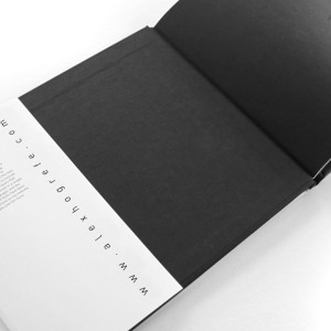
I also tried out a hard cover as a last second decision and I am glad I did. This ended up being the book I was most excited about. The hard cover added another level of quality and professionalism that you don’t get with soft covers. The addition of the dust jacket meant I had another opportunity to build in more design to the book. I can imagine the inside flaps of the dust jacket taking on many uses such as a place to introduce a resume or intro excerpt. For school applications, the hardcover may be a little much yet for the professional world and job interviews, it could be a nice touch.
QUALITY: Compared to all of the books I printed, this felt like the highest quality for obvious reasons. The hardcover had a linen finish with options to customize the color at an added cost. Because most portfolios aren’t thick books, the hardcover helps to give the book a more substantial feel and weight.
TRIMMING: For whatever reason, the pages for this hardcover book trimmed much more accurately than the softcover Blurb book. The margins were near perfect and the spreads aligned really well.
COLOR: Similar to the softcover, the coloring for this book was very accurate. I have printed a lot in my lifetime and I was more than pleased with how accurate these colors were reproduced.
The cost jumped another $10 going from a softcover to hardcover with dust jacket. This increase may or may not be worth it to some, but I came away impressed with the final product.
CREATESPACE (Softcover)
I didn’t actually do a test print from this company because they didn’t offer a size that worked for me, but I still wanted to include them in the list. The reason being because if I had created an 8″x10″ portrait oriented portfolio, I could have printed the entire book for $6. From my research, they use a 60# paper and a similar glossy softcover to Lulu and Blurb. I prefer to design landscape oriented portfolios, but I am not completely opposed to portrait orientation. I have seen them done well in the past and I may give it a go for my next Vol. 4 portfolio. I am curious if anyone has ever used Createspace before and how their experience was. The company is Amazon owned, and at that price point, hard to ignore.
PORTFOLIO VOL. 3 AVAILABLE TO PURCHASE
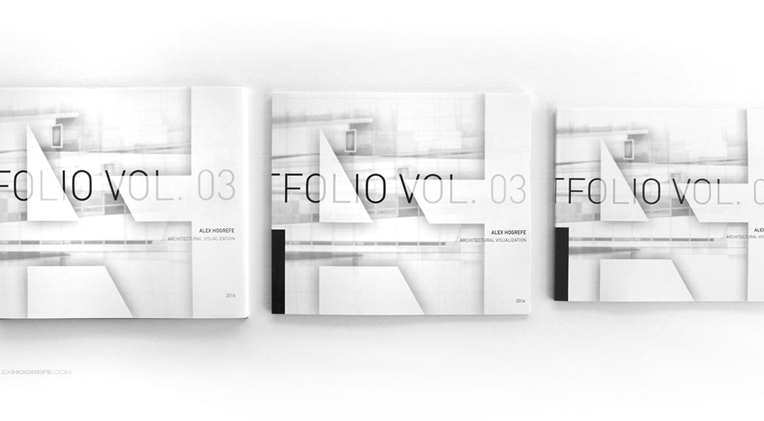
I am really excited about how the Portfolio Vol. 3 turned out and thought it could serve as a helpful resource to those creating their own portfolios. I have reworked the “Portfolio Design” section of this site so that all of the Portfolio Vol. 3 posts are in one place and easy to find. The final printed portfolio will serve as one more resource on this site to aid in portfolio creation.


Hi Alex,
Do you know where i can get my portfolio (interior) reviewed with feedback. I am having difficulty with layout and making it graphically clear and easy to understand for large scale project such as hotel design.
Thanks for the round up – very helpful!
The book printers happen to be an integral part of publishing industry. Well renowned book printers play a vital role in conferring grand success to the books.
Hi Alex,
Would you know where I could go about printing and binding my A3 portfolio here in the US?
-Thanks
Hi Alex,
What paper weight did you choose for the Blurb soft cover, would you chose that again?
-Thanks
@Pax,
Honestly, Im not sure. You would probably need to go to a local print shop and do something custom. Createspace also does a lot of custom sizes.
@Joey,
I used the standard paper weight (80#). It has a great feel and weight to it, and am more than happy with it. I really don't think it is worth the extra money to go with the 100#.
Bought the soft cover portfolio (received it in 7 days in Europe) and it looks amazing, nice touch, great colors and, obviously, lovely design.
Good to know to print my own portfolio in a near future.
@NM,
Thanks for the update and kind words. That's great to here!
Hi Alex,
Do you remember the time it took from when you ordered your portfolio from Burb to be printed to when you actually received it? I just printed my own portfolio from Blurb and it says I'll received it in 2 weeks or earlier. Do you think it will take the full 2 weeks to get to my house?
Thanks,
Anne
@Anne,
I think it most likely will take the full two weeks. I remember it took about 2 weeks to get my first print.
I am trying to figure out how to design the spline via Lulu (Blurb although easier to understand, takes 8-12 days for UK Delivery at a cost of roughy £10!) – It states the measurements based on the number of pages your book will be – Do you just add this number to either the front or back cover? Thanks.
Thanks for this review Alex! The portfolio looks great!
Found your feedback while looking for places to print my portfolio. Thank you so much! They look absolutely great!
HI Alex,
your site is very helpful , thank you.
but i want to create online portfolio.could you set up a tutorial in this subject?