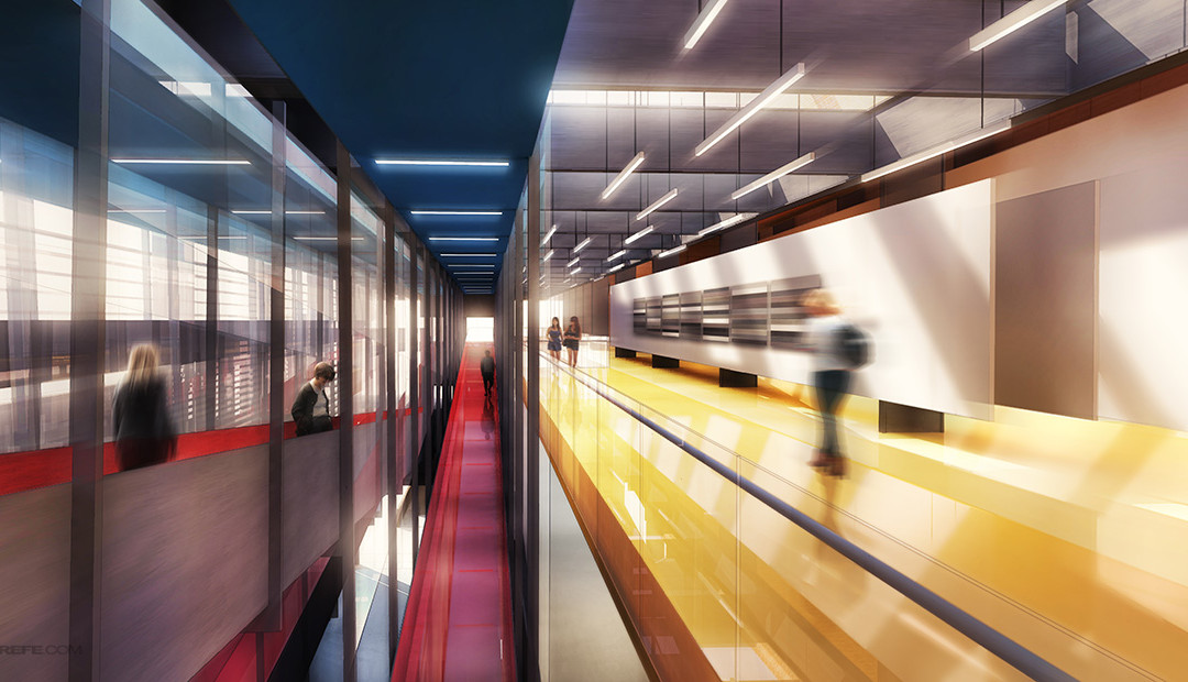
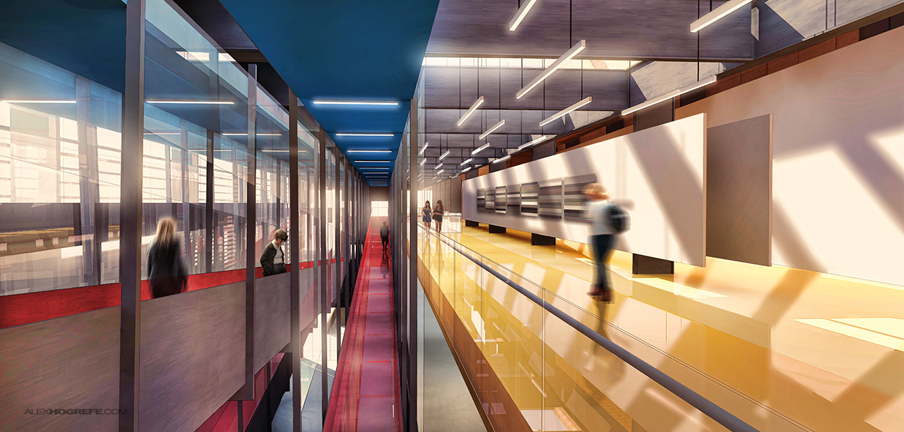
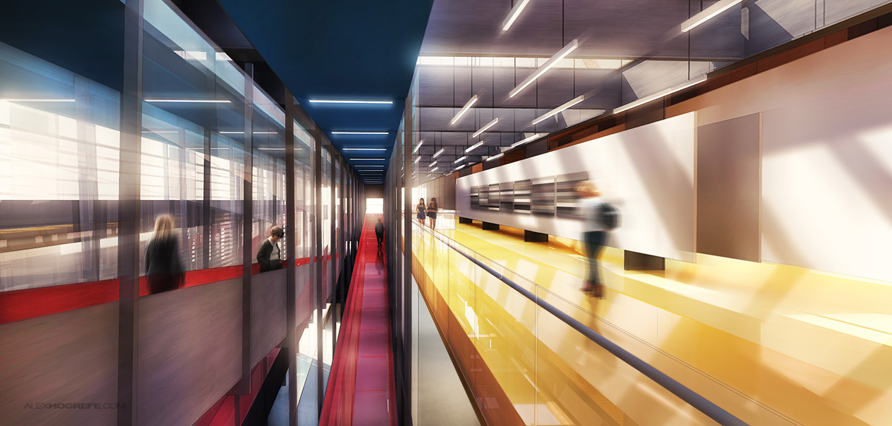
I don’t use blurring techniques that often but every once and a while, I come across an illustration that needs a little extra kick. This was the case with the interior illustration introduced in the last post. The shot was looking down a long and narrow space with all of the lines converging to the center. I’ve never used radial blur before in an illustration but I had seen it done in the past and the effect seemed appropriate in this situation.
The breakdown is as follows:
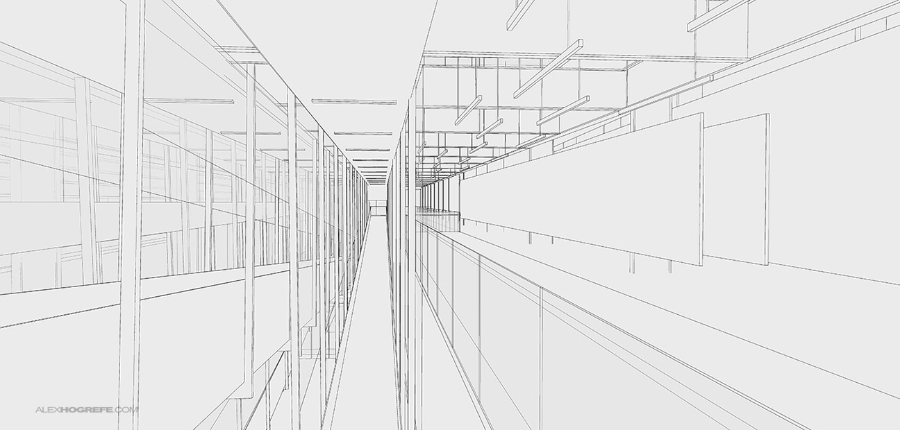
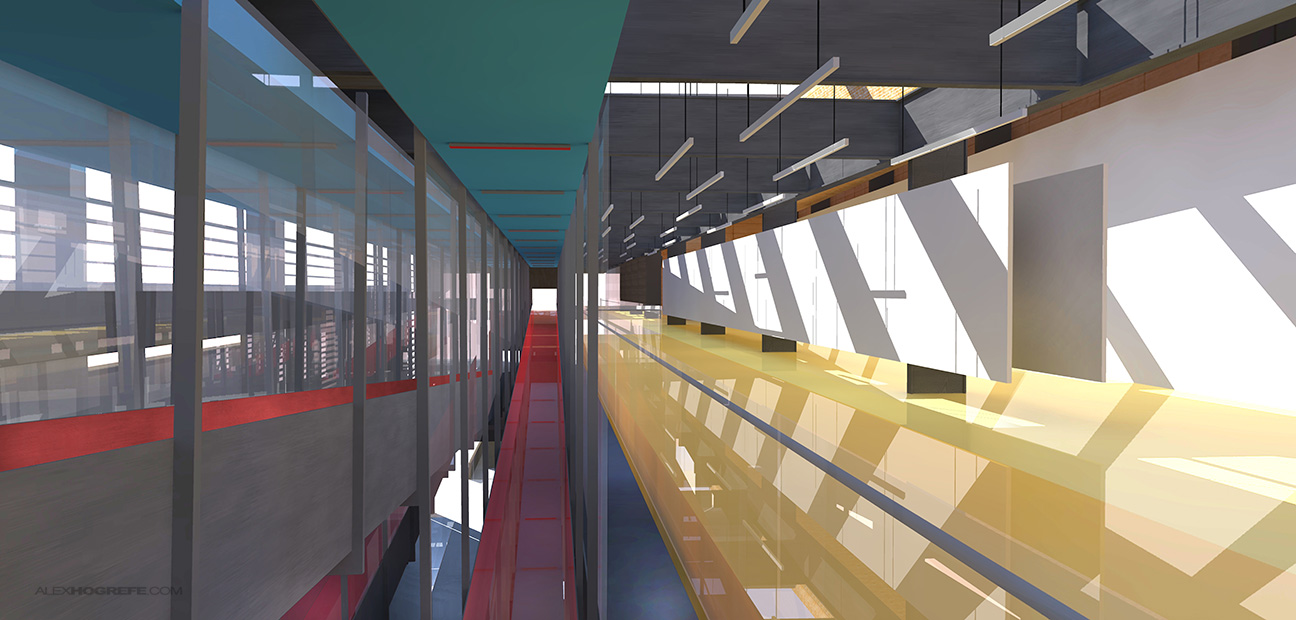
1. As always, below is a screenshot of the Sketchup model line work and the base rendering. I looked at a ton of views before I settled on this one. Instead of fighting the long and narrow space, I embraced it by looking directly down the center. I liked the idea of having the lines converge in the center of the image. It encourages the eye to start in the center and spiral outward from there which I thought was a great way to read the illustration.
Sketchup line work.
Base rendering done in Kerkythea.
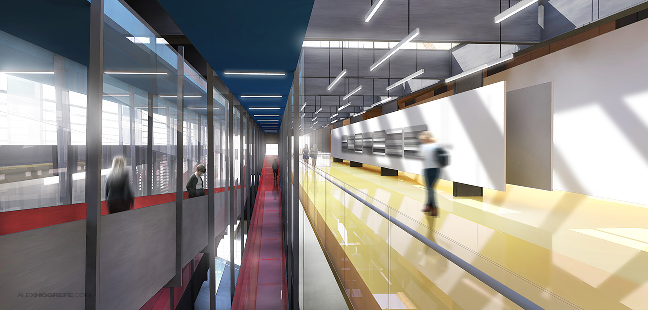
2. Once in Photoshop, there was a lot of work to be done. I began with the lighting, adding a little glow and adjusting the fixtures. I also tweaked the colors, punching them up in some areas and toning them down in other areas.
3. Next, I used a Photoshop plugin called “Topaz Adjust”. It’s something I’m starting to use more often in my workflow for color adjusting as well as bringing out detail in the image. In this case, I added some warmth to the color tones and gave it a subtle HDR effect.
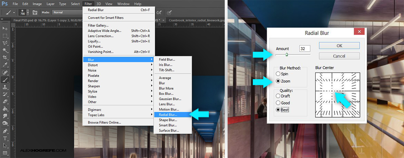
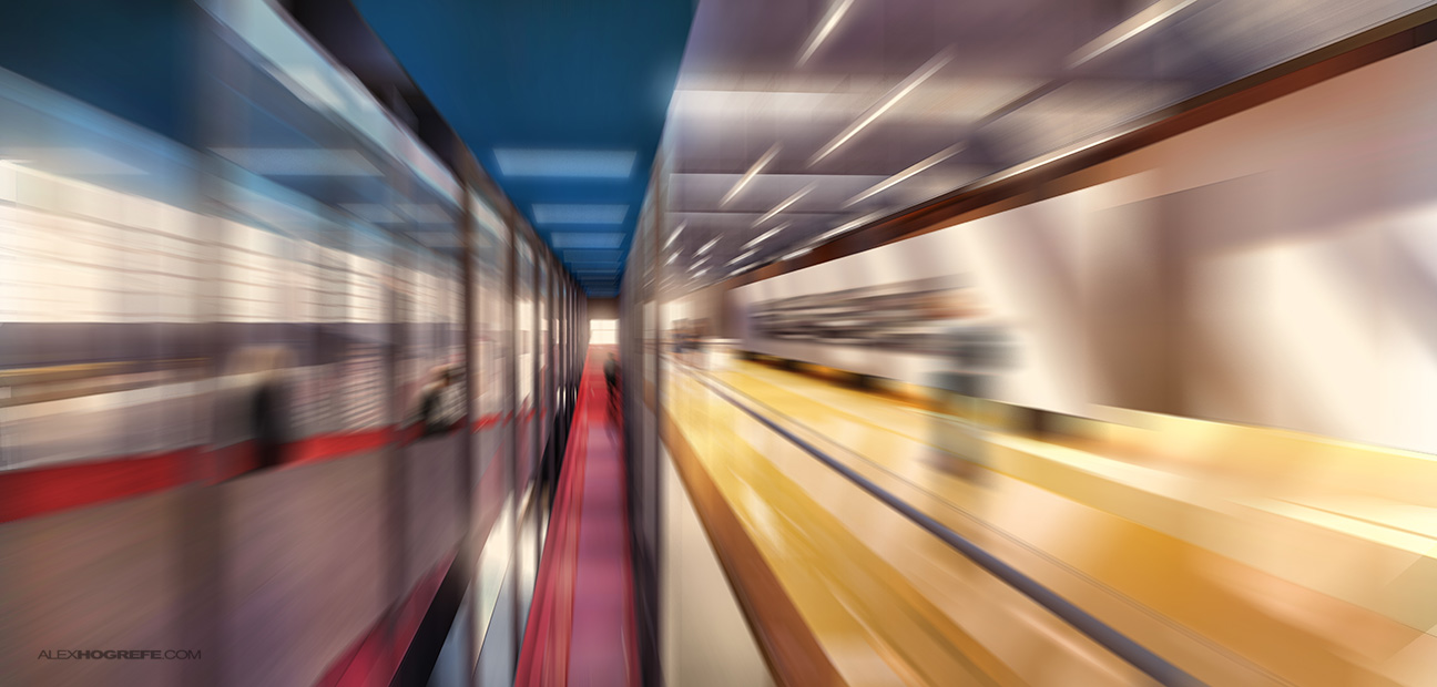
4. This was the point that I thought the image needed something extra. I like the idea of creating the feeling of moving through the space in which case I would typically use the motion blur filter. However, motion blur doesn’t work in this situation since everything is converging into the center. This is where radial blur comes in. There are a couple of things to note in the settings. Be sure to duplicate layer that is being blurred so that the original layer is left untouched. To get to the filter, go to “Filter>Blur>Radial Blur.” In the “Radial Blur” dialogue box, be sure to select “Zoom” under “Blur Method”. Also, the center of the blur may need to be adjusted as was the case with my illustration. The center of the converging lines is not directly in the center of the Photoshop canvas. You can move the center of the blur by clicking and dragging inside the “Blur Center” box. Depending on how much blur you want, you will also need to adjust the “Amount” slider.
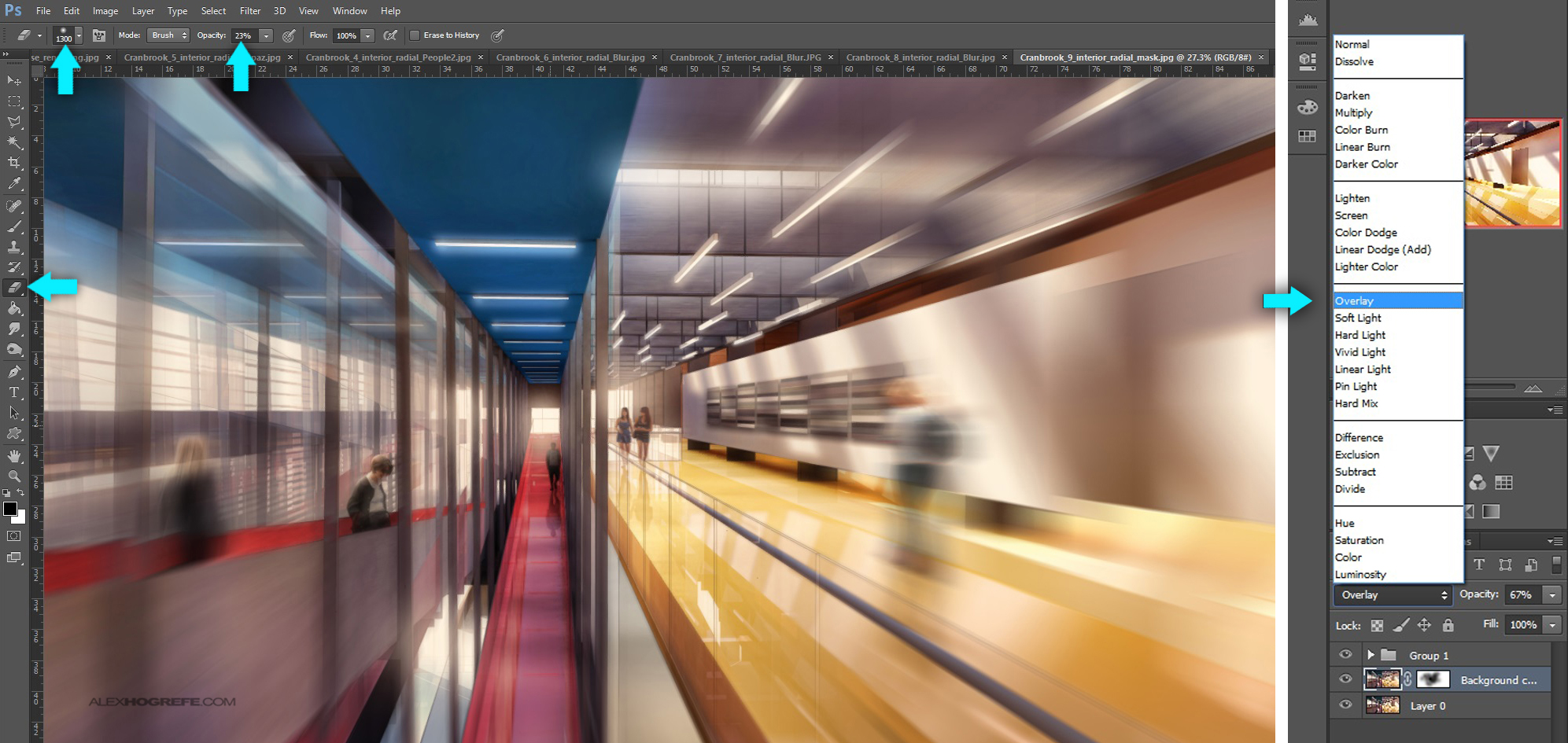
5. There are a couple of ways to tone down this affect and apply it to the original “unblurred” rendering. Since the original rendering layer was duplicated, you could simply lower the opacity of the blurred layer and let the original rendering layer show through. Instead, I erased the center of the blurred image with a soft brush so that the blur was stronger around the outside (it’s always better to use a layer mask instead of erase, but for simplicity, I’m showing the eraser tool). I then set the layer blend mode to “Overlay”.
The final effect is subtle, but adds a nice kick to the illustration. Its one of those tricks that only takes a few seconds to try. If it looks good, you keep it. If not, at least you didn’t waste a lot of time testing it out.


Very nice soo nice and trippy haha!!
Great portfolio!
Was wondering what size your portfolio is and what size and resoultion do you keep your images when you render? (ex. 3300x2550px)
GREAT JOB! NO WORDS TO SAY!
nice process . . .
Hi Alex, have been following your blog for a while, really wanna know how could you get so detailed in sketchup, can you give us some video about how you did that?
If you like Topaz – take a look at Red Giant's Magic Bullet Looks. I found it to be more powerful. Great work on your site – thanks for sharing your knowledge!
Great job! Can you possibly make detailed tutorials about Topaz plugin?
I vote for a topaz tut
I’m a student in my final year for Interior design and I just love this website. I just wish I had come across this before. But thank you this is great help!
Excellent job!