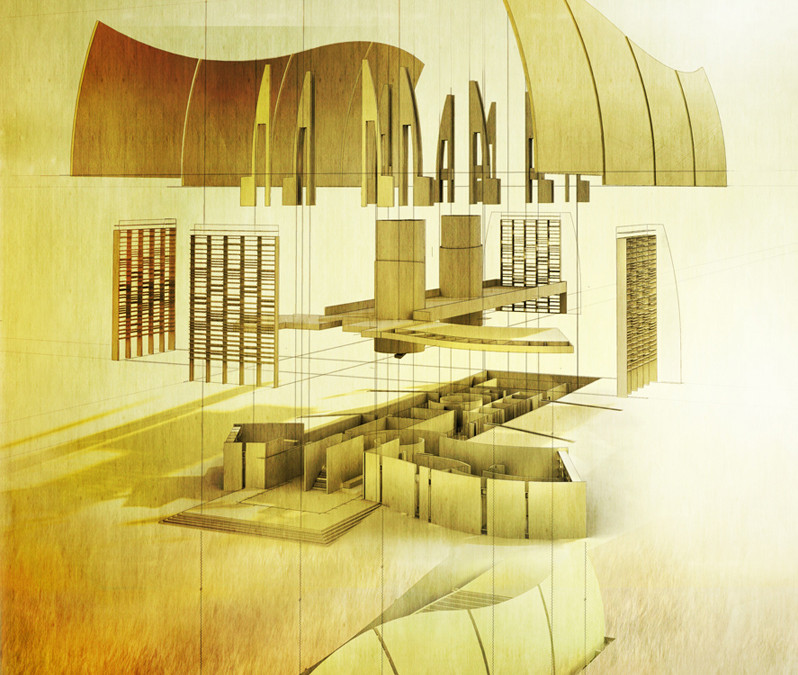
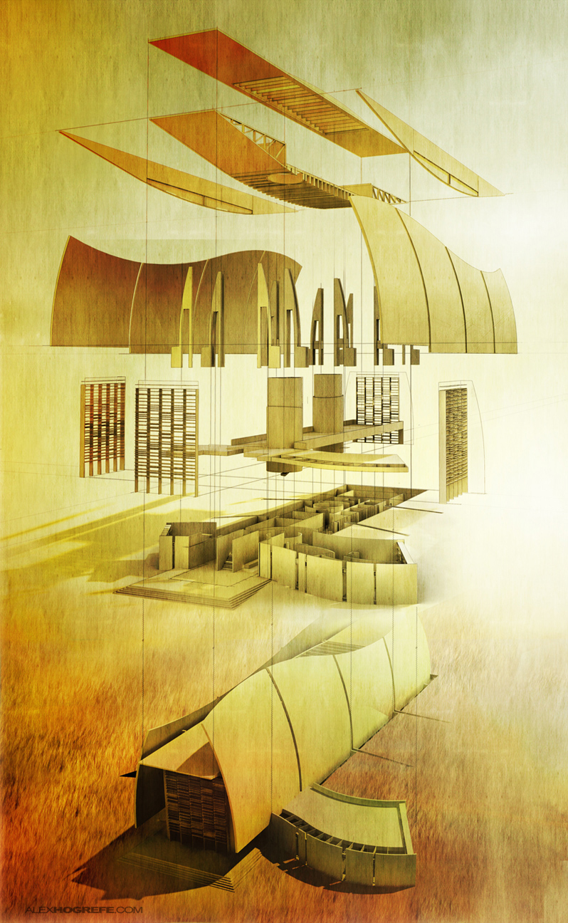
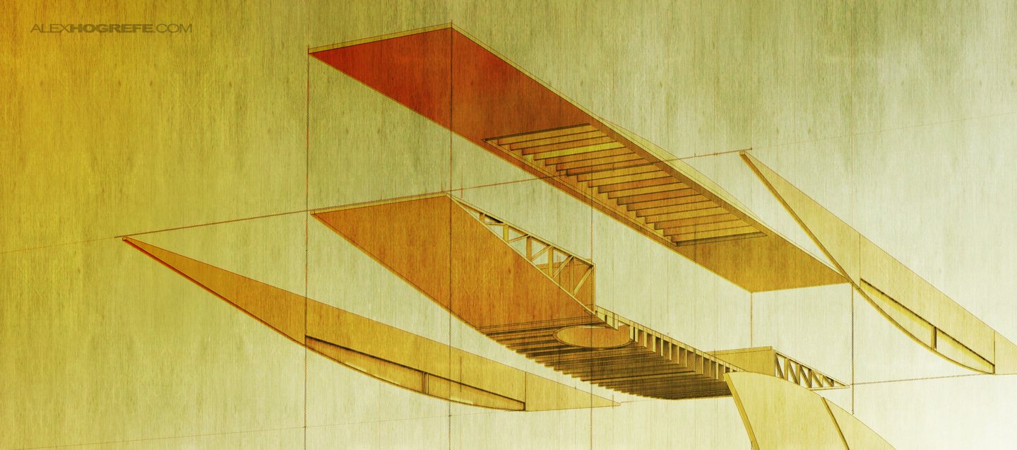
I have always been intrigued by exploded axonometric illustrations. They add a kinetic aspect to what is typically very stagnate fixed objects. Even more though, I like how a successful exploded axon depends on a clear understanding of all the elements of a design, not just a single facade or dramatic interiors by themselves. Instead, this type of illustration emphasizes the relationship between the different elements and the role each element plays to the larger whole. I liked seeing these types of illustrations in presentations because it shows the audience that the techtonics of the design have been thought through.
I started out with the above illustration not really knowing what the end result would look like as is typically the case. I explored different ideas such as separating the building more horizontally or going with a simplified diagrammatic look. I then decided on placing the complete design at the bottom with a copy of the exploded elements above, located at eye level. I went this route for two reasons. First, this allows the viewer to relate the exploded elements to the unexploded design clearly and easily. Also, by placing the unexploded building at the bottom of the page instead of to the side, the focus remains on the exploded elements at eye level.
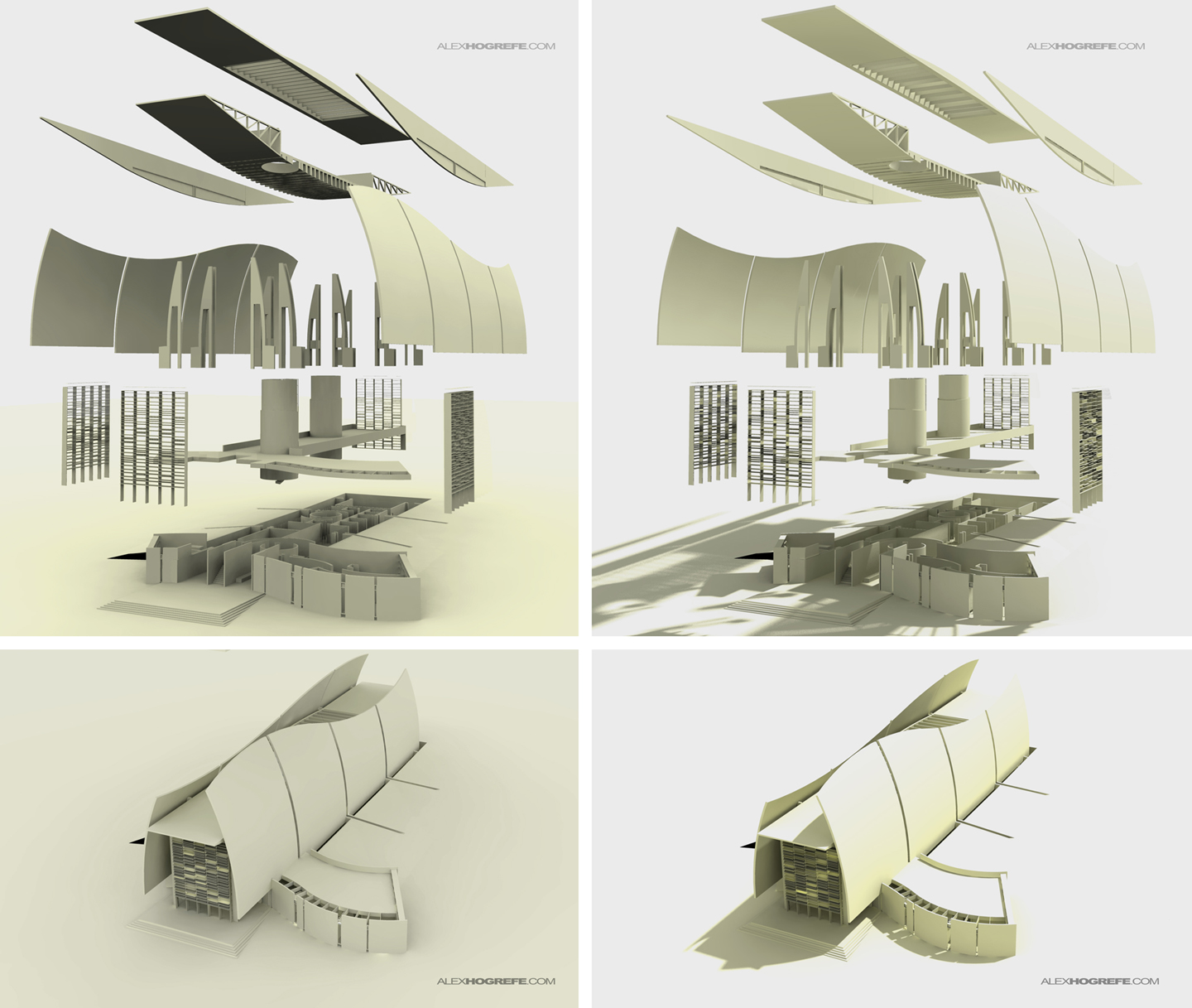
I broke the rendering up into two images so that I could render at higher resolutions. I also did this because I rendered a ground plane in two areas. If I would have rendered everything together, the unexploded building would have been completely in shadow by the ground plane above it. You can also see that I did two shadow styles, one with soft shadows and one with hard shadows. Like I said at the top, I wasn’t sure where the rendering would go at the beginning of the process, so I wanted to have both options to experiment with. In the end, I combined the two which allowed me to extract detail in areas where the other was to dark or didn’t render correctly.
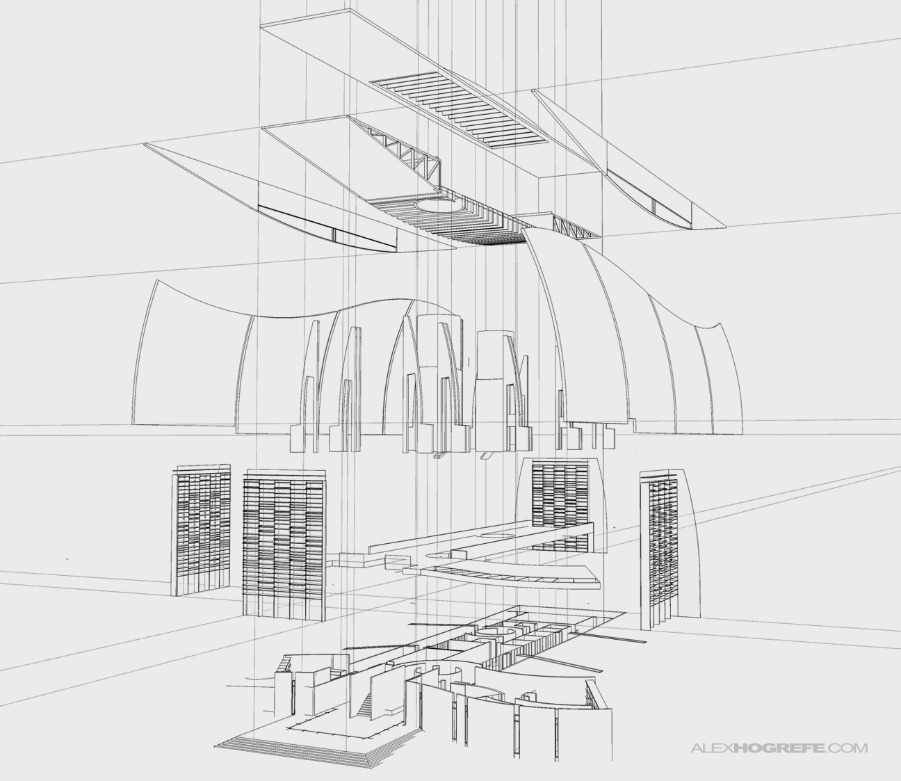
Exploded axons are easy to create if the 3D model is built correctly. When I build my models, everything is grouped. There typically isn’t one surface in the model that is not grouped or not made into a component. I also have a clear hierarchy of groups so that large systems such as walls, roofs, or the structure can be moved out of the way for easy editing. If I have any advice for creating clean models in Sketchup, it’s to group like crazy. Using layers is not the same as grouping either. I usually only use layers to quickly turn off and on large group items to test out different scenarios or to temporarily turn off poly heavy objects such as trees while I model. However, I don’t use layers to call out different elements such as windows, doors, walls, etc. Back to the exploded axon, once the groups are established, exploding the geometry for the illustration takes no time at all.
Because the model didn’t have any materials or a ton of geometry, I was able to render at much higher resolutions without extremely long render times. I’m guessing each rendering took about 20 minutes.
Exploded axons have a lot going on, so it didn’t seem necessary to have a busy background. Instead, I focused on color and less on content for this aspect. The site is very serene and I like the idea of just seeing the unexploded building at the bottom sitting quietly in the field with all of the action happening above it via the exploded elements. I didn’t want to see the horizon so I washed out the background and made it appear as though there was a large sun glare which helped tie all of the elements together.



Do you just move each group a set distance to what looks best? or do you have a plugin ?
looks great as always!
Great job as always. No video lately:(
Regards
@Don,
I just manually moved the items a set distance based on what I thought was the best spacing visually. No plugins were used.
@Juancamiloarq
It has been a while since I made a video. Summers tend to get really busy for me and the videos are a little more labor intensive than traditional posts. I hope to create a few more here shortly though.
Hi Alex,
Did you take your exploded axo into Illustrator to get your wireframe dwg?
thanks
Nice work. I have used your example in an architectural class, with references of course to your site. The composition is great, between the coloring, the easy to follow construction lines and even the details such as lighting and shadow. A pleasure to view.
Hey Alex,
I have noticed you use construction lines quite often. Exactly how are you making those. I know with guides in Sketchup you get dashed lines. I am just curious.
Thanks!
@schu
The wireframe is a direct export from Sketchup. Illustrator was not used in this illustration
@Robert
I exported the guides separately from Sketchup. I then blurred and lowered the opacity of the guides to help remove the dashed look.
It would be great to see the "making of" process of this beautiful explosion.. Thanks for sharing your illustrations!! I am a big fan of your works 🙂
Hei Alex, first of all, THANK YOU SO DAMN MUCH for all you've done with your site!!!! I think I speak for (probably) thousands of people to whom your work has helped and influenced in an incredibly enormous way.
YOU'RE GREAT.
Regarding this post, I'd like to ask you, specifically concerning the image where you see the axonometry with soft ang hard shadows (left and right, respectively), how can you get those hard shadows and render quality on the right? I follow thoroughly your sketchup to kerkythea clay tutorial and just can't achieve the same level of perfection and smoothness. Are there any extra options that need to be altered?
Thank you an awful lot for your time, attention and knowledge!! Really sorry to be bothering you!
Have a great weekend!
Hi Rick,
I would look at this tutorial instead of the clay rendering tutorial. It may answer some of your questions about shadow settings. http://www.alexhogrefe.com/kerkythea-tutorial-part-2/
Also note that I tweaked the levels in Photoshop to increase the contrast.
Hi there…first of LOVE you work! Just wondering after you had the sketchup model made, how long did it take you to do the axonometric from it? I probably wanted to be as efficient as you but just a general idea would be a help..Thanks, Mel
hi Alex !Do you know how to get this AXO image in rhino?
THX!
this is not an axon 😉 it has a vanishing point, so it is a perspective, but nice work!