One of the images not initially generated for the Philly Bridge Project was the south side of the pedestrian bridge. Here, the bridge turns into a park-like setting with lots of trees, vegetation, and a grand stair connecting down to the street level. This was an important view because of the bridges connection to the convention center and the activities that are formed around this relationship. I therefore started looking at potential views that would tell the story of this place. I struggled deciding on a single view because of all of the information this illustration needed to convey. Below are some of the options that I looked and my thinking behind them.
View Option 01 and 02: Street Level Looking North and West
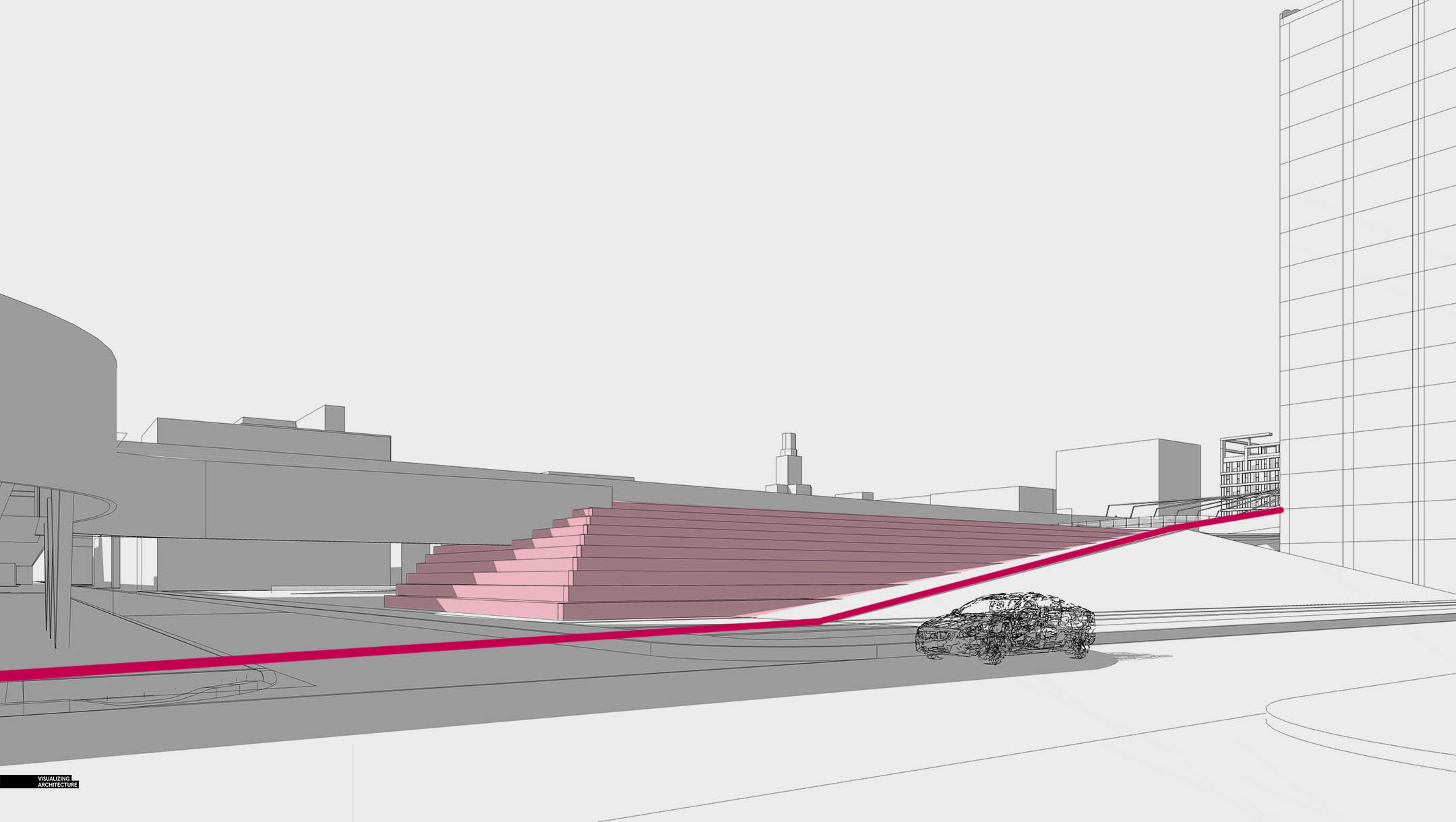
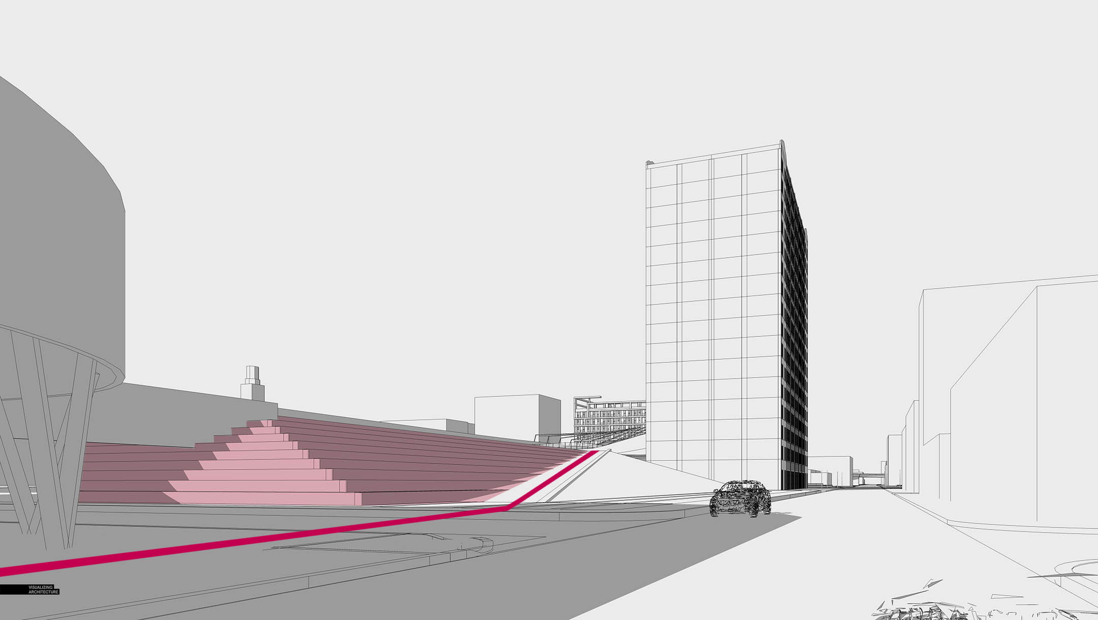
The first set of views that I looked at were at street level looking up the tiered seating. The problem with these angles was that too much of the upper level was out of view. The view looking more down the street was more interesting to me, but both images felt too disconnected from the “action” happening at the upper level. Compositionally I liked them. They just were not succeeding in telling the story of this area.
View Option 03: Street Level Looking South
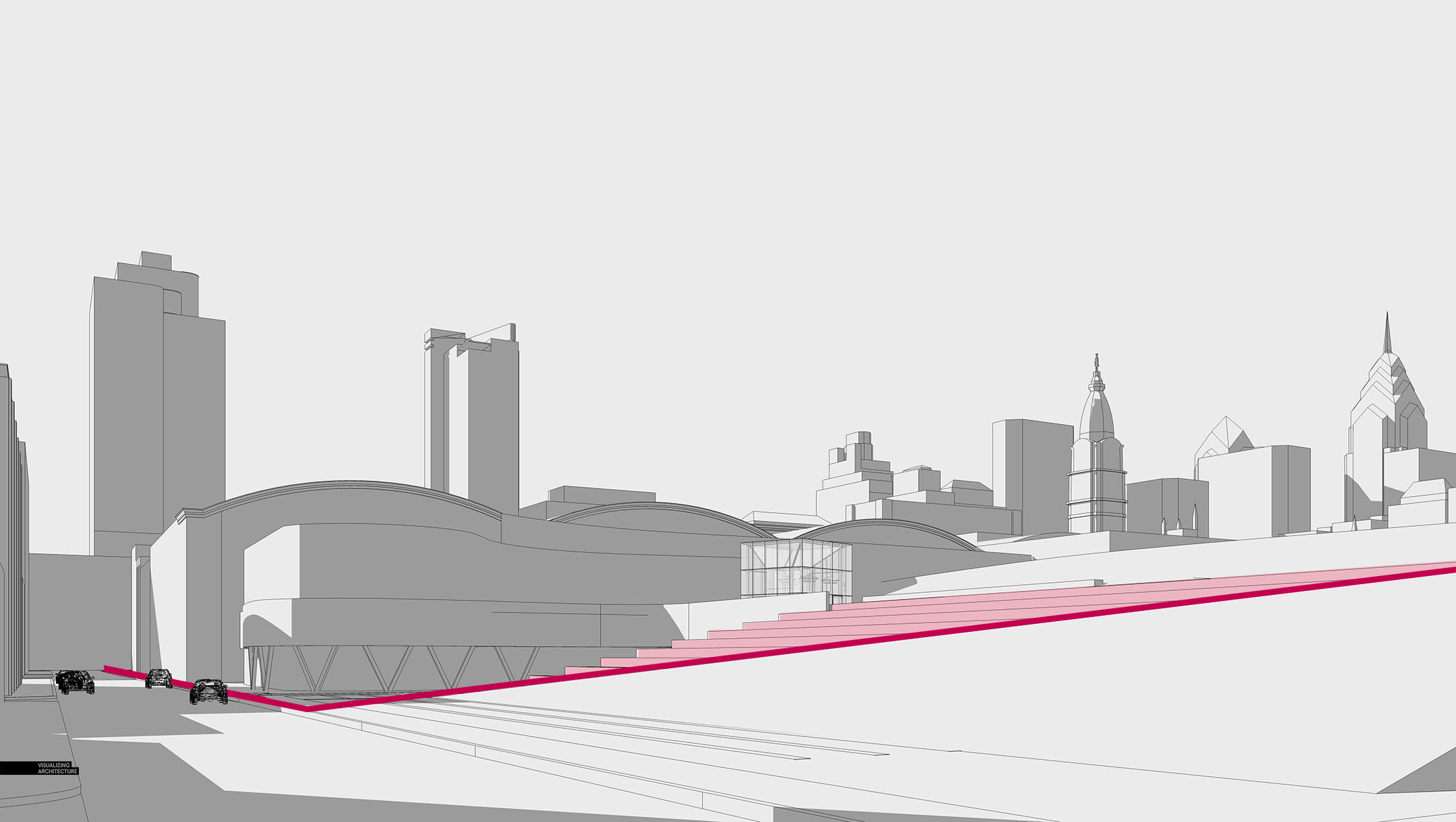
A key idea of this zone of the pedestrian bridge is how a large proportion of the foot traffic will flow up and down the ramp and wrap around the convention center as marked by the dark red line. This view shows this relationship well and I liked the idea of placing the large sloped grassy area in the foreground. However, similar to the other street level views, I still felt it was too disconnected from the upper terrace.
View Option 04 and 05: Aerials
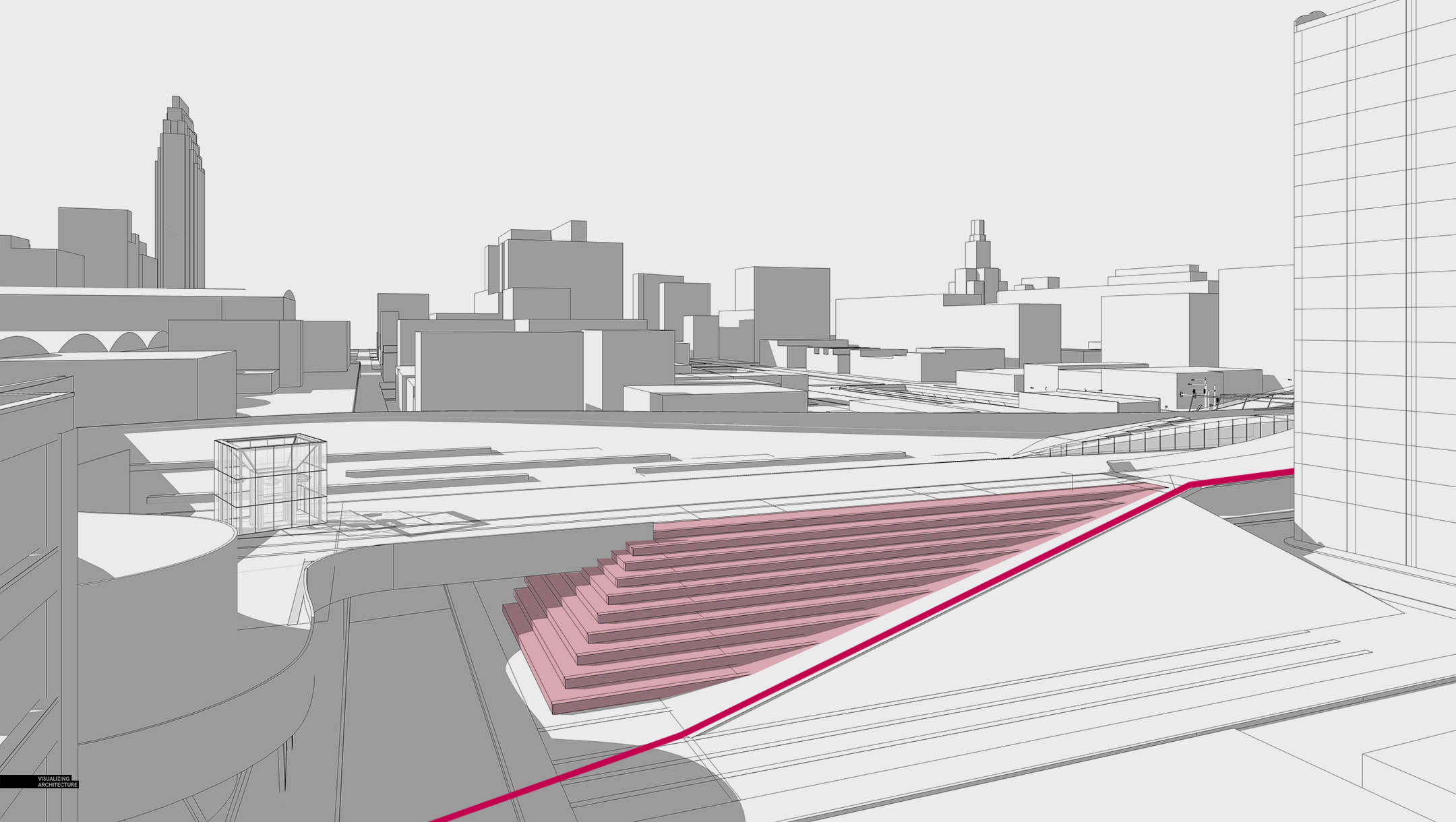
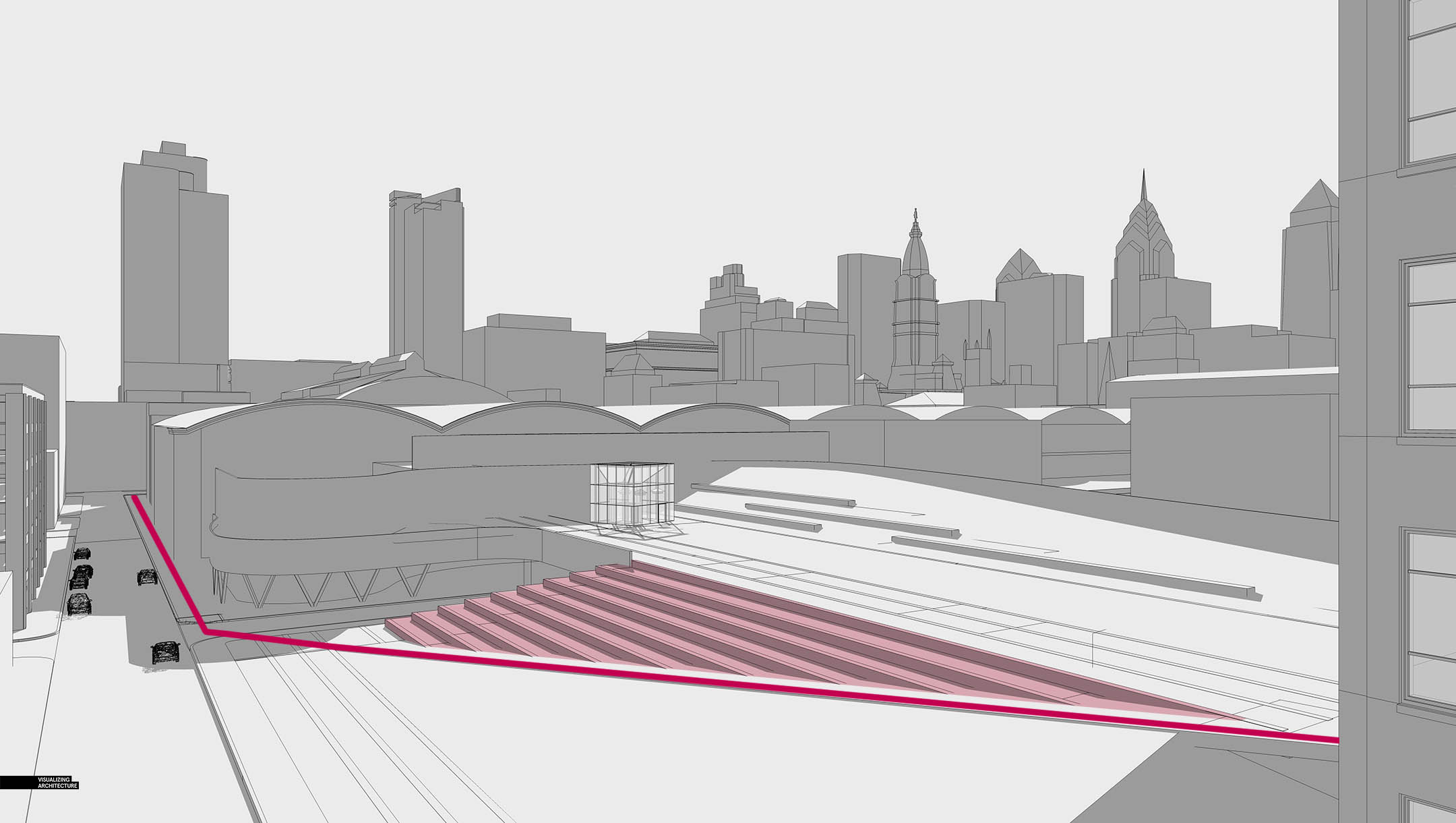
Next, I looked at some aerials views. The aerials did a good job of clarify all of the geometry and probably explained this area of the site the best. However, there were two problems. First, there was a large amount of context that I would need to define. I had limited time to generate this image and I couldn’t spend all of it on the city in the background. The other problem was that the aerials did not feel intimate enough. This is the case in general with most aerials. I wanted the viewer to really connect with the space and feel like they were there. These aerial options, while compositionally interesting, would not have provided that intimacy I was looking for but instead, would have felt more diagrammatic.
View 06: Upper Level
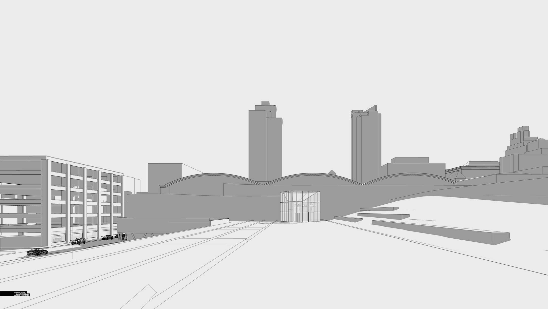
I moved the camera to the upper level since this is where a lot of the action would be happening, but the tiered seating ended up being steeper than expected and was completely cut out of the view. I needed to get pretty close to the edge for the seating to appear again. I looked into placing the camera on the hill to the right, but it still was not high enough to capture the seating.
View 07: Raised Upper Level
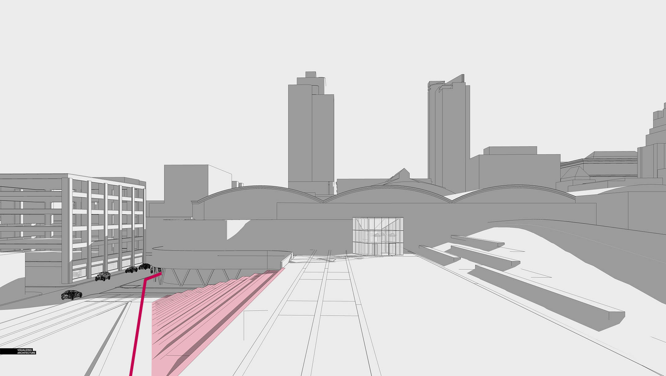
One option to get the tiered seating into view was to raise the camera. While this was closer to the ground than the other aerials, the same problem remained. The view felt too disconnected from the project and was at a vantage point that visitors would not experience.
View 08: The Chosen One
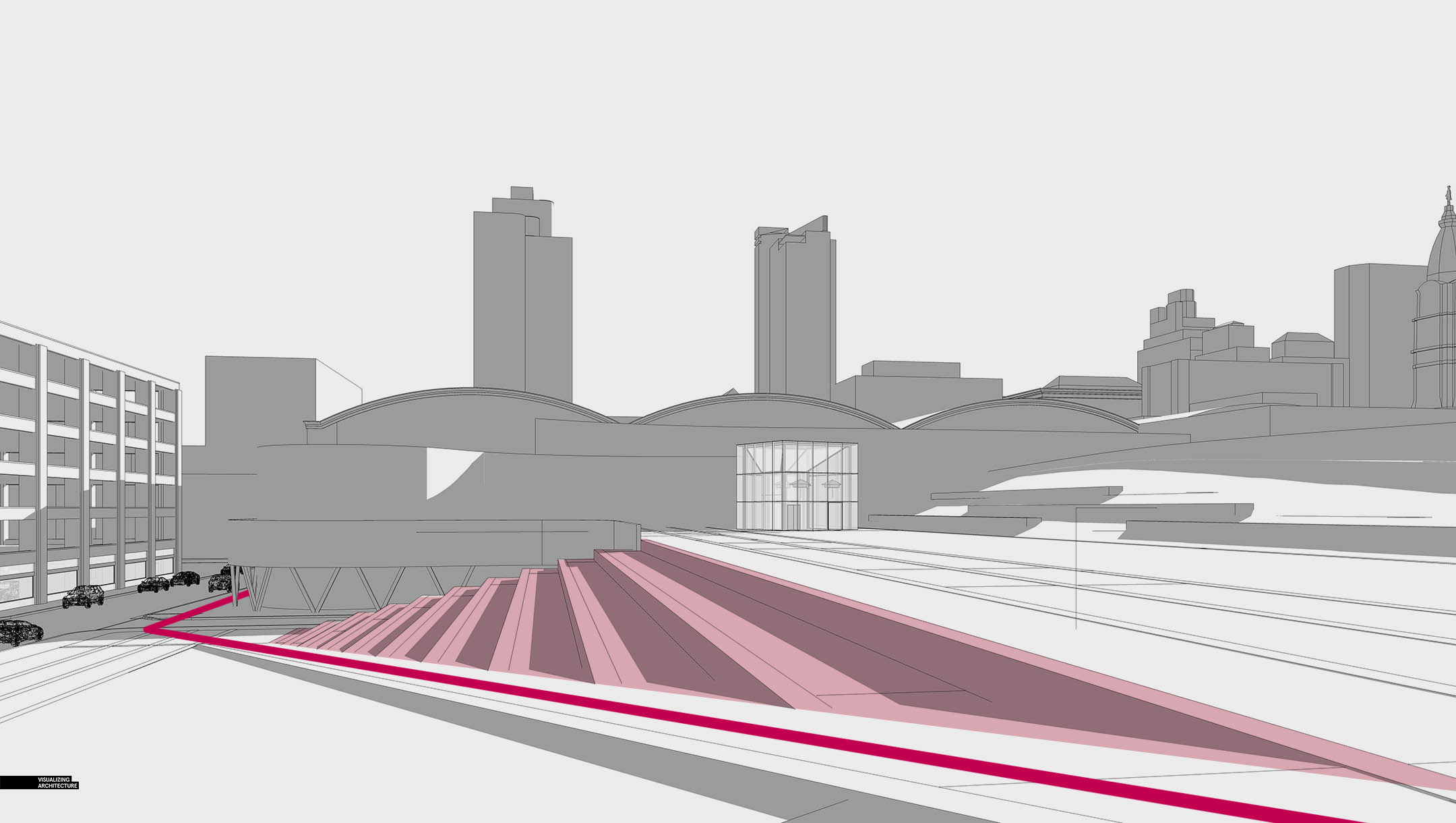
Ultimately, this view checked all of the boxes. Compositionally, it wasn’t my favorite, but it told the best story. The ramp cuts across the scene and wraps around the convention center. The upper level is in view as well as the tiered seating and large grass hill. The viewer can see the relationship of the bridge to the Convention center but the bridge is still the focal point. I also knew that I could use the trees and people to help frame the view and strengthen the composition.
V-Ray Rendering

With the view decided, I rendered out the base image. As I mentioned before, I didn’t have a lot of time to piece this illustration together. The model was simple, but I did take some time to add some details to the ground plane such as the stone edging. Most everything else would be handled in Photoshop.
Photoshop
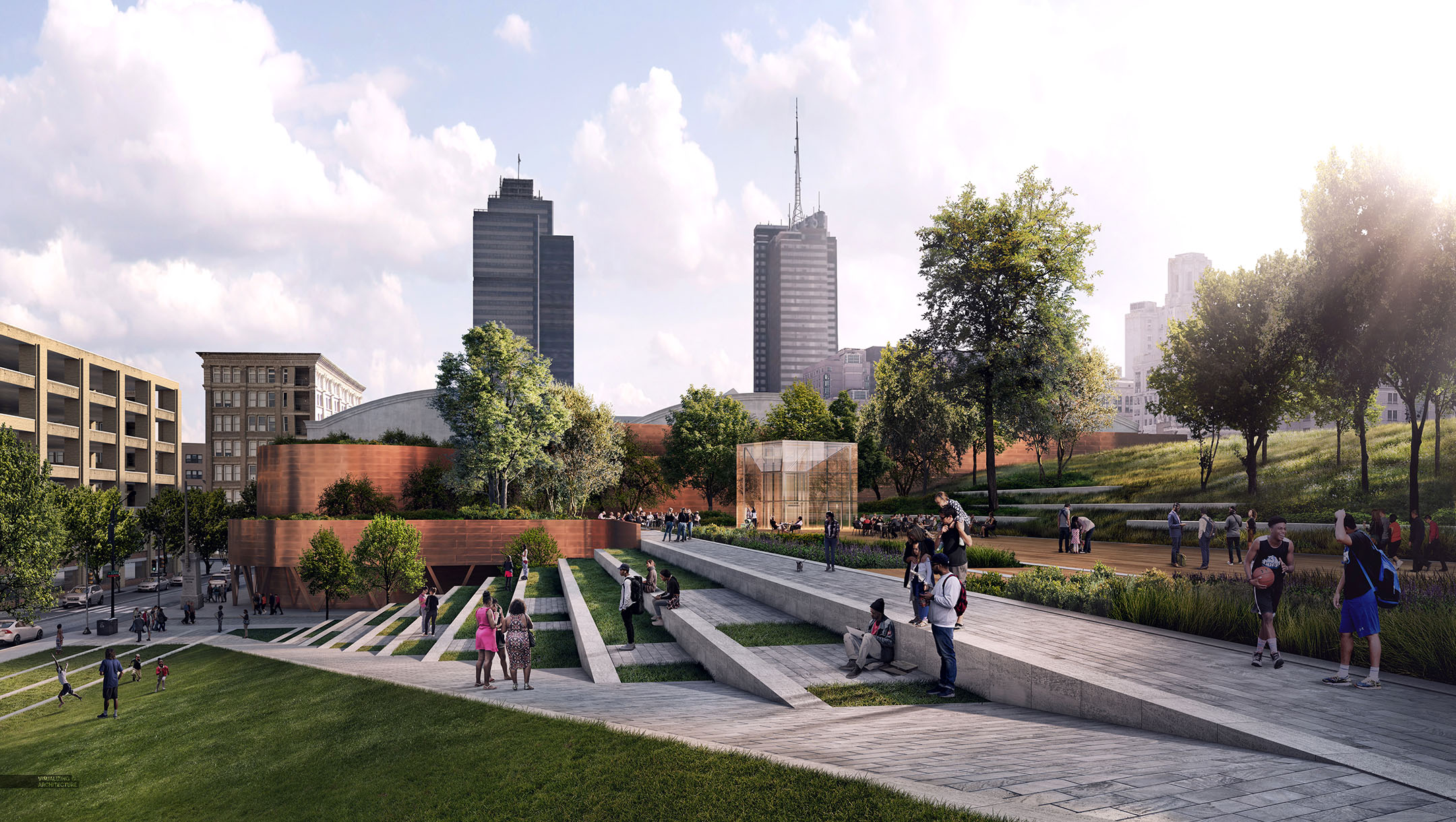
There was a lot of Photoshop that went into this illustration. The vegetation was intense, but helped add lots of texture to the image. I wanted the space to be activated, but I didn’t over-do it with entourage. With so much going on in the image, too many people could have hurt the flow of the scene.
Black and White
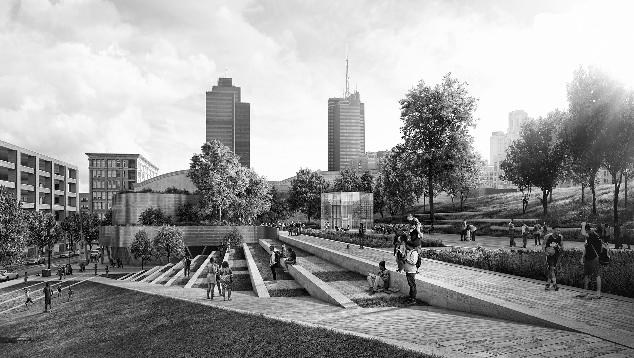
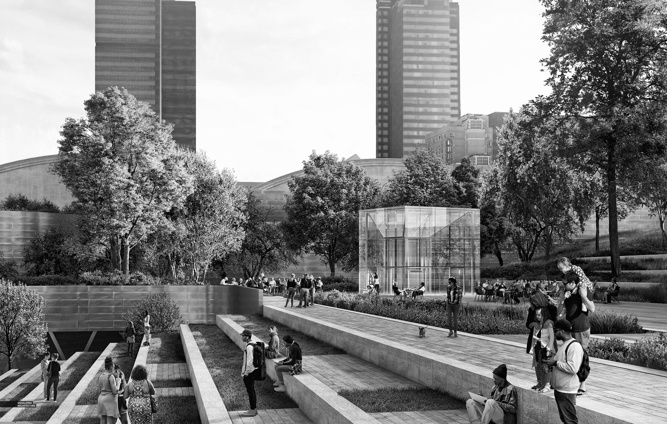

I didn’t mind the color version, but I really liked the image in Black and White. The light and shadow reads better in my opinion. I still haven’t decided which option will go in the portfolio though.


Hi Alex Hogrefe,
the nice viewpoint you share in this video.
I overlooked your entire video this looks very good.
Thanks for sharing this type of blog post…
Nice post thank you share with us.
I read your blog. After reading your blog, I earn a lot of changes your blog is better, I will also ask your contacts to read your blog.
“Indian Visa Services”
this structure is looking amazing.
This is a really helpful post, very informative there is no doubt about it. Thanks for sharing this information with us. I really appreciate your work.
The information is very special, I will have to follow you, the information you bring is very real, reflecting correctly and objectively, it is very useful for society to grow together.