For the first time on Visualizing Architecture, I am bringing in a new voice to help discuss some important graphic design related topics for the upcoming design of Portfolio Volume 05. Matt Uminski is a really good friend and encyclopedia of knowledge when it comes to graphic design. He has extensive experience in branding, print, and environmental design projects. Matt has worked with a range of public, institutional, higher education, and real estate clients on developing compelling brands that translate into real-world applications. He currently works at Sasaki in Boston. You can see more of his personal work at studiooffset.com (http://www.studiooffset.com)
Portfolio Volume 05: Typography Part 1
By Matt Uminski
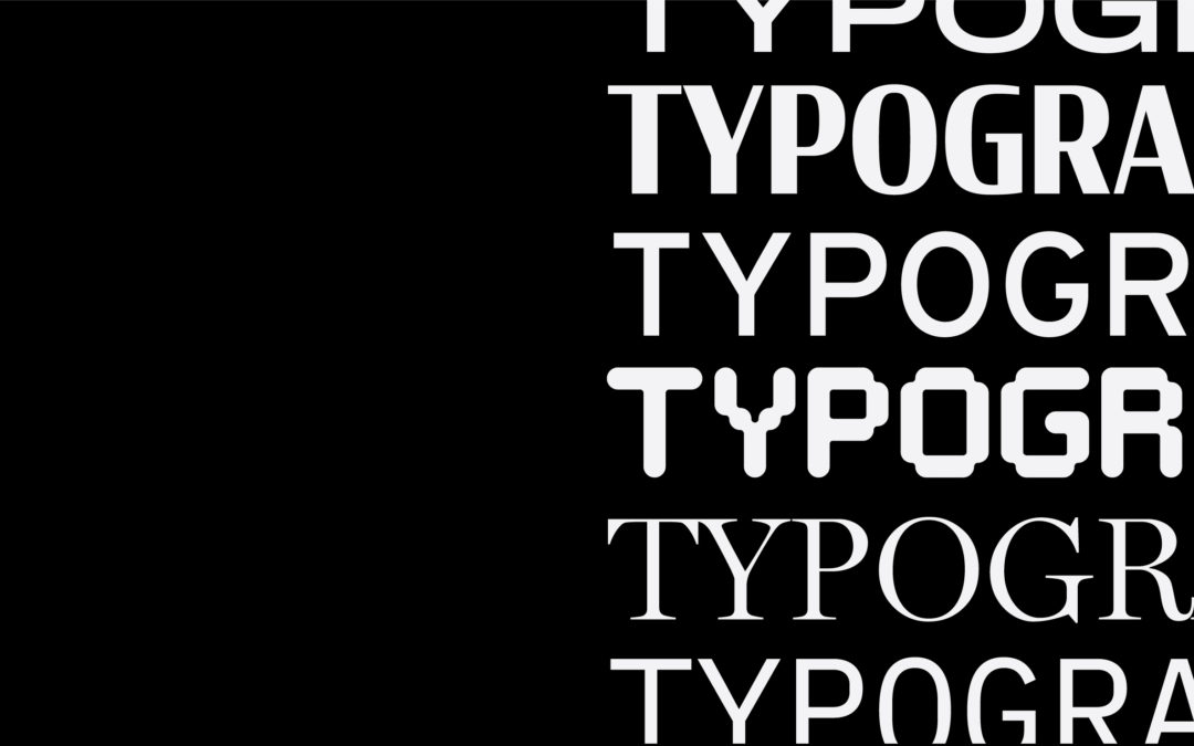
Today’s post is about typography, and specifically type that will be used in the upcoming Portfolio Volume 05. The topic of typography is broad and can get overwhelming fast. However, if used correctly, can significantly enhance the narrative of a design. The fonts below cover a broad spectrum of situations and uses in the architectural industry and are meant to give you a solid foundation to start from.
The first recommendation I typically give to designers in the search for a typeface is to use an online font library like Google Fonts or Adobe Fonts (previously Typekit). These online libraries allow designers to test, download, and use any number of typefaces. Unlike other online libraries, Google and Adobe fonts are all licenced and FREE to use. The only major difference between each of these libraries is that in order to install Google Fonts you need to download and install them on either your Mac or PC. Adobe Fonts, however, is a cloud based system, so no installation is necessary. All you need is an Adobe CC licence and you’re ready to go. For Portfolio Volume 05, we are going to limit ourselves to only use Adobe Fonts.
Below is a breakdown of some of the typefaces that will be considered for Portfolio Volume 05.
01. Underlying Typeface
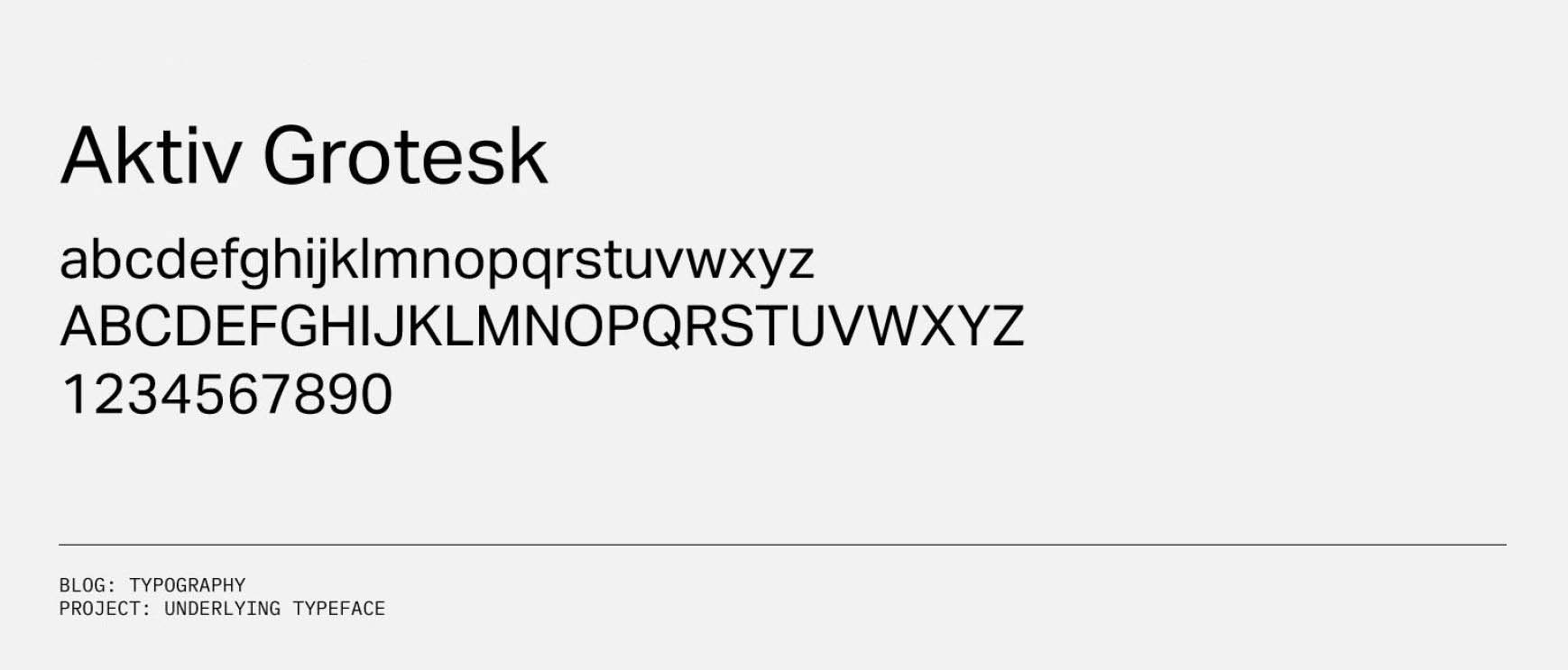
If you plan on having more than three typefaces in a project (which we are) the first step is to pick an underlying typeface. The underlying typeface runs through the entire book or project and pulls it all together. Main or orienting copy like page titles, body copy and page numbers should all share the same typeface.
Aktiv Grotesk
For Portfolio Volume 05, I suggest Aktiv Grotesk as the underlying typeface. It’s an extremely legible grotesque sans serif that has a wide range of weights and styles. I personally use this typeface for a variety of applications. It’s a great complementary typeface to have available.
02. Research Lab
Rather than focus on the architecture here, the typefaces chosen are meant to evoke a conceptual take of what a laboratory space is: a place for exploration. These typefaces are meant to be techy. They relate to computer screens both classic and contemporary.
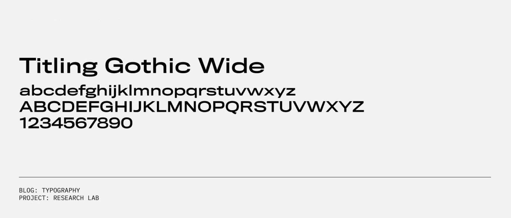
Titling Gothic
My first suggestion is Titling Gothic Wide Standard, a wide grotesque sans serif. Use this typeface to mimic the motion messaging that appears on a digital display like a ticker board. The lingering width of the Titling Gothic gives the illusion that the copy is moving across the screen or page.
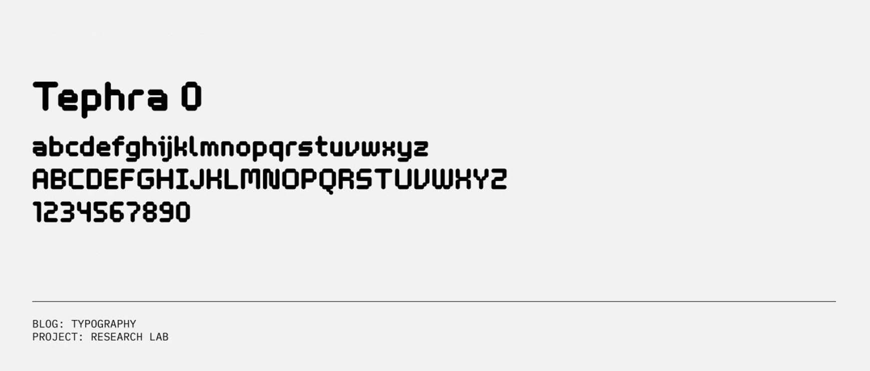
Tephra
My second choice would be Tephra 0 Regular. Tephra is a purely decorative display font that should only be used to indicate a small amount of information. Whether that’s a brief, bold statement or just a few numbers. This isn’t a font to use at a small pt size. It’s far too illegible to be used as body copy or captions.
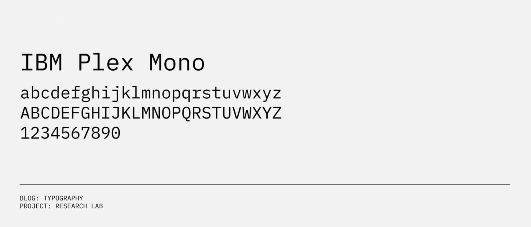
IBM Plex Mono
Lastly, I offer IBM Plex Mono. If you’re talking about anything technology or code related, I recommend finding a mono that works for your project. IBM Plex is a great contemporary interpretation of a classic mono typeface. Briefly, monospaced fonts were used in early computers, due to lacking graphic capabilities. The goal was to create a typeface in which all characters had the same width rather than proportional spacing like many fonts have.
03. Philly Bridge Fonts
How do you pick fonts for a bridge? I look to signage. Typically traffic signage typefaces are bold and legible to help viewers quickly find their way. As a designer this is the perfect opportunity rethink an existing type application and conceptually work it into your project.
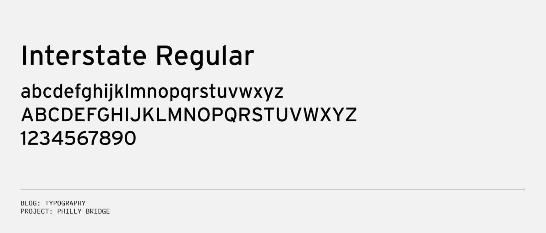
Interstate
The first typeface I suggest is Interstate. This is the same sans serif used on the Federal Highway Administration official signage. Interstate has a lot of subtle characteristics that differentiate it from other sans serifs. For instance the terminals (endings) of the lowercase characters are all angled at 90° from the stroke (the main diagonal of a letter.) For example take a look at the lowercase t and l. These little details allow for increased legibility at all scales.
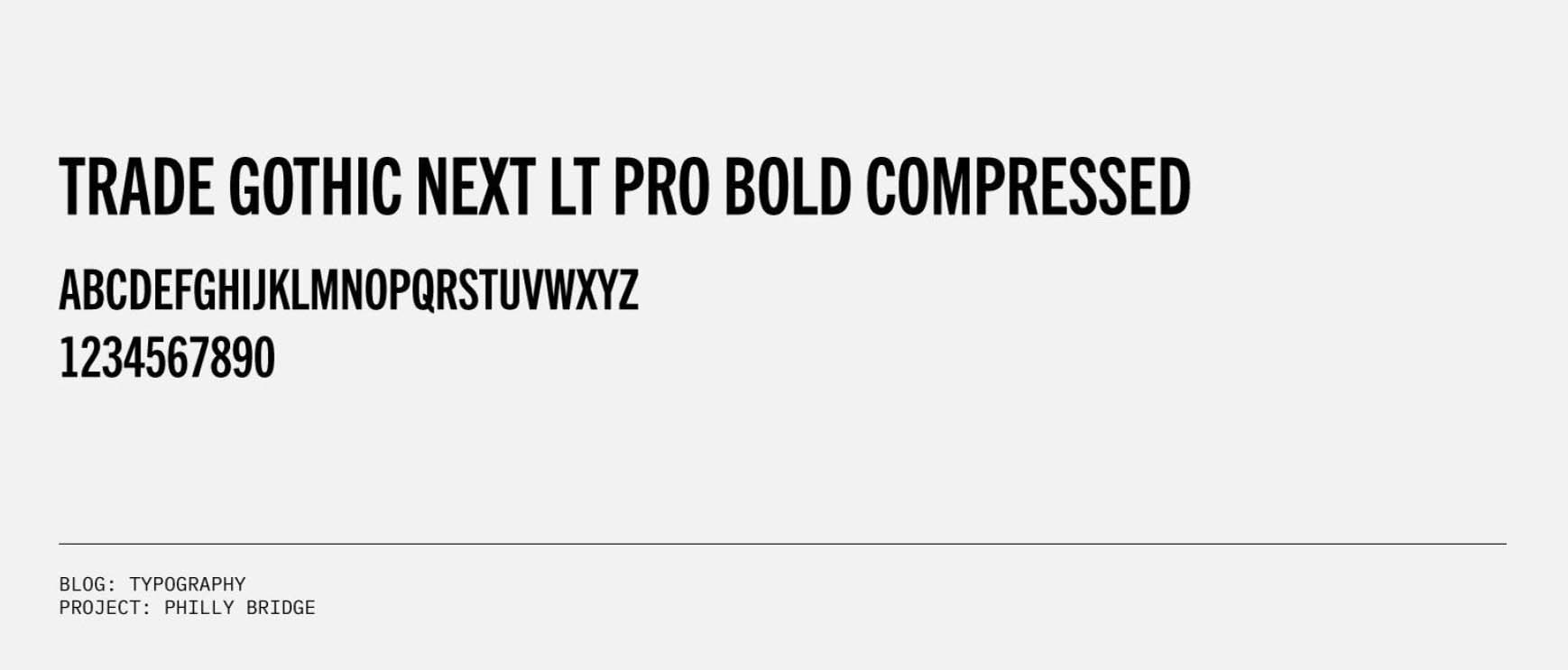
Trade Gothic
A complementary typeface to interstate is something tall, condensed, and bold like Trade Gothic Next LT Pro Bold Compressed. A sans serif I would use in order to reflect bold, impactful messaging on a sign or poster.
04. Desert House
The Desert House is, again, a perfect opportunity to let architecture influence type. The house’s bold form and sharp angles can start to be reflected within the typography.
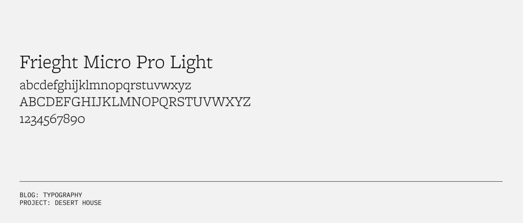
Freight Micro
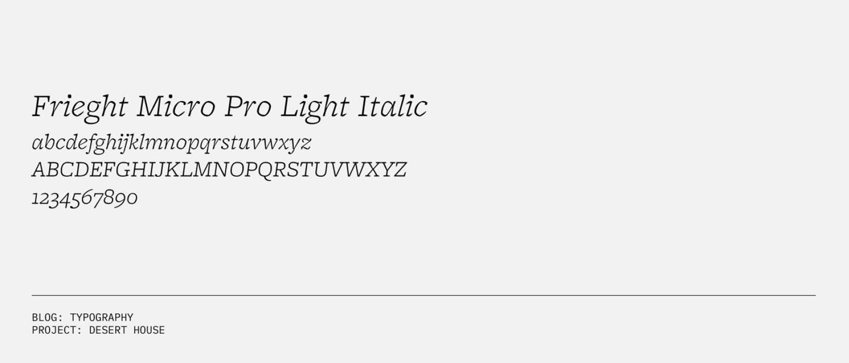
Using the sharp angles of the house, I searched for a serif that had bold, sharp terminal endings. Enter Freight Micro Pro Light & Italic. A serif that strikes the perfect balance between being both harsh and soft. However, the italic allows it to become extremely angular and reflective just like the architecture. This is a great way to use one typeface but end up with two different visual representations.
Rigid Square
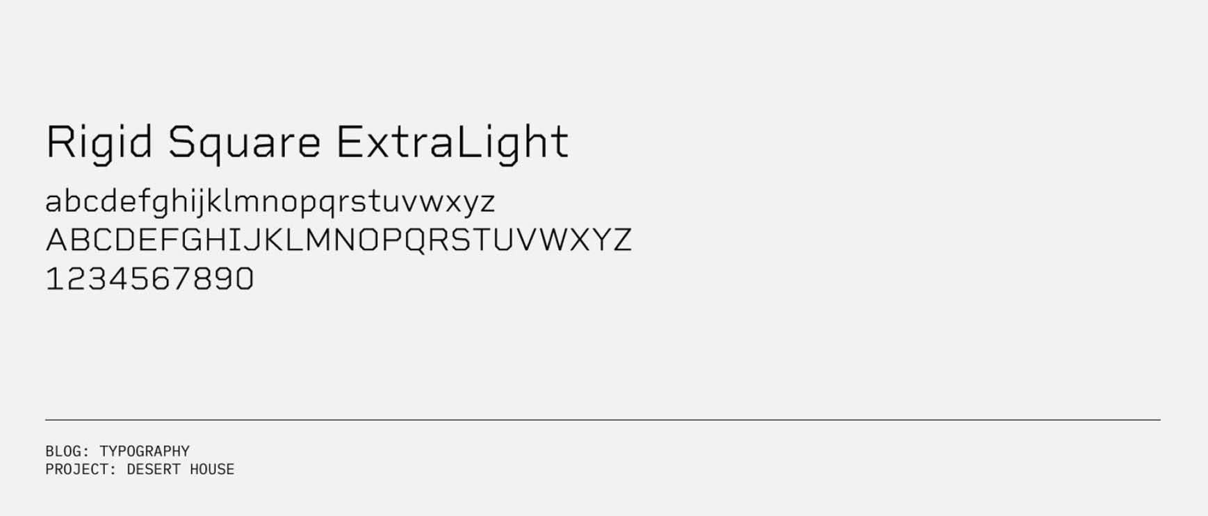
I also wanted to find a sans serif with the same angular qualities as the architecture and the Freight typeface. Rigid Square Light is a complementary sans serif that has an extremely angular expression on its characters compared to other sans serifs. It will be most effective in larger type applications within the spreads.
05. Mountain Hotel
The Mountain Hotel is another great opportunity to use the architecture to our advantage. The project is extremely vertical so it makes the most sense to use a typeface that emphasizes verticality. Also it’s an opportunity to use the mystique that comes with a hotel. Many hotels are associated with a certain sense of luxury and timelessness which can easily be translated into a typeface.
Condor
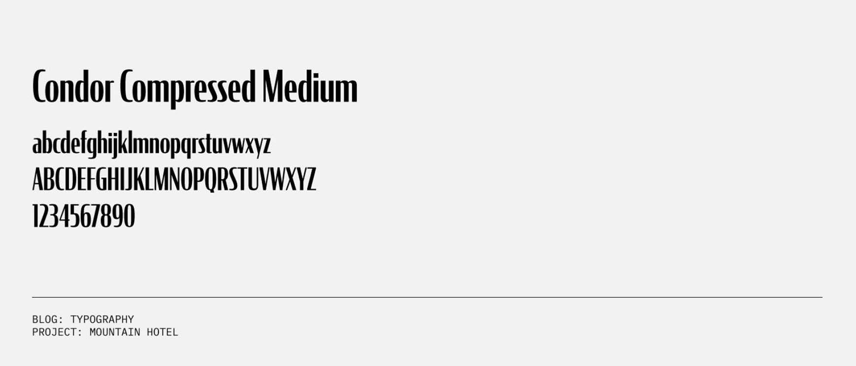
Take for example Condor Compressed Medium. A high contrast sans-serif that when used in a compressed style makes the typeface appear taller than a traditionally compressed sans-serif like Trade Gothic that we’re using in the Philly Bridge section. I suggest using this typeface to display large headline text rather than smaller body copy.
Miller
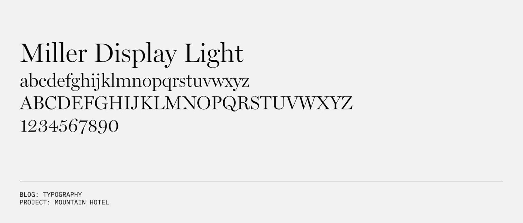
In order to achieve the sense of luxury and timelessness, use a modern serif like Miller Display Light. This typeface is typically used in magazines and newspapers because it has a classic elegance and legibility associated with it. Typically serifs are associated with characteristics of being traditional, respectful and legible. Whereas sans serifs are clean, modern and objective.


Thanks for sharing this wider body of knowledge.
Looking forward to see how all these suggestions play out in the final iteration of the portfolio.
The fastest way to login to Hotmail
this is fantastic! Looking forward to part 2.
Hello there, I do think this is a magnificent blog. I discovered it. I will return indeed since I have spared as a most loved it. Cash and opportunity is the best method to change, may you be rich and keep on managing others.
Oh! typography is great! I love seeing and doing typography. The visuality, the art is seen magnificently in typography. These collections will help me a ton for my website. This makes more artistic and real when the typography meets 3d architectural visualization and 3d rendering. I know rendering is not a part of typography, but I guess it’ll look gorgeous when those two will meet.
Waiting eagerly for the second part.
this is amazing post . thank you for sharing this awsomwe post .this is very helpfull.