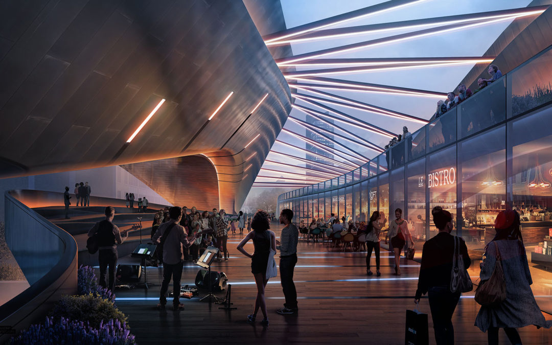
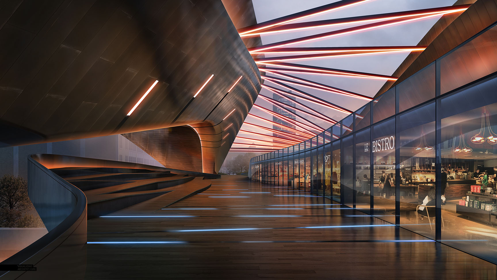
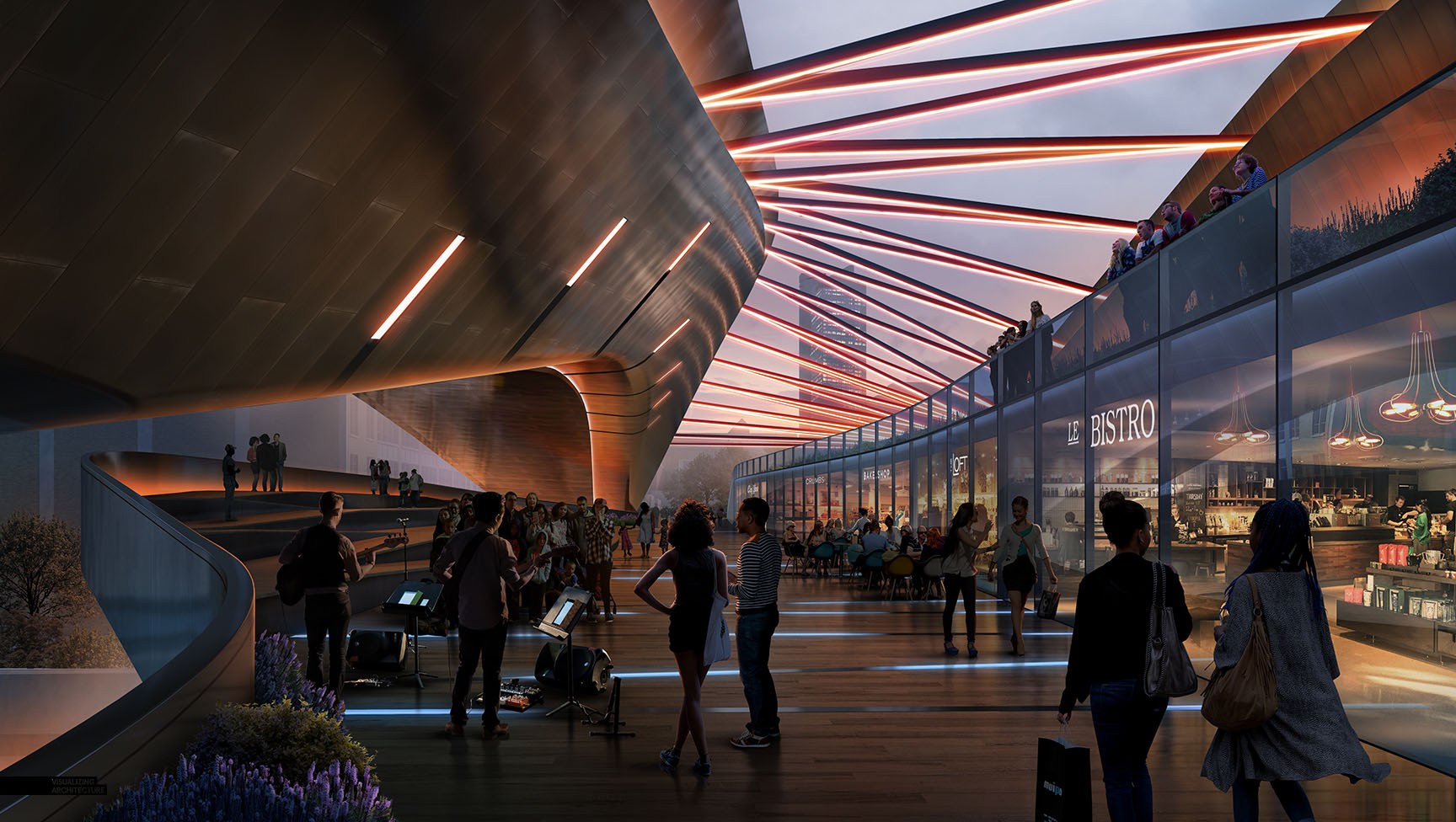
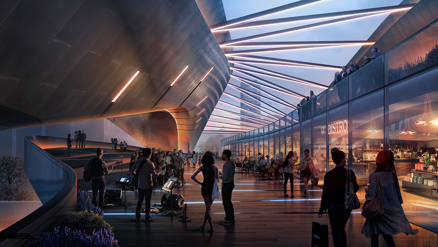
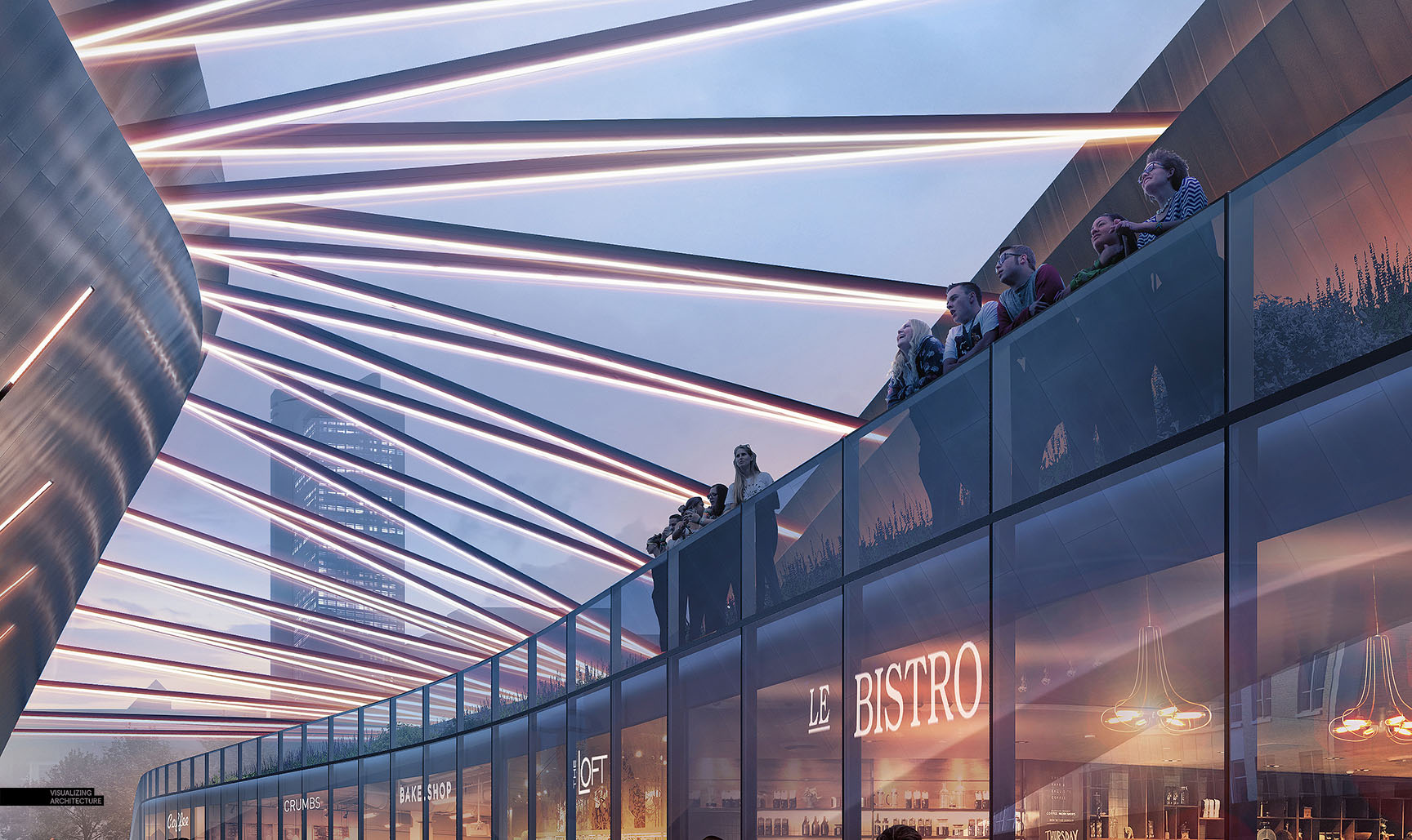
This will be the third image that I have posted on this site that goes from a daytime base rendering to a full on night rendering using only Photoshop. The first ever No Render Night Tutorial I created came at the very beginning of this website a long time ago. Since then, the technique has shifted slightly but the concept remains the same. This updated workflow can be seen in my Day to Night image break down and explains certain key moves such as darkening the base image that will help make sense of some of the steps shown below. While the breakdown below is brief, I hope it still paints a picture of how this image evolved and the transformation that took place.
Also, I am excited to say that I will be meticulously breaking down this image layer by layer in a few weeks at the Renderit 5 conference in Mexico City. I am looking forward to the event and meeting everyone that comes by the workshop!
1. Sketchup Model
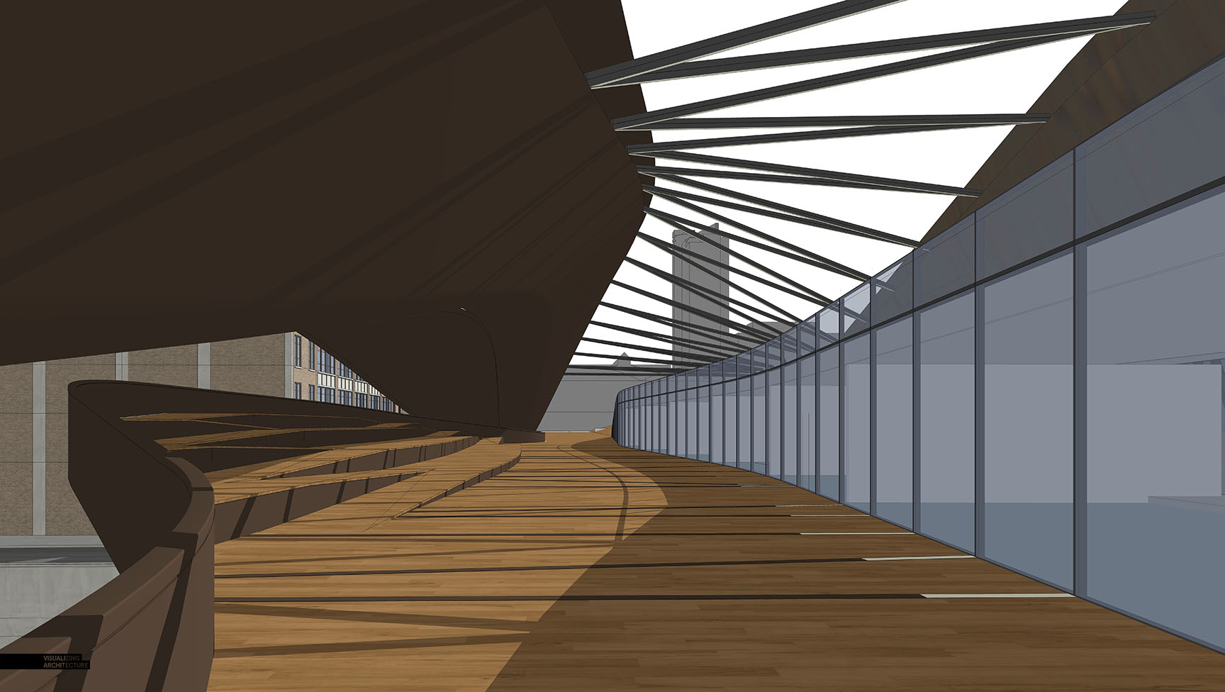
The Sketchup model is unchanged from the daytime rendering. The sun even remained in the same location.
2. V-Ray Base Rendering
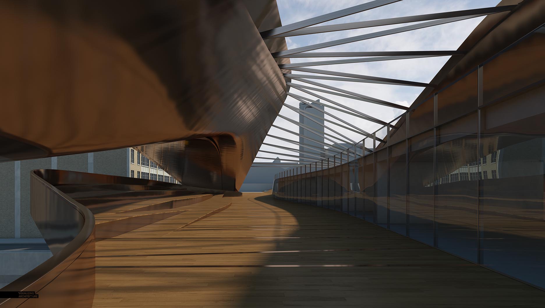
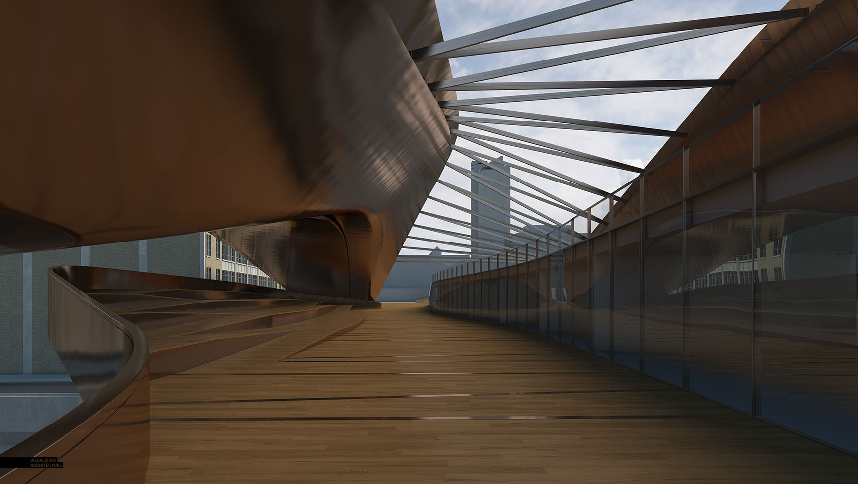
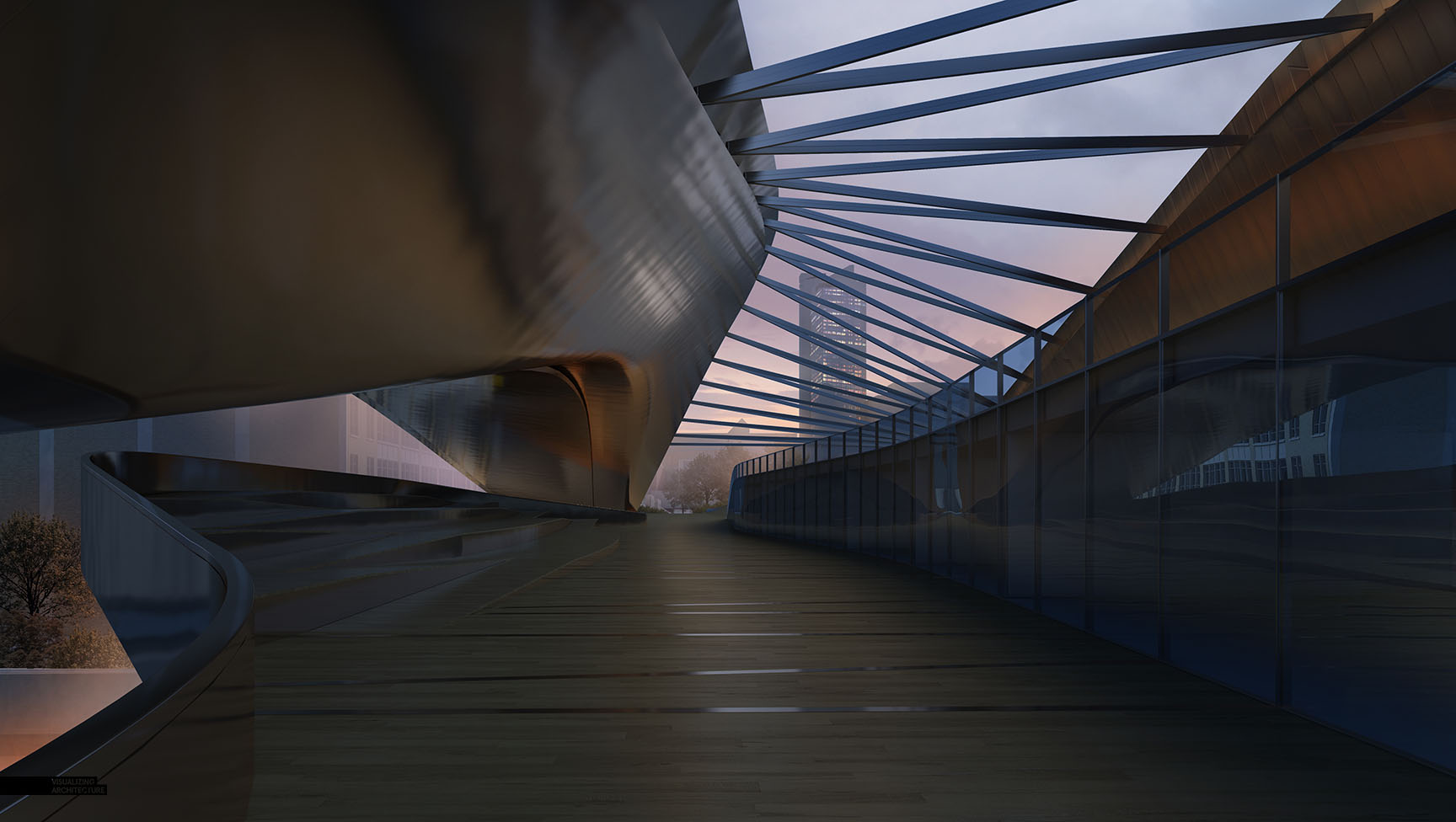
Above is the original V-Ray base rendering used in daytime rendering. Instead of spending time Photoshopping out the shadow lines, I rerendered with softer shadows seen below.
In order to get the soft shadow, I changed one setting which was increasing the size of the sun in the V-Ray option editor. Everything else remains unchanged in the model and light settings.
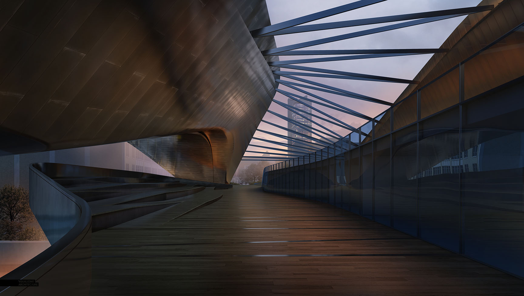
3. Darken the Image
As dramatic of a change as this is, this step is pretty simple. Paint the entire image blue except for the sky, and set the layer blend mode to “Multiply”. After that, I dropped in a new night sky, and painted in some haze to help separate the background from the foreground.
4. Textures
This step took little time because I simply dragged over the textures from my daytime images and dropped them into place. I also warmed the floor just a hint.
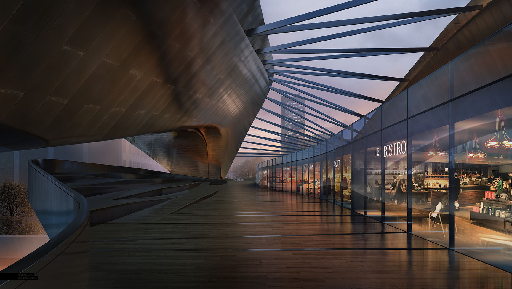
5. Interiors
This step also went fast since I was also able to carry over the interior textures used in the daytime scene. However, I did need to paint in some floor reflections.
6. Lights, Lots of Lights
This is the step where I spent much of my time experimenting with lighting options. Everything is painted in using different techniques and layer blend modes. This could make a good tutorial in the future if I can somehow find the time…
7. Entourage
Entourage was added towards the end of the process to add narrative and give movement to the image. For this type of lighting scenario, the people were darkened to almost a silhouette, with highlights added as needed.
8. Color Adjustments
At the end, I brought back some blue tones to contrast the spots of warm light. I also used some warm color overlays to punch up areas to help activate them.
Just a few more images planned for this project including a grand aerial shot. Stay tuned….


amazing.. looking forward to see step by step tut.
Awesome as always!
Alex, I have one question, for the interior, how do you find the image and what mode you are using (overlay?)?
I am always trying to use the interior image to put inside, but the light always seems not right.
I agree Le Bistro compositing was a brilliant move and absolutely sets the right mood to the image. I am working on a similar retail image but don´t trust my Photoshop skills as much, and neither find it easy to find the right picture. I will give it another try but probably end up with setting a simpler 3d scene.
You should definitely make some light tutorial, it would help a lot 🙂
Another great post – Chapeau bas!
I agree Le Bistro compositing was a brilliant move and absolutely sets the right mood to the image. I am working on a similar retail image but don´t trust my Photoshop skills as much, and neither find it easy to find the right picture. I will give it another try but probably end up with setting a simpler 3d scene.
Ups this was meant as a reply to Raultinson up there, so Alex feel free to delete the wrong one and this message. Sorry.
Brilliant again. Apart from your design skills i admire the fact you are so confident in Photoshop to bring out the best of your models, no matter the how the base render came out. Would love to see those parts in more detail, as i guess you are compositing out of render elements as antialiased wirecolors, etc.
Hey Alex, I think you have some really amazing design skills. I loved the night look of this design because it looks a lot more urban and real! I also like how you textured it!
Alex,
Your posts are incredibly helpful and have given me a lot of inspiration for future design rendering.
I notice you use Topaz for giving your renders a final tweak and to enhance the atmosphere.
Are there any programs similar to Topaz that you could recommend for a similar process?
Keep the posts coming! 🙂
Yesterday I had the opportunity to see how this render came to life with Alex’s talent. I learned how the workflow works, is really simple, but you have to be really organized with all your layers, and pay attention to detail.
It was really great and totally inspiring, thank you Alex!
I hope you had a great time here in Mexico, despite that earthquake…
Your article reflects the issue people are concerned about. The article provides timely information that reflects multi-dimensional views from multiple perspectives. I look forward to reading quality articles that contain timely information from you.
I’ll never cease to be amazed by the relative starkness of the initial raw render to the final image.
Cant wait to see the tutorial. This is really inspiring.
我觉得很厉害,学习了!但是我不知道为什么不用3DMAX建模。而是用Sketchup。这一点很疑惑。我的邮箱458445253@qq.com 希望你能回复我的信息!我英语不好所以用的中文!
Because I thought, by using Sketch Up would be a quicker, easier and more productive solution to creating a 3D sense at this case. 3D max is a crazy tool to use.
Every thing about modern architecture
This is really good….. thanks for sharing this article..https://bit.ly/2sL4gIf
Glad I found this story. I love reading about it. Visit our page at http://www.auassignmenthelp.org/marketing-assignment-help/ for more interesting topics.
Always amazed by your work, thanks a million!
Just curious, were the left-handed guitarists intentional?