As much as I love working on the Porter Sq Station redesign, I needed to change things up a bit so I started designing my next personal render project. We have been working on a lot of really interesting projects lately at Design Distill, and it has been spurring some ideas of what I think could be some interesting environments to illustrate. After some back and forth, I have decided to position the next project within the vastness of the Texas landscape. This environment will be a big departure from the very urban site of the Porter Square project or any of the projects in Portfolio 05. The site will be a combination of natural prairie, wetlands, pastures, small hills and tree groupings. This sets up opportunities for interesting texture combination where the many different natural elements blend into one another.
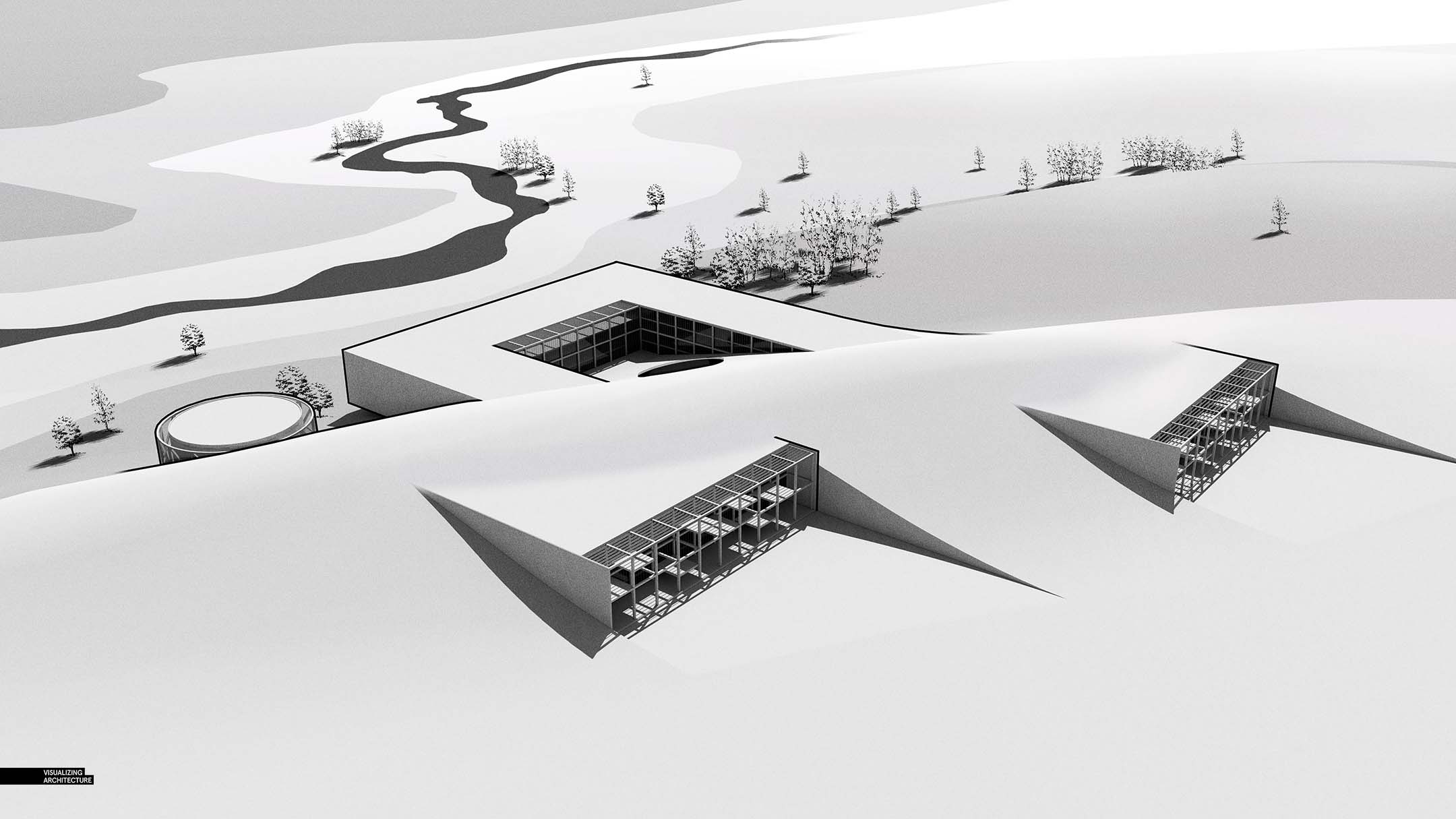
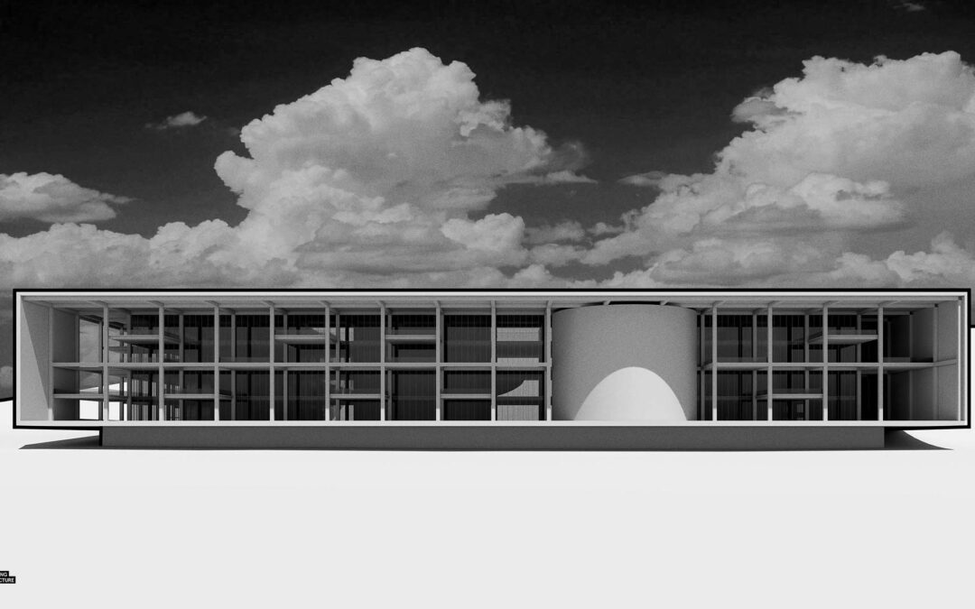
For the architecture, I am going to be designing a large office building complex that will weave into the landscape in an attempt to play down its massive scale. I am intentionally doing a much larger scale architectural project because of the opportunities it creates for image making. The illustrations become less about the detail and more about the vast space and volumes. As with many of my projects, the landscape and architecture will blend into one another blurring the line between man made and nature.
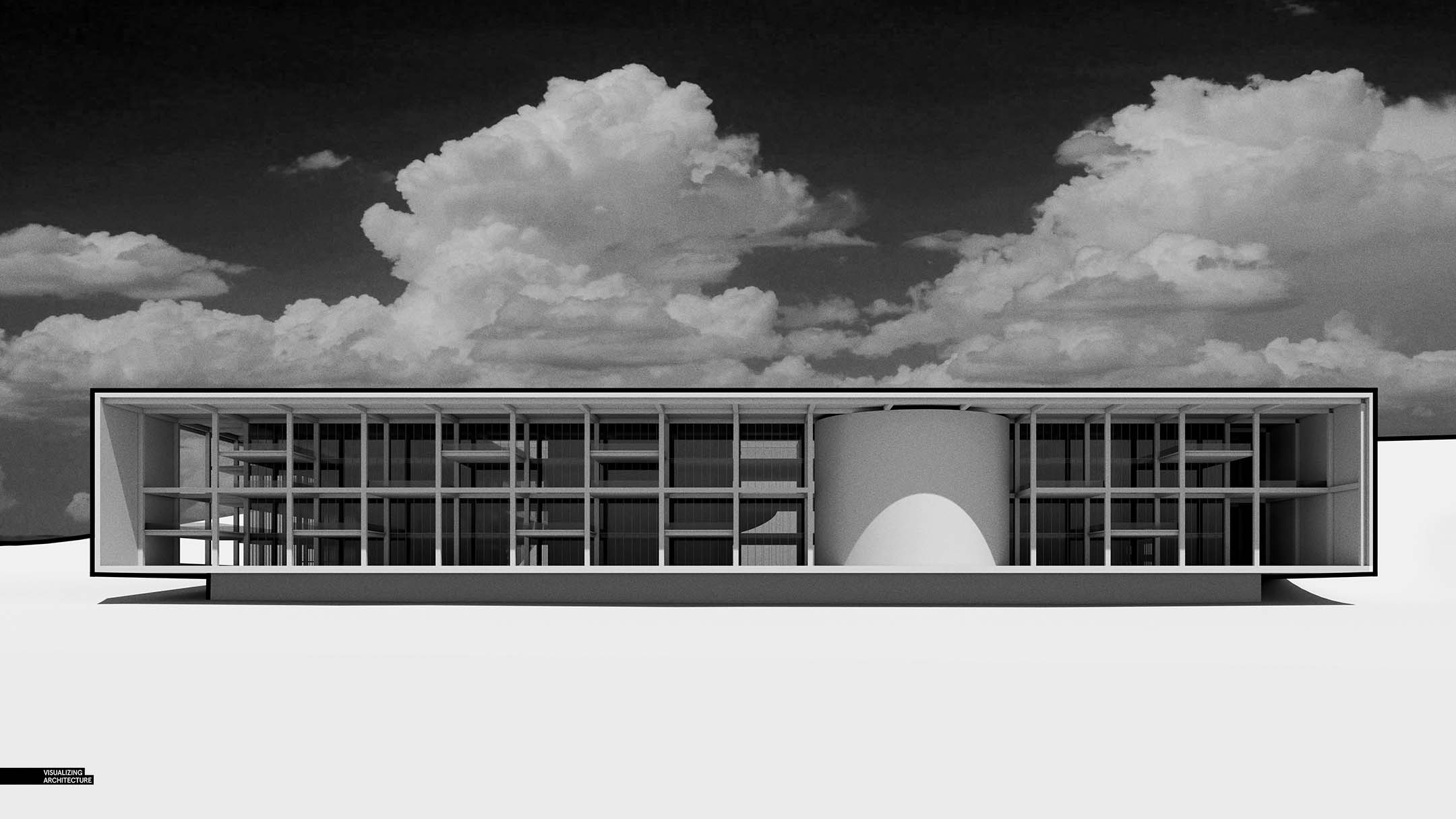
The design will have a lot of repetition and simple tectonic ideas to take the pressure off of modeling and free up more time to experiment with the visuals. The Porter Square Station redesign involved a ton of curves and non repetitive geometry that ended up demanding a lot of my time in 3D. Because I know the landscape will be very Photoshop intensive for this Texas project, and I want to be able to invest a proper amount of time to it as opposed to modeling endlessly into the sunset.
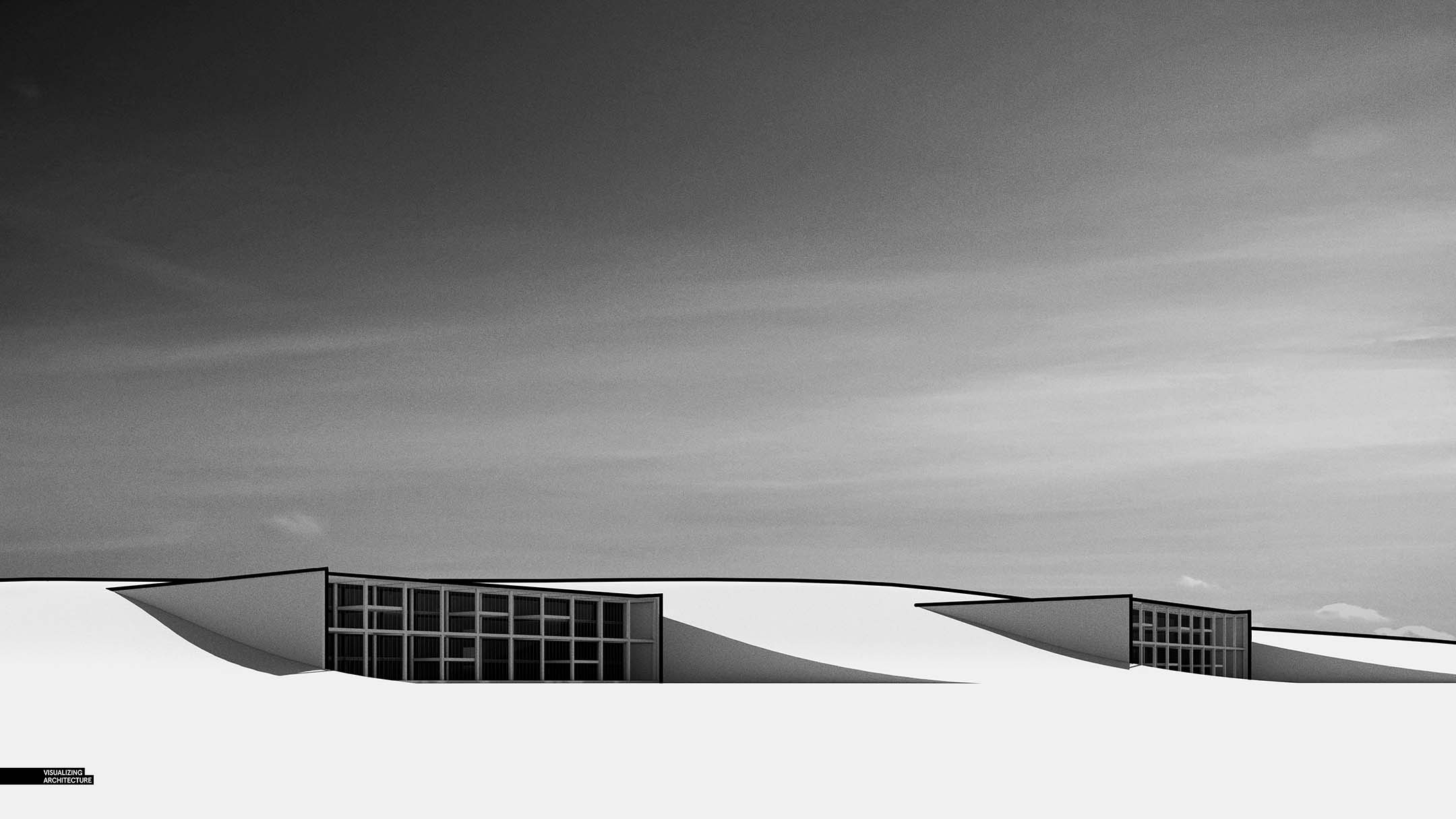
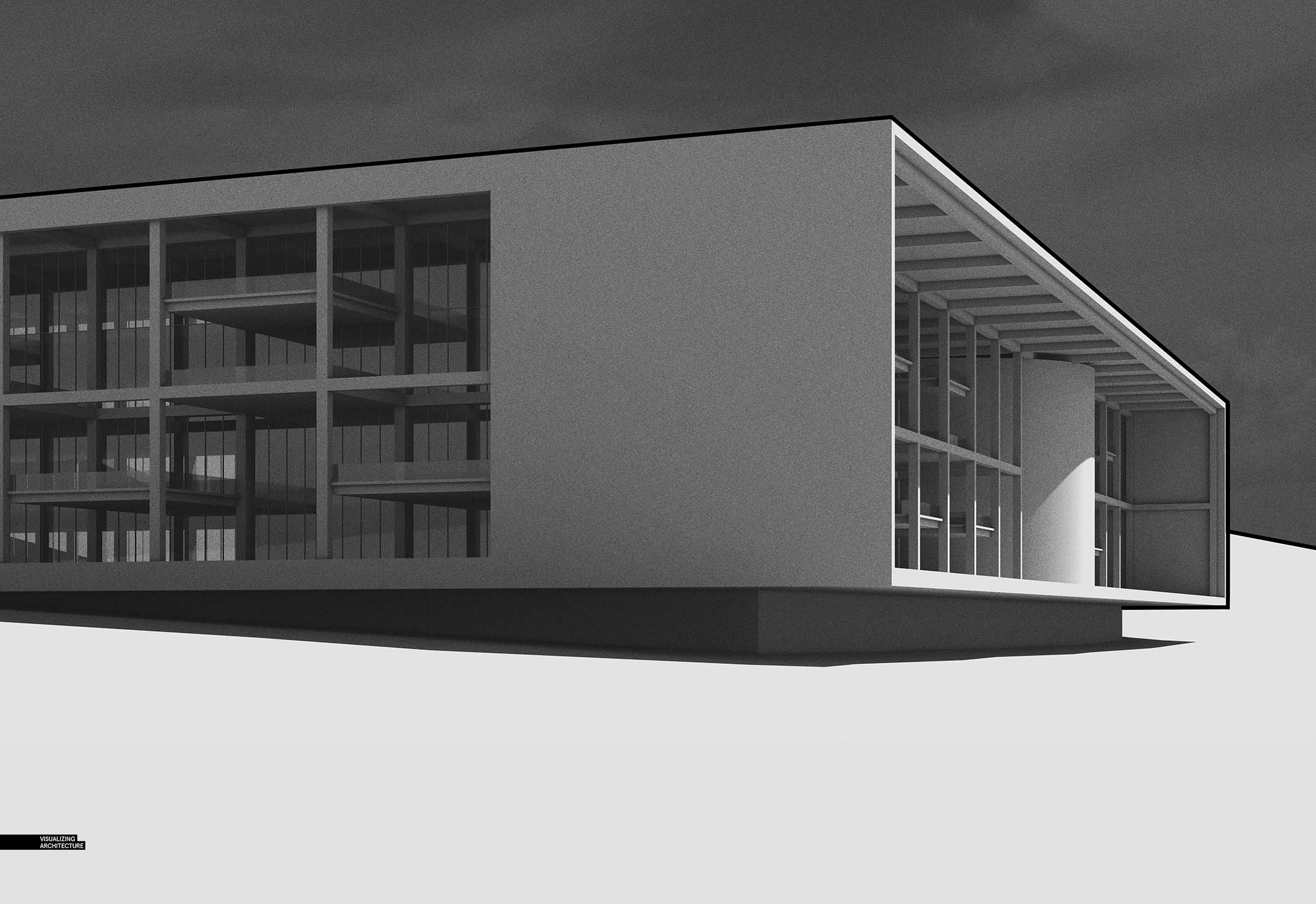
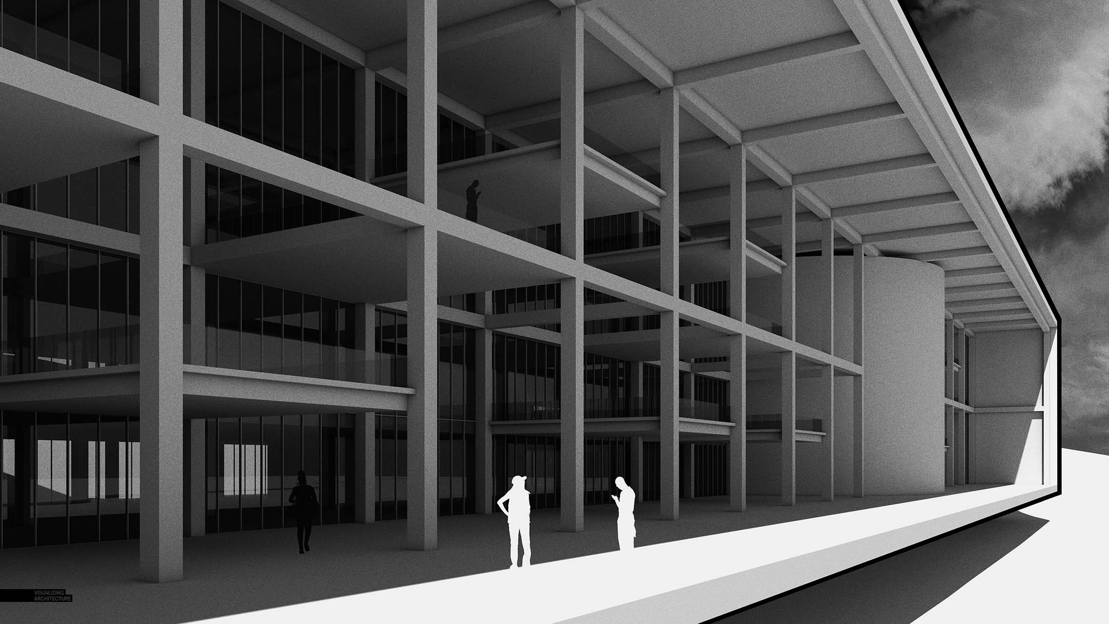
I’m super excited to get going on this project. I think the massive scale of the project and landscape will lead to some interesting compositions and light setups. At the very least, it will mentally allow me to escape to the outdoors while we are all physically stuck inside.


This is awesome. Thank you so much for creating content that as you say allows us to escape for a moment
cheers from Canada!
How were these black and white images created? I really like the style and feel as a preliminary design concept presentation.
This is amazing. Made a very good building
I’m always curious. When you begin these designs do you start working in 2d with a floor plan? Or is it more of a 3d process all of the way through?
Very good project but a rendering with a black outline is a little curious.
This is a great blog. I like the way you express the information to us. Thanks for such a post and please keep it up.