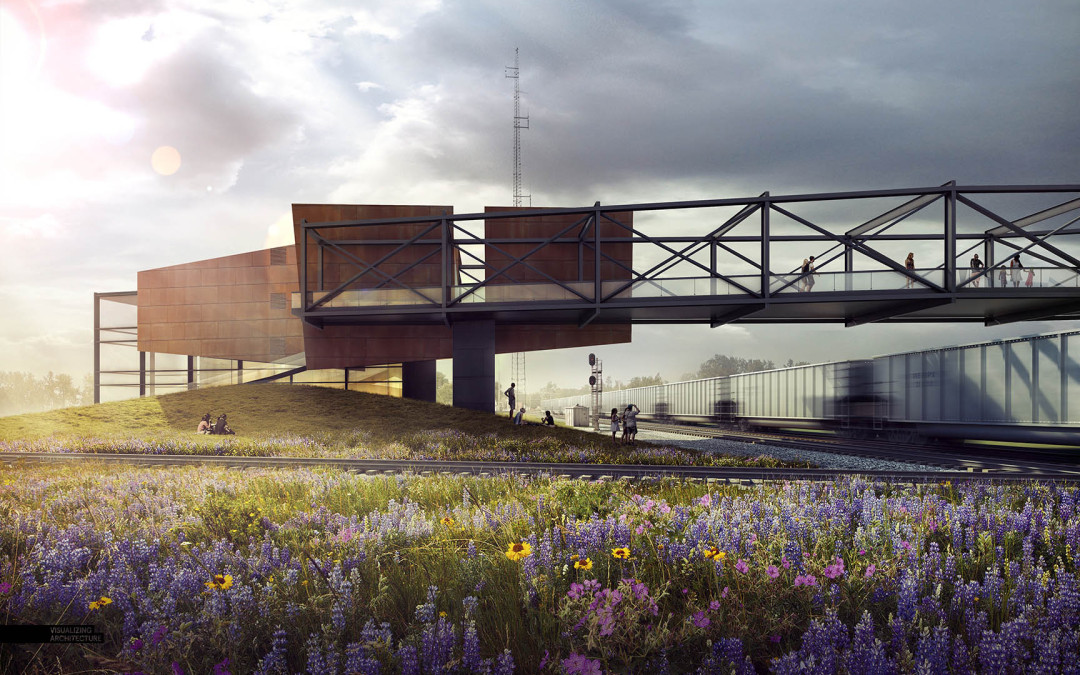
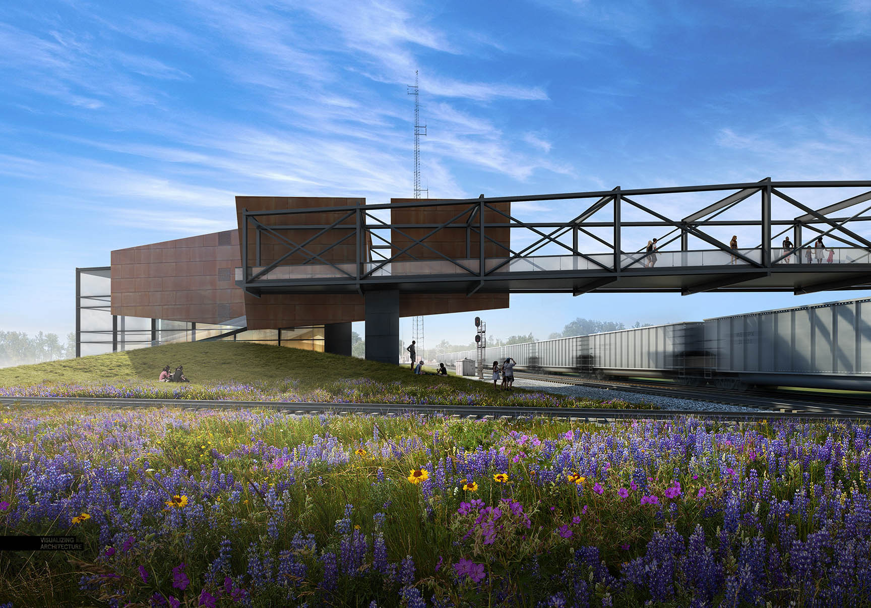
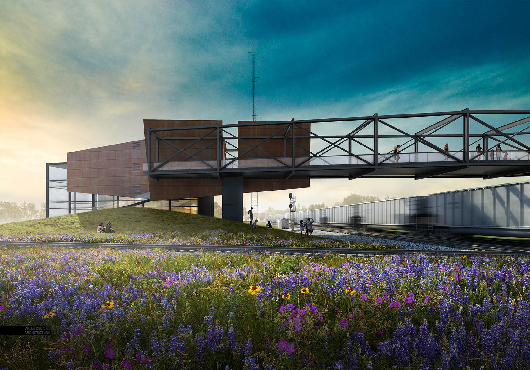
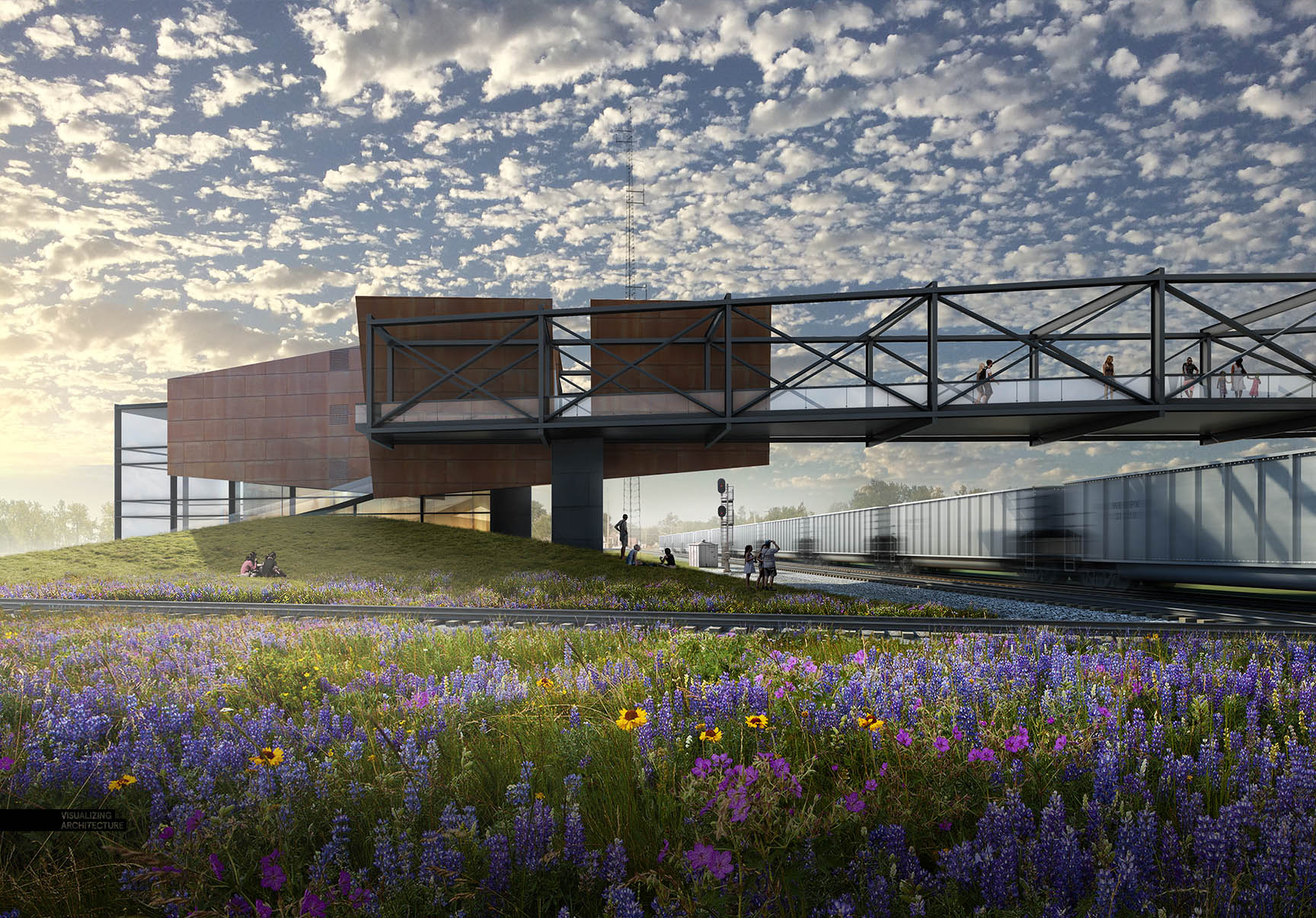
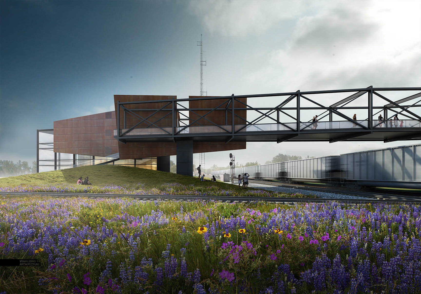
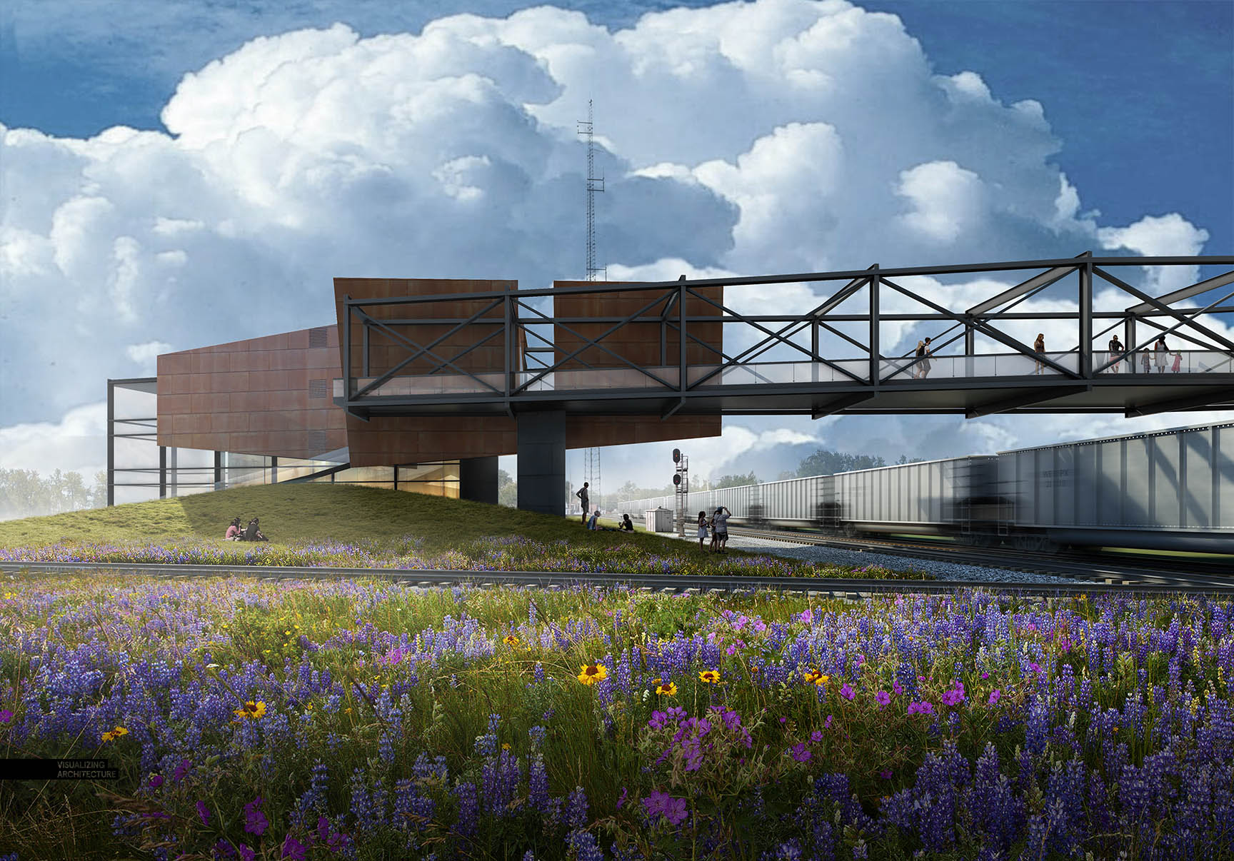
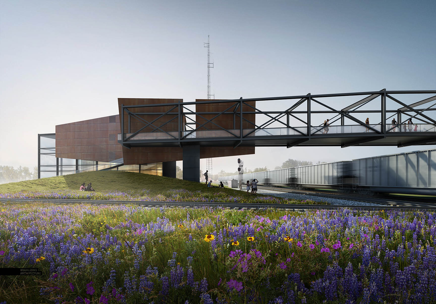
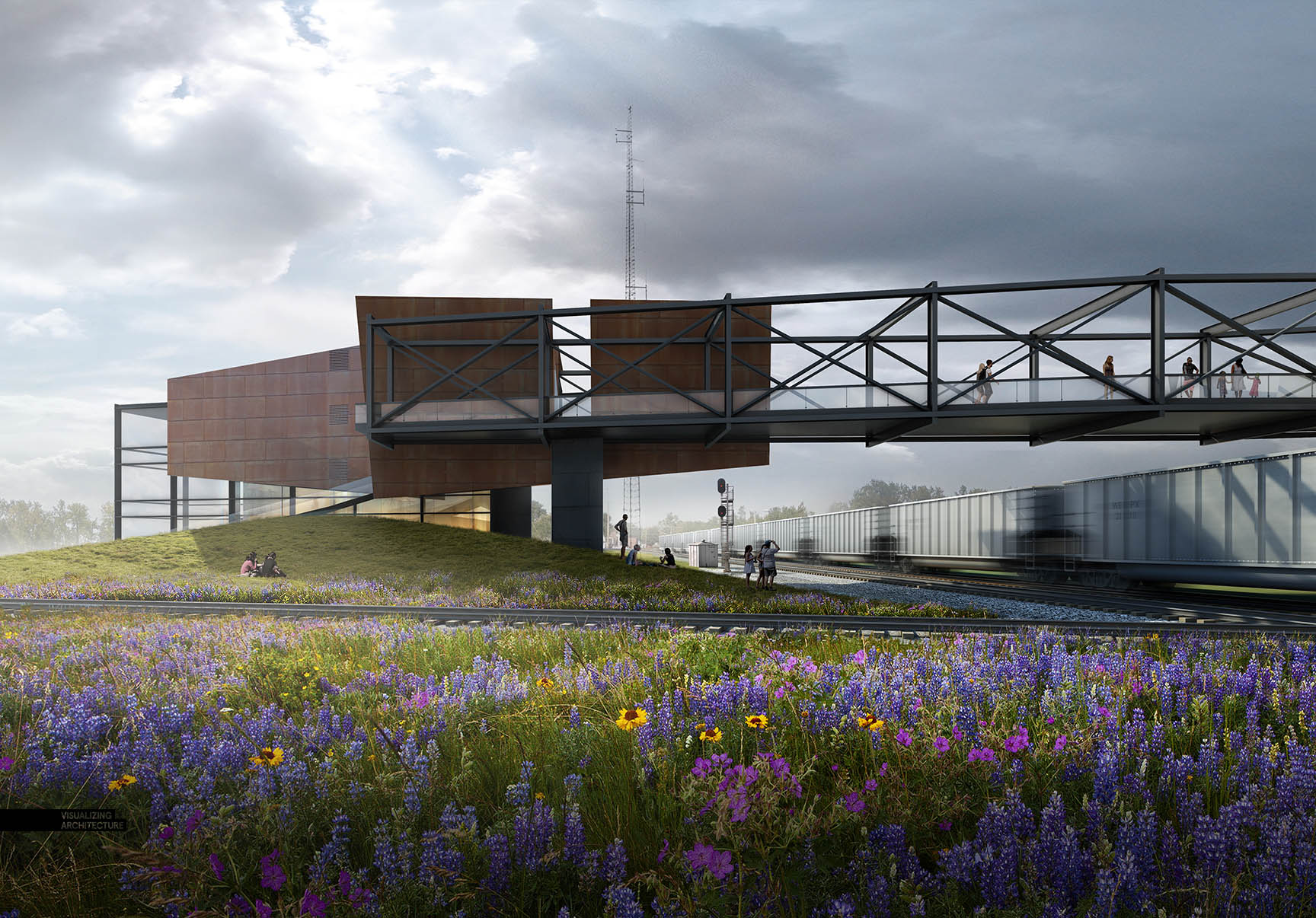
I can’t believe that I have not written a post about skies yet on this blog. In most cases, a sky can make or break an architecture illustration. It’s also something that I see a lot of people overlook or only spend a few minutes on in their renderings. The thing is, a good sky sets the entire mood of an image. Because of this, it’s my first priority as soon as I get into Photoshop. I spend quite a bit of time combing through images online to find the perfect one for my scene. With the different images below, you will see how much the mood and tone shift from just changing out the sky.
I have put together some ideas to think about when looking for that perfect sky. It should be noted that these are guidelines. There are many of different scenarios and situations in architecture visualization in which these tips may not apply. However, I have found that to be rare and I follow these ideas in almost every image that I create.
1. Avoid Oversaturated Color
Oversaturation is an issue I see often. Many of the sky images that I find online have this problem because the sky has been enhanced or amplified to be more dramatic and catch viewers attention. However, too much color saturation in the sky will overpower the colors in the architecture and ground plane ruining the hierarchy of the illustration. To fix this, I go into “Image>Adjustments>Hue Saturation” and I move the “Saturation” slider to the left to remove some of the color.
2. Avoid Awkward or Unnatural Colors
Unnatural color brings with it similar issues as oversaturation. Unnatural sky color can throw the whole image off from the start making it difficult to pull off a successful composition. Not only that, it creates a “Photoshopped” look instead of looking harmonious with the architecture and ground plane. Due to the many gradients and color tones, I prefer just finding another sky vs. trying to alter or fix the unnatural colors. However, if I really like the cloud forms or texture of the image, I sometimes will desaturate the color, and then use the color of a different sky overlaid on top.
3. Minimize Overly Busy Skies
As much as you may like clouds, too many will hurt the reading of the image. Simply put, they take all of the attention away from the architecture. However, there is a fine line between distracting and dramatic. I tend to like cloudy skies, but I will dilute the image by desaturating the color and fading out the detail so that the texture is softer. An easy way to fade the detail is by finding a sky with no clouds, just color, and setting that as the base sky. Then take the cloudy sky, set that layer on top of the just-color sky, and lower the opacity so that the clouds read much lighter.
4. Wrong Sun Direction
This is one of those situations where you look at an image, and something seems off, but it is not clear what is wrong. However, once a light source issue gets corrected, the image reads dramatically better. This holds true for other Photoshopped elements such as entourage shadows and trees shadows. The more that the light source of all of the elements relate, then the better the entire image will read as a single cohesive illustration instead of a bunch of single Photoshopped elements.
5. Look for the Correct Perspective
This idea is more important or less important depending on the view. However, scenes showing a lot of depth will read much better with a sky that shows the correct perspective. In the example above, the clouds have almost no perspective, meaning the clouds don’t change in scale as they recede into the distance and get closer to the horizon which causes the background reads much flatter.
6. Don’t Be Afraid To Go Simple
You don’t always need to show clouds. Sometimes, the perfect gradient is all that is needed to set the right tone for an image. This move creates a calmer scene and helps to highlight the architecture and ground plane.
The Final Image
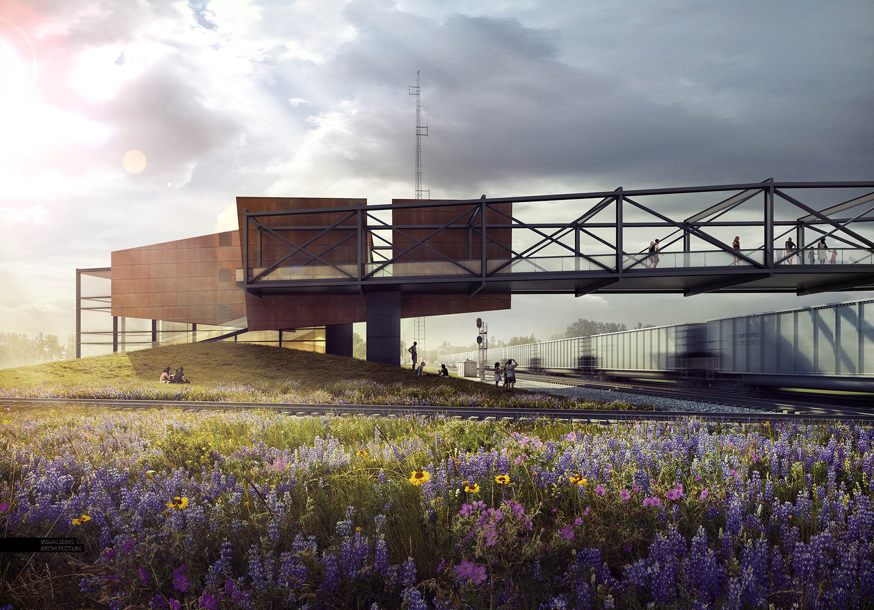
The sky I ultimately chose was a cloudy one with pockets of blue. This allowed me to play up the sunlight coming from the left and give the overall image a dramatic light to dark gradient. I combined two different cloud images using a similar process as described in tip #3. I found a sky with no clouds and great color and then combined that with a cloudy sky. By adjusting the opacity of the cloudy sky, I was able to zero in on a good balance of color and softness.
Once I had the sky, I amplified the warm and cool tones using color overlays and added more shadow at the base of the image. All these moves help to start the viewer’s eye on the left side of the image, and slowly move it to the right over the bridge and to the train on the right, mimicking the path pedestrians take. In this way, I am using the light started by the sky to help tell the story of the project.


awesome tips
it looks so cool
just me!
This is great Alex! I am wondering is the train on the image render or pure photoshop? Thanks!
The train was a 3d model. I added a radial blur to give it a little more action.
Hi Alex,
very useful tips, I do often this error and the result is a flat image.
Thank you again Alex.
Umberto
Very Useful tips Alex Thanks
Just a quick question, where and how do you search for the images you use in your compositions? like the grass/flowers, and the sky.
Lots of google image searches mostly. Just make sure you choose “large” images under the size filter to get only high res images in the search results. You will need to choose the “search tools” button at the top to get the filter options.
Thanks!! One more thing, I hate to be that person but would you consider doing a tutorial on materials? I tend to have a problem with materials having a 2D look to them, and I was wondering if you have any tips to improve this.
What’s the minimum res for a good pic background?
Lejanro,
tl;dr
Ideally the background and the render should have a simliar ppi resolution – you can cheat a little bit.
If you render your image at 1020 x 720 @ 150ppi you can’t use a BG image that is 1020 x 720 @ 72ppi because you would need to resize that BG image to 510 x 360 for it to be 144ppi. Conversely you could use a 2040 x 1440 @ 72ppi, as when you resize it the resolution will be closer to the 150ppi for your render image.
Ryan, you can find good selection of free skies for ex. at mrcutout.com. They also applied new category of images called “foregrounds” – these are grass/flowers fields and other front parts of scenes. The selection is still a bit limited, but it grows fast every week.
I just surf to the comment and saw your comment about the website, it’s really good! Thanks Billy
nice and terded…
Do you teach any classes ?
yes, you’re right about the skies, the skies can change the whole mood of our rendering. Good tips, Alex! Keep up the good job.
Maybe you can show us how you combine the skies and how to put a good gradients on it.
thanks
-Hall-
Umm,
am I the only one who noticed the sun in the model isn’t coming from the left?
the building casts a shadow on the grass hill a bit to the left – meaning model sun was from the right.
Train is also light so either they are from 2 different models or the sun is coming from the center of the image between the two.
either way, not from the left.
Yes,
You are the only one. If the sun was on the right side then the train carriages you refer to would be entirely in shadow. Draw a line along a shadow that is cast from a vertical element from bottom to top and follow it like a vector – that’s where the sun is .
Hi dear Alex, I enjoyed your rendered works so much. Thank you I do learnt a lot! Would you like to tell me the website you find so many great pictures of materials like grass, skies etc. etc. Thank you very much! 🙂
You never fail to inspire me. Thanks for this and long live 🙂
Just came across this resource….
http://retouchthesky.com/
thanks!!!! Really Really Helpful…
Oh that’s the best web for downloading high res Sky that I’ve ever met.
Thank you
Dear Alex, thanks for the wonderful tips, I’m just wondering how did you place those lighting effects that appears from the sun? 🙂
mrcutout.com has quite some selection of skies. There’s also FOREGROUND category where grass/flowers and anything in the first plan can be found…
it looks so cool!
Really Awesome !!
Just AMAZING works! Very impressive!
it really worked. thank you for your valuable tips
GORGEOUS WORK!
A little meaning.
Great tips, It’s funny how easy is to forget about some basic rules and go in some crazy sky ideas.
Hello Alex!! is there anyway that you can share your folder with all the textures, like water, sky, grass, all of that?? your work its impressive!!! thank you for your amazing tutorials!
Awesome! What you use to do the rendering?
Hi Alex.
Just got into your site and it’s helping a lot so far .
Quick question , do you photoshop the flowers and vegetation ? Also which render do you use most times and is there a post that Had tips on how to do good presentations
it is very help full tips thank you
Great! I am your fan 🙂
Thank you for sharing your skills and knowledge.
Very nice tips!
Have encountered with the mentioned problems and found the solutions.
Amazing tips and technics, yes this is a must follow for a great sky compositing,
thank you.
Hey Alex,
Love your work. Just wondering whether you made the gradients for the very simple sky in photoshop or if you find the gradients online from a resource you use?