All weekend has been spent working on the cover design for the Project Portfolio Upgrade and it is turning out to be extremely challenging. There is a lot of pressure that rides on the cover. It’s the first thing the audience sees. It’s the first thing they judge. It sets the mood of the entire portfolio.
I have been debating in my head how minimal to go. For instance, do I just go with text and no graphics? I have always liked the portfolios that go this route because it gives the impression that the designer has a certain amount of control and refinement. In a way, it peaks my interest more and encourages me want to open up the portfolio to see what is inside. However, minimal can be difficult to pull off. A lot of focus is put on the font, size, placement, alignments.
On the other hand, I could go with bold graphics. In a large pile of portfolios, unique geometry and strong color can get your stuff seen. The audience will most likely remember a cover with bold graphics and colors over one with a white cover and some black text. The problem I have with a bold cover is if not done right, it can come off as looking desperate for attention, and in some cases competes with the content inside.
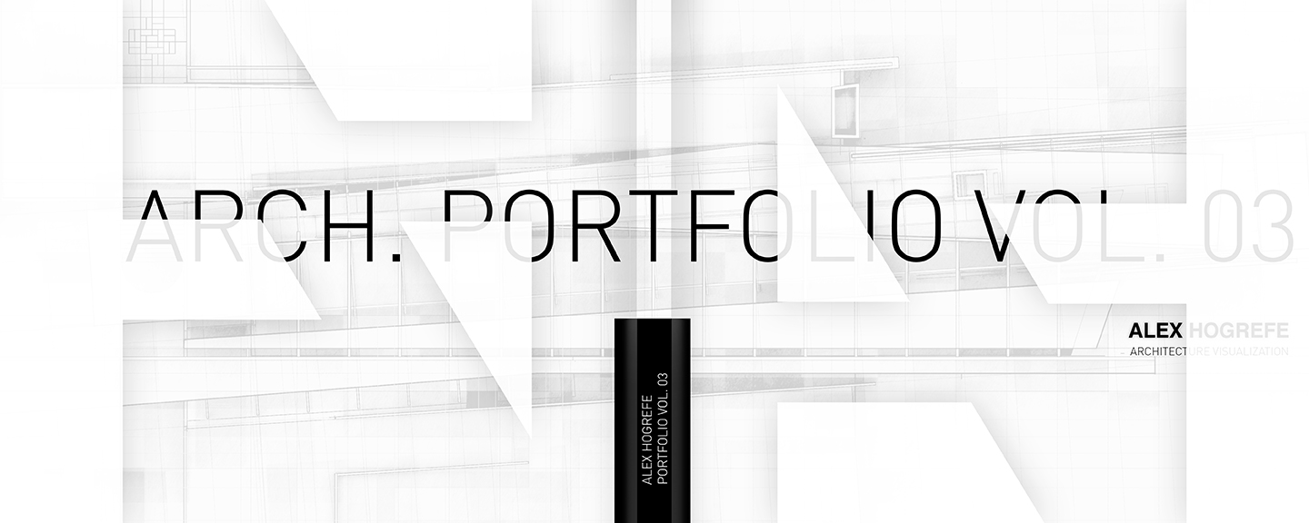
I wanted to see if I can find that sweet spot right in the middle of minimal and bold. In other words, I want a design that shows a certain amount of refinement and control, but still keeps a similar language to what is going on inside. If you have seen any of my project pages, they use very bold colors and textures. Therefore, I want to carry some of that texture and graphic style to the cover, but maybe leave behind the color. This will help to tone down the loudness of the cover but hopefully still grab the viewers attention.
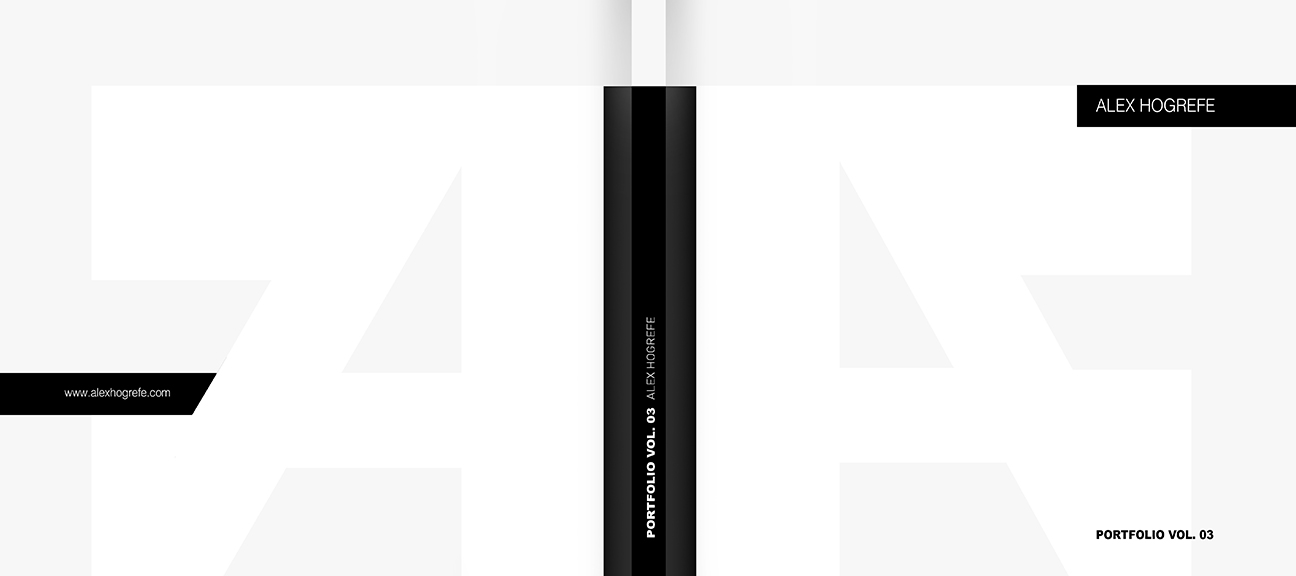
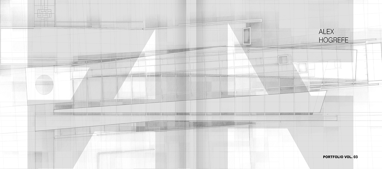
Below are some of the first iterations that I did. As you can see, I started out very simple and slowly built in more texture and info. I used the favicon of my website as a large graphic to overlay the spread which gives some movement to the page as well as provides me something to relate text to.
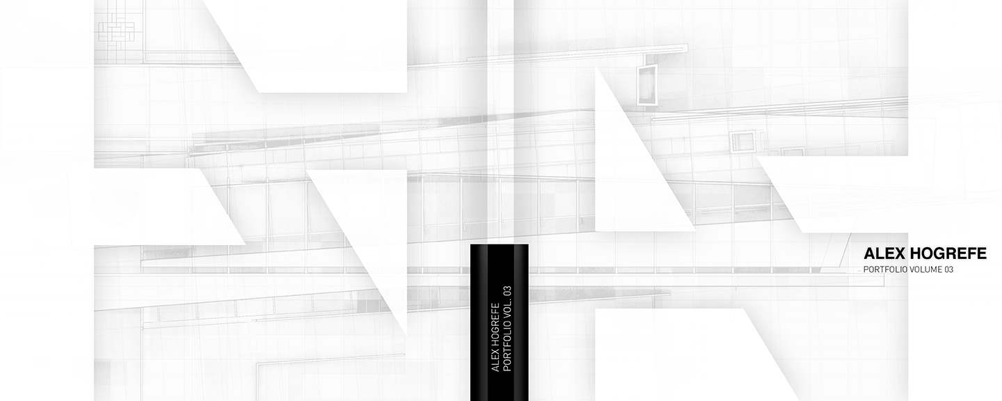
The last two images are what lead to my final design. I liked the idea of using layers of transparency to build depth and thought it could transition well into other parts of the portfolio such as the table of contents. So I kept playing around with the favicon graphic along with text and texture and ended up with the image below.
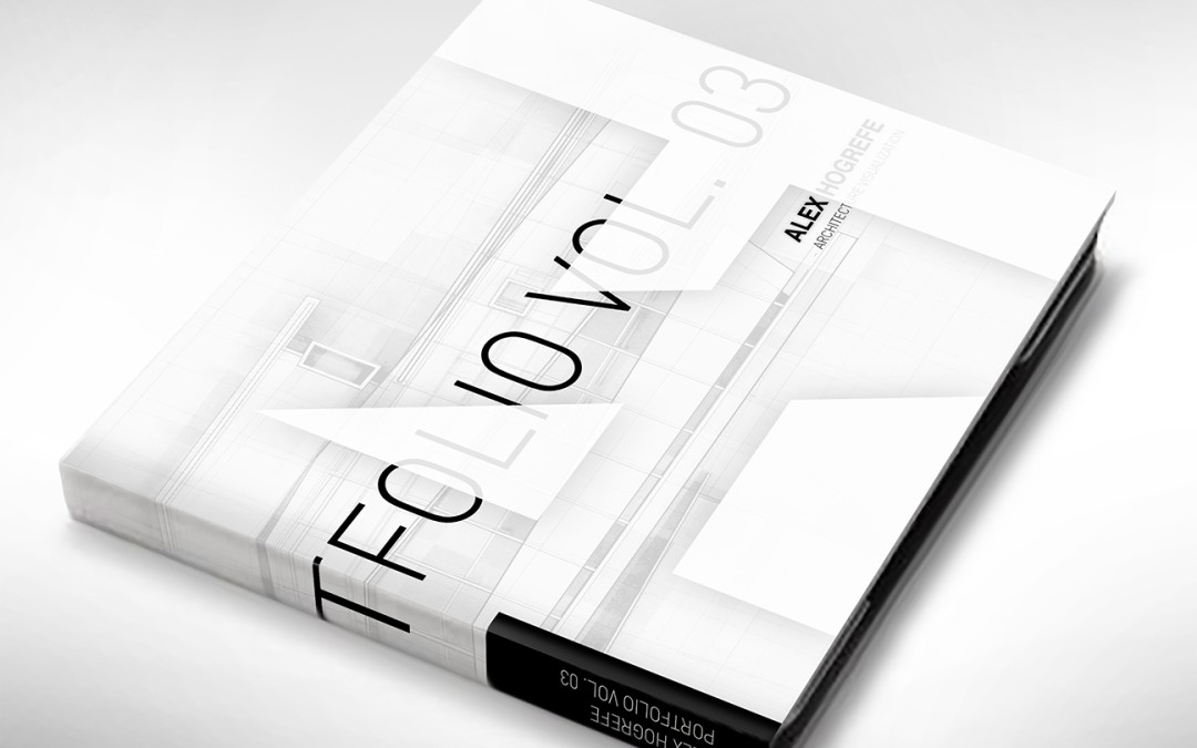
The above image was close, but I still wasn’t getting the transparency effect that I was looking for. I then brought in some large text and placed it in such a way that it appeared to slip behind the white graphic. I sized the text so that the “03” rested completely in the white zone and so that the viewer would read “folio” and understand that it was the word “portfolio” wrapping around the book.
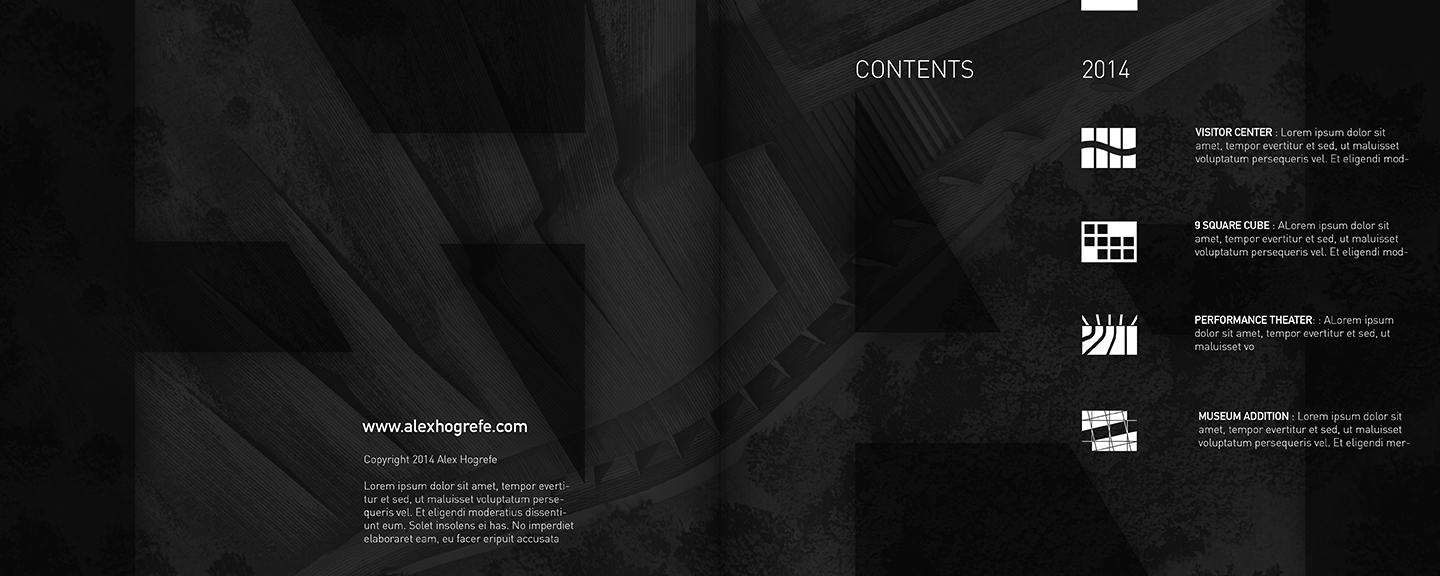
Once the cover was complete, I carried over much of this language into the table of contents. I like the contrast of going from light colored pages to dark color pages so I inverted the background to get a predominately black spread for the table of contents. I also set up a grid to help place the text and create alignments and relationships.
I still have a few more pages to work on inside the portfolio but once those are done, I will start doing some test prints from various online printing companies (The image at the top of this post is just photoshopped. I haven’t actually started printing yet). There are a lot out there and I am curious how the quality/price differs from company to company. I plan to post on every step of this process so be sure to check back often.






Don't let the cover set the mood for the entire portfolio, let the entire portfolio set the mood for the cover, otherwise your cover is lying.
The cover is ALWAYS the last thing designed. It should be an expression of the contents.
To overly simplify the design of book covers: if you have large text inside, put it on the cover, if not, don't.
If you have type over image inside, do it on the cover. If not…
Hello Alex I have been a reader of your blog for about a year or two now and I hugely appreciate all your tutorials and insights and the fact that you share your processes with us all. Thus I feel compelled to give you some feedback on your cover here. I might be terrebly wrong here since I have never done anything like this and you are at your third volume but here goes :
-I like the details
-I like the linesfaded in the bg
-I like the contrast and everything
-I don't like that you can't read the text clearly, I get where you were going but it's a usability issue that could affect impact
-I feel like the design is too crowded mostly because of the logo that you implemented over the details . It doesn't read well and people won't get it anyhow.
-I would go with something simpler ( as you said…minimal is good but hard to pull off) there really is something beautiful and attractive in simplicity
-Here is something I made in 5 mins http://screencast.com/t/lolxvn6vT This is what I would go with, ofc this is something really really rough but it's where I would start
Hope you take my criticism as constructive I am simply trying yo help. Also if you feel that my advice is very very wrong then by all means ignore it completly
Best of luck
Alex
omg i'm just doing my cover too it's hell:)) the two black and white ones are awesome i think. i would choose the 2nd from the top with the big logo. its a good logo and the cover looks super professional, nothing 'studenty' about it:) it means business!!:D anyway great job on the covers and the blog!! and thanks for letting us participate:)
Hi Alex,
I am a big fan of your work and techniques :-). Looking forward to see that cover !
Saludos de México,
K.
Love the cover. Looks like a firm or publishing house's publication, not a portfolio (in my opinion) but I don't think thats an issue.
When I first glanced at the perspectival mockup, I thought you had designed a semi-transparent dust jacket or sleeve. LOVED that. Totally captures the transparency you were going for.
Don't know if I'm the only one who read it that way. Might get tricky if it starts to look dishonest, but not an issue if I'm the only one who saw it in that way.
Great job.
Really looking forward to the assessment of online publishing services!
Hi Alex,
First off beautiful work. It captured me and made me want to see more of it at first glance, so I believe it does its job. I got some questions though if you wouldn't mind answering them for me. Right now I am in the process of creating a portfolio for graduate schools and I was wondering:
How do you bind your portfolio?
What material would be good to use for the cover?
Thanks
In all honesty – this is exactly what I hate most about architecture – If someone had told me in advance that I would predominately be doing a graphic design course based around buildings I never would have bothered wasting all that time and money!
@ Tyler,
I am going to be looking at some online printing which is typically use "perfect bound" which is similar to most soft cover books that you see. Most are very limited in materials you can use for the cover. To do anything crazy, you would either need to bind yourself or go to a local print shop that will do more customized work.
Can this portfolio be purchased once it's done? I'd more than happily grab a copy.
Hi Alex,
always a pleasure to browse your blog for ideas about graphic design. Outstanding work. One question, how did you do the actual book cover (first image)? Is it a render you've entirely done or is there any website that does it quickly?
Thanks
Hi Alex, I really apreciate your work and it is really helpfull for me. Can I ask you for the typography? How it's called?
Thanks
Hi Alex-
Love the work!!!
Could you share some of the sources you use for your textures and forested backgrounds?
I'd really appreciate anything you could share.
Thanks and keep up the great work.
Regards-MC
@FUBARCH,
The 3D book at the top was Photoshopped. However, someone told me about 3d-pack.com which essentially generates a 3d image of a book with your cover design for free. Its worth checking out
@Serge,
I have been using a font called Din Light.
@Mike,
Most of my textures come from google searches, especially the forested backgrounds. I have been building up my own personal library to save time but I still spend a lot of time searching google images for each illustration I do. I also use CG textures quite a bit.
Alex,
Great blog! and awesome works.
Regarding your portfolio cover: I think the type, grey theme and the texture all look great. But the title might need some legibility and understated presence: at first glance it doesn't read well, and one has to flip the book over to see what it says. Maybe that level of engagement can be achieved simply with the abstract rendering of your project, if you let it flow without being inscribed in the monogram? It would direct the focus of the viewer to your name while still giving some intrigue.
Hi,
love you stuff, so appreciative of your tutorials. Is there a link somewhere were I could see your portfolio in whole? Just graduated so I wanted to update (redo) mine, so seeing the whole book would sure help.
A
@Amy,
I plan to release it here in the next few weeks. I am still making changes and cleaning up some of the pages. Thanks
hey will u pl send me ur entire portfolio wanna check the work
"There is a lot of pressure that rides on the cover. It's the first thing the audience sees. It's the first thing they judge. It sets the mood of the entire portfolio."
Well this is so true for a cover. I'm taking too much time thinking how to design my cover with minimal design & it just represent me.
By the way, love all your tutorials. Keep more to come.
Hi Alex
I am such a huge fan of your work!
Is it possible you could provide a tutorial on something like this with the sizes with regards to the tolerance etc.
Regards
Amit Propheta
You might want to consider flipping the text orientation on the spine..
Hi Alex,
This is great work! I really enjoy looking at your tutorials and many of them have helped me on renderings.
The cover looks great. I do feel like it fits with your overall style because your layouts and renderings have a lot to do with layering, blending and transparency.
Did you design the cover in Illustrator?
Thanks,
Olivia
Hi Alex,
I am also in the works of putting together my portfolio for grad schools and had a couple questions.
1.) What type of work did you use for the background image? CAD linework, hand drafted…etc
2.) You state in other posts that you like to use InDesign for text but I’ve also seen you do text in Photoshop. How do you decide which program you will use for text or does it matter?
3.) Do you complete an entire project/design (elevations, sections, plans, renderings…etc) before you design your spreads in Photoshop or do you make everything as you go
A lot to answer but I’d really appreciate it.
Hope all is well,
Sean
which font have you used for ‘arch portfolio’?
Hi Alex,
I am a frequent visitor to your site and helped me a lot in making my undergraduate portfolio.Can u please tell from you get the v ray materials?
Hi Alex, Just wondering, is that Latin what you are writting in the last image?.
Greetings from Ecuador.