This tutorial will explain a way to create a night scene with lights, using only Sketchup and Photoshop. I typically use this style when I need to quickly light a large building with many windows. Inserting hundreds of lights though a rendering program in a large structure with a lot of windows is difficult, takes an enormous amount of time, and really increases the rendering times. This technique is quick if your under a time crunch.
VIDEO
INSTRUCTIONS
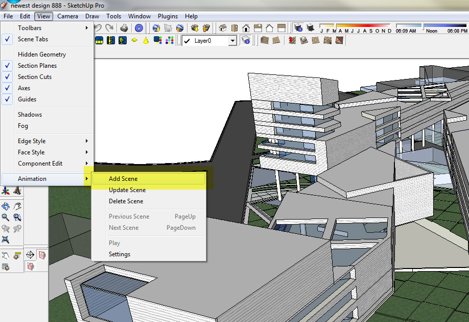
1. The first step, as always, is to save a scene of the preferred view in sketchup.
This can be done by going to View>animation>add scene
2. Next export (File>export>2D graphic) 2 images with the following face styles and edge styles :
FACE STYLE: Shaded with textures, EDGE STYLE: shadows OFF, edge lines OFF
FACE STYLE: X-ray on, Shaded with textures, EDGE STYLE: shadows OFF, Edge lines ON
3. Open the exported image -shaded with textures, no edge lines- in Photoshop
Duplicate this layer (right click layer>select duplicate) and move it to the top
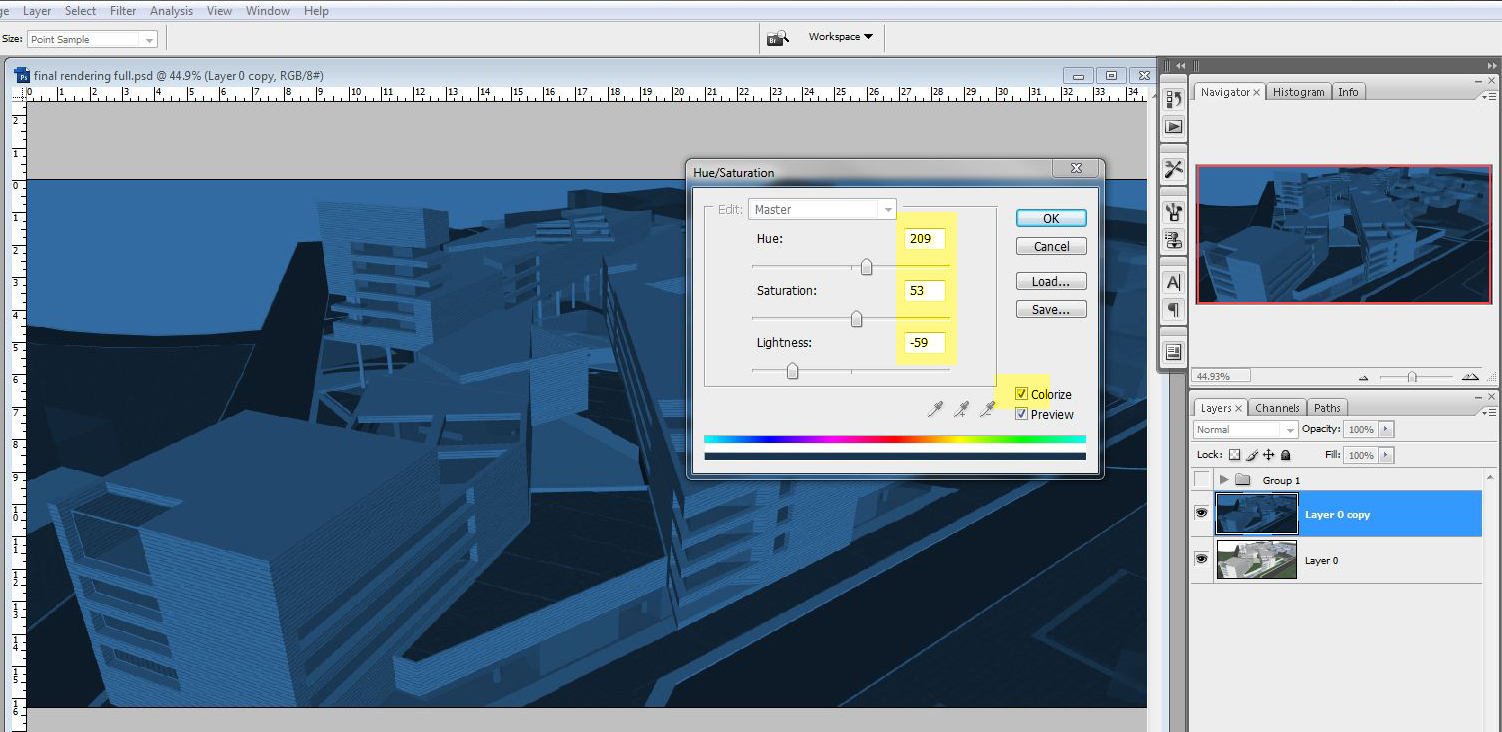
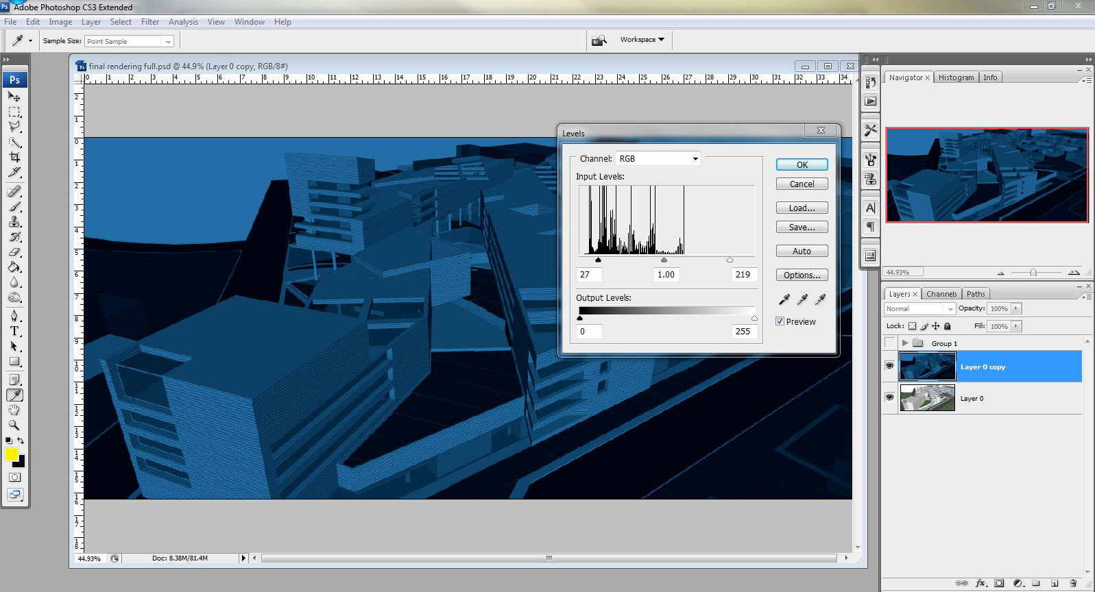
4. With the top layer selected, open the Hue Saturation dialog box (Image>adjustments>hue/saturation)
Check the COLORIZE box in the bottom right hand corner
Adjust the HUE, SATURATION, LIGHTNESS similar to the image below, you can see the settings I used.
5. With the same layer selected, open the LEVELS dialog box (Image>Adjustments>Levels)
Move the left triangle slider to the right until the dark colors in the image are almost black. You can see the settings I used in the image below. Typically, you want to move the sliders to where the curves on the graph are the highest.
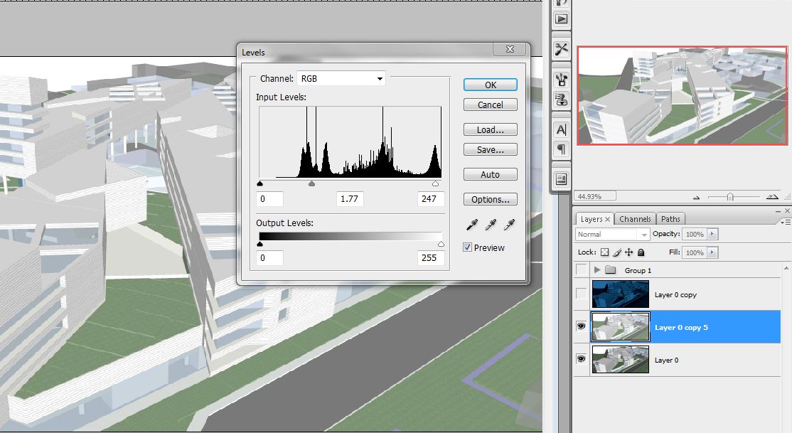
6. Duplicate the original layer (the one straight from Sketchup), move it between the two layers already created, and turn OFF the blue layer (click the eye next to the layer)
Open the Levels dialog box (Image>Adjustments>Levels), but this time, move the center triangle to the left to make the image brighter. You can see the settings I used below
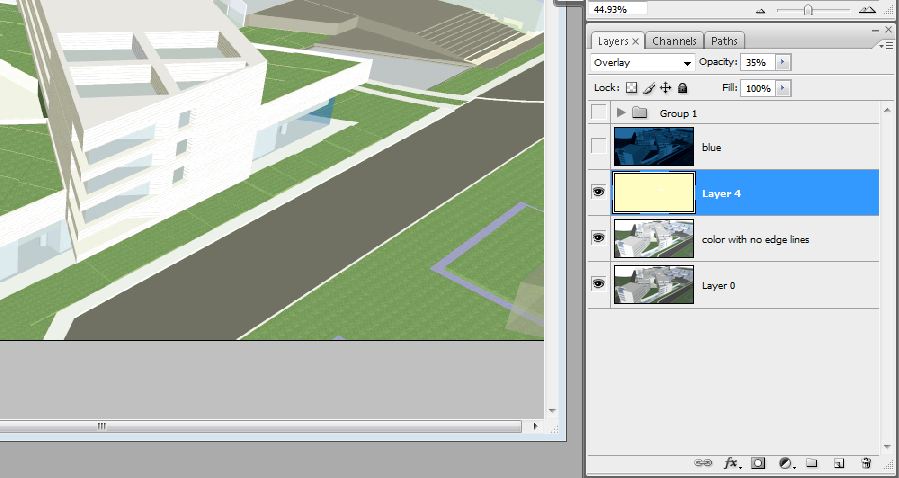
7. Above this layer, create a new layer (icon next to the trash can in the bottom right of the layers palette)
Fill this layer with a faded out yellow color using the paint bucket tool (shift G)
Change the Blend Mode (drop down menu on the top left side of the layers palette) to OVERLAY
Set the OPACITY (top right of the layers palette) to 35%
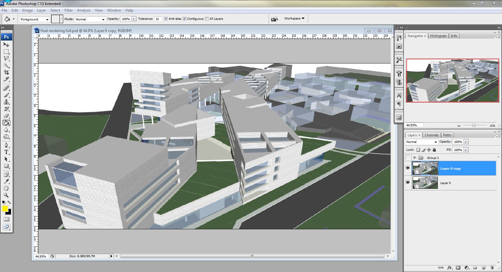
Your layers palette should look something like the one below
8. Now we can begin to add lights
Select and Turn ON the top blue layer created earlier (the eye next to the layer in the layers palette)
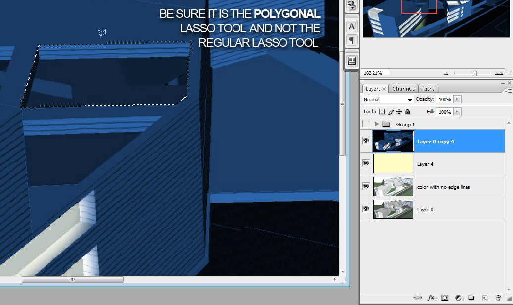
Select the Polygonal Lasso Tool (shift L for PC’s)
With the blue layer selected, begin lassoing windows or areas you would like to light up
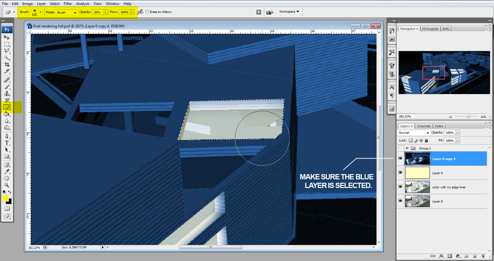
9. With the area selected, select the ERASER tool (shift E for PC’s)
Set the hardness to 0, size to 125 or so, and the opacity to 35%
Begin erasing away the blue layer, and you will see the other layers show through giving the appearance of light.
(NOTE: it would probably be more appropriate to use a layer mask for this step if you plan on making many changes. For simplicity reasons, I am just using the eraser tool for this tutorial)
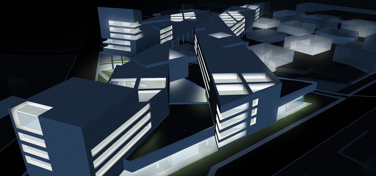
An important thing to remember is how light will be reflecting off of surfaces and the ground. This will ultimately bring realism to the image. Here is what the image looks like after this step. Notice how the green color of the grass shows through and how light is fading out on certain surfaces.
10. These next few steps are personal preference that add a little interest to the final image
Create a new layer and move it to the top
Select the paint brush and use the settings: Hardness=0, Size=200, and Opacity=10%
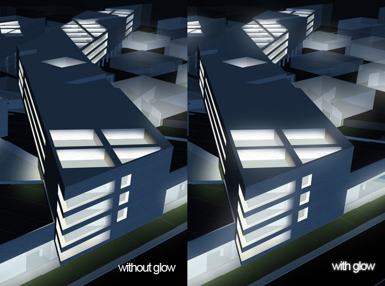
With the new layer selected, paint around the windows to give a glow effect. This step is very subtle, but adds a little more drama to the image
11. This last step I like to do when I am using Sketchup images that have a lot of flat, evenly shaded areas. This will add a little texture and excitement to those areas.
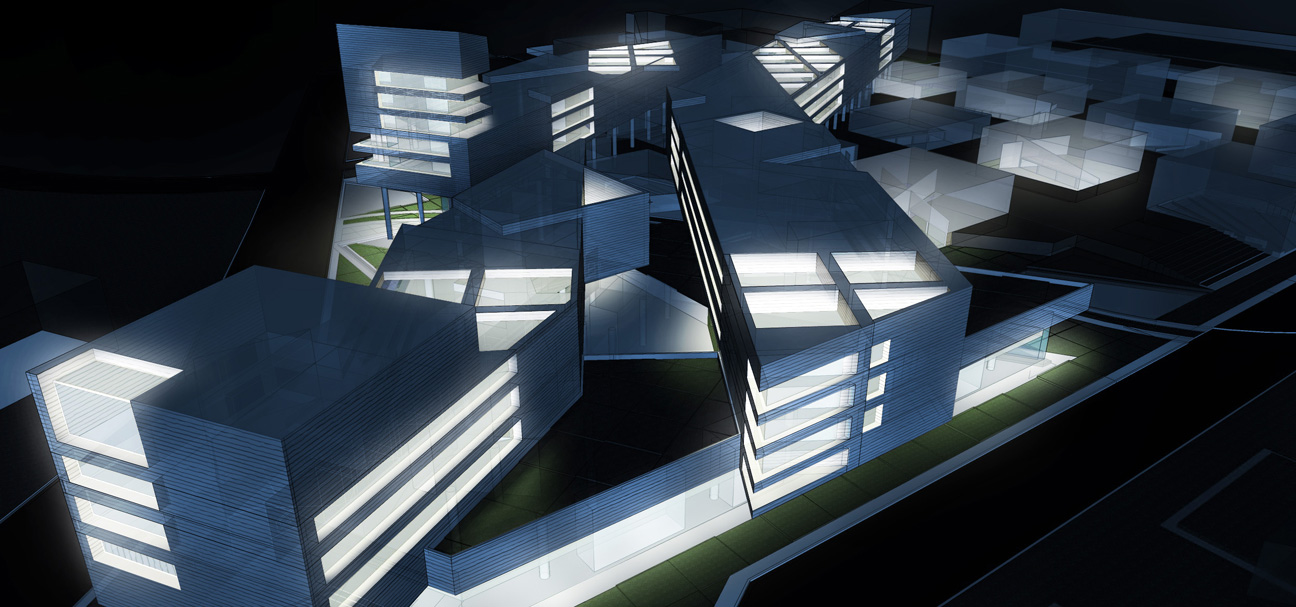
Open the -X-ray with edge lines- image exported from Sketchup at the beginning of the tutorial
Move this layer to the top and set it to Overlay
With the eraser tool, erase away areas where you may not want the x-ray showing.
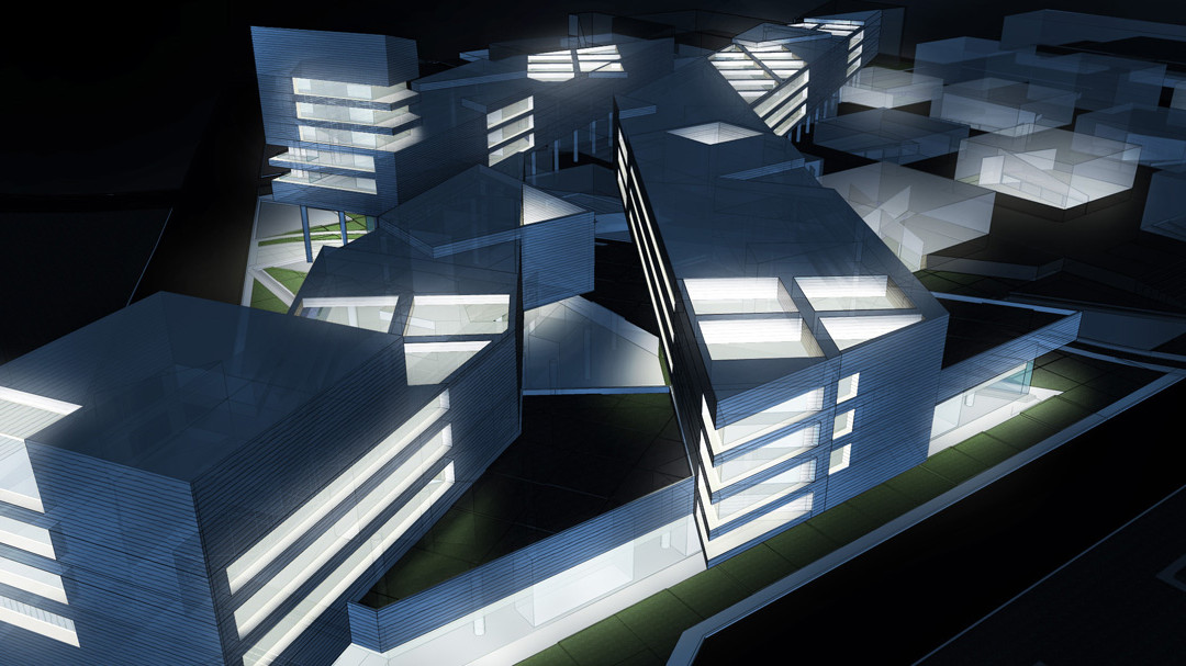
The final image:


Hey, I love this technique.. great stuff..thanks for sharing
hey alex
nice and easy.. great technique
thanx really..!!!
Thank you for sharing.. good work!! 🙂
keep your blog please 😉
i just want to remove all the things i learn about lighting in 3ds max … great
Great blog!!!!!!!!!!!!!!!!!!!!!!!!!!!!!!!!!!!!!!!!!!!!!!!!!!!!!!!!!!!!!!!!! Plz keep the site…
well done, learned some neat tricks. thanks!
Hey alex. great respect
Thank you…for everything
what should i do to reach your level :S
Hi Luca,
I learned most of what I know about photoshop from graphic design blogs showing photoshop techniques and tips. They get pretty creative with PS and its a lot of fun applying those techniques to architecture illustrations. So branch out of the architecture blogs and into some blogs like http://psd.tutsplus.com
Awesome stuff Alex, Very Inspiring! +1 for keeping the blog!
your tutorials are awesome! thank you for sharing and keep up the good work!
Very nice technique. And quick too.
Congrats!
Oli
very well,All things in their being are good for something.Experience without learning is better than learning without experience.-online replica Hugo Boss
Great blog!!!!!!!!!!!!!!!!!!!!!!!!!!!!!!!!!!!!!!!!!!!!!!!!!!!!!!!!!!!!!!!!! Plz keep the site…-discount Jessica Simpson Boots
Alex,I'm a student from China.I really really appreaciat what you've done.You tought me even more than my teachers.Thank you very much. You are a quite smart student who can use the least steps to creat the best result.Great blog! Plz keep the site….Thx ^~^
very very great stuff you are sharing here..god bless you ..(even more..:)
Alex,
I can't thank you enough for these tutorials. Great work, simple, easy and so helpful when you don't have much time in hand. Please do keep up the good work. If you have any 3D max tutorials for beginners, that'd be awesome!!…… i just found this site and still browsing through all your tutorials and get more excited as i go through each of them. 11/10 for the awesome work!!
This is a very good rendering tutorial architectural rendering
Thanks for teach us man, im doing all your tutorials, and in one afternoon im better image maker,
Thanks
Christmas gift <h1>coach bags outlet</h1>
The most fashionable cheap <h1>coach outlet online</h1>
Christmas Specials <h1>authentic nfl jerseys</h1>
Beautiful and unique <h1>coach outlet online</h1>
2011 most unique design <h1>wholesale designer bags</h1>
Buy want to buy products <h1>coach outlet store online</h1>
Professional design <h1>coach handbags on sale</h1>
Single product sales <h1>coach bags on sale</h1>
Cheap and good-looking <h1>coach outlet store</h1>
With top design <h1>authentic jerseys suppliers</h1>
Male friend love <h1>nfl jerseys from china</h1> Very glad that you buy
Amazing work, I'm an architecture major student and is amazing to have this as a way to make my work better and be able to please the professors that seem to be never pleased.
Thanks a lot!
I don't really get the next step after the number 9! What effect should I use after 9th step to get the final night perspective?
espectacular loco! saludos desde argentina
Thank u very much for taking the time to explain how u do things! It really helps a lot. I'm learning a lot for my architectural designs. Thank u again.
amazing !!!
alex, this is really great architectural rendering work , good , thanks !!
Hi Alex:
Thanks a lot ! I learned so much from you! But i'm not sure if you have overlap the X-ray layer in this tutorial. Is it necessary?
magnifico otra vez su trabajo¡¡¡¡¡¡ me gustaria obtener sus modelos para seguirlos paso a paso y poder mejorar la representacion q es excelecte la de usted, seria tan amable de pasarme los modelos por favor 😀 se lo agradeceria bastante, espero su respuesta por favor
U R a genious!! thanks
Great tutorials, very inspiring stuff!!
Many thanks for these great tutorials Alex. I teach SketchUp and CAD to students at Coventry University and whilst my PS skills are ok, these tutorials have helped the students realise what can be achieved with sophisticated but accessible skills. I am trying to eradicate the SketchUp template style and the use of Podium and your tutorials are an inspiration. Thanks very much indeed.
Regards and best wishes
Paul
You are awesome!!! Thanks so much for great tutorials!
A great log …. A great Respect . U make every thing simple . Plz keep it up
awesome technique thanks for sharing 🙂
Thank you for sharing. Every one of your tutorials are extremely well prepared and full of intelligent solutions. We owe you.
Hey Alex, another great tutorial. I found this page recently, it is a different technique to get a similar result, some of the visitors to your blog may be interested.
http://www.idigitalemotion.com/tutorials/guest/aura/aura.html
PS. Thank you so much for sharing your knowledge like this, I owe 95% of my Photoshop skills to watching your tutorials!
I am hoping to do this soon. Thank you for the awesome tutorial!
hey alex, great work….
unfortunately due to the music in your vid and some copyright issues,it isn't possible to watch it in germany. greetings from trier 🙂
Thank you so much , for shairing such a great knowledge , which helps us to make better view of your projects ,
I honestly cant thank you enough for these tutorials, I'm brushing up on my CAD presentation skills over the summer break and I have picked up so many great tips from your lessons.
Cheers!
Great tutorial!
This was a wonderful tutorial. Really helped me out 🙂
very good
its so usefull and functional .I have'nt seen it yet
Thank you Alex! Your tutorials are so helpful. Well appreciated! I've put an additional layer on my night renders, using custom downloaded paintbrushes to give a little more texture to the render. Some grit.
Really effective and quick way of preparing presentations in a short period of time & i really appreciate the fact that you are sharing your tricks and method of working so generously that even our professors never did back at the uni !
thank you .. amazing
“Notice how the green color of the grass shows through and how light is fading out on certain surfaces.”
Nope. Not at all. Though i am using photoshop 7 in the office, and the eraser tool has no “hardness” option. Is that whats going wrong here?