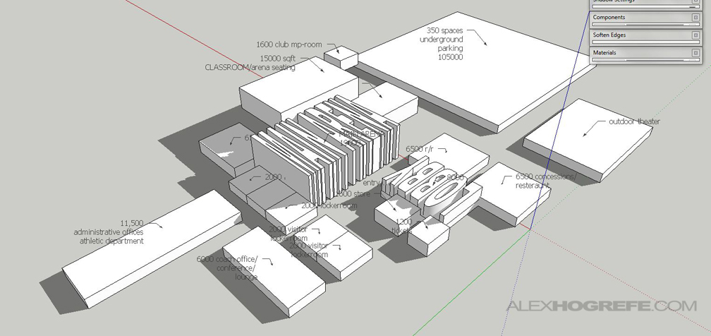
I’ve been putting together some program diagrams for work, and it reminded me of one that I created a year and a half ago in grad school. Experimenting with different arrangements and adjacencies of programmatic needs in Sketchup proved to be an effective tool in the preliminary design process. Each volume contains the correct square footage (or sq. meters) of the defined programmatic element, but also takes into account height needs and vertical relationships. Even better, the process of taking this information from Sketchup to a presentable diagram was quick and easy. I didn’t create a full fledged tutorial, but the following images explain the big moves from Sketchup to final diagram
To get the volumetric text, I used the “3D Text” tool, then stretched the words to the correct area and height.
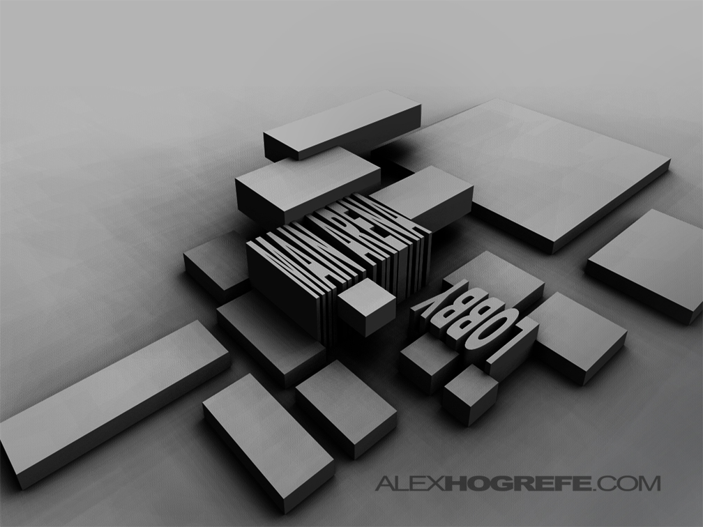
As with a lot of my stuff, I began by rendering the SU model in Sketchup as a clay model. TUTORIAL HERE
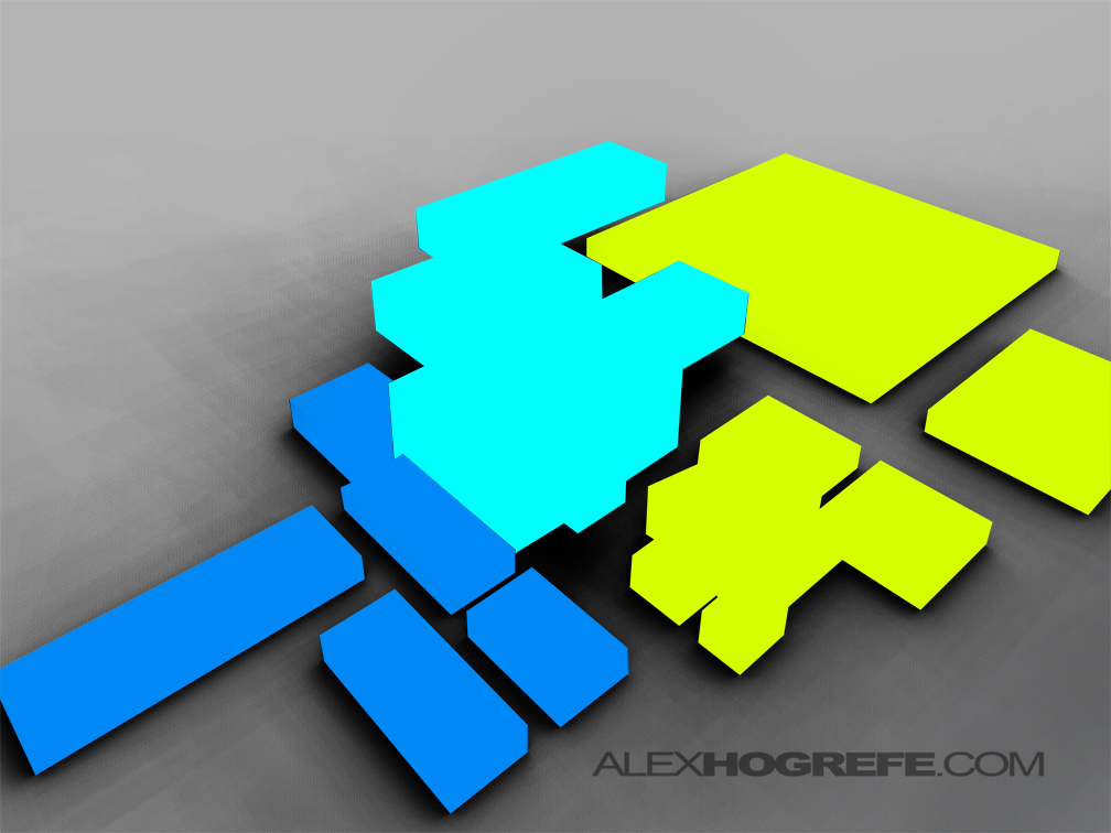
I next wanted to break the program up into 3 categories: Public, Semi-Public, and Private spaces. To do this, I created 3 new layers and painted over the program elements.
I next set the layer blend mode of those 3 layers to “Overlay”. Also with a soft paintbrush and really low opacity, I painted some color over the entire image to get rid of the desaturated look of the grey background.
To define use of each element, I added text and distorted it to the perspective of the image. Ctrl+T will bring up the transform option. Then, hold “Ctrl” while picking the corners will allow you to distort the text as need to get the correct perspective. Finally, lower the opacity of the text or set the layer blend mode to “Overlay”.
The final result is a clean diagram that organizes a lot of information into a clear and concise graphic.






Thanks as always Alex. Always wondered how you achieved this effect.
AWESOME!! You're giving me GREAT ideas for my thesis!! thank you so much!!
Again a simple tutorial and magic happens ……… fantastic!
By the way Alex, how was the vote on "the world's most famous blog" and what the final result in the contest?
I voted every single day, both in my office and at home! 🙂
Thank's again for this simple and very useful tutorial,
João Torres
from Portugal
@ Joao Torres,
Thanks for all the voting, that's awesome. I will find out on the 16ht who won
How do you get contrast between the ground plane and the buildings when you render the clay model? I tried, but there is so little contrast between the ground and the buildings that it is hard to get a good idea of the building layout. Thanks!
@ James,
Try Adjusting the levels using this tutorial: http://www.alexhogrefe.com/quick-tips-adjust-levels/
Also, just to double check, make sure you have a ground plane modeled.
Alex
Yea, I tried adjusting the levels, but the color of the buildings (unless they are in shadow) are so similar to the color of the ground plane that it doesn't really help. You may have just done it in photoshop by darkening some of the building sides with the paint brush. Could you change the material/color of the ground plane in Kerkythea or SU?
I created this diagram a year and half ago. I may have done some post processing in photoshop but don't remember. To change the color, give the base a different material in sketchup. Because you export as a clay model, everything will import into Kerkythea as one color, however, you will still be able to select that material in Kerkythea and darken it with the material editor.
Thank you for gracing us with such useful tutorials.
There is one thing about this tutorial which I have not been able to figure out and has, as a result, kept me from achieving the professional level of quality yours displays. I have not been able to figure out how you got the great depth of shadow and light in the clay model image before you begin the color overlaying.
I followed your kerkythea tutorials closely (thank you for those) as well as your suggestions about levels but none have achieved the look of the above image
any suggestions for this would be greatly appreciated!
@Adam,
One thing to try is adjust the clay material once in Kerkythea to be a darker gray. This will give you better shadows and definition. Also adjust the sun light to be not so bright which will help avoid a washed out look.
What font did you use on this diagram? Thank you so much for your tutorials!!
@ Jessica,
I think I used Arial Black. I may have also tweaked the character spacing so that the letters were closer together.