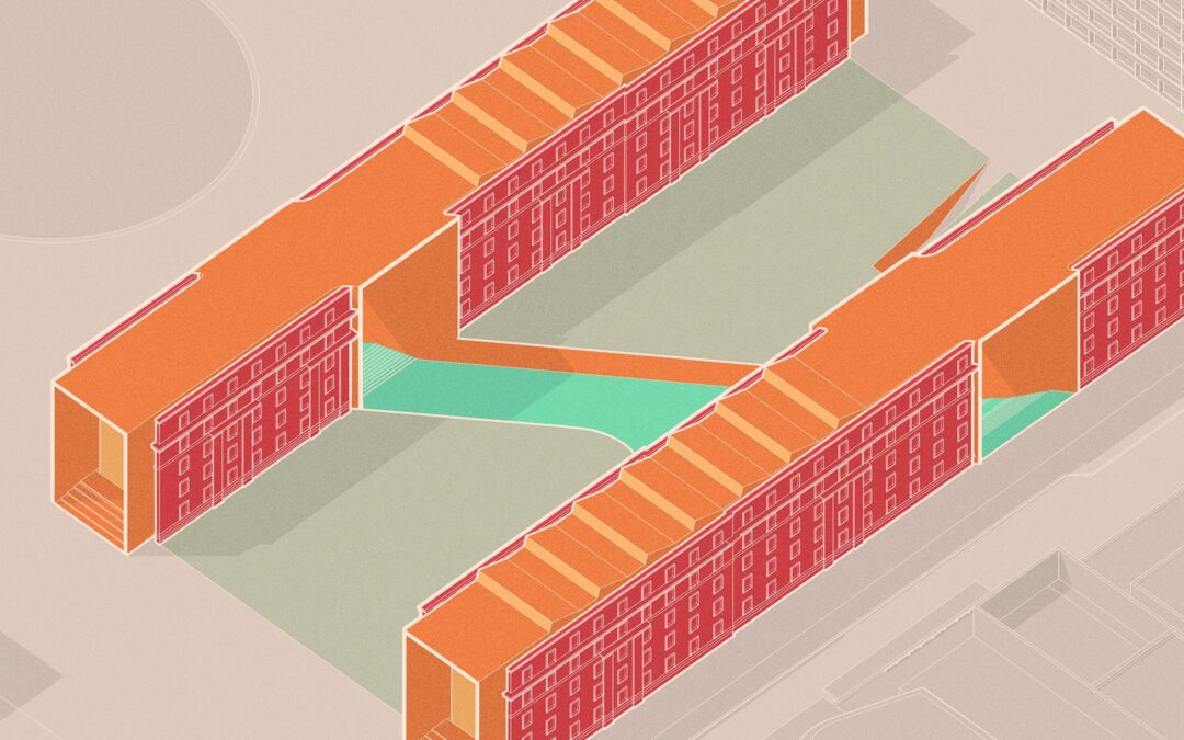
I have begun a new personal visualization project to start off the winter season and help me switch things up a bit. As much as I liked working on the Texas Prairie Office, the project and scope was huge which meant every image required lots of design and time to develop the illustrations. For this next project, I am keeping the scale of the project smaller and the design more paired down. The project is located on the MIT Campus and will be a “Student Hub” containing restaurants, large event spaces, and smaller study spaces.
My ultimate goal with this visualization project is to spend more time on the 3D side developing better materials and light. Along with the 3D, I am also going to be exploring the “Aging” of the building and illustrating what the building may look like 20 to 50 years down the road. For example, how will the metal patina or how will the dirt build up in corners and crevices. I am curious if attempting to illustrate a building’s age will influence the design and if it alters how the building is percieved.
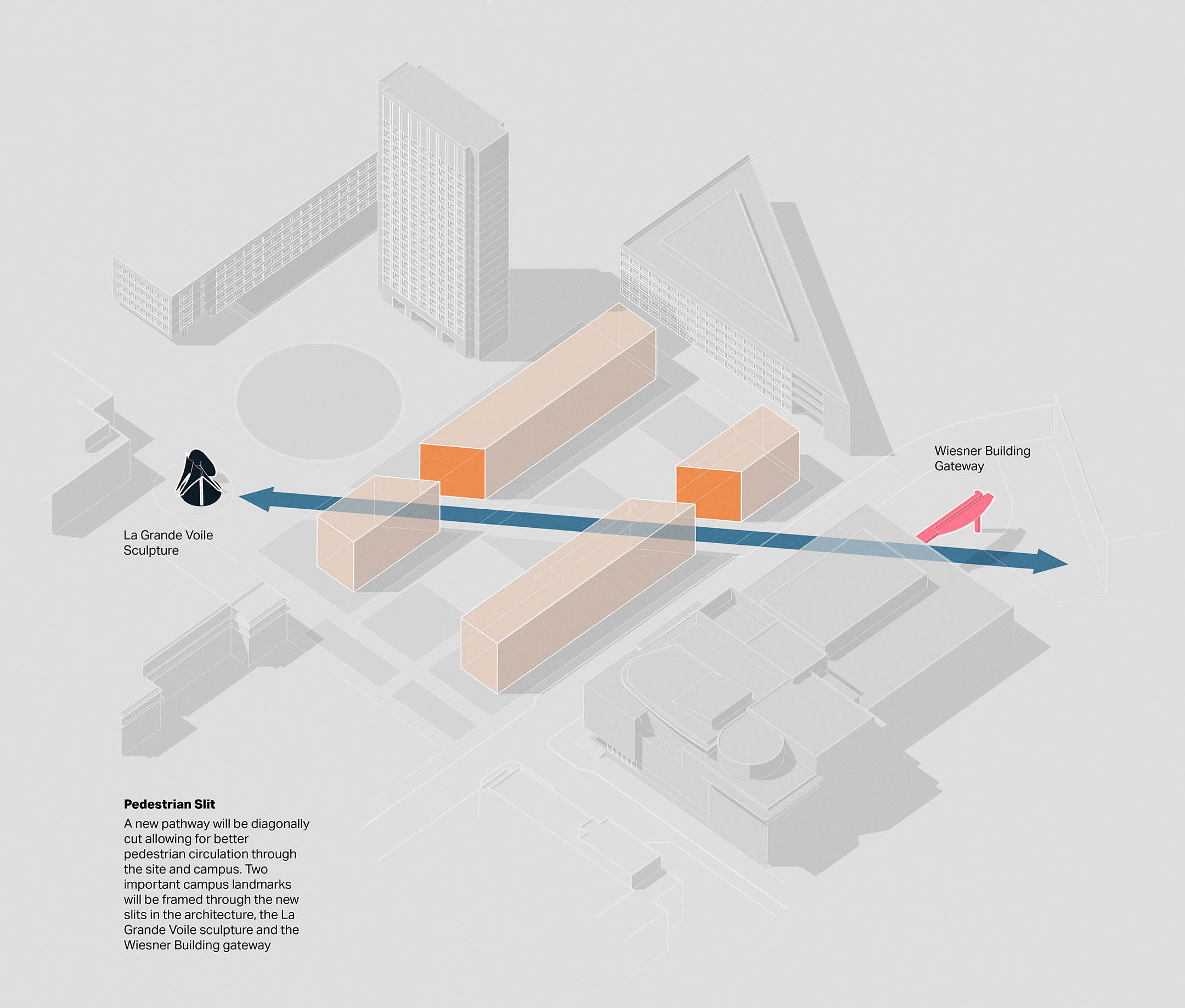
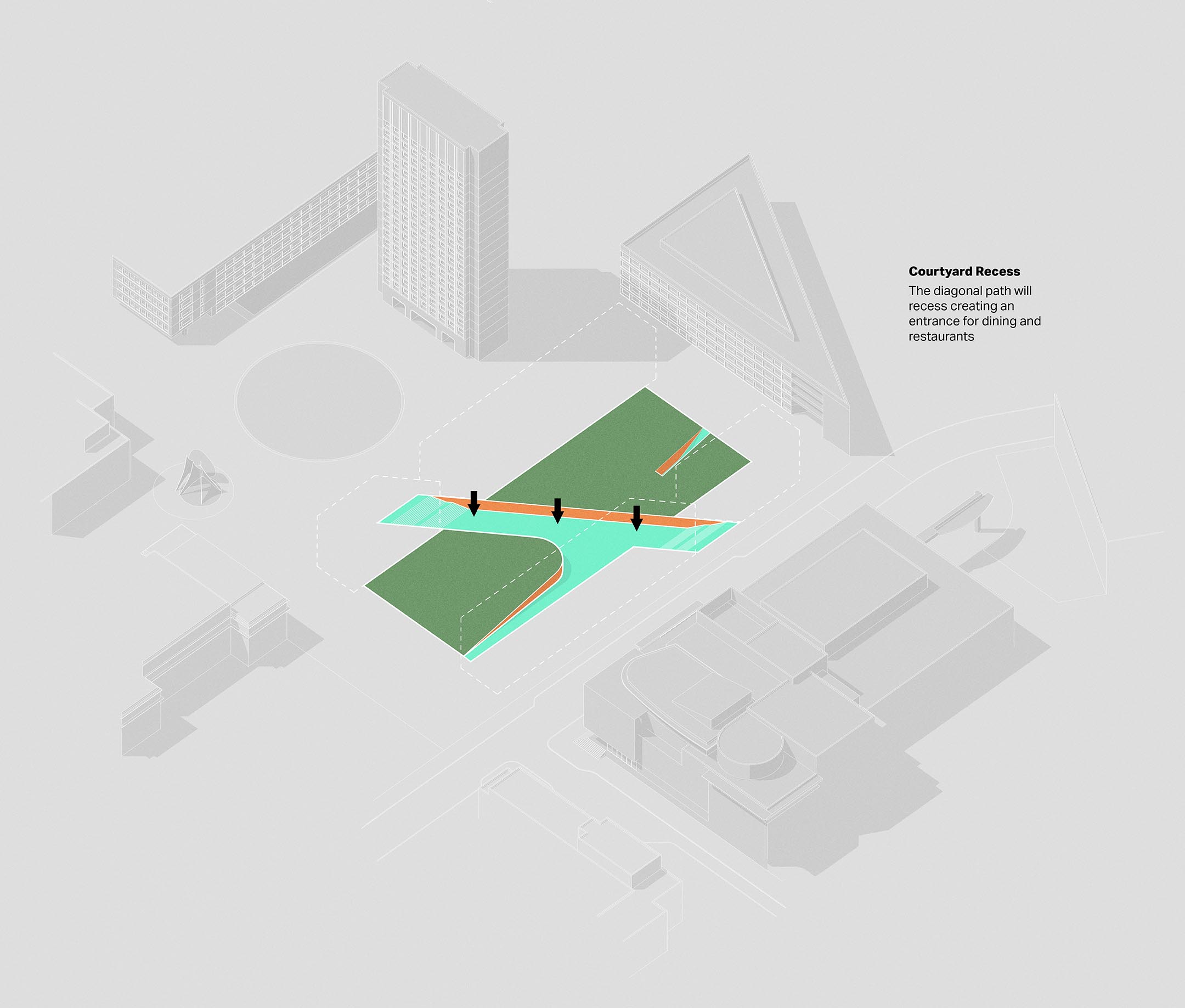
For now, below are a series of diagrams explaining a little bit about the project and how the form was conceived.
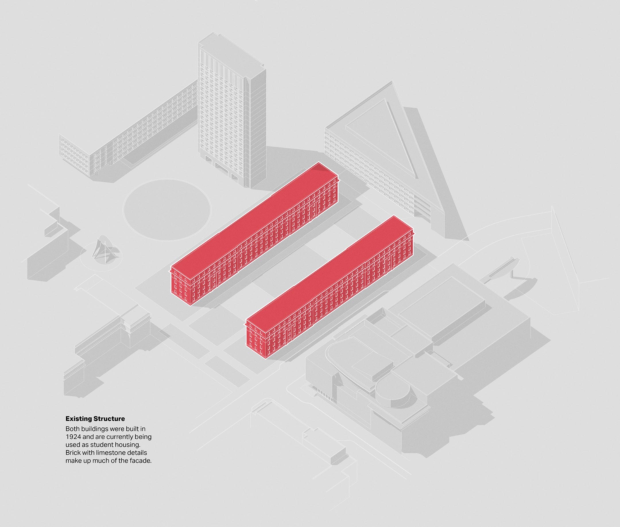
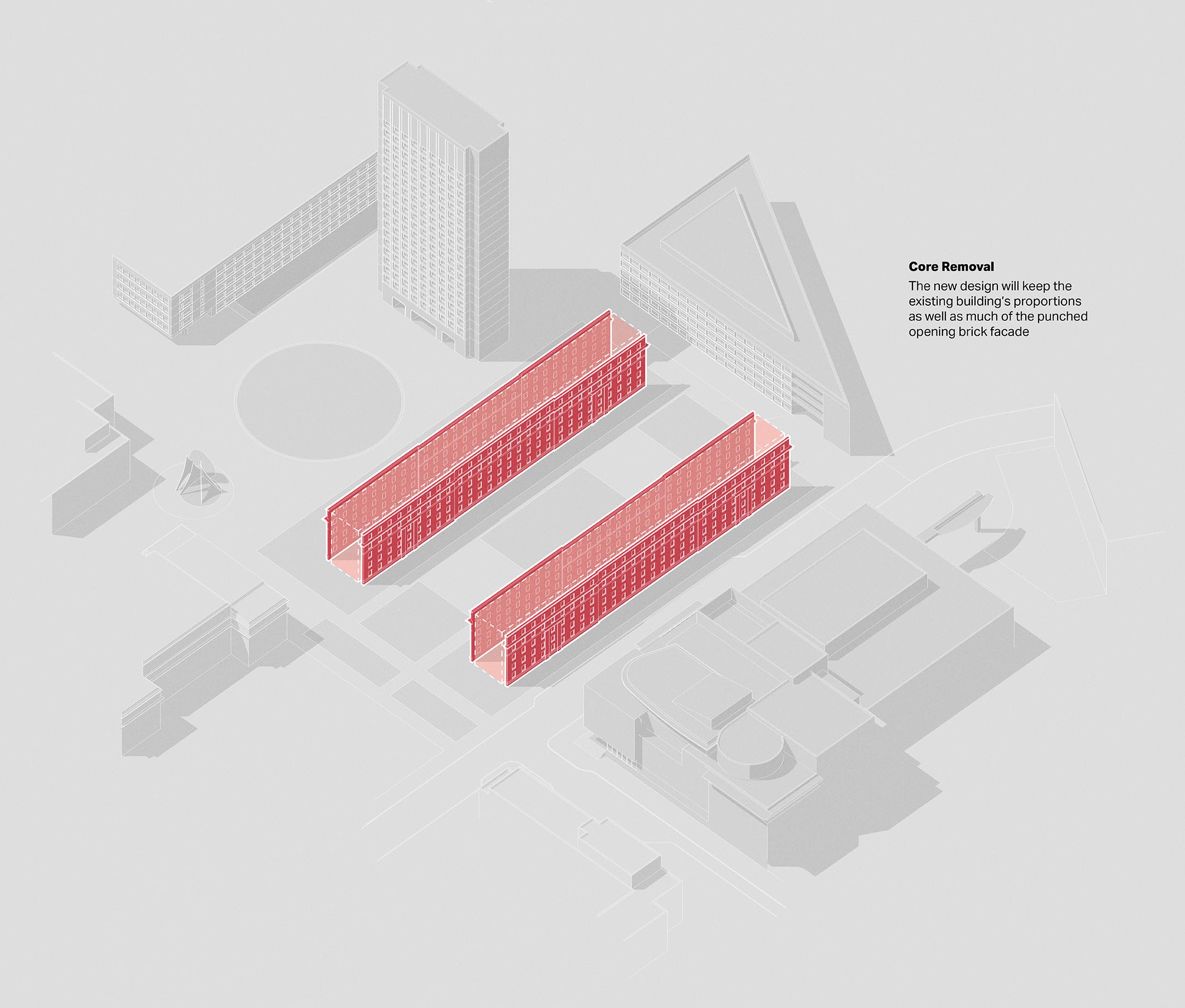
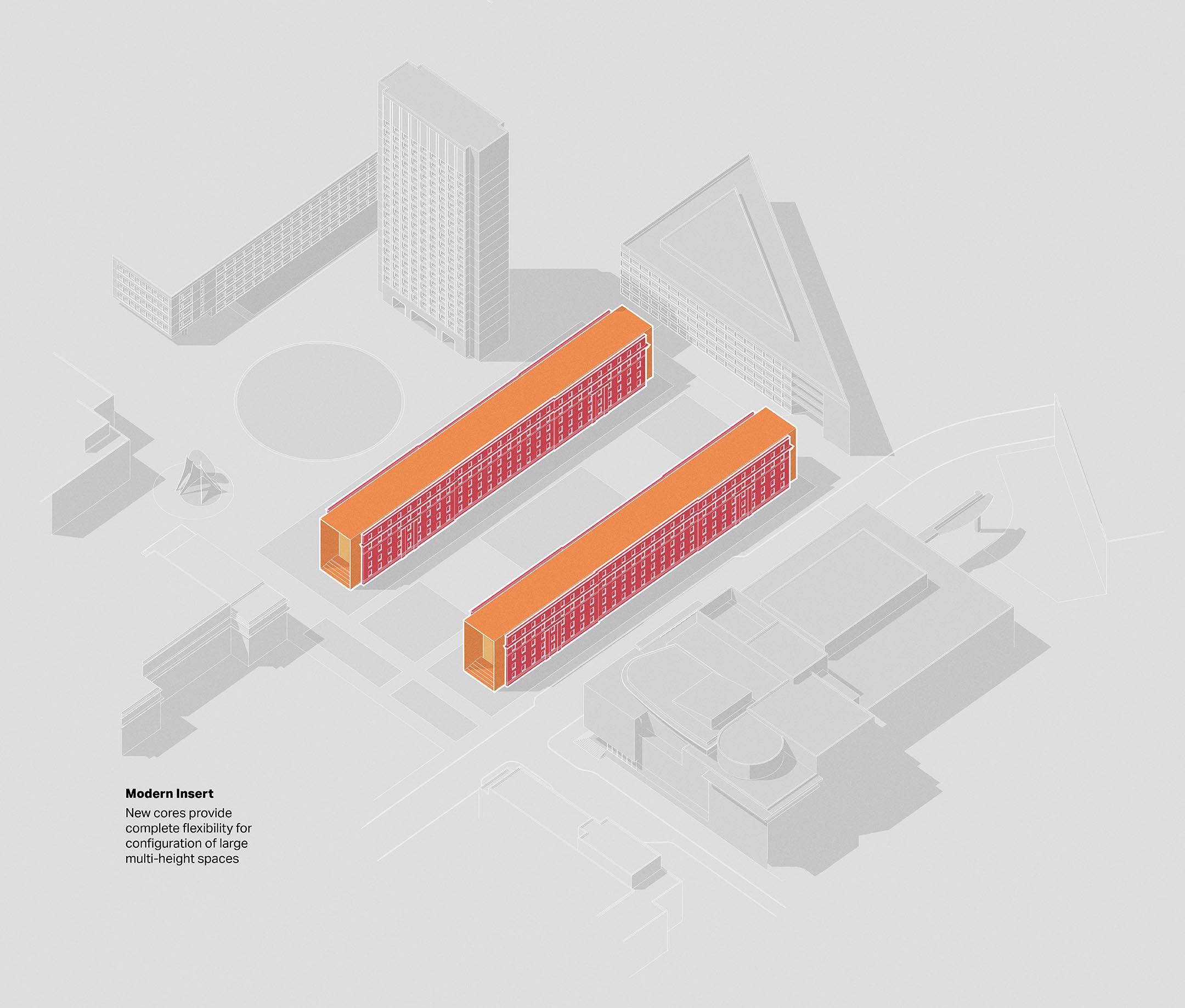


Beautiful, love the simple but clear diagraming. Also love how you composed the diagrams vertically on what appears to be one sheet. This method lends itself perfectly for viewing on a website as you scroll. Was this created with a combination of SketchUp & Photoshop?
PS works but AI would be more useful
This is lovely to see, paired back but to the point! Did you use rhino or sketchup to model everything?
Very cool work !