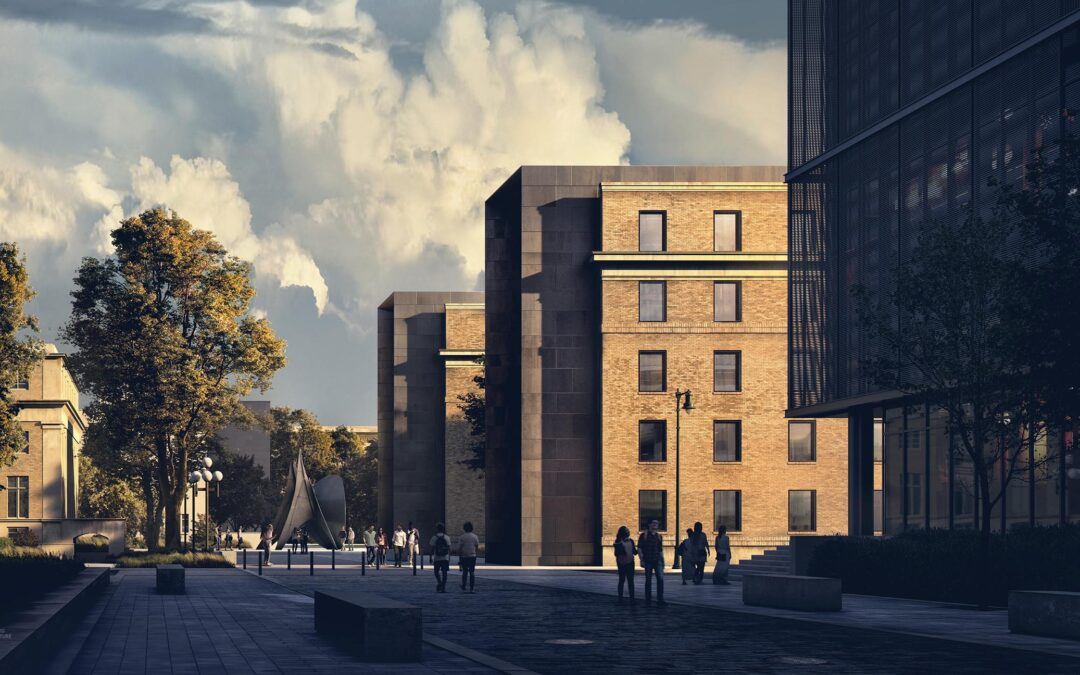
One of the first views of the MIT project that I wanted to explore was an approach shot down a new proposed pedestrian street. It is not necessarily the most compelling view of the new architecture, but I like that the view shows how the student hub volumes reinforce the edge of the new pedestrian street. The existing conditions of the site consist of aging narrow streets, overgrown vegetation, and lots of on-street parking. Yet it runs parallel to some of the most beautiful views of Boston’s Charles River and skyline.
I was trying to think of a different way to break down this image rather than showing a slow buildup of layers in Photoshop like I normally do. What I came up with was to show some side-by-side comparisons between the raw base rendering and the fully Photoshopped final image. I think this method helps reveal all of the nuanced adjustments that happen throughout the illustration. I also tried to extract some of the 2D assets that I used so that you can see how I reworked the lighting and tones of these assets or how I overlaid them to add age and texture to the base rendering.
1. Left Side Closeup
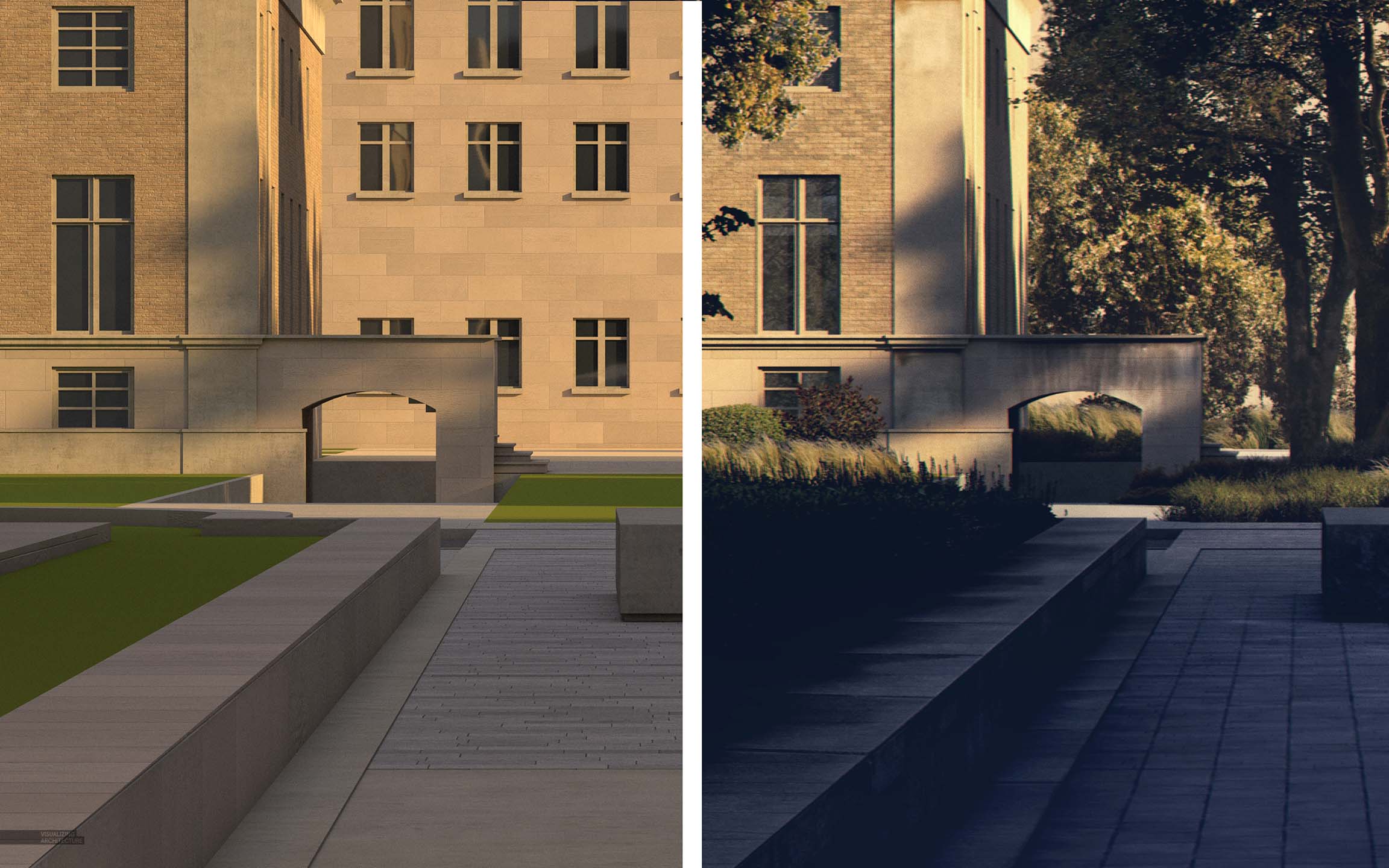
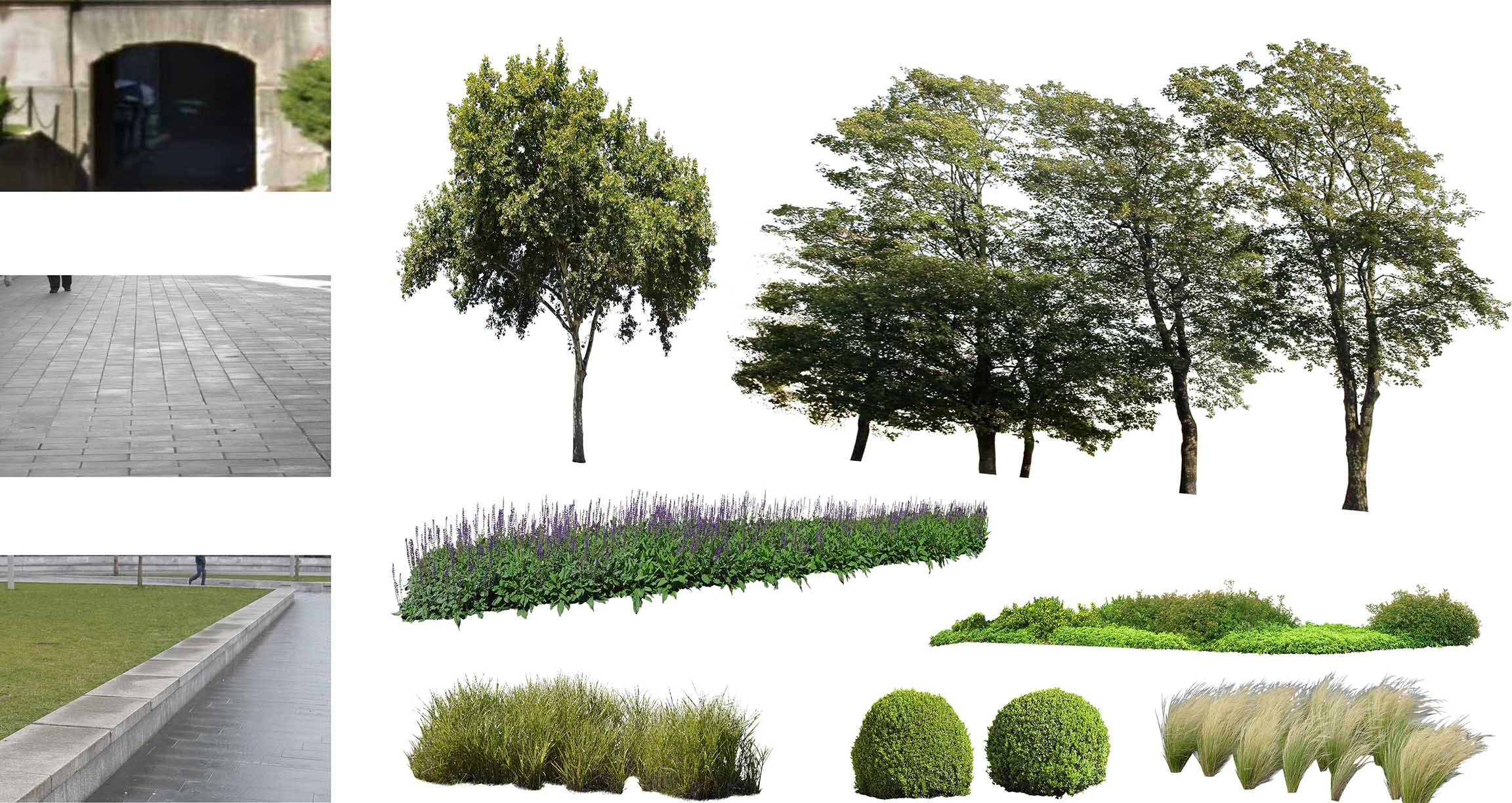
With each new image that I create, I find myself spending more time thinking about and exploring how to blend the 2D with the 3D to the point that the two are indistinguishable. It has become a borderline obsession for me. The more that I do this, the more I realize that it is less about over-the-top complicated moves in Photoshop but instead more about implementing really simple moves that nudge the tone or lighting to where it needs to be. I’m constantly studying light and tone in the real world which then allows me to better estimate what needs to be done with 2D or 3D elements to better blend the two.
In the above image, there are a lot of really subtle things happening in Photoshop that add up to a much more dramatic final result. I overlaid a ground texture to breakup the plaza. I added a ledge texture in Photoshop to create the appearance of more weathering and age to the seat wall in the foreground. Similarly, textures were added to age the buildings in the background. For the vegetation, I really just used a careful layering system to create moments of highlight and shadow. From there, it was all about reworking the toning so that all of these different cutout elements read holistically as one.
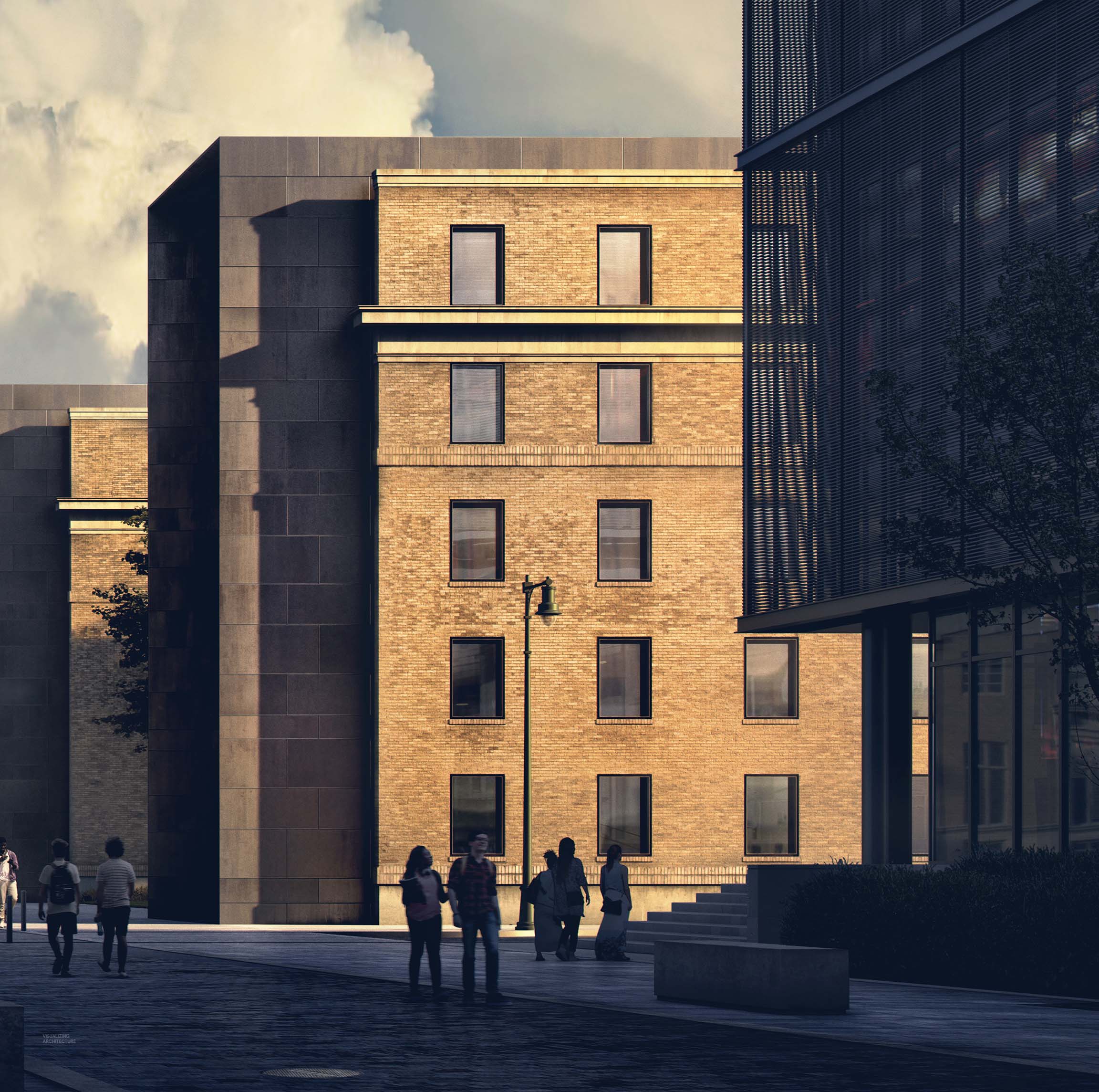
2. Right Side Closeup
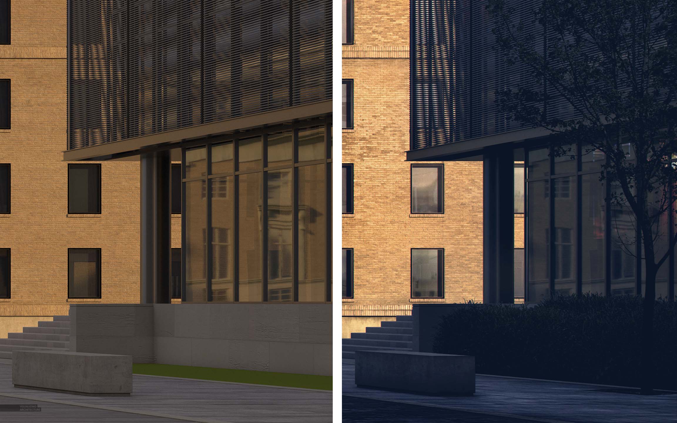
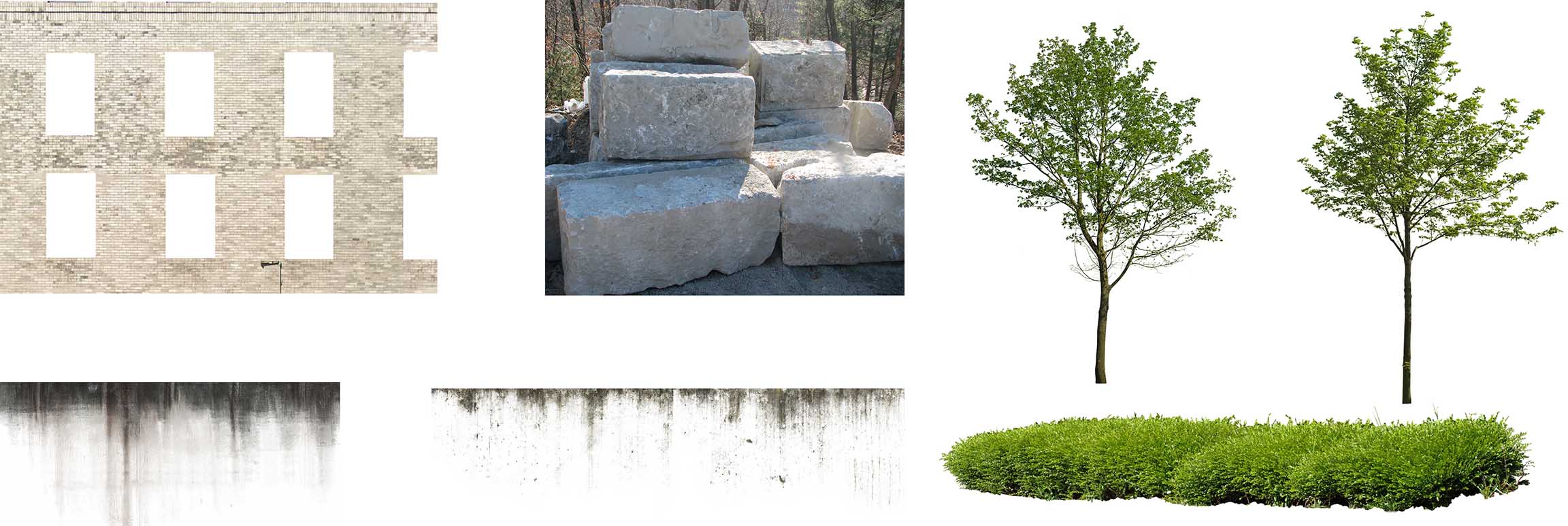
The first thing you may notice with the right side is just how dark certain areas had become to the point that all of the detail was lost. Though this bothered me in the past, it doesn’t much anymore. I tend to worry more about the highlights getting too blown out rather than the shadows getting too dark. The dark shadows help to soften an image when there are a lot of textures going as well as add drama to the highlights of the scene.
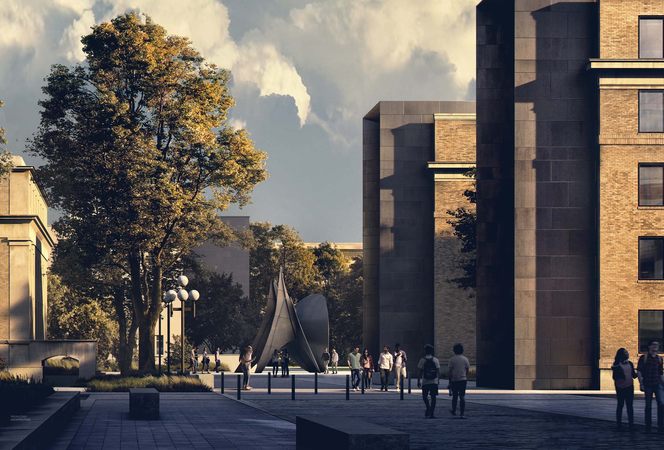
3. Center Closeup
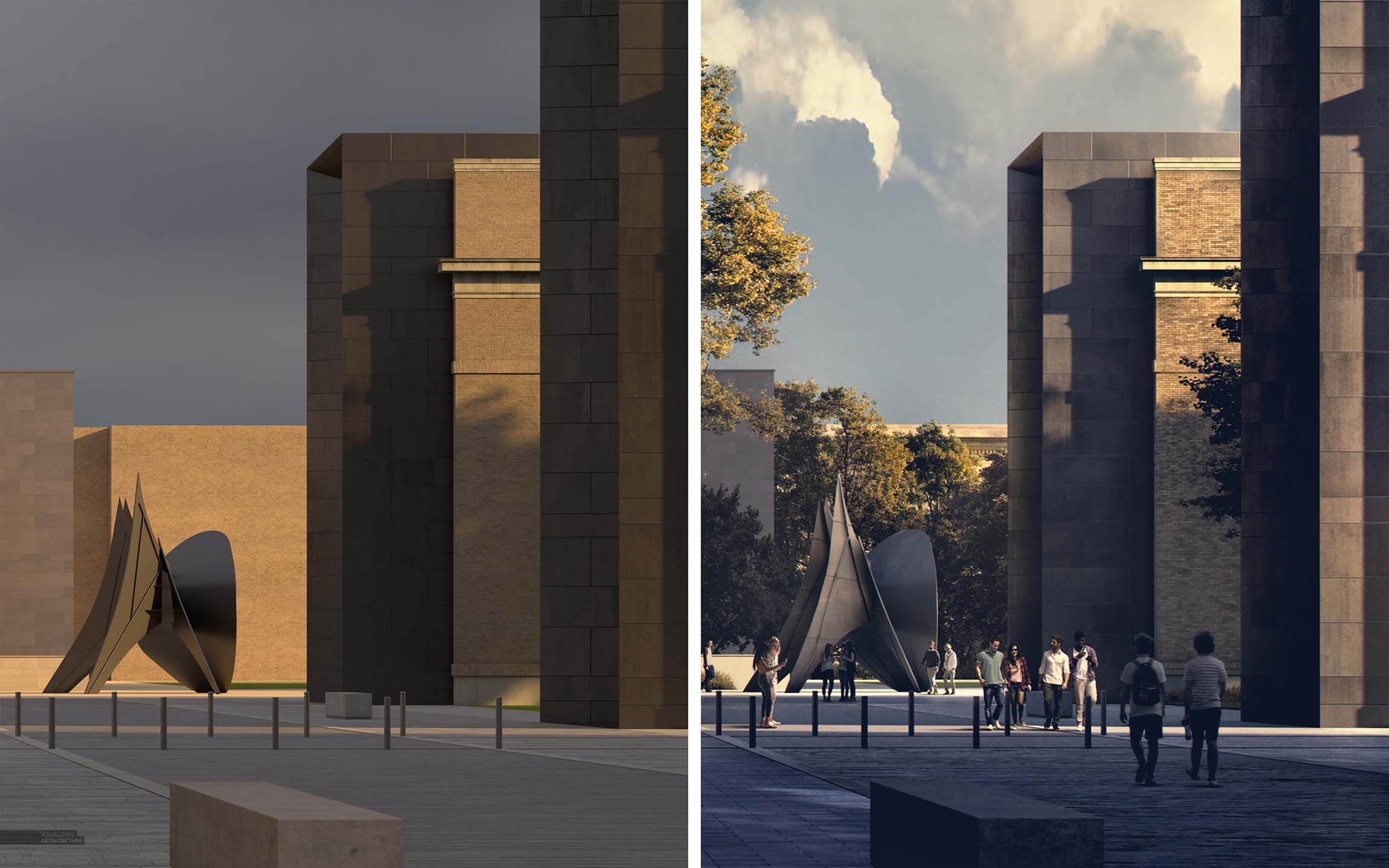
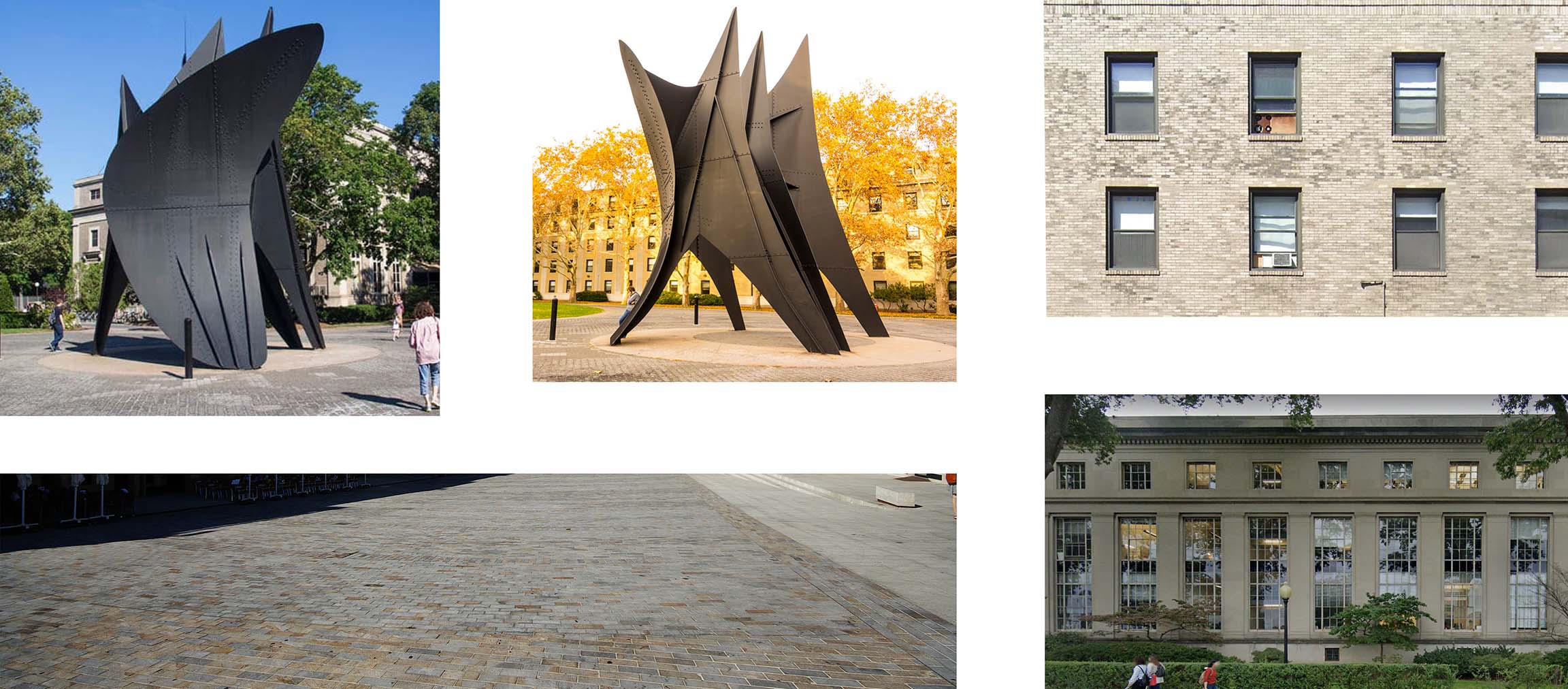
Again, I used some textures to breakup the paved plaza. I pulled textures from photographs of the La Grande Voile sculpture to more accurately represent the age and sheen of the steel. I wanted the metal on the new student hub volumes to relate to the sculpture which meant lots of toning and extracting of texture. The whole point of the illustration was to show the relationship of the architecture to the iconic sculptures and buildings surrounding the site and how a well placed pedestrian street could connect these elements. Most of the people were placed in the center of the image to keep the focus there. However, I let them move in and out of the light and shadow to create clear focal points and push elements forward and back.
4. Sky
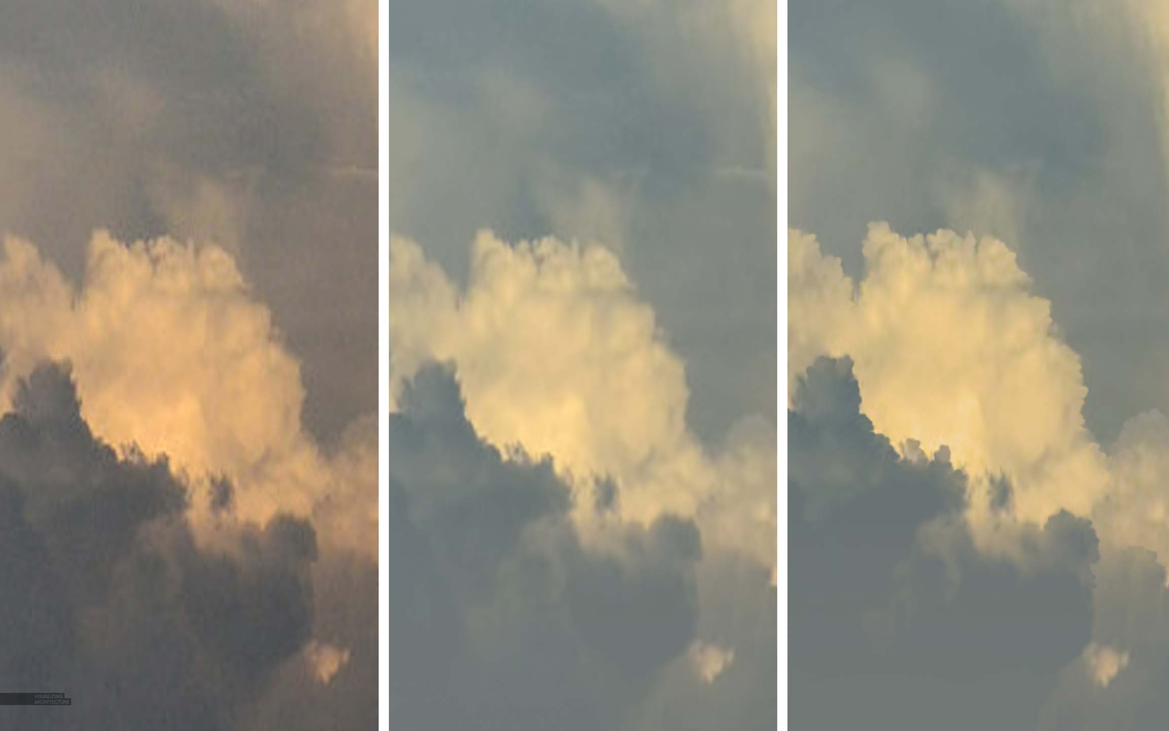
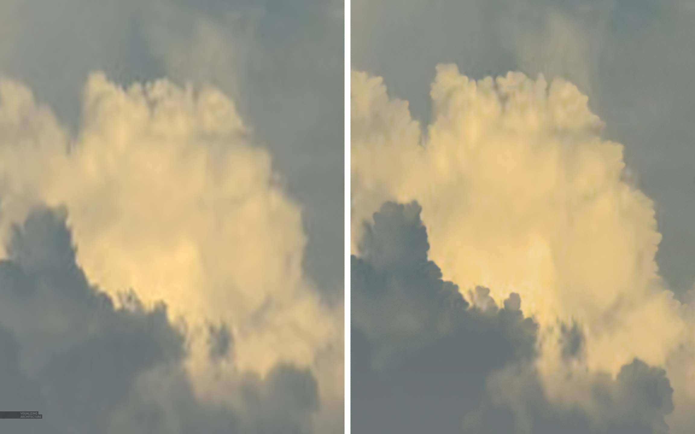
I actually had a little breakthrough moment when I was working on the sky for this image. It seems whenever I find the “right” sky for an illustration, the quality is terrible. I can sometime run a denoiser filter to smooth it out, but it still lacks detail. In this case, the sky I wanted to use was really poor quality. But I had spent too much time looking for the right cloud formation and was coming up empty so I had to make this one work. The first step was to tone the colors to match the lighting of the scene. I then ran a denoiser (I use a denoiser by Topaz). However, at this point, the clouds still lacked detail. This is where the breakthrough came in. I grabbed the smudge too, set the strength to 90, and used a soft round tip. I then started smudging the edges of the cloud through a series of small quick movements to get back the crisp edge. I was surprised at how natural it looked considering how simple the move was. I spent all of 10 minutes and the image looked like it was at a much higher resolution. I know I am probably not explaining this well, but perhaps I will do some quick tutorial about it in the future.
Final Image
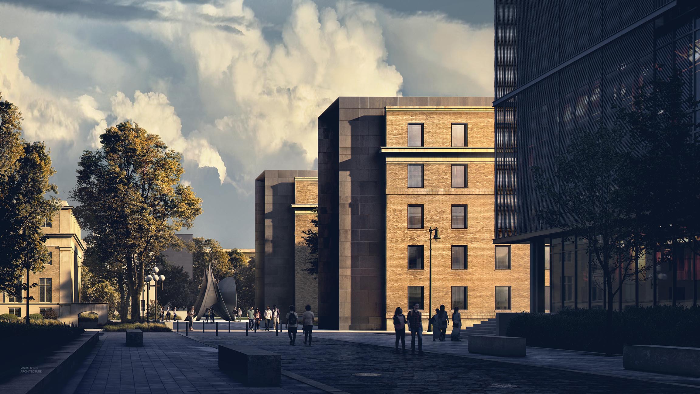
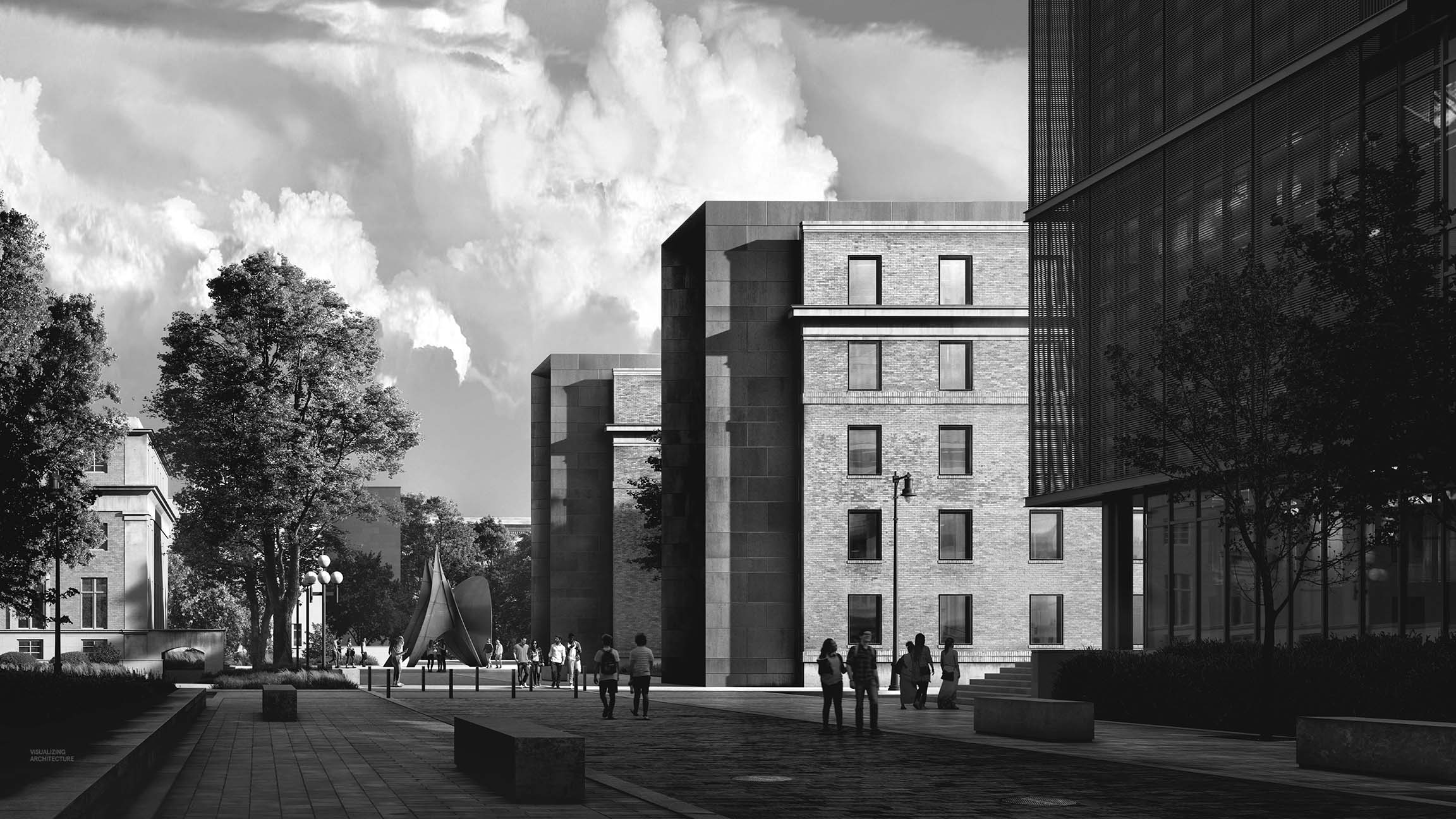
I just about posted this image as a black and white because I almost think it is more successful as a black and white. But given how much time I spent playing with the colors and toning everything, I couldn’t bring myself to do it.
Hi Alex, Great work.
Can I ask what part of the feature you use most in Topaz lab? And how to adjust the lighting in PS?
Thanks
@Sam, that is a broad set of questions you asked that cannot be explained in this comment section lol. However, I tend to use Topaz Adjust a lot for sharpening and slight coloring as well as the Gigapixel and denoiser AI.
Wow, amazing. My mind is flooded with the sense of experiencing the scene while my breath to speak is taken by the complex simplicity of your work.
Thanks John!
Im glad you decided to use this image with colour. I feel that the thoughtful and detailed way in which youve brought the tones, shades and colours together in this image, really help convey the feel of the image (which I fear, gets a bit lost in the blck and wite image).
Thank you for sharing this wonderful work.
Thanks Shrey!
I’m following your work since a long time. It’s always really inspiring to see your works and energy you used to share with us your skill.
Thanks you.
Thanks Mickael!
Fantastic explanation, the depth and lighting is great.
Thank you!
Thanks Alexander!
windows reflections from base Vray render looks weird, i personally tweak up reflections from hdri even if it is not physically correct, but your final image looks great .. And with that 2d/3d elements – one my friend who do viz as pro (im just civil engineer and sometimes do vizualizations) told me that he does every staffage in 3d for quite some time, but your work prove that it is still doable and for me it it is more human than have 3d people and trees
Thanks Filip
Thanks, Alex, for the really helpful tutorial, lots of great tips.
I love the sky, it’s just perfect!
Thanks Tony. I spent so much time looking for that sky lol!
Impressive work!
Even if I really like black and white architectural photography, I find your color rendering sublime!