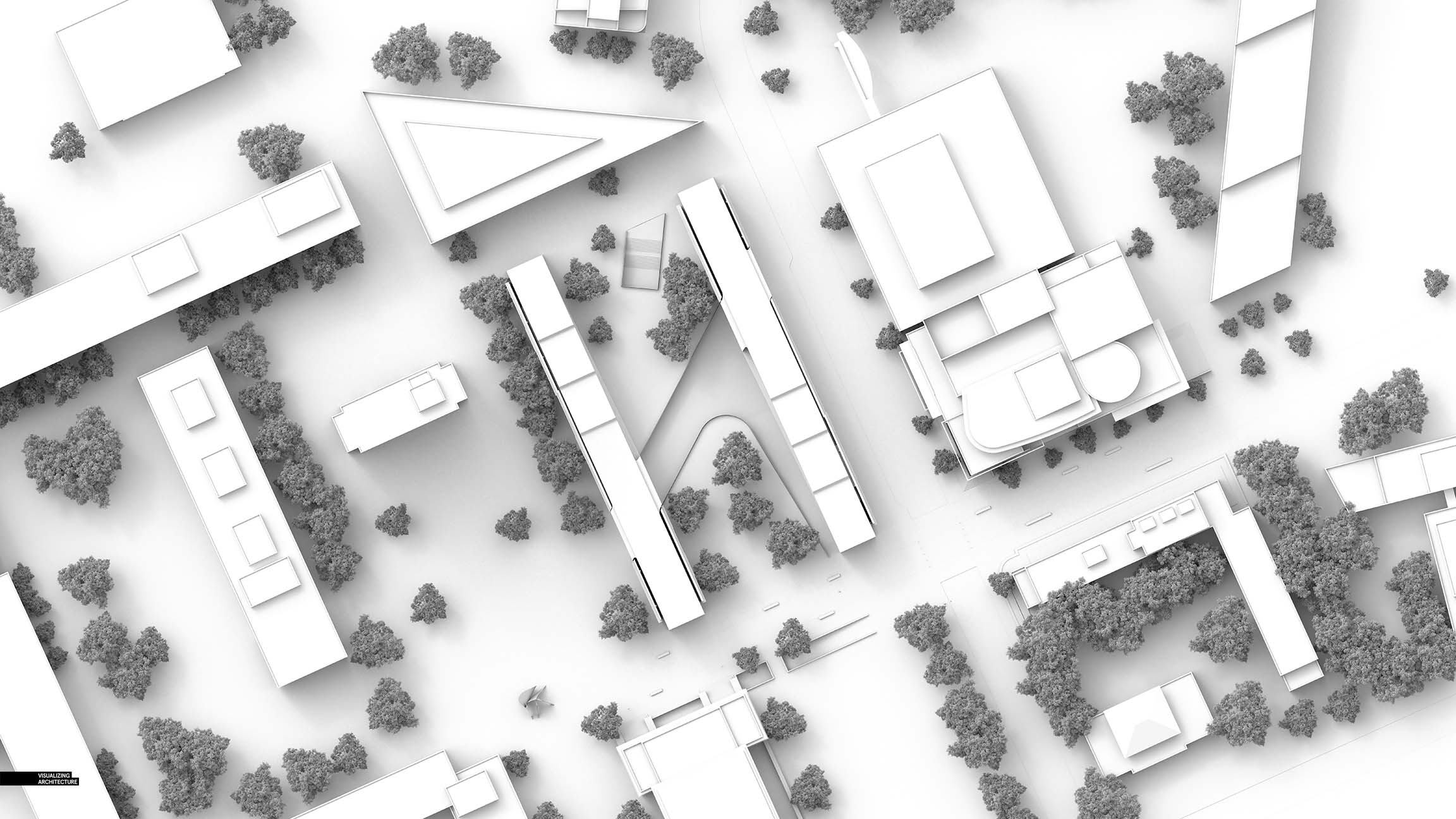
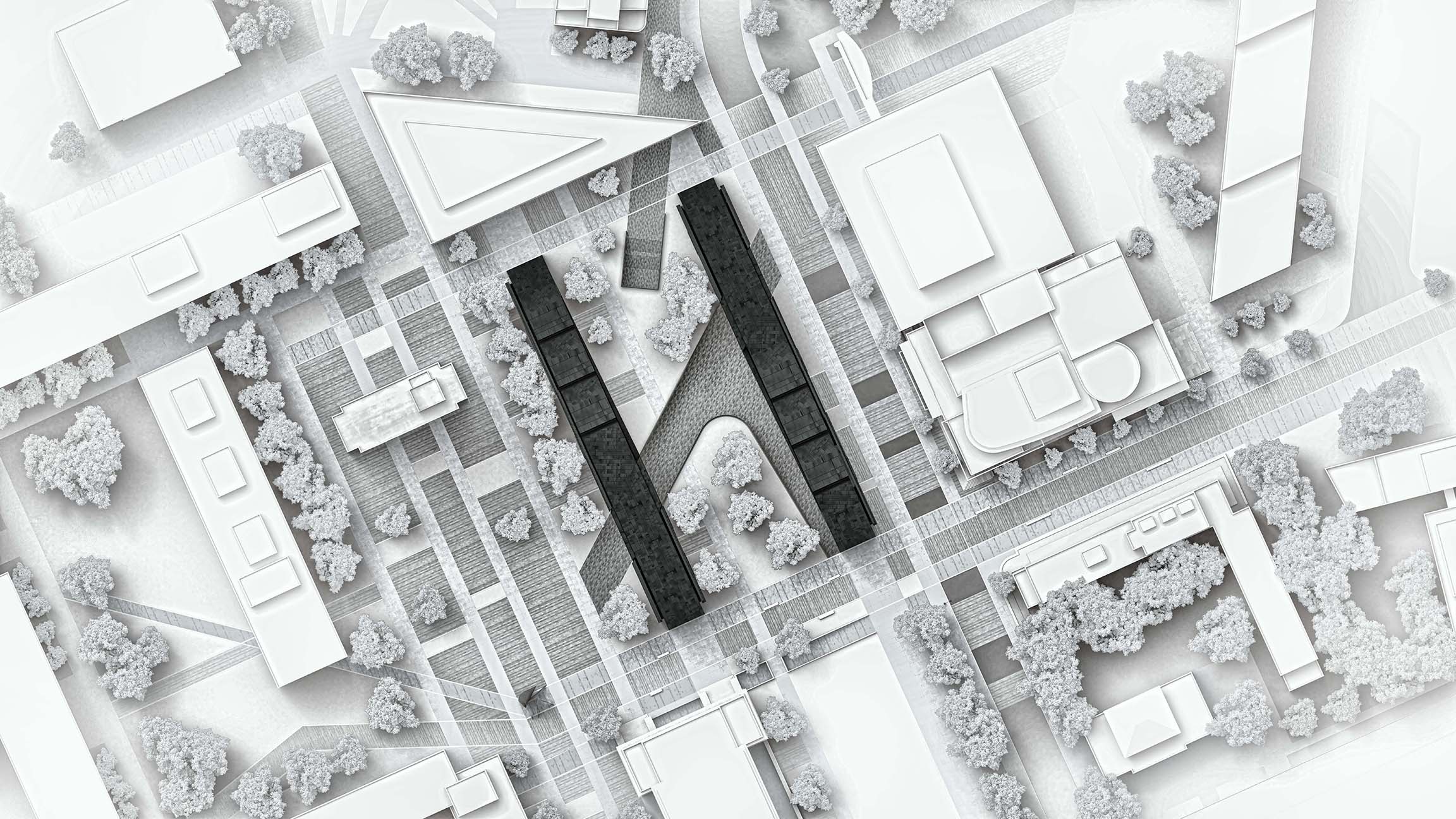
The past several weeks have been sort of a right-brain focus on image making. I wanted to play around with colors and textures and iterate on style a bit and not get lost in the technical and detailed side of things. However, before I started with the graphic studies, I first needed a good base. I originally was thinking I could accomplish most of what I wanted in Photoshop however I changed my mind and ended up modeling just about everything including the the ground plane textures and paving as well as trees and buildings. While this required more time up front, it meant I could move much quicker once it was time to play around with styles.
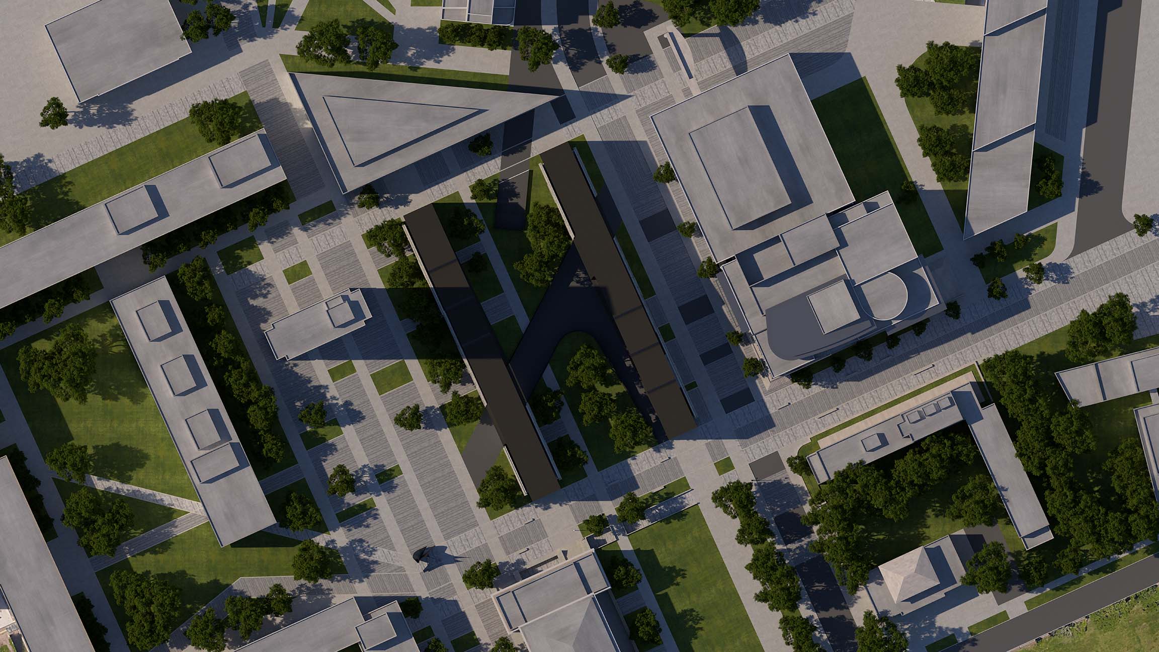
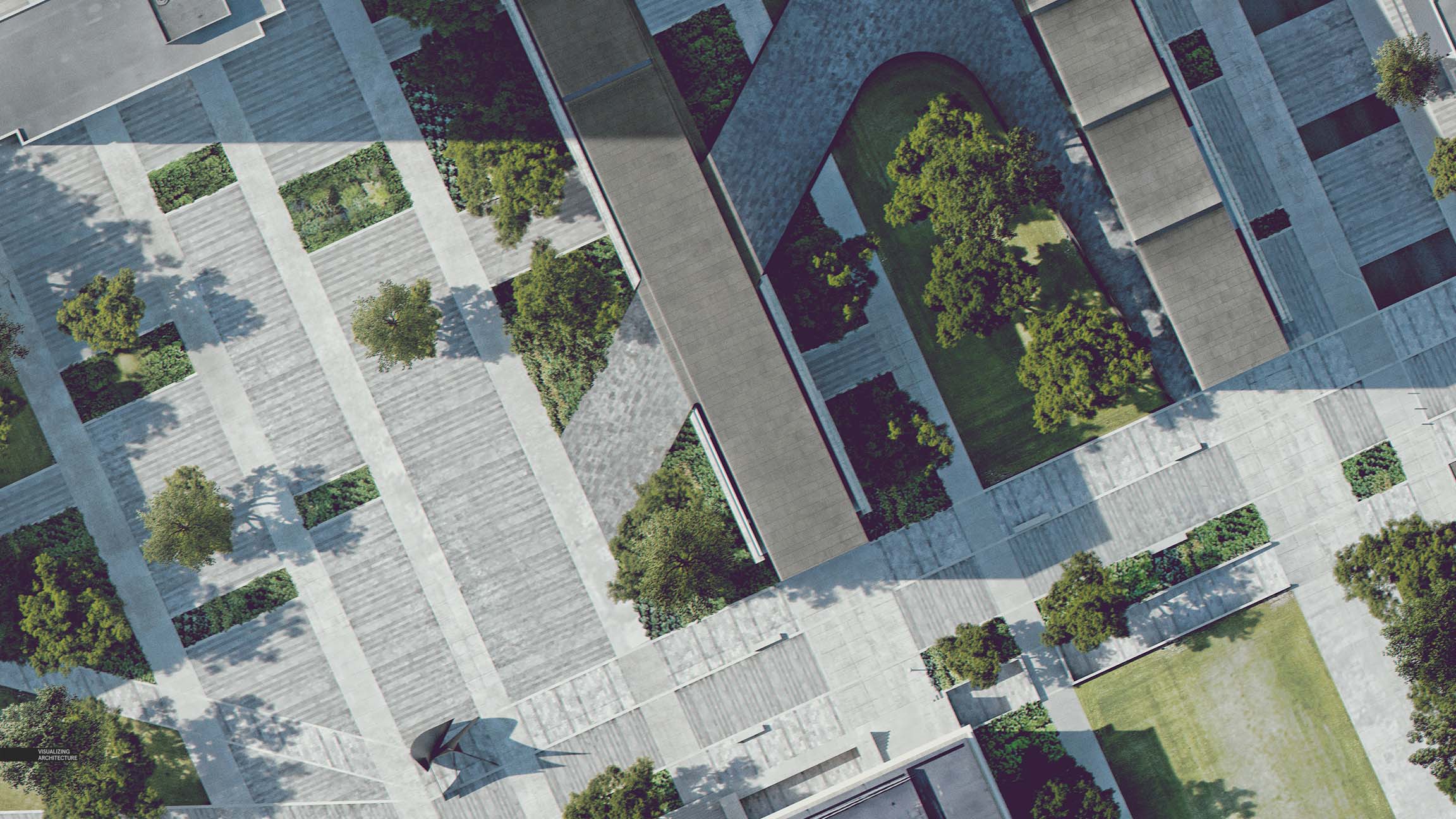
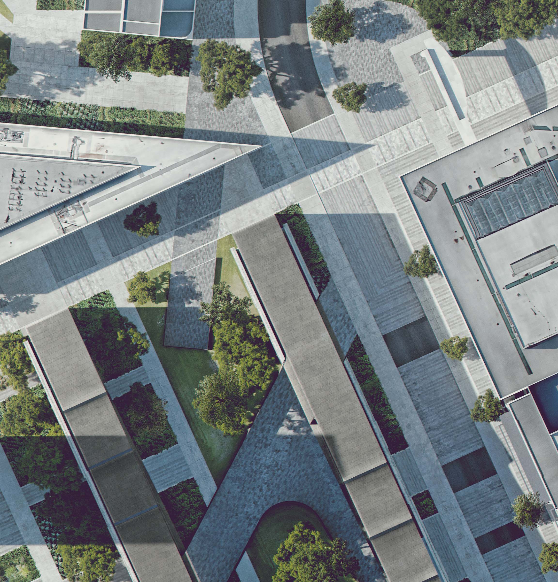
I also generated a before and after semi-photoreal illustration of the site plan. Again, because I had modeled most of the geometry, generating these illustrations didn’t take too long. Plus, I like the visual contrast of the abstract diagrams next to the realistic illustrations of the site. Google Earth was used to create many of the textures such as the rubber roofs of the existing context buildings and to age the ground paving and vegetation a bit.
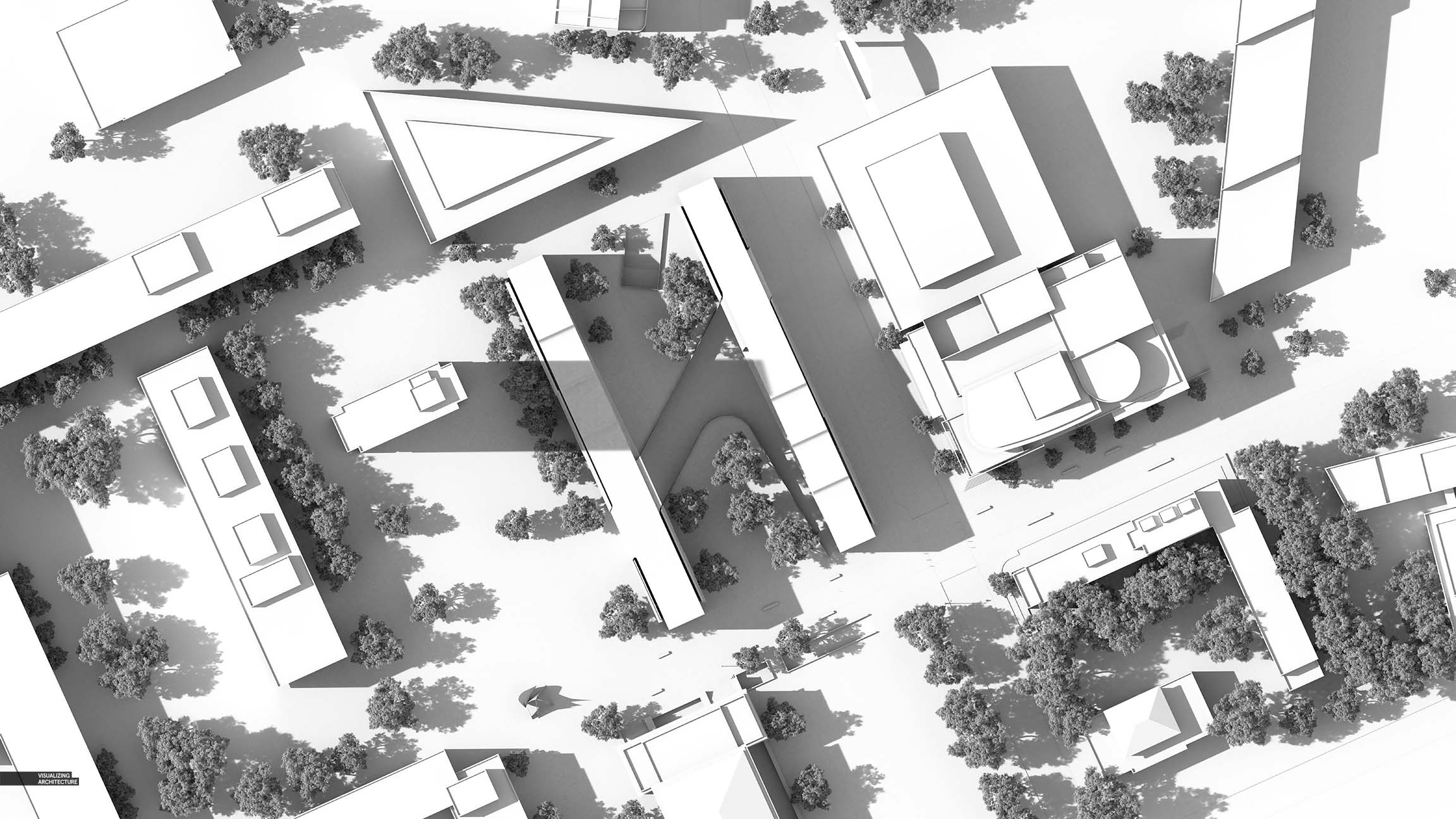
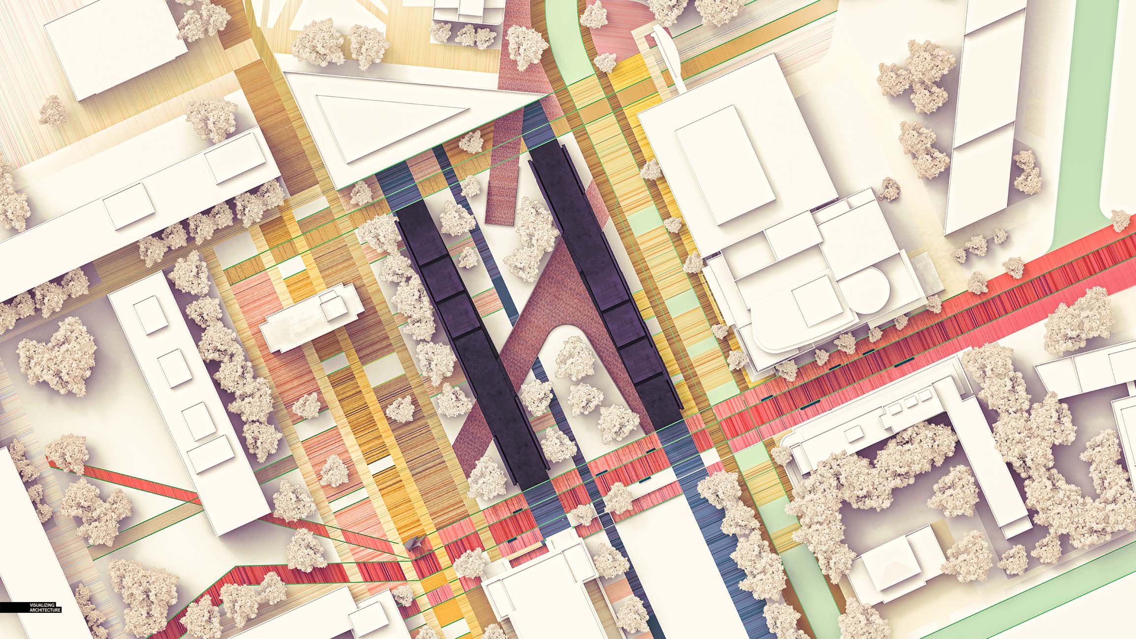
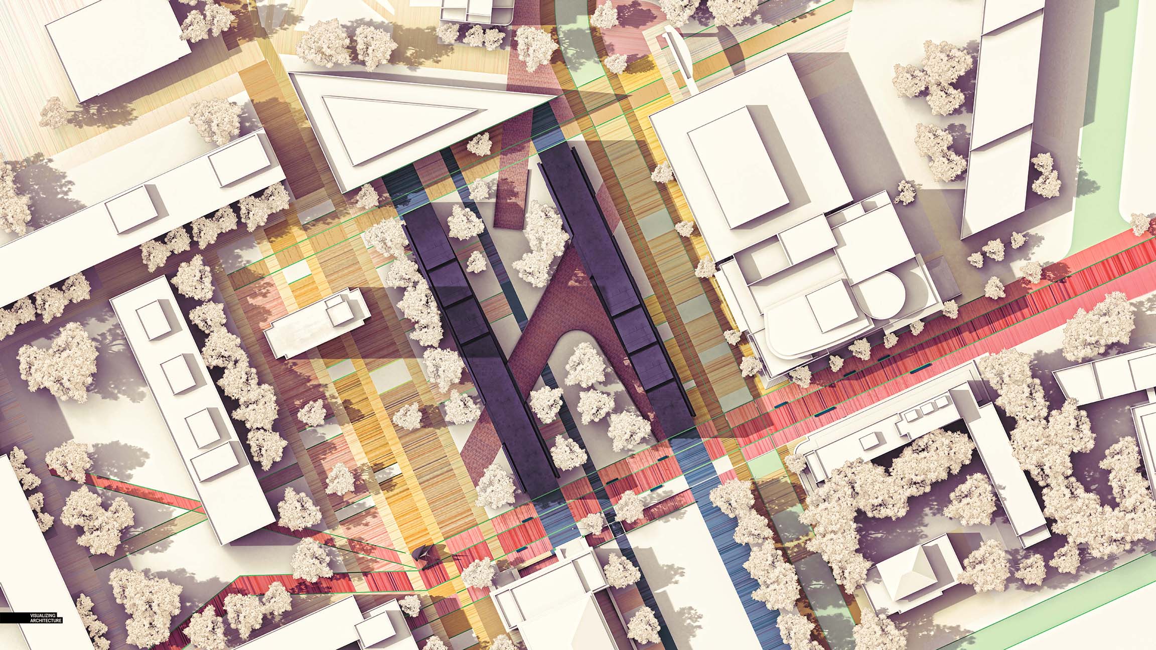
For maximum flexibility, I rendered with both soft and sharp shadows. Sometimes, especially with diagrams, shadows can be distracting and impact clarity so I wanted to have both options ready to go.
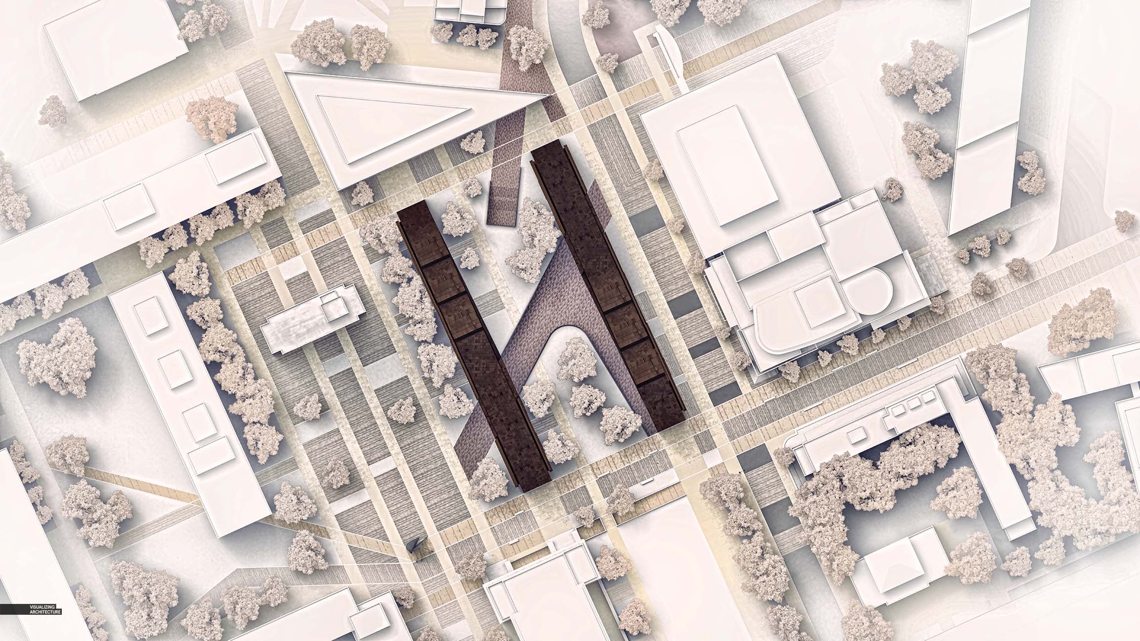
Before and After Illustrations
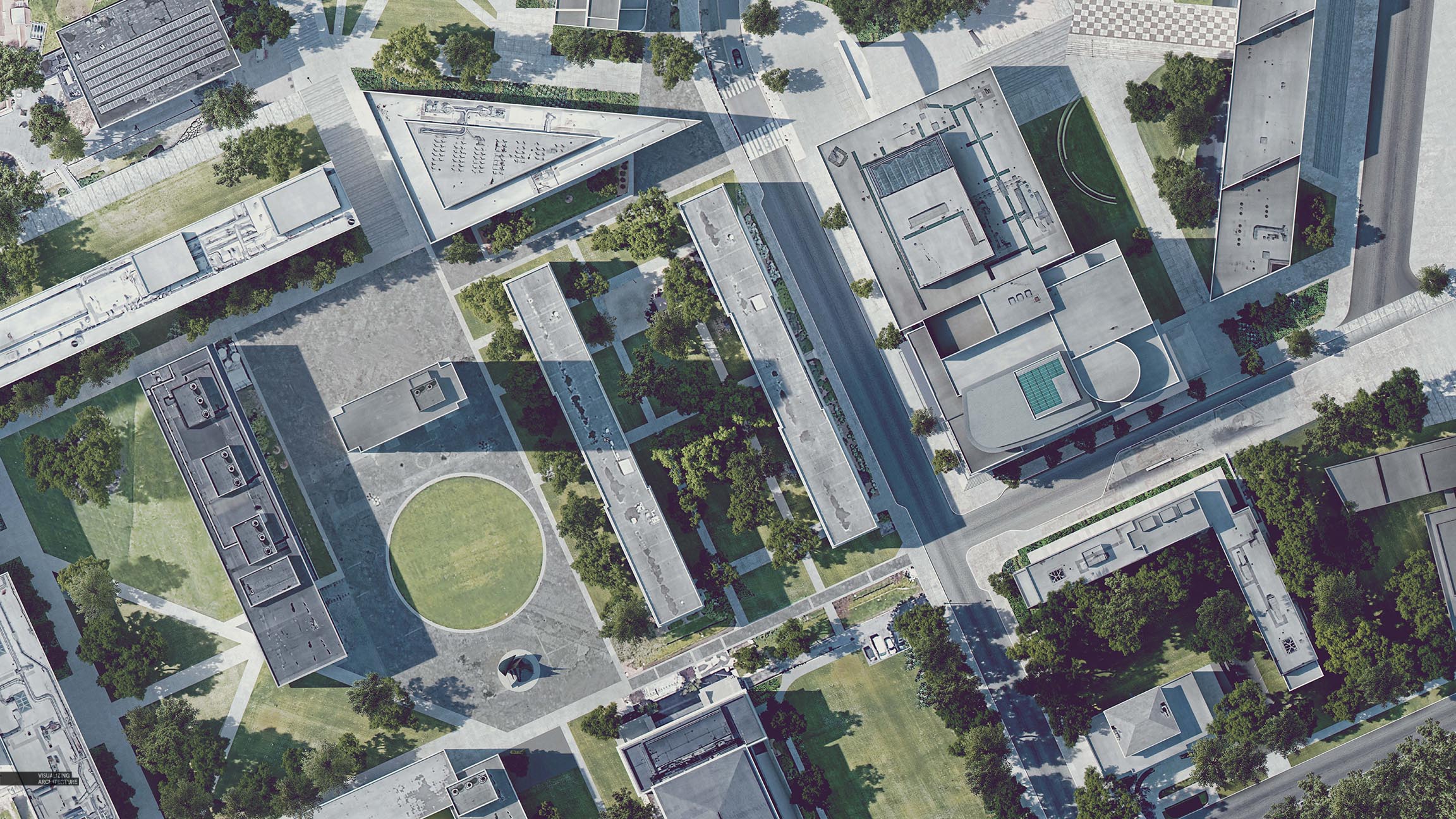
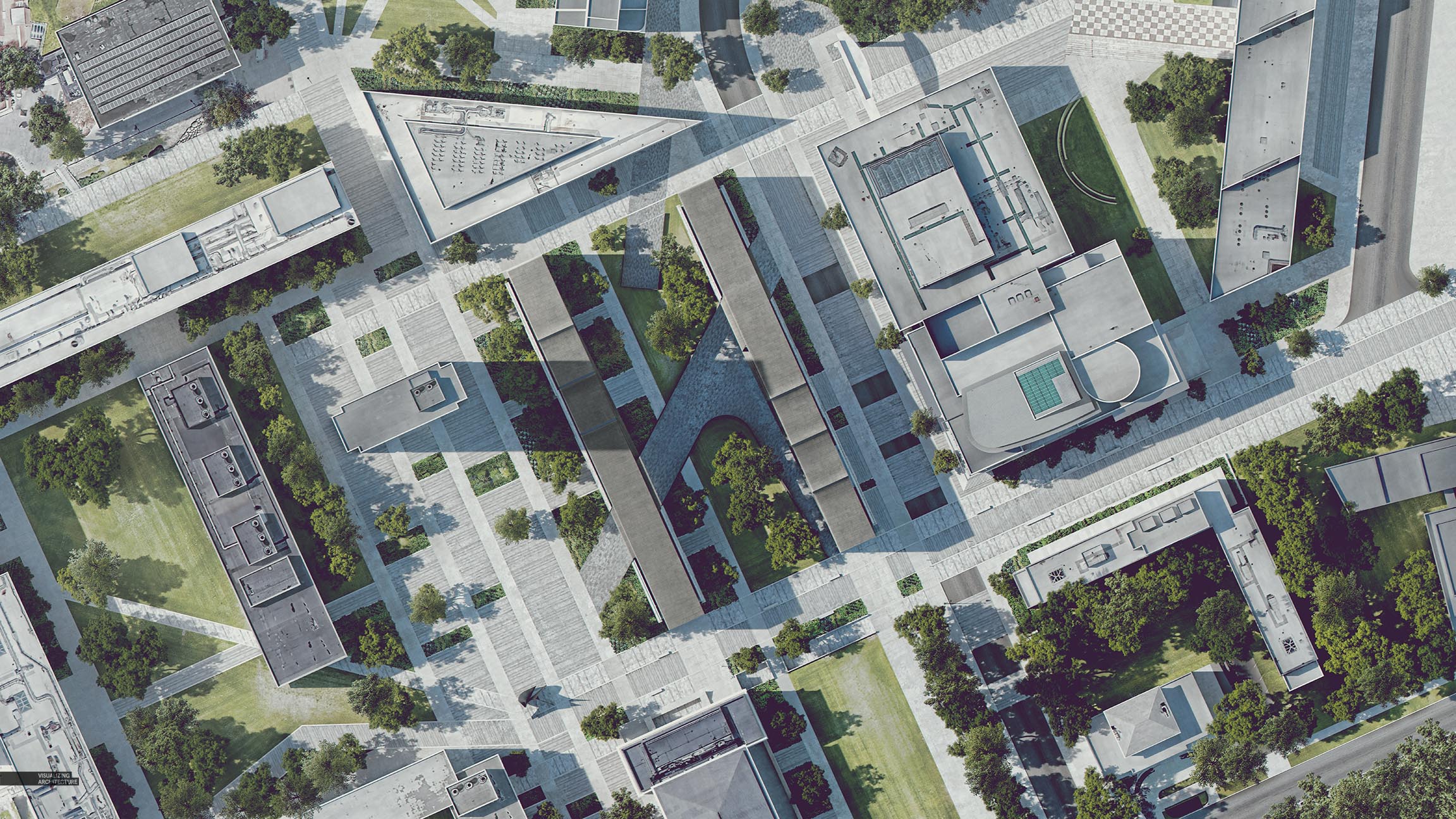
The MIT project that I designed is a large intervention on the campus and I thought a before-and-after series of images would help illustrate this idea. As I mentioned above, I extracted a ton of textures from Google Earth screenshots to more accurately depict rooftops and other misc. textures.
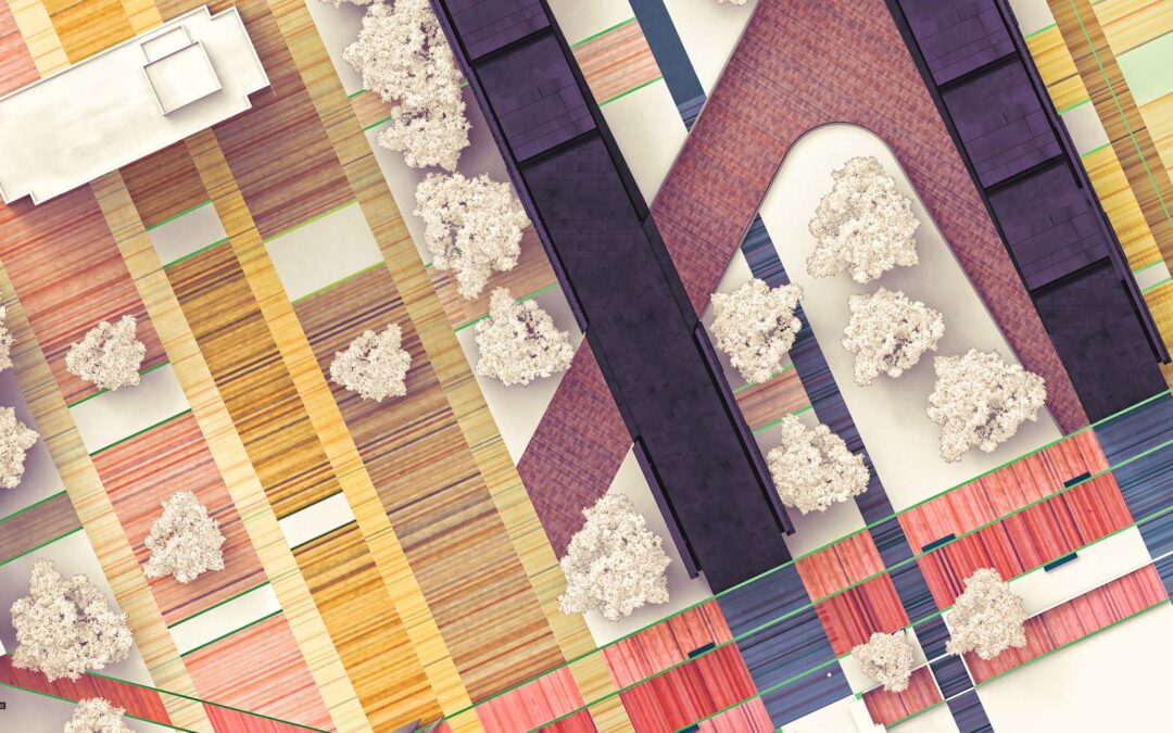
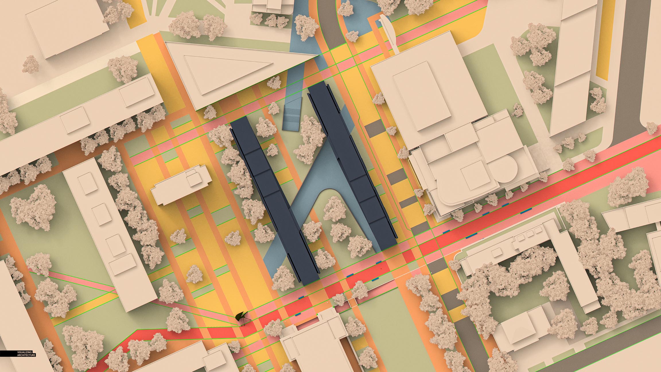
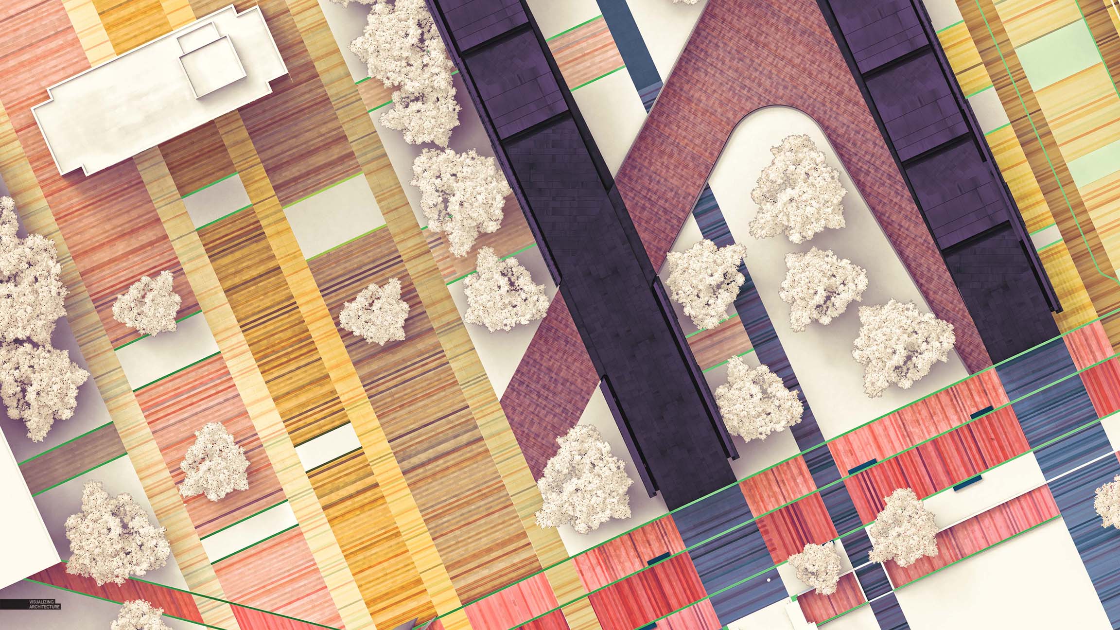
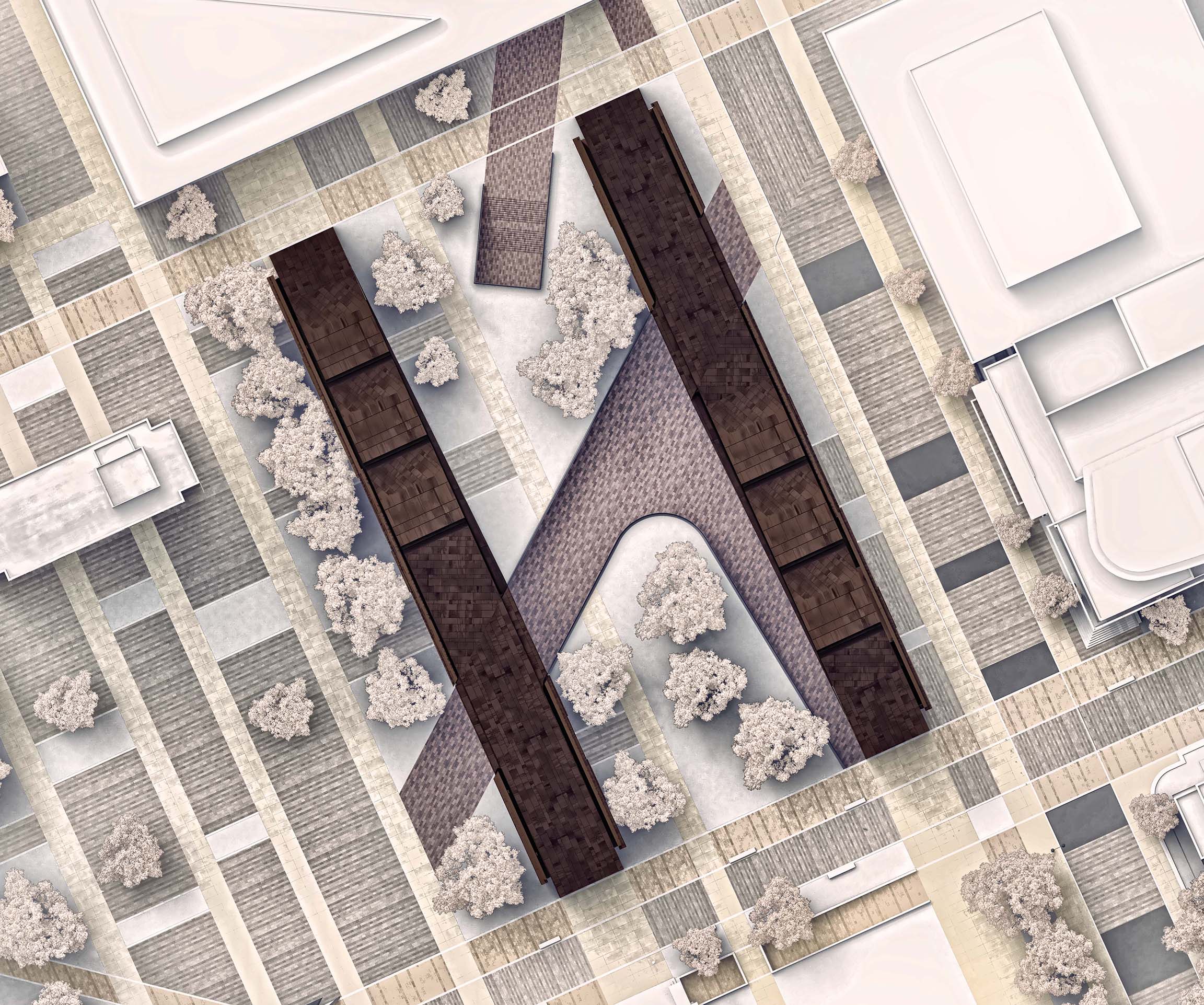
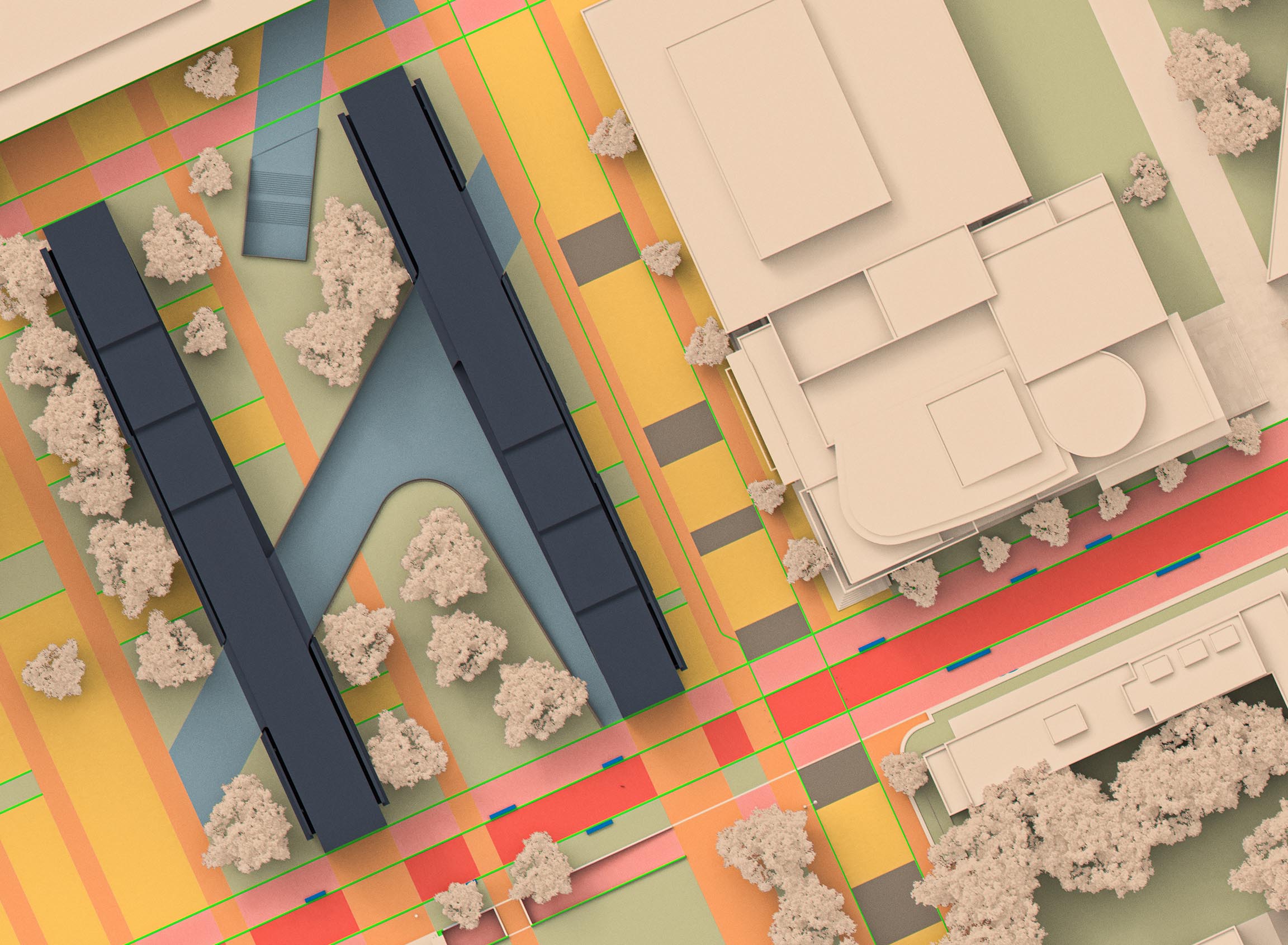
Graphic Iterations
Once the before-and-after illustrations were completed, I switched modes and started experimenting. Above all else, I wanted to study color combinations and texture levels as well as test out styles that ranged from minimalist to full on texture and complexity. My Photoshop file had lots of groups and masks setup so that I could adjust colors and textures rapidly. Again, this took a little more time upfront to setup, however, it allowed for super clean edits that didn’t get messy and confusing after hours of playing around. More importantly, it allowed me to really fine tune and dial in things because I had full control of every color and texture. Below are some of the images that were generated from this exercise.
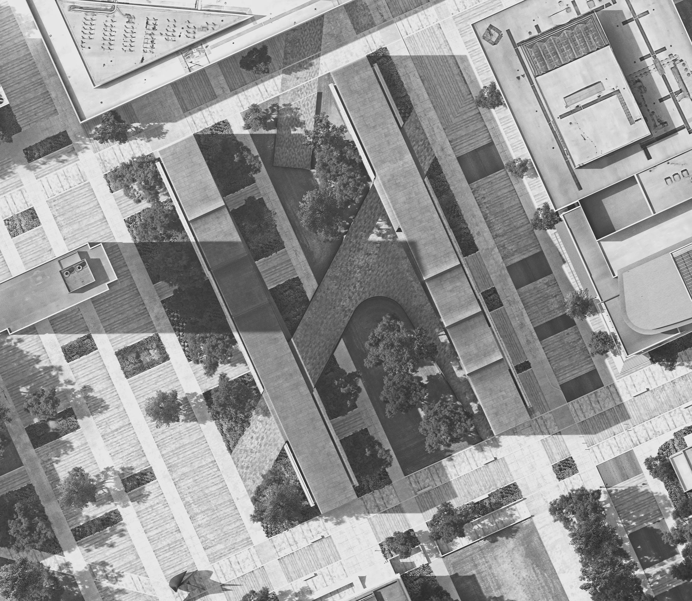
Crops
Great!!
hi Alex, I’m curious about how to render trees like yours. It’s trully good.
Great job of rendering the master plan of the houses. Congratulations. How long did it take for you to complete the entire job?
Good job! The details are very fine and the artist really thought about it.