Over the past several months, I have developed many illustrations for my conceptual wharf design. I wanted to start thinking about how these illustrations would be organized into a portfolio layout. One of my favorite parts of arch viz is page layout. Last year, I put together my Portfolio Vol. 3 which combined many different types of illustration styles and techniques. At first, I saw it as an experiment and not really sure how successful combining the wide range of images would be. However, once finished, I think the juxtaposition of the different styles generated a better portfolio.
Going into this new round of spreads, I want to continue this idea of mixing styles while still maintaining control and flow of the story. I will also be exploring portrait orientation. I have typically only designed portfolios in a landscape layout in the past. Portrait layout offers a lot more options and possibilities with the online printers which I plan to explore later on. Beyond printing options, I just want to see what other advantages and disadvantages there are with portrait vs. landscape.
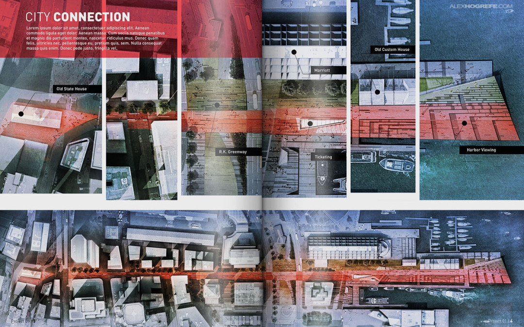
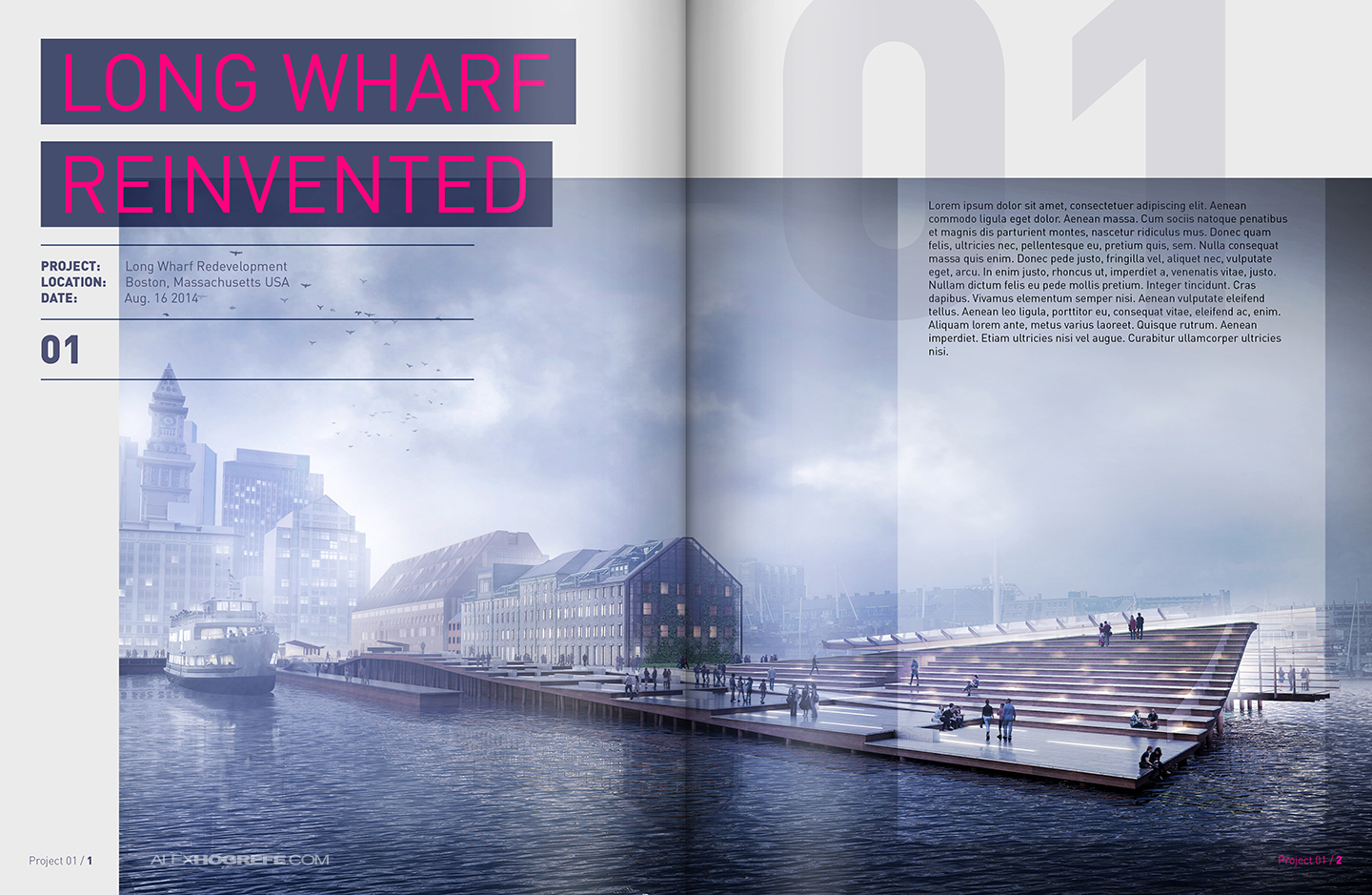
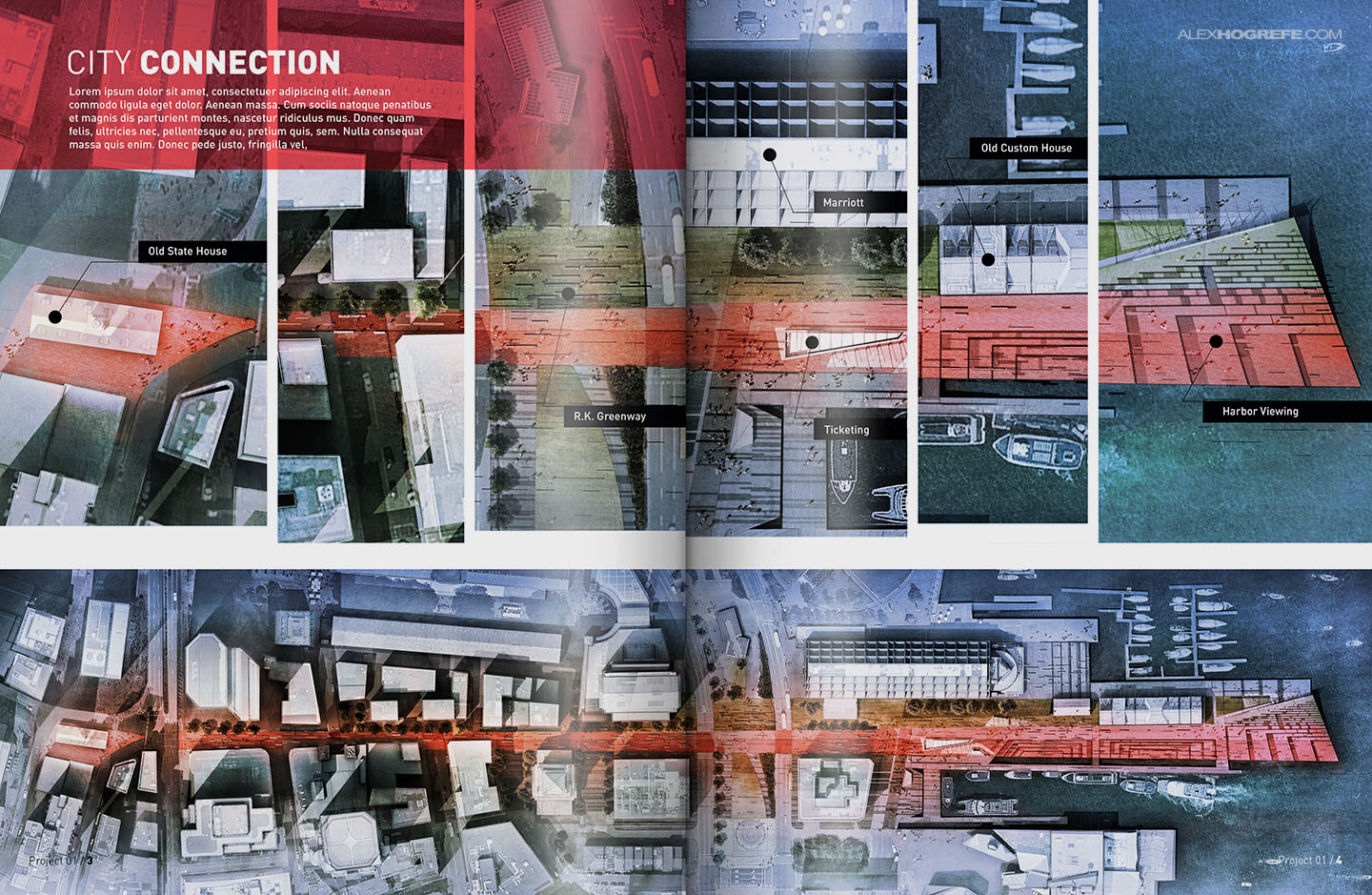
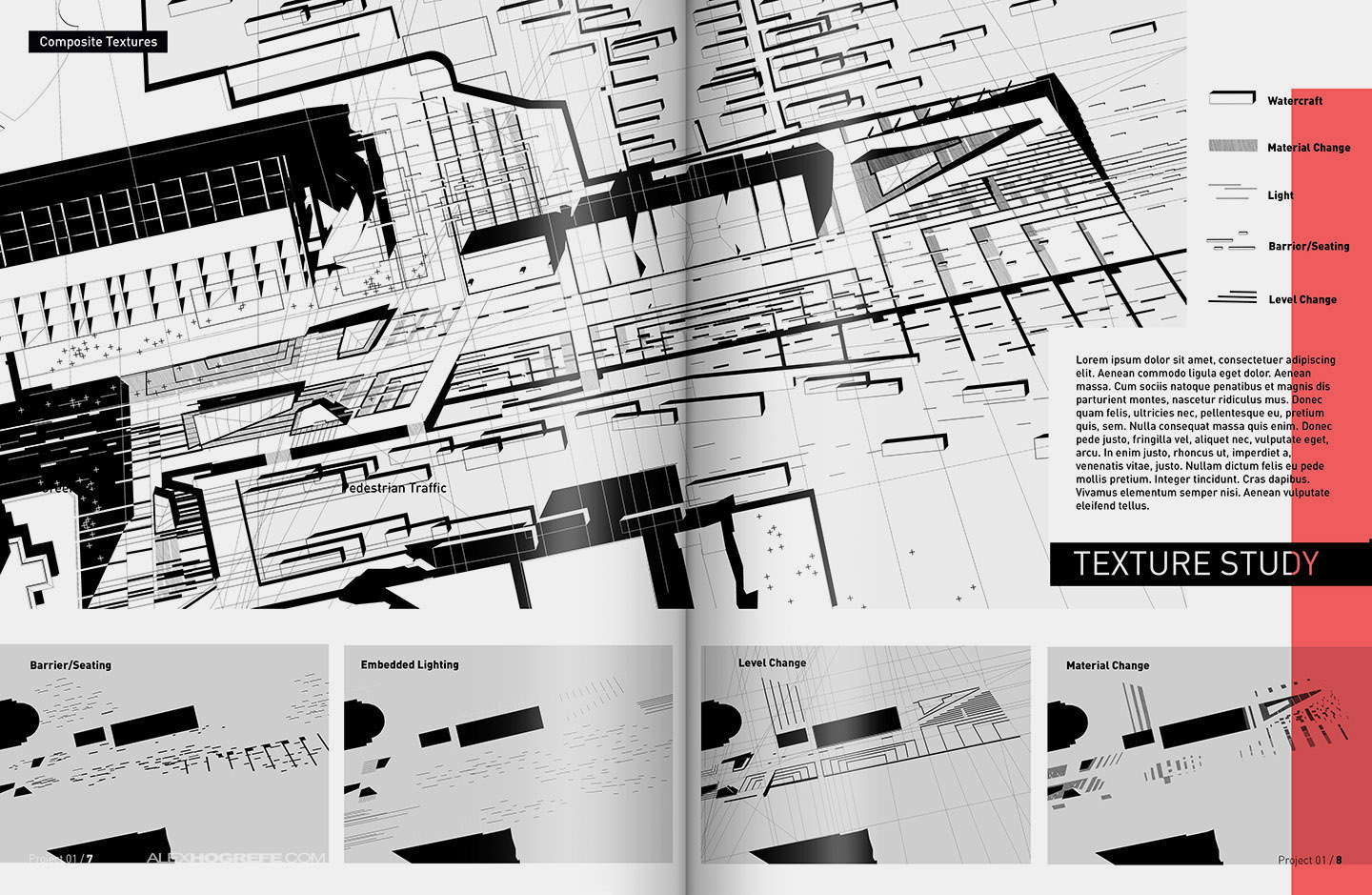
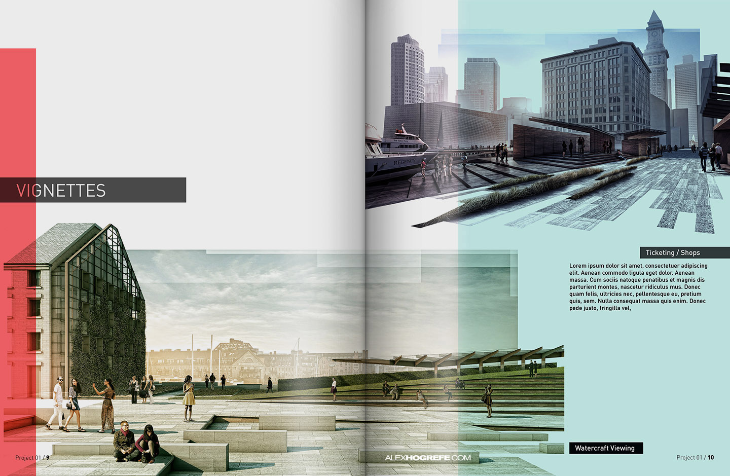
Below is the first round of spreads of the wharf project. The tone of the spreads was set with the first image of the foggy morning illustration. The layouts still need to be refined but the structure and coloring are in place. This early assembly of the pages will also help me to determine what information is still missing and which images need to be created next.
I also wanted to make a quick anouncement that the softcover version of Portfolio Vol. 3 is sold out. There are only about 50 copies of the hardcover left so if you had your eye on one, now is the time to get it. Thanks to everyone who has already purchased a copy and helped support this site.
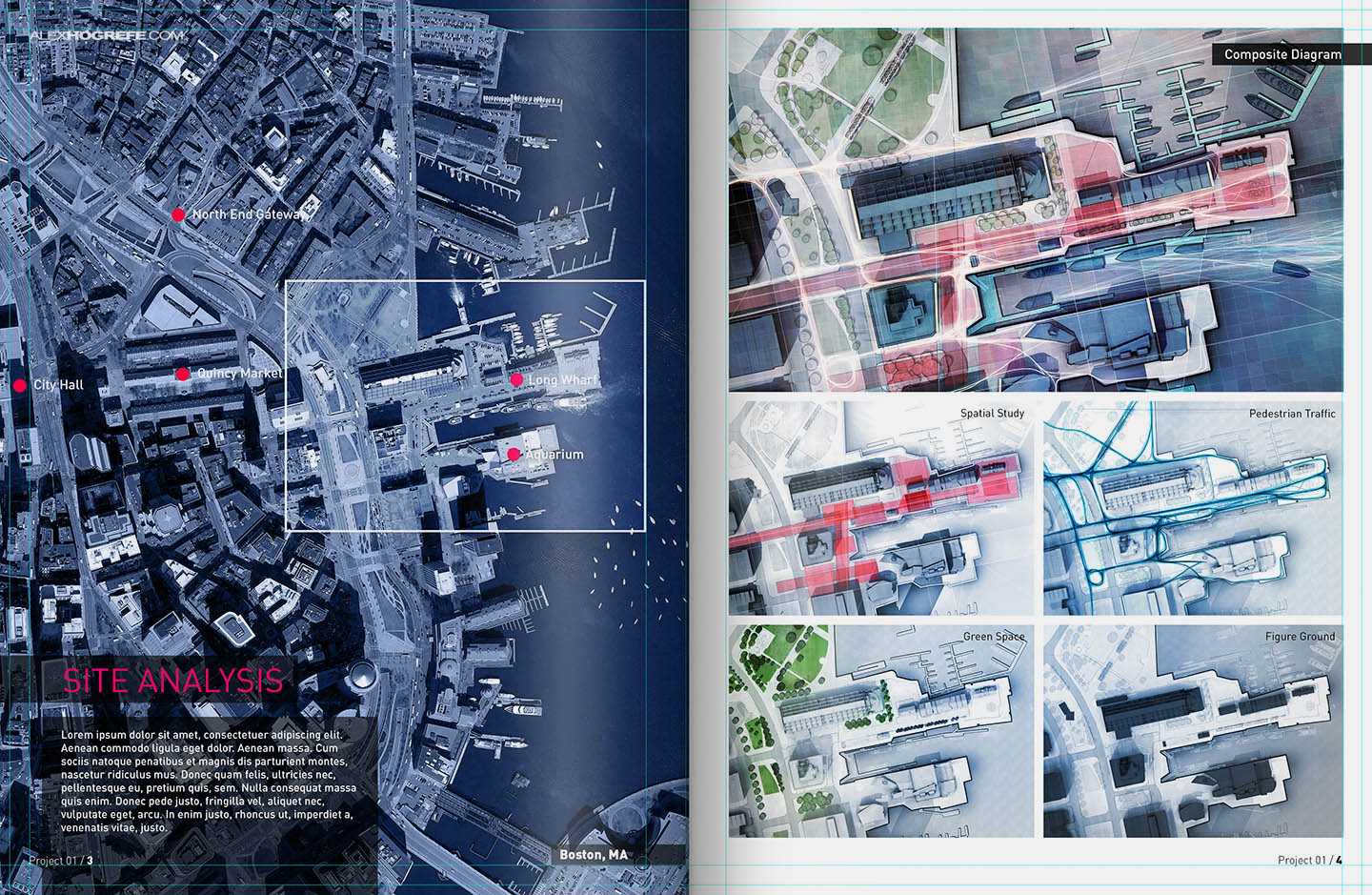


HI) I am 3rd year architecture student) Found your blog and got very inspire by your graphic style and quality. I wonder where do you get those maps?
**It looks like 'Level Change' was repeated from your Texture Study spread and copied on top of your Watercraft Viewing vignette by accident
@Simon,
Fixed it. Thanks for the catch.
Beautiful layout, and great inspiration for some site diagrams. I have a separate question though. Roughly how long would you say a illustration takes you? I know it must vary but for example the wharf design foggy perspective?
What's the point of having a huge "Vignette" title on the last page? That's like writing "Plan" under a floor plan drawing or "Section" underneath a cross section through a building. The person reading the portfolio should be intelligent enough to know what types of drawings they are looking at.
Hi Alex, I’m an architecture student and great fan of your work. How do you design the typography of your spreads? And which font have you used in this example? Cheers from Brazil.
Hi Alex,
What font did you use for this project?
Kind Regards
Hi Alex, thanks to share your jobs to us. I’ve learned a lot with you in this site. I want to observe a little thing, your pagination number is wrong, you repeat the pages 3 and 4 twice. I think you already noticed that. Thanks, man.
Hi Alex. Great Job again!
I’m a big fan of your work and I loved the choice for the fonts.
It is very clean, simple and brings a kind of lightness sensation.
Can you tell us the name or the kind of this font?
Thanks!
i do really amazed with all of this tuttorial, im a beginer designer and i need your suggestion about the step to make my very first rendering with sketchup and photoshop only.
i mean, what is the first thing to do to when my models on sketchup is done, and then what next.. and next.. and next until i get the perfect image like yours?
my english is not really good, i hope you understan what im trying to say..
This post is exciting.
The illustrations of your design are very impressive, I enjoyed the design, it was very beautiful.
I like your website: