The last portfolio I created was in 2010 midway through my last year of grad school. It’s been a long time and I have a lot more content now. You may have noticed that I have revisited many of my old projects and have continued to develop and illustrate them. Because of this, I now have new images not represented in any of my portfolios. I have some ideas for layouts and I want to spend the next several weeks putting together new portfolio pages. This will be an evolving portfolio moving in parrellel with my site as new illustrations are created.
The above pages are the beginning explorations and are still in the draft phase. Many of the individual illustrations vary in style so part of the challenge is getting them to read well with one another in the same spreads. I plan on adding two more spreads to this particular project which will include a new site plan, process work, and some interior renderings. It’s probably important to note that this will be considered a post graduation portfolio and that I won’t be trying to claim this as a project finished in undergrad even though it was started in under.
I have some goals with this new portfolio:
Clean: I want the pages to have more “white space” than I normally give. This means using more pages and less dense layouts. The idea is to focus on clarity of content not quantity of content.
Good flow: The information and graphics should transition into one another and be displayed in a logical order to better tell the story.
Range of styles and process work: I want this portfolio to have a range of styles to keep things fresh from project to project. Process work such as sketches and early diagrams are also key to giving this portfolio a human touch and revealing the design workflow.
Relational: I’m going to look for opportunities to combine diagrams and organize the pages so that images feed off of one another.
Explore color: My first portfolio was entirely black and white. My graduate portfolio was a complete 180 introducing much more color. With this next portfolio, I want to be bolder with the color selections and and use color to my advantage to get the pages to read clearer.
PAGE EXPLANATION
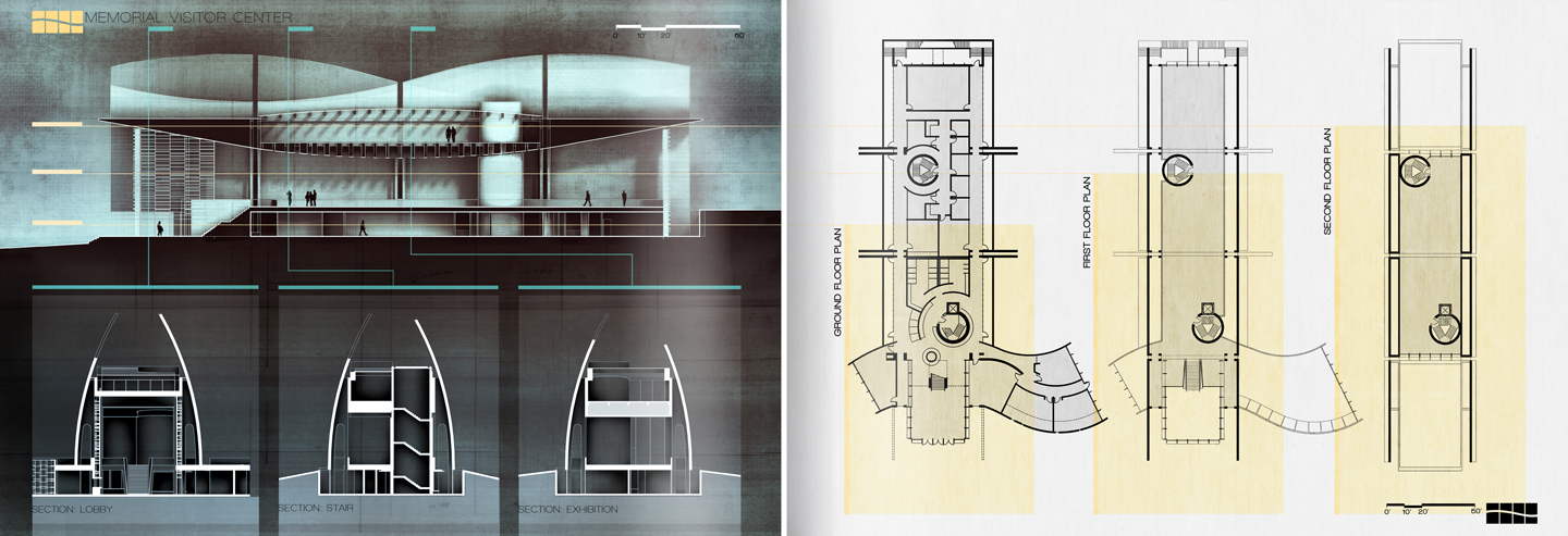
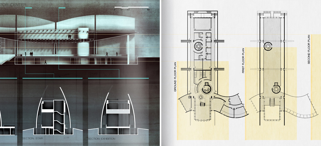
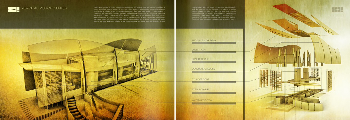
I see this spread as being the 2nd and 3rd pages of a total of 8 pages for this particular project. These pages document the most fundamental information of the project i.e. the plans and sections. I have laid out the sheets so that the rendered section is the focal point from which all other information is generated. I have located the plans and sections in such a way that I could graphically explain the cut locations with minimal linework. The plans are minimal, but I always prefer clean and simple floor plans and the contrast seems to work well with the corresponding dark sections page. I plan to add some more text calling out the room uses in both the plans and sections however I will keep the text light to avoid drawing too much attention.
In this spread, both of the above illustrations are graphically strong and it is easy to over-complicate these pages. I therefore avoided adding anymore graphics or diagrams to either page and clearly designated an area at the top of the page for the body text. In an another attempt to simplify things and to relate the two diagrams to one another, I shared the callout labels. I think there is an opportunity to do more with the callouts but this will have to be explored another day.


fantastic developments – been exploring on re-doing my undergrad portfolio as well.
What's your workflow in terms of software ?
I have a theoretical question for you:
I have a portfolio that is creative, expressive, and flamboyant in it's delivery and content- not so unlike yours you show in this post. However, when it comes time to email a worksample to prospective employers, I have taken an approach that is to send a more clean and organized portfolio sample -something much more closely related to project 'cutsheets' that a firm creates for their projects, if you are familiar- in order to shrink my PDF size and send a smaller sampling of my works at the onset of contact.
This limits the content sent to an employer (as I have always believed one should not send a 40 page PDF as a portfolio) and if they are interested, I follow up with my full version either in print or email. This method is extremely helpful when employers limit portfolio sizes to 3MB, 5MB, or 10MB, as my full version is much larger.
My question is, what are your thoughts on this delivery method? Do you feel it is a bad idea to send a more generic portfolio at the onset? Have you worked in the field yet (or only been in school thus far) and come across the problem of being limited to only a 3MB portfolio to send via email?
Any thoughts, comments, or discussion would be appreciated.
Nice update, I came across your website accidentally and I must say: Great JOB!
Once again, your works amaze me, btw where can we find the full version of your updated portfolio, i cant wait to read it that definitely inspire me .