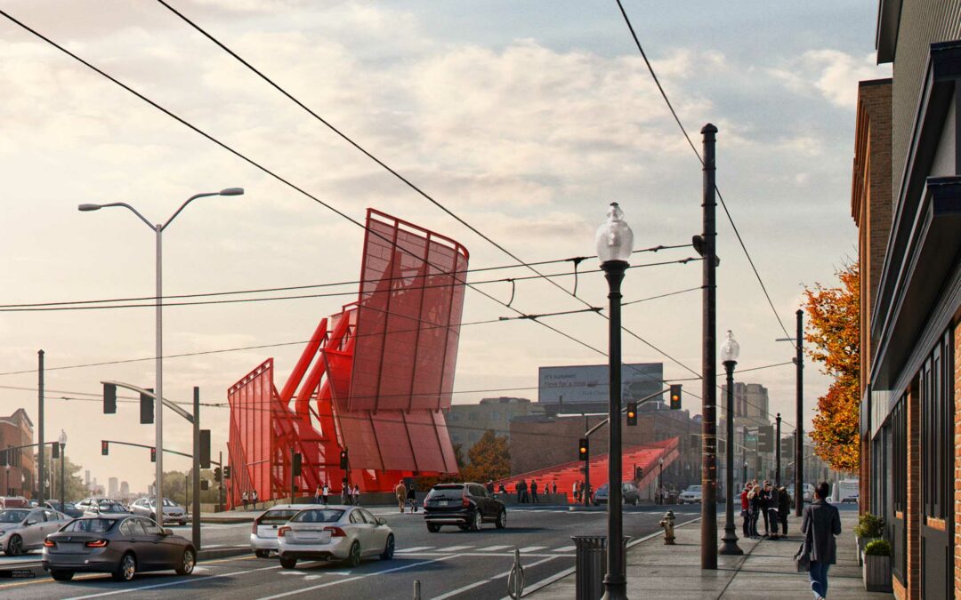
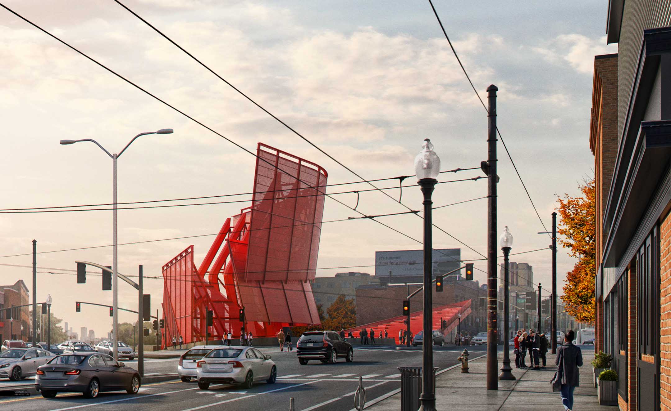
I was riding the bus into work last week and as it approached Porter Square, the sun was casting some amazing light accross the area. This experience got me motivated to illustrate the new station design as seen from further down Massachussetts Avenue. I love working on these types of images because of the amount of textures and details involved. I also think these types of images are important because of the emphasis that is placed on the context and how the new design fits within the fabric of the area.
I was able to put this image together in a day, but so much of my time went into the details. Because there are so many elements to this image, I needed full control over the composition and positioning of the camera and light. This meant a lot had to be modeled in 3D. Luckily I could recycle elements from my other illustrations including the axon from the last post. Once the 3D was in place, most of my time went into Photoshop inserting textures and building up details.
1. Base Model and Rendering
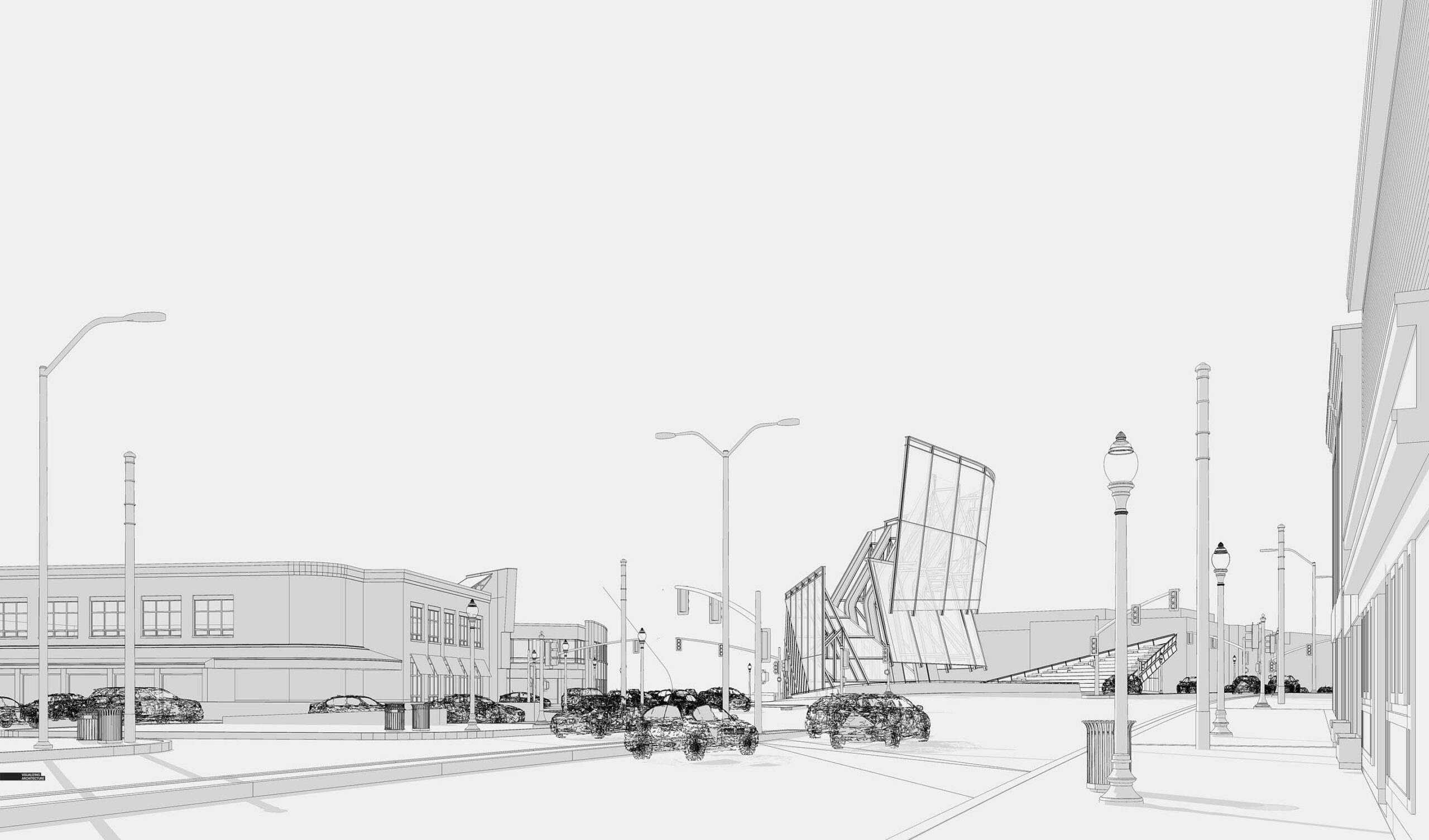
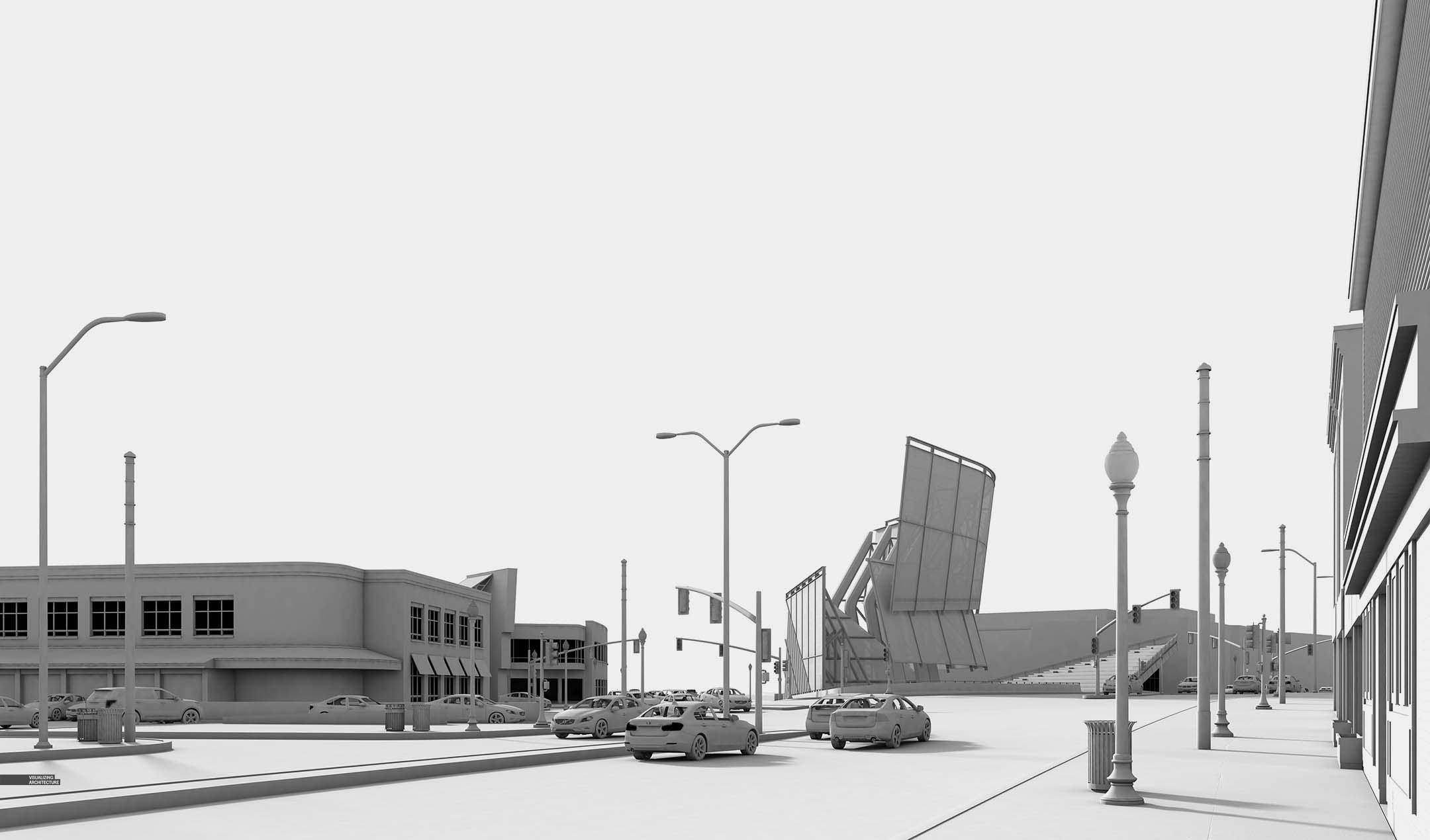
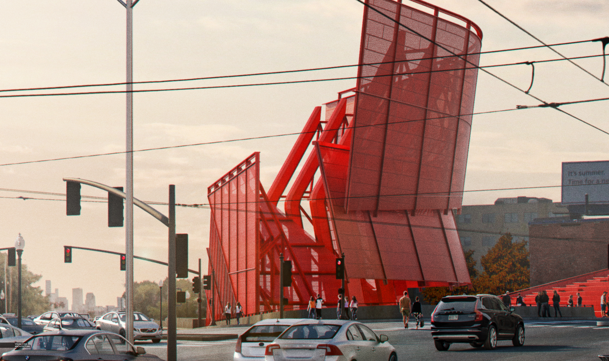
For this image, most of the core elements were modeled including street infrastructure and context buildings. I didn’t have any site photos from this exact view angle nor did I take any at the correct time of day (busy week at work). This was fine though because the more I had in 3D, the more control I had over the placement of things like cars and street infrastructure.
2. Composition
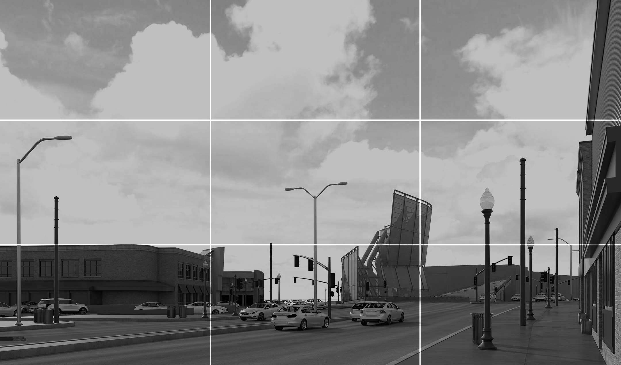
In images that are pulled back like this, I love giving the sky a ton of real estate. If you cut the image into thirds, the skyline sits at the lower 1/3rd of the image. The horizon sits at the lower 1/6th of the page. All this means that the sky will become an important part of the image. Elements like street lights and bus cables can be dramatized by allowing them to break the skyline and cut across the page as you will see later on.
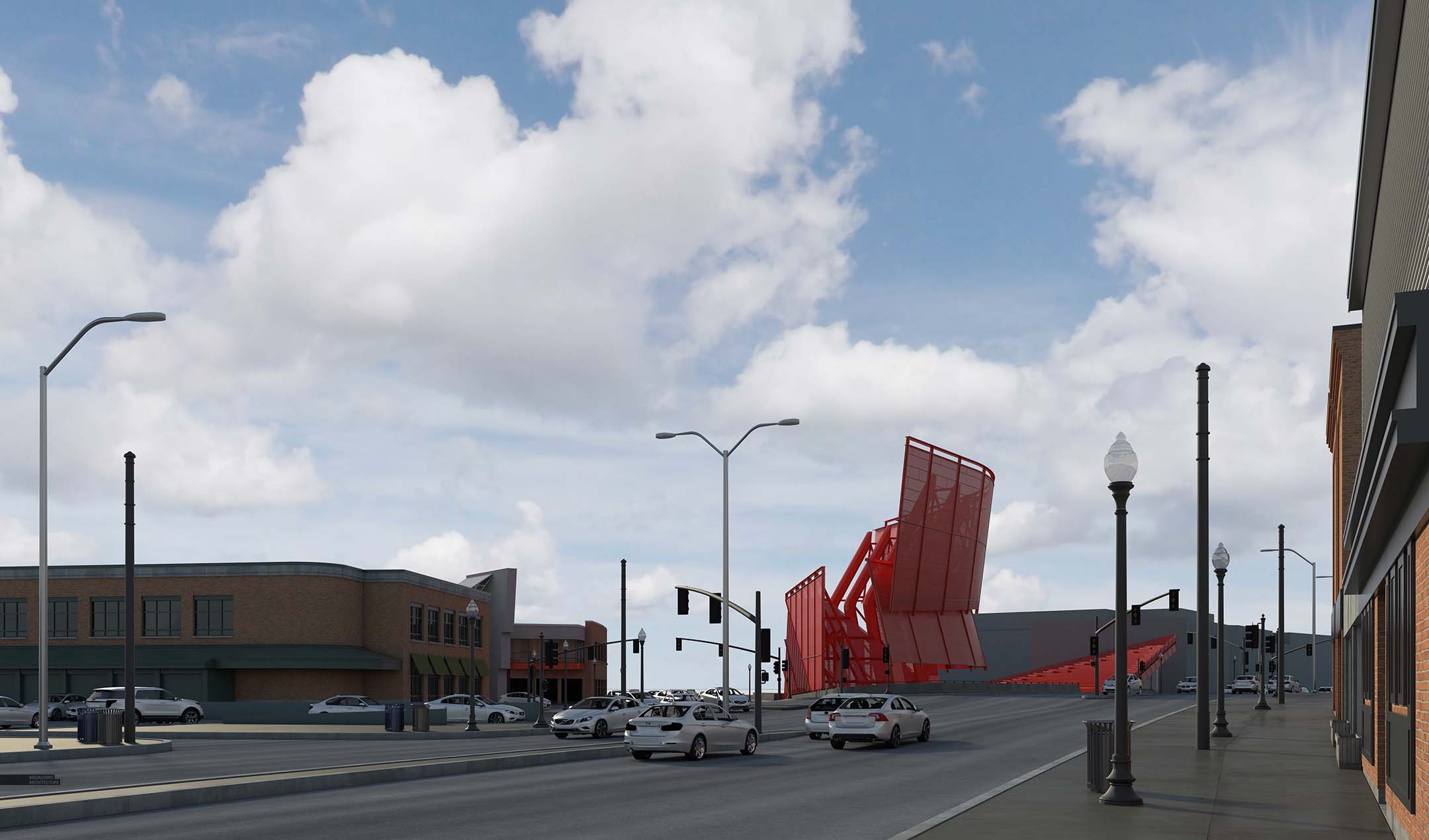
3. Sky and Texture
I spent a long time looking for the right sky and I am really happy with the one I found. The clouds are not overly dramatic, and there is a nice overall gradient from warm to cool. I also used Google Earth to collect street and sidewalk textures to help give things a little wear and tear.
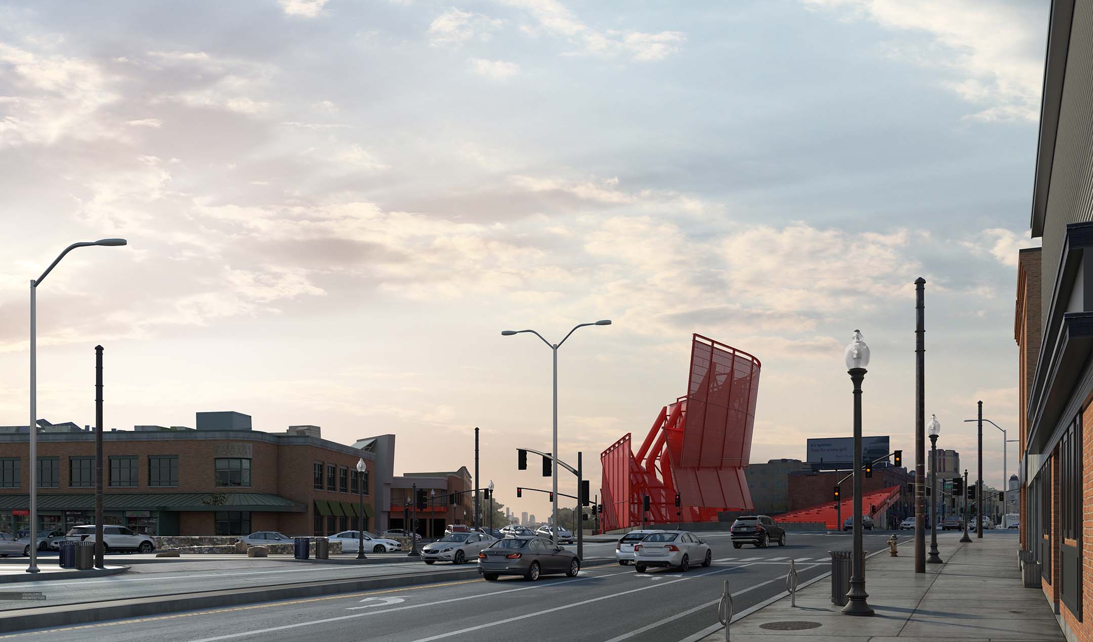
4. Trees and Entourage
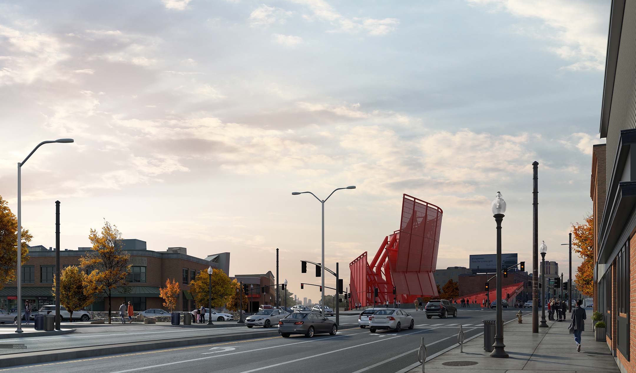
I went with fall foliage because I was worried to much green would steal some of the warmth of the early morning scene. Plus, the orange and yellows play well with the bright red of the new station design. For entourage, I placed just a few, but making sure they were all back-lit.
5. Cables

There are electric buses that run up and down Mass. Ave. which means cables everywhere. Power lines can sometime ruin the atmosphere of the image, but in this case, they add some really nice movement and texture. It took some trial and error, but I was finally able to Photoshop them in such a way that they work compositionally. It can be tricky to insert cables in Photoshop along with all of the attachments and fixtures, but they ended being my favorite part of the illustration.
6. Final Image
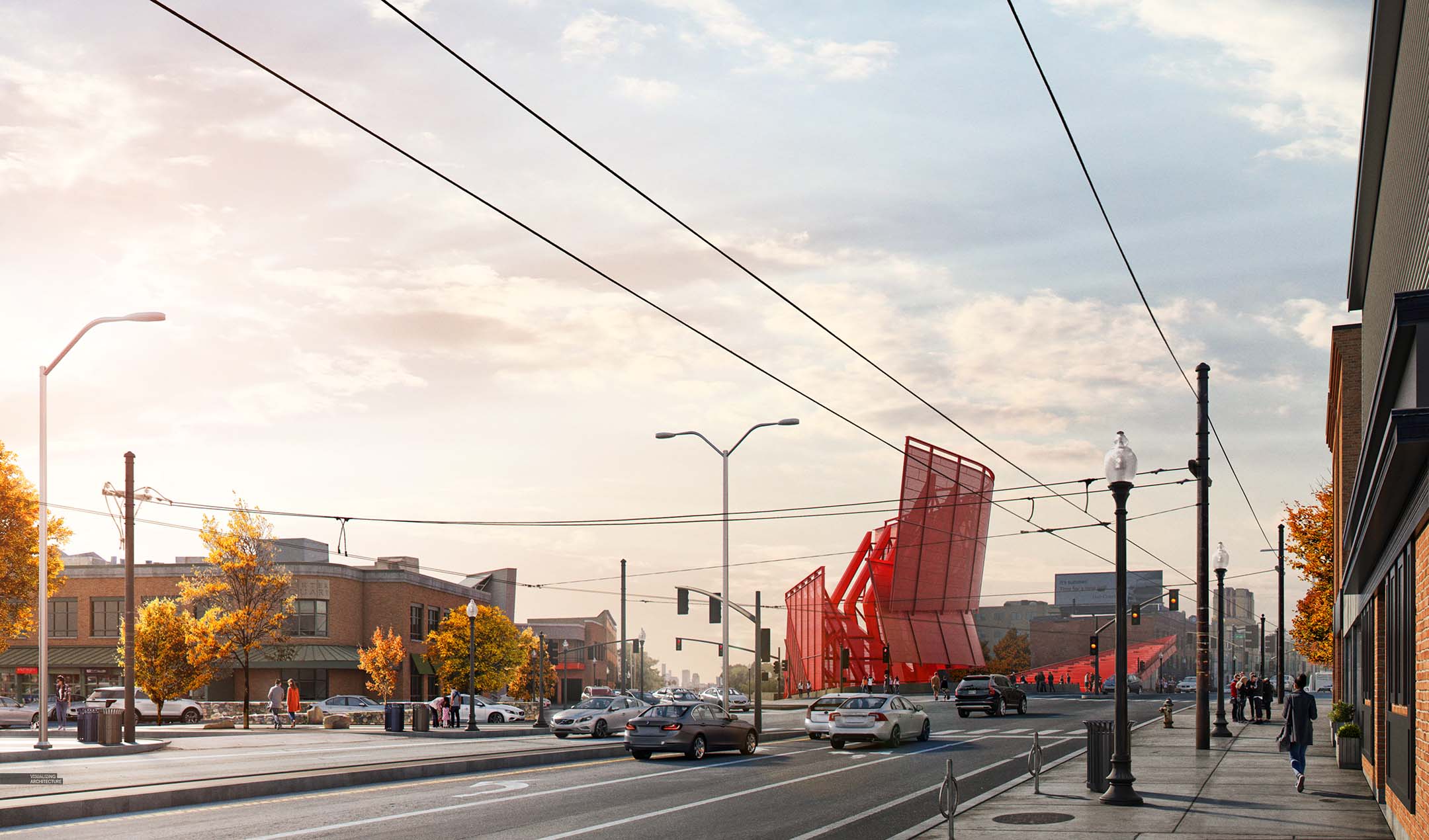
I didn’t do anything crazy with the toning. I just added a hint of light to the left, played up the glare, and increased the saturation. Some images, I will spend hours playing with tones. For this one, it happened relatively quickly.


Great composition and final image. Thanks for the very helpful steps towards how you achieved it! I’m working on an exterior visualisation of my PG thesis project and hope to put these tips into practice.
If poss, would you be able to share tips for visualising high-rise buildings? The project I am working on is a 200-meter high bank tower. My current struggle is capturing a realistic view of the top of the tower from street level, at a human angle. I find that it gets very skewed and distorted as I pull the camera further up.
You will need to post-process the perspective most likely in photoshop
Nice to be visiting your blog once more.
Nice to be visiting your blog once more.
I enjoyed reading your blog its quite interesting! Seeking for dispensaries worry no more!
Wonderful Blog!
Hi Alex, just wondering how long do you normally spend on modelling the scene? I realise for example in this render, the more detailed the model the better the outcome however I’m wondering about the neighbouring buildings, for example the structure immediately to the left. Did you have this already modeled with textures applied or did you model it just for this project? Could you share any tips on rapid context modeling that really cements the feeling of reality without spending excessive time on each extra structure?
I focus on getting the basic volumes right for the light and shadow. It also depends on how far away from the camera it is. So for the building on the left, I spent maybe a half an hour modeling basic details. I then used google street view to get textures to overlay on top of the 3d. For the building on the right, since it was close to the camera and at an odd angle, I added a little more detail in 3D. It was about a half of a day total modeling in 3D for this scene. I also was reusing quite a bit from the other 3D scenes.
this is a really nice image! It would be great if you could make a tutorial out of this! 😉 thank you