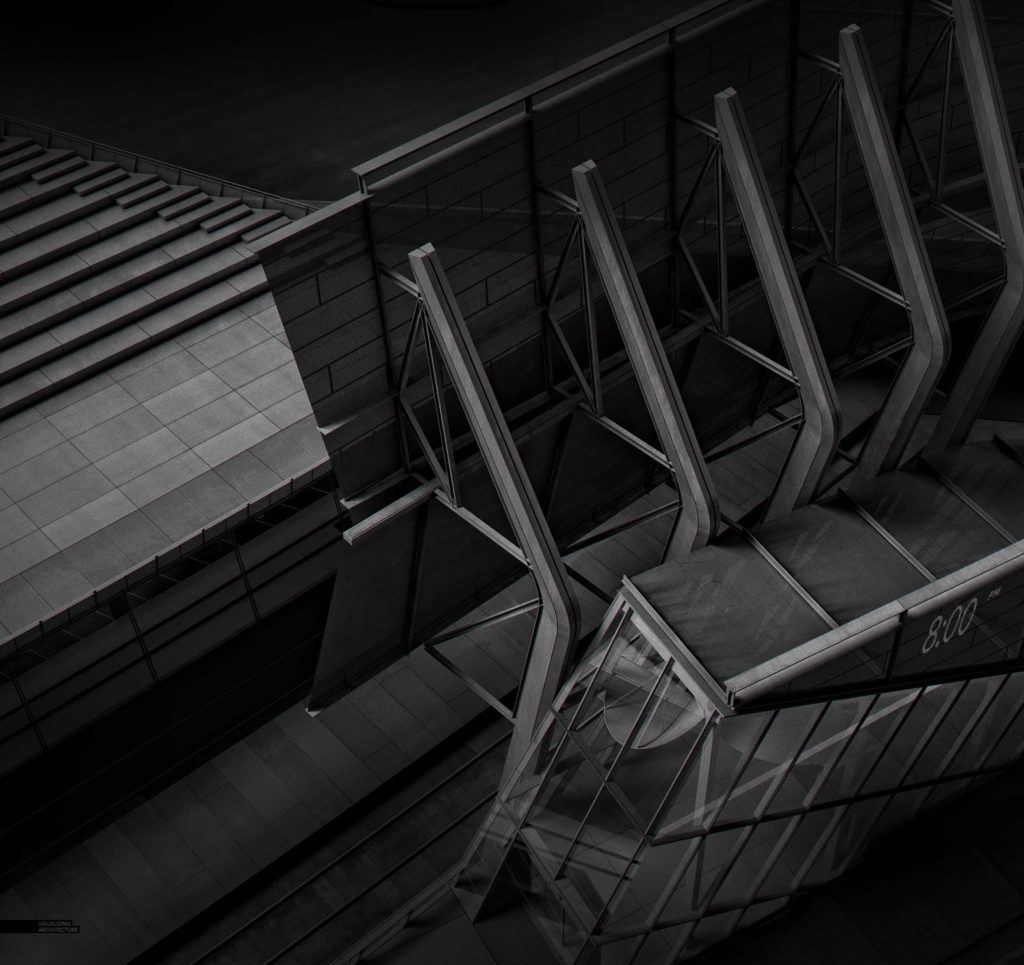
I recently stumbled across an article about an architecture photographer named Sajin Sasidharan and his black and white photos of Dubai. The images are extremely dramatic and he is very strategic about how he uses light to create clear focal points and manage visual hierarchy. It’s a style that I have seen used by photographers for as long as I can remember and there are a few key moves that create such an impactful image. First, and probably the most obvious, is the levels adjustments that amp up the contrast and slide the image to deeper darker tones. Second, these images tend to have long exposures so that the shadows and sky have a softness to them. Third, the sky is shifted to nearly black, with clouds providing a subtle light texture. Finally, a heavy dose of vignetting is applied to somewhat connect the dark sky to the heavily contrasted architecture as well as drawing the eye to the center of the image.
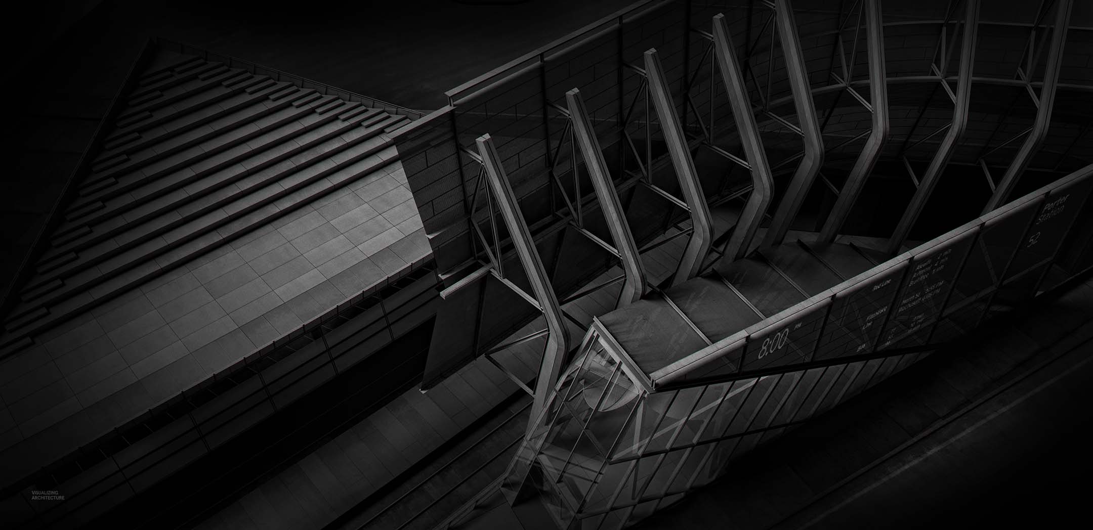
The result is an image that almost acts as a clay rendering, where it is all about the form. As I developed the images below, I went back and forth on whether or not to add entourage. Adding people would help add scale to the images and add a bit of narrative, however, they would also remove some of the abstraction and focus on the architectural forms which I didn’t want. With that said, these types of images are relaxing to create because many variables of image making are removed and you are simply left playing with shadow and light. I looked at many view angles, but I ultimately settled on these three shots.
1. Base Rendering
As I mentioned above, there are a few simple steps that I used to create this type of look.
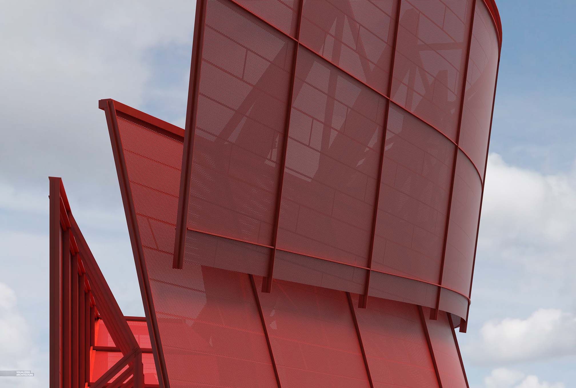
I rendered out my Sketchup model in V-Ray as a daytime scene with soft shadows. There are several ways to soften the shadows depending on how your scene is setup. Here I simply increased the size of the sun in the V-Ray to get this effect.
2. Desaturate
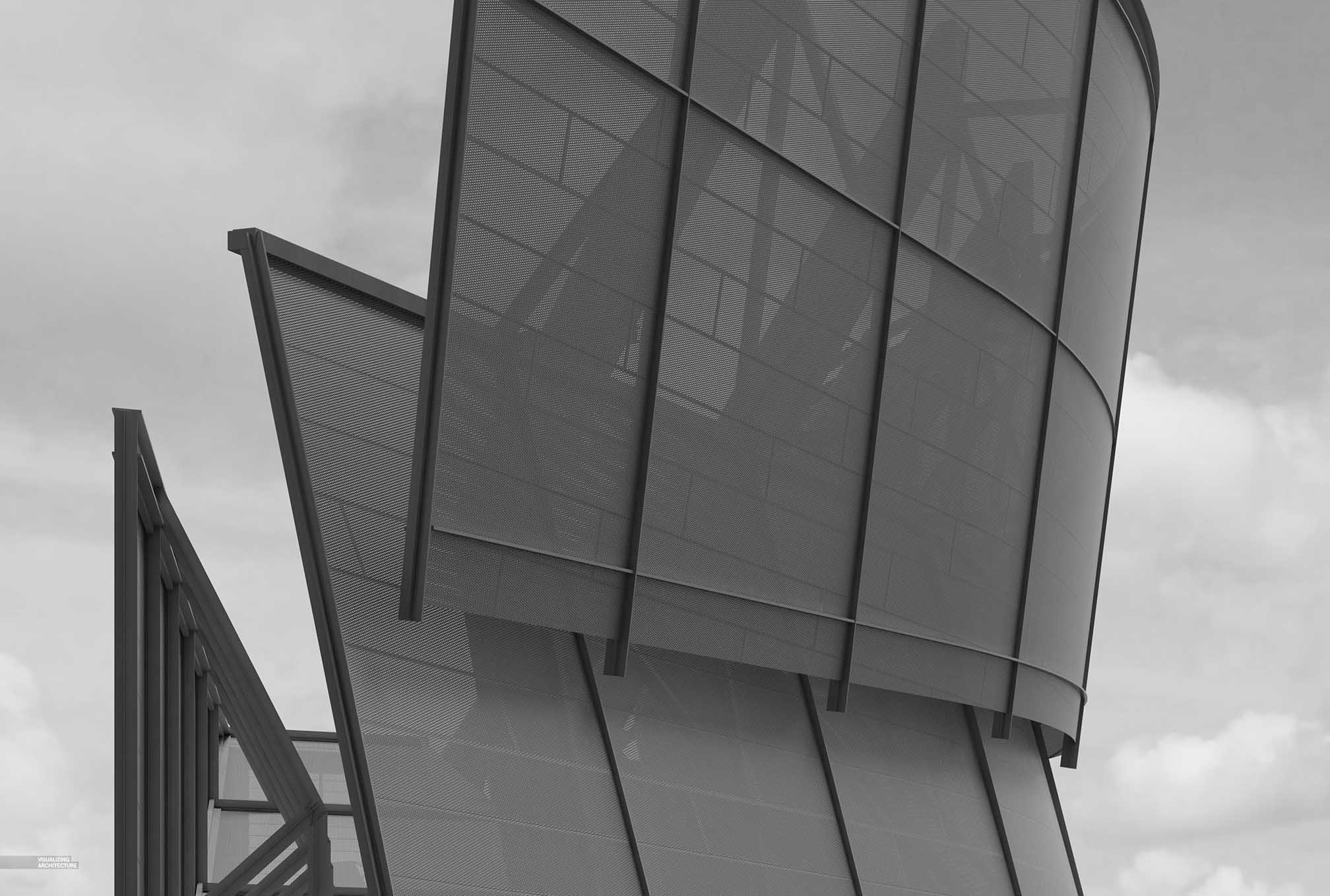
Next, in Photoshop, I desaturated the image (Image>Adjustments>Desaturate or Shift+Ctrl+U).
3. Levels Adjustment
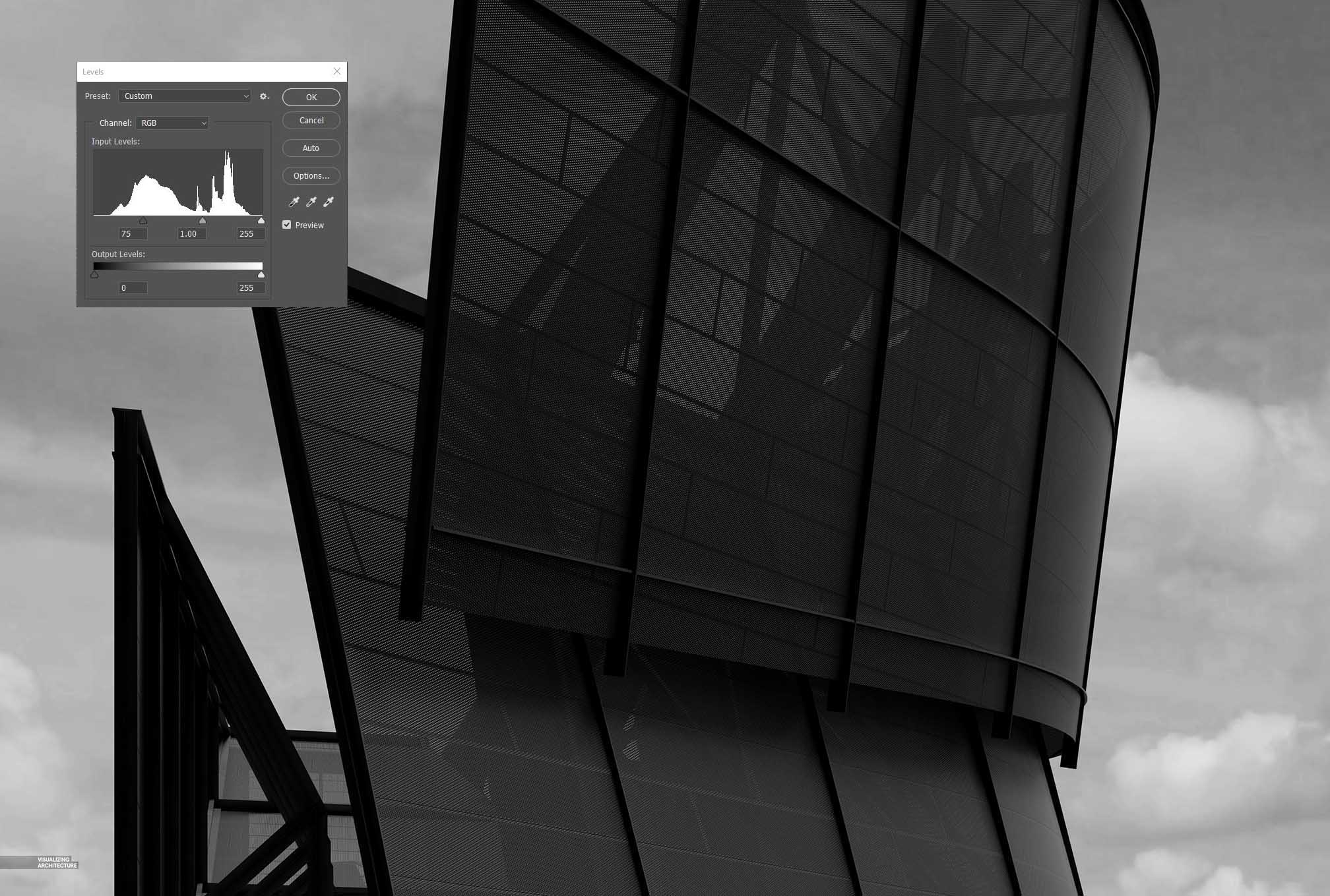
I needed to start pushing this image darker, so I adjusted the levels (Ctrl+L) by taking the left slider and moving it to the right. This really deepened the shadows almost to the point that some of the details got lost in the darkest parts of the image.
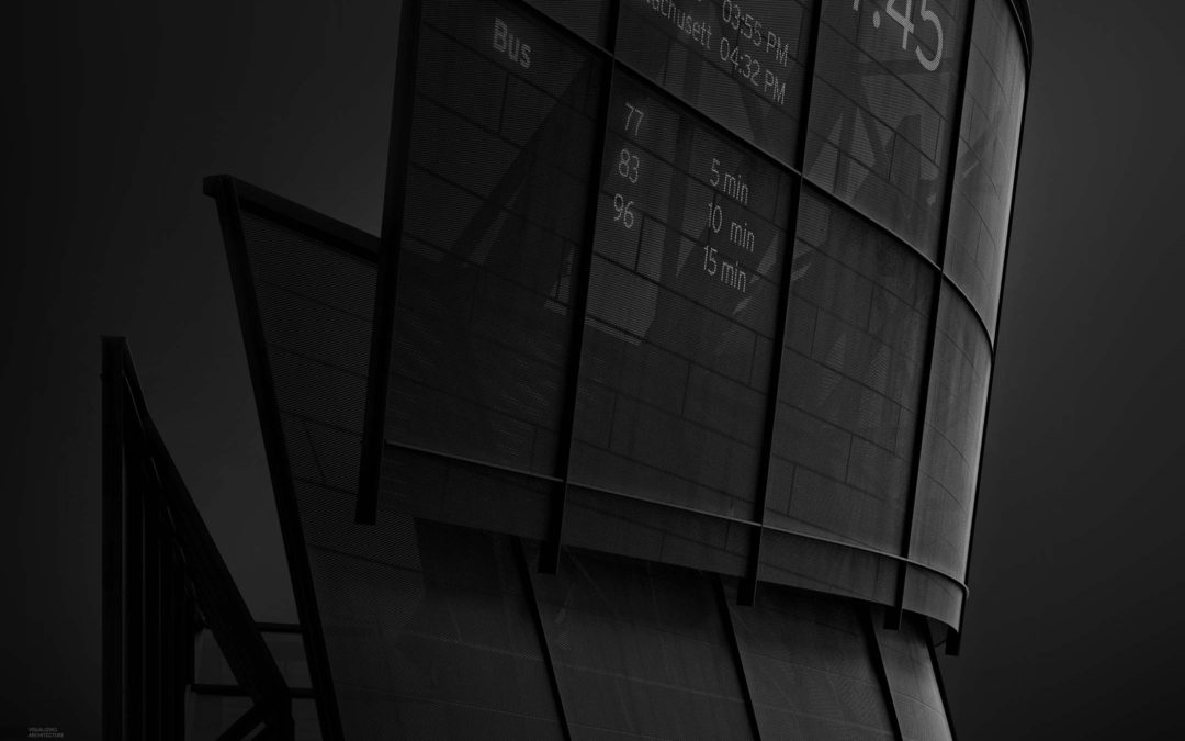
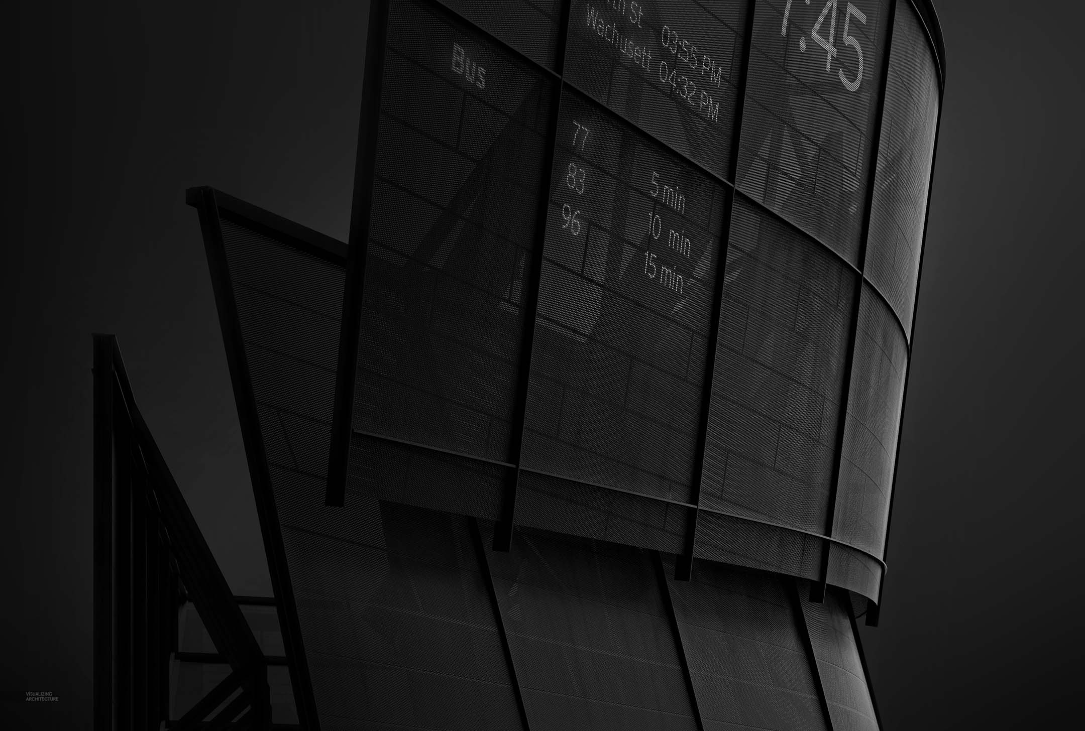
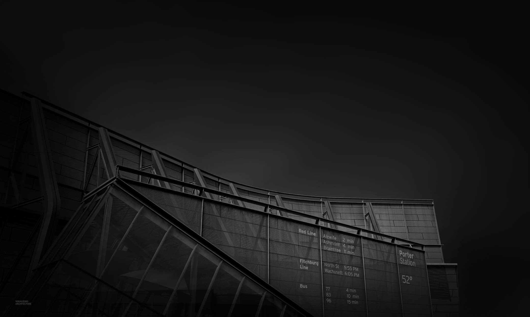
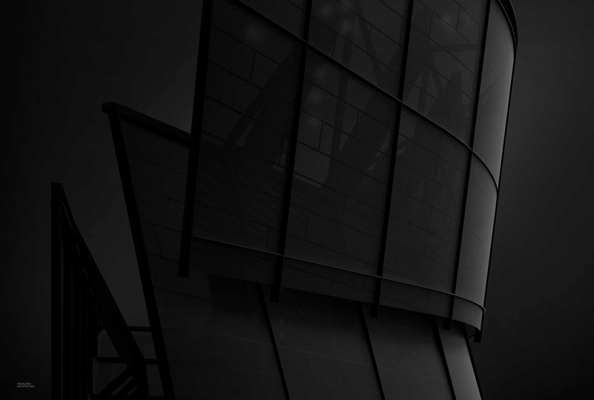
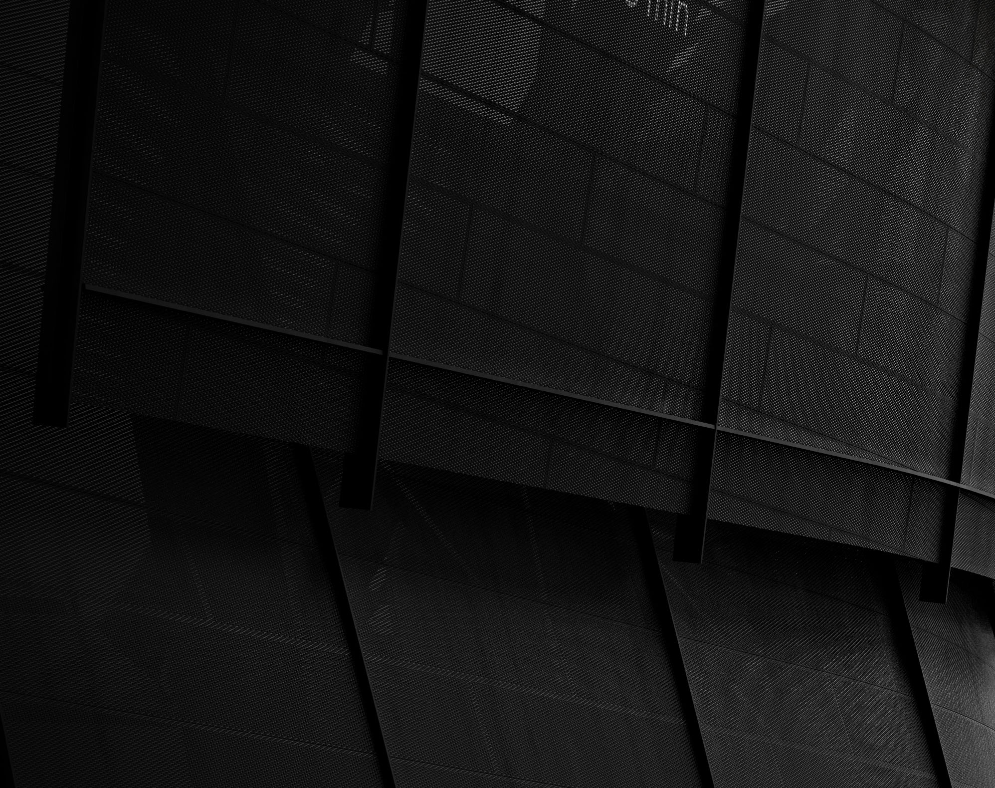
4. Darken Sky

Here, I painted the sky black and then added a very subtle grey paint just behind the architecture to separate the dark sky from the black steel structure. At this moment you can start to see the focal point of the image which is the highlight on the right side of the facade.
5. Vignette
The image still needed to get a little darker. I really wanted to play up the highlight on the right, so I added in even more shadow on the left as well as on the top and bottom of the image. The little bit of grey that was painted over the sky is now revealing itself next to the nearly black structure on the left side of the image. The highlight on the right is really popping.
6. Detail
Finally, I added some details such as the LED signage and some weathered textures over the mesh. Hierarchically, I wanted the highlight on the right to be the strongest, so I diluted the LED text and made sure that these added details did not overpower the image.
You can see an identical workflow was used on the other two images. Soft sunlight, a focus on specific highlights, and strong vignetting,


I have read your article, you have really worked hard for it, and your website is superb, I have visited your website so many times and all the time I have found some new and better things… Thank you for this article…
nyc post i realy like this.
Hello,
Usually, I never comment on blogs but your blog is so convincing that I never stop myself to say something about it. You’re doing a great job Man, Keep it up.
Hello,
Really very happy to say, your post is very interesting to read. I never stop myself to say something about it. You’re doing a great job. Keep it up.
I really enjoyed reading your blog, you have worked very well on this website but also I like it and I have received a lot of suggestions in your web site and I have learned all about it and I have been benefited from writing such blogs. Stay.
Norton.com/setup helps you to deploy Norton setup on your computing devices. Here are the steps for deployment of Norton setup without any interruptions.