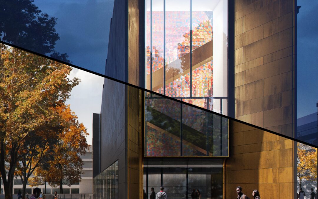
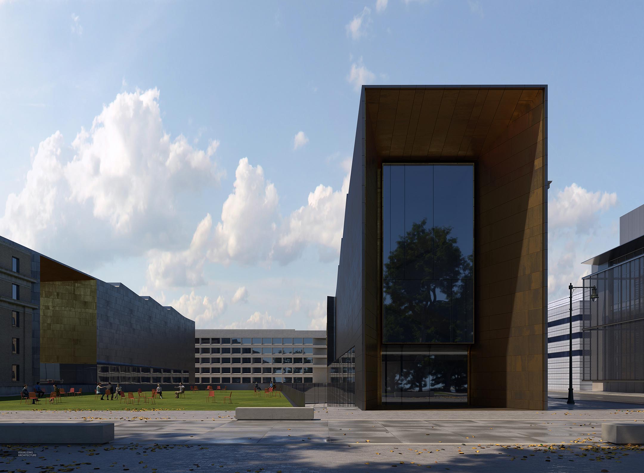
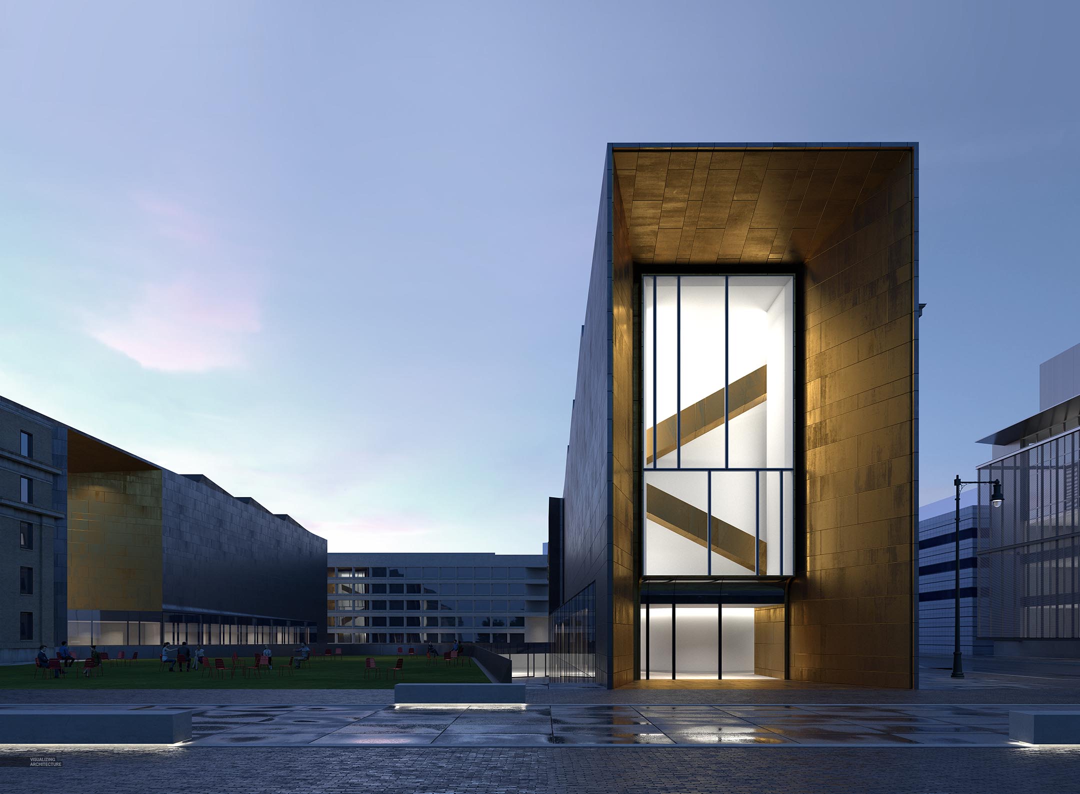
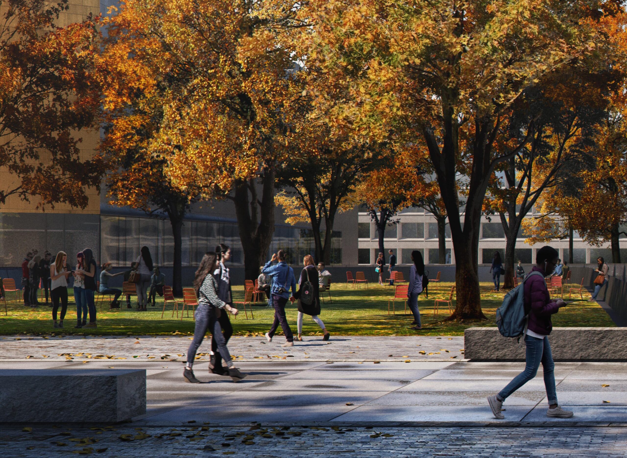
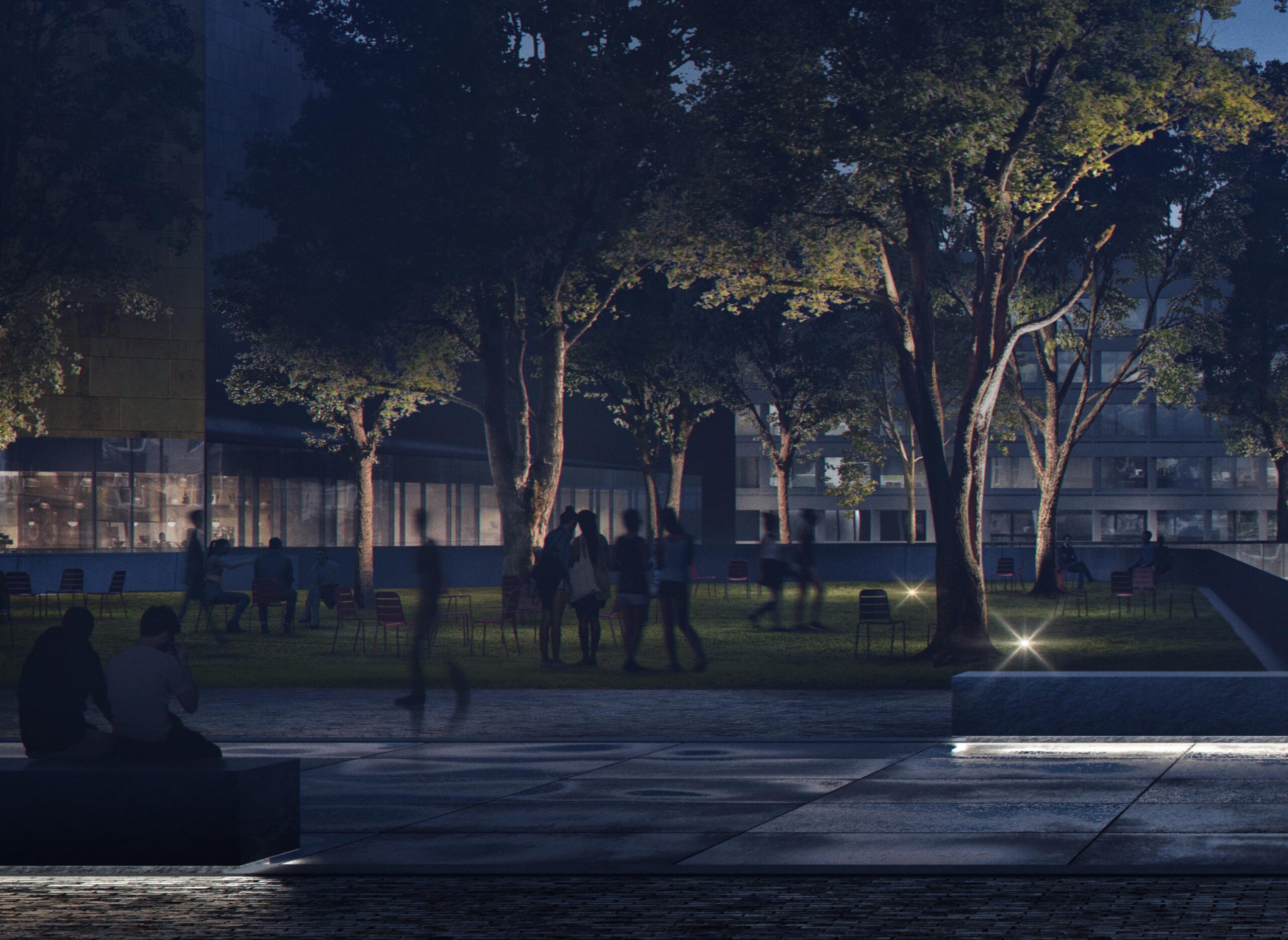
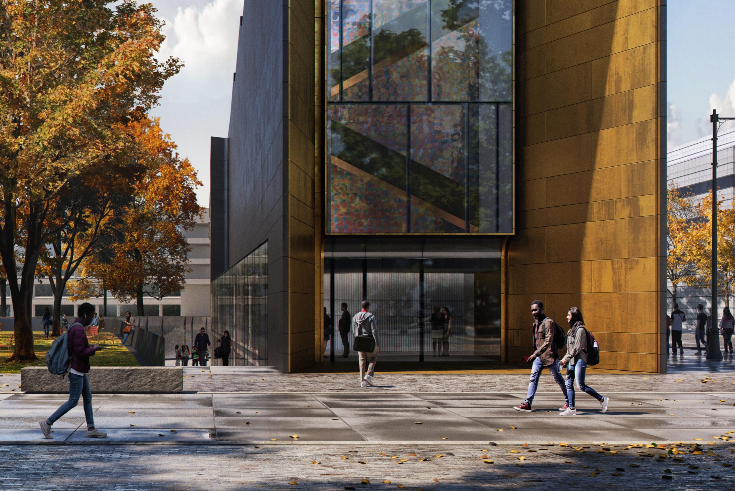
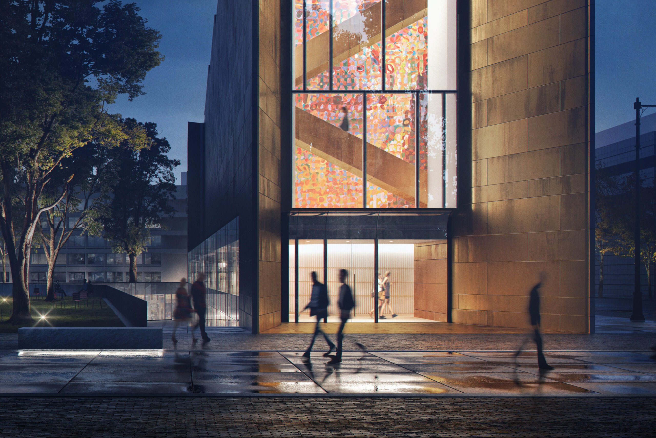
A long time ago, I put together a day to night illustration for my Philly Bridge project. Back then, I had a hard time deciding what kind of scene lighting to go with so I just did both and ended up creating a tutorial around how you could shift an image from daytime to night all in Photoshop. For the MIT project, I again was struggling to decide what time of day to go with so I decided to go with a “Day versus Night” series of images again. There were elements in the view such as the green courtyard that would have a better narrative with daytime light, but then elements such as the brass portal entry would have a more dramatic reading at night. It became clear that creating both a day and night illustration of the same view could be a powerful way of showing how these elements change and adapt with different lighting.
This time around, I didn’t make the transition from day to night all in Photoshop as I did with the Philly Bridge images. I setup the model with completely different lighting for each image so that I could be a little more accurate with materials and reflections. It is also just a massive time saver rigging the model with lights rather than managing in Photoshop. Back when I created the Philly Bridge images, the materials I was using in 3D were less refined and my 3D lighting abilities were not as strong. Therefore it was quicker for me to actually make it all happen in Photoshop. Nowadays, I am relying on the 3D much more to get reflections and textures where I want which saves time and is more accurate.
3D
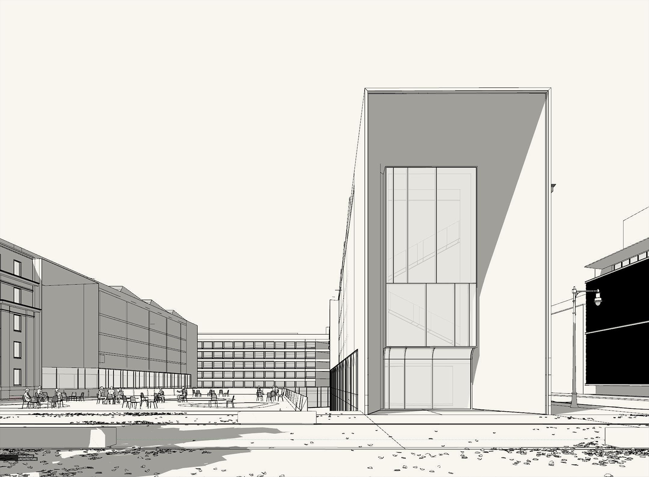
As I mentioned above, I setup the 3D scenes for the daytime and night rendering with different light. Specifically, I used a different HDRI for each sky and I added in interior lighting for the night scene. I also dropped in some leaves on the ground for the daytime scene.
Brass Portal and Interiors
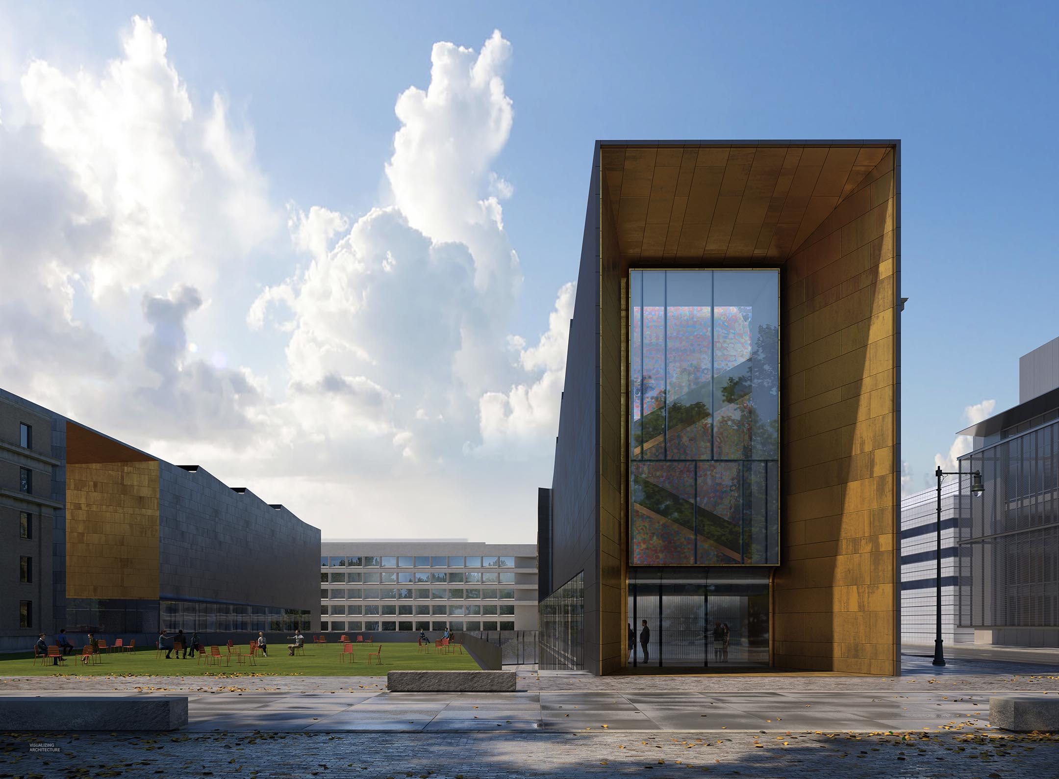
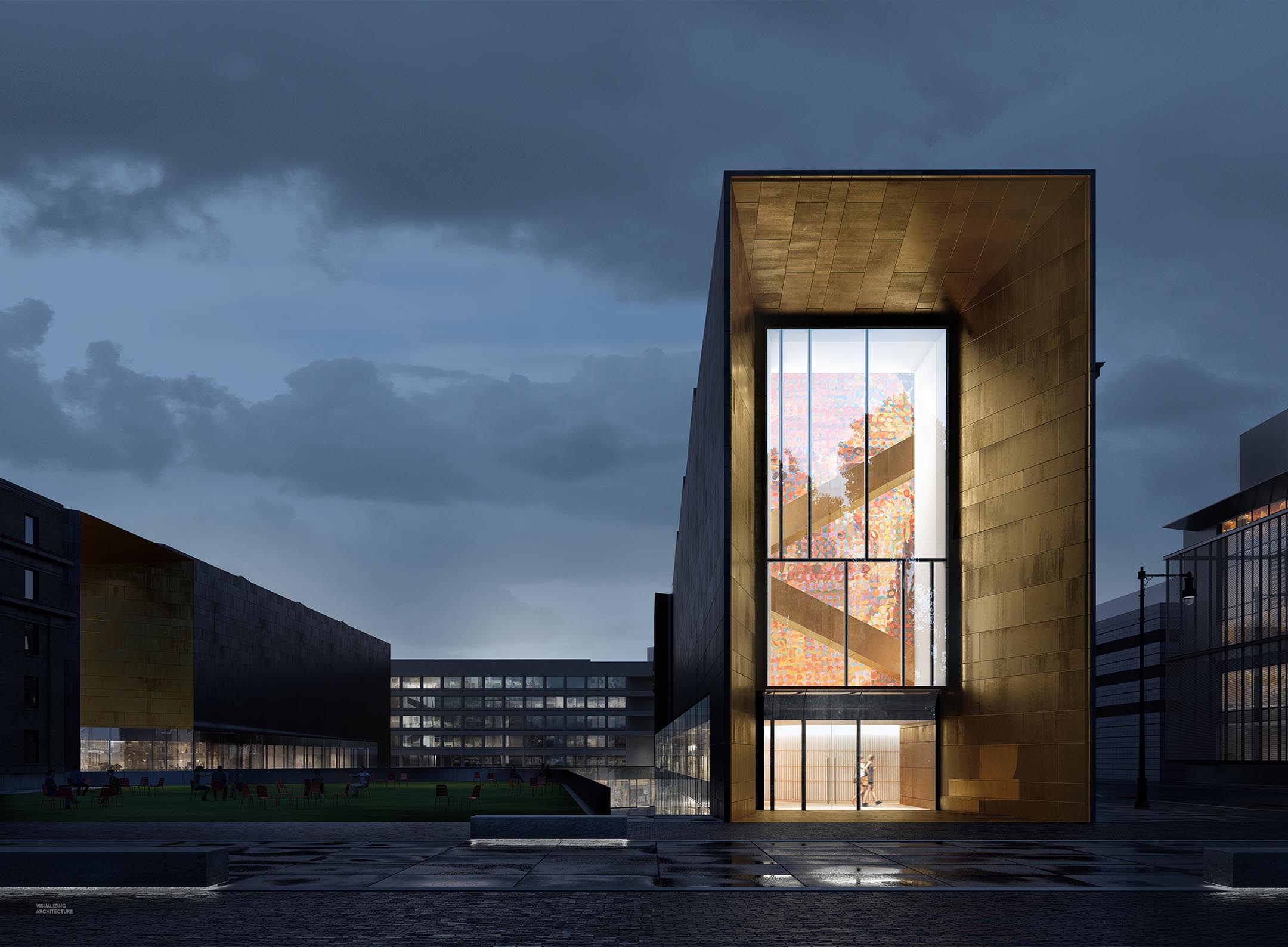
An important focal point for both images was the brass portal surrounding, so I punched up the color and adjusted the texture so that the brass had more of a presence in the image. I also added in the interior detail via Photoshop. I envision the portals at the end of the buildings to be a place to display art. The art also helps to draw out the diagonal stairs crossing the space.
Trees


Adding the trees in was a little tricky as they needed to look “similar” in each view but with totally different lighting. Originally, I was going to take the same tree and edit it for both views, but this ended up muddying the colors too much. I decided to do a little surgery and switched around the tree tops so that I could get different lighting on the leaves for each scene but maintain the same trunk forms. This allowed me to properly up-light the trees at night while still showing proper color in the fall.
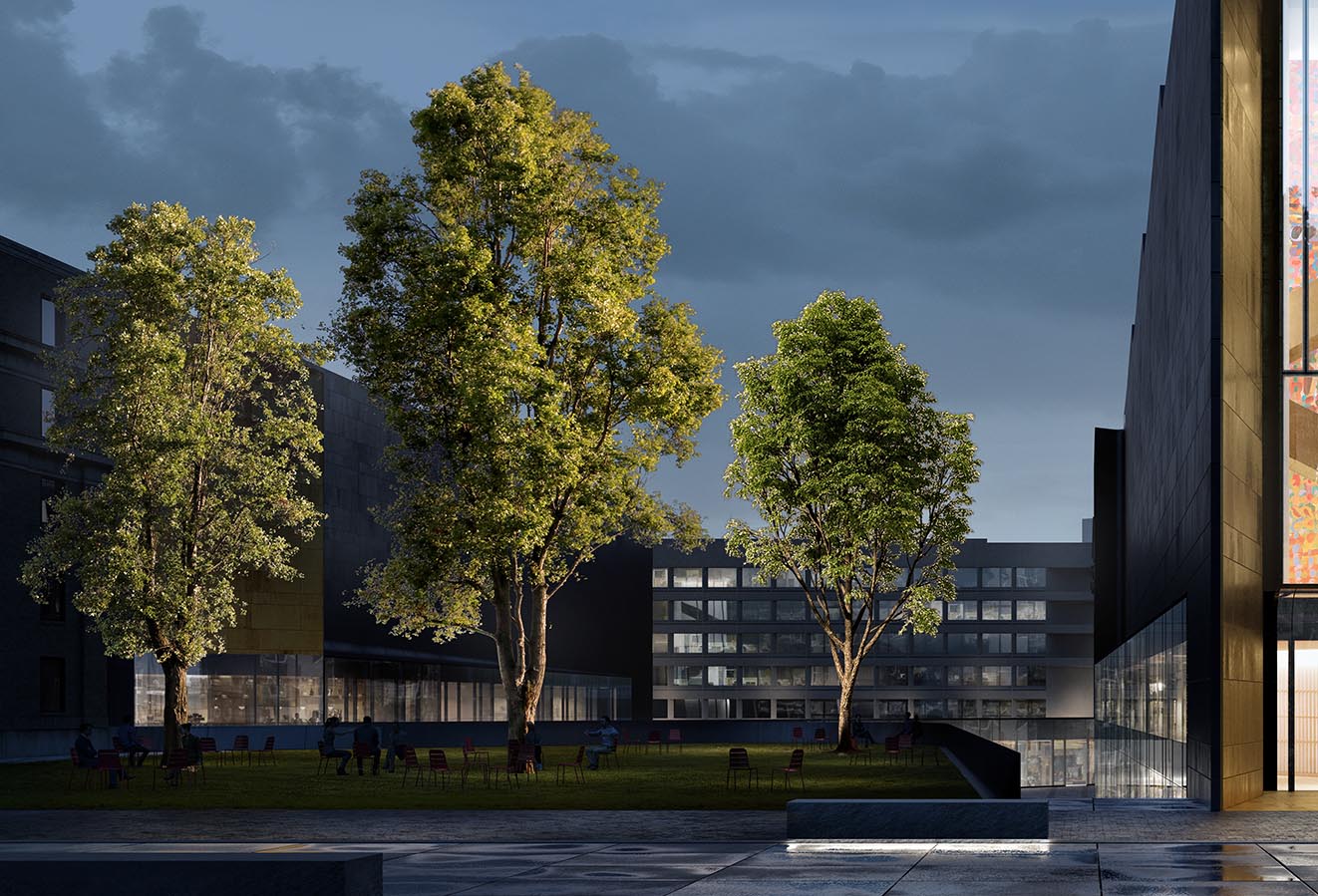
To properly up-light trees at night, you first start with finding the right kind of cutout tree. I look for daytime lit trees that have a nice highlight both in the leaves and on the trunk. I then adjust the color so that the leaves are a little less green but have some warmth to them.

Next, I duplicate the trees and darken them almost to the point of being completely black. My night scene is pretty dark so this is fine. If the scene is a little brighter, I will leave a little texture, but really desaturate the tint the colors blue.
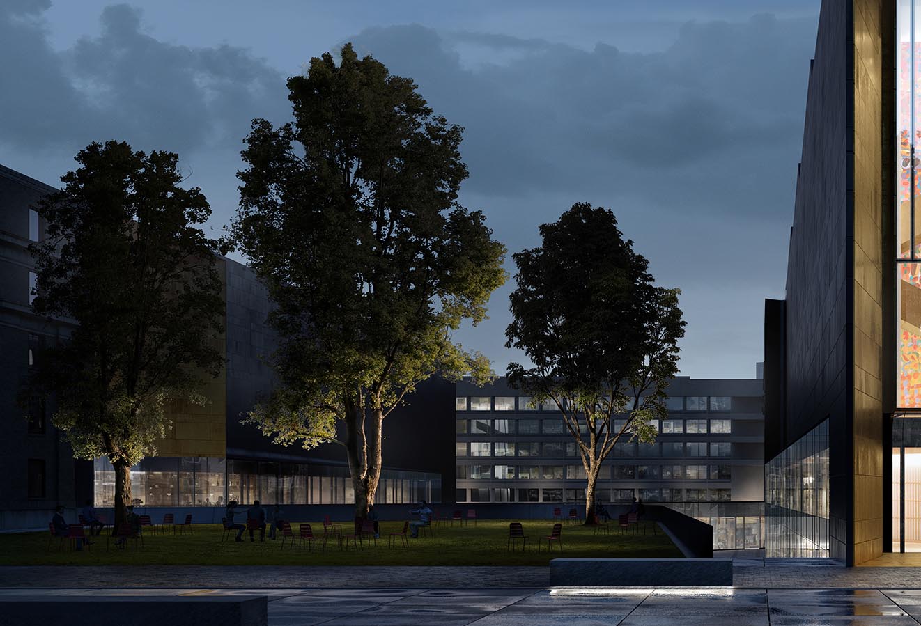
Finally, I carefully and slowly mask the light color trees on top of the dark color trees so that highlight is contained on the bottom side of the tree and around the trunk. I have used this method so much that I have built up a library of these manually made up-lit trees because they do such a good job of activating the ground plane.
People
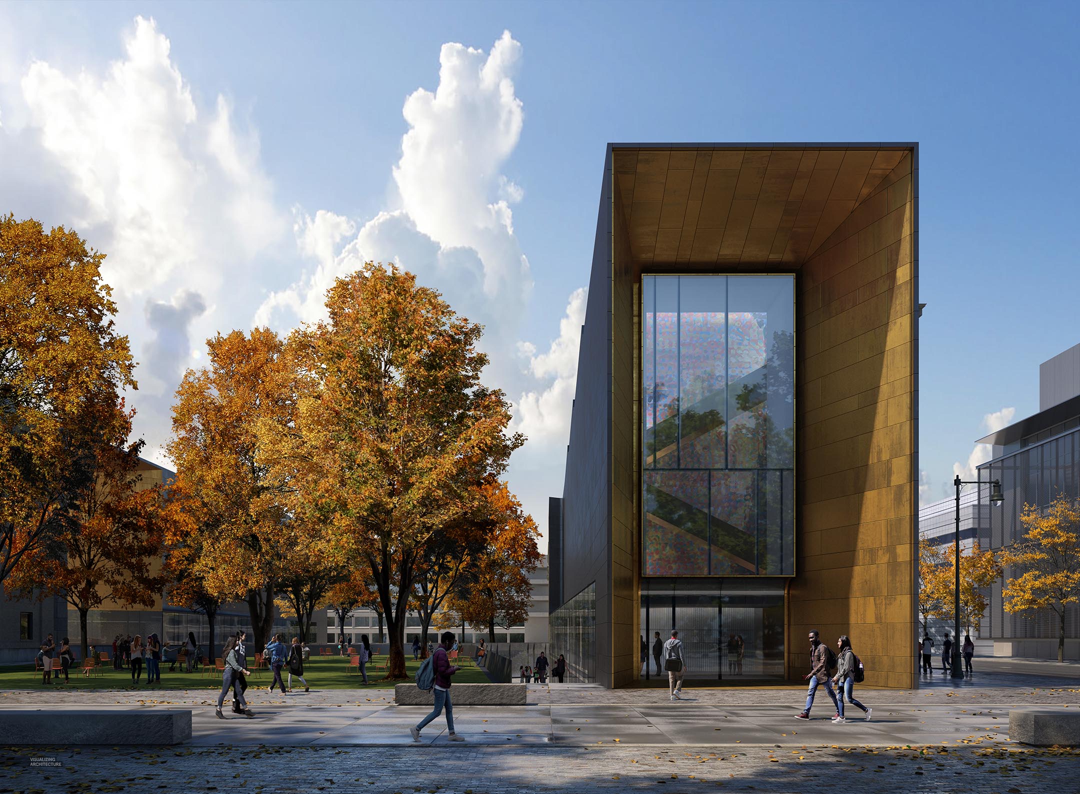
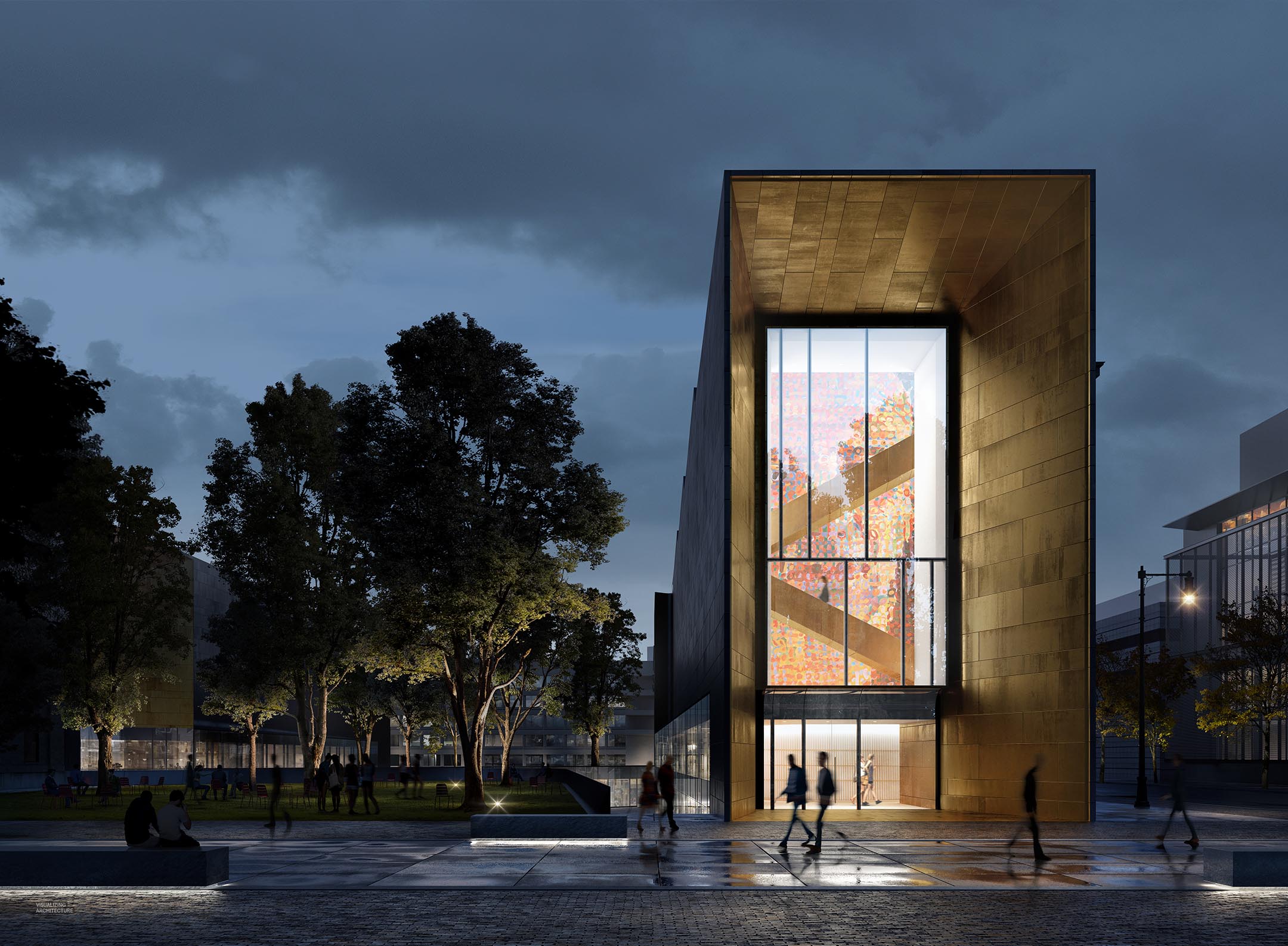
For this type of eye level perspective in a campus environment, the entourage is really important. I wanted to play up the pedestrian street in the foreground so most of the the people are moving horizontally across the image. Conversely, most of the people in the courtyard on the left are standing or sitting in groups implying a place of gathering. I have been starting to use blurry cutout entourage more and more for the low light images because I really like the look and realism it adds to the images.
Final
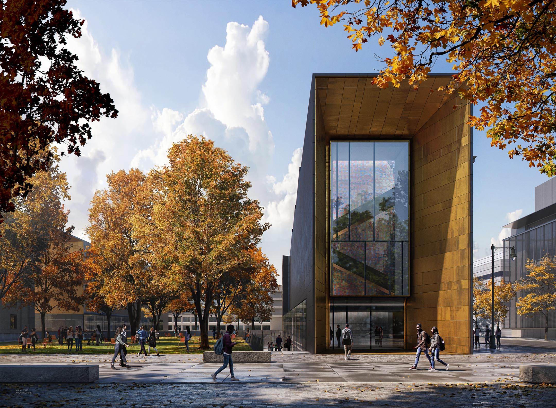
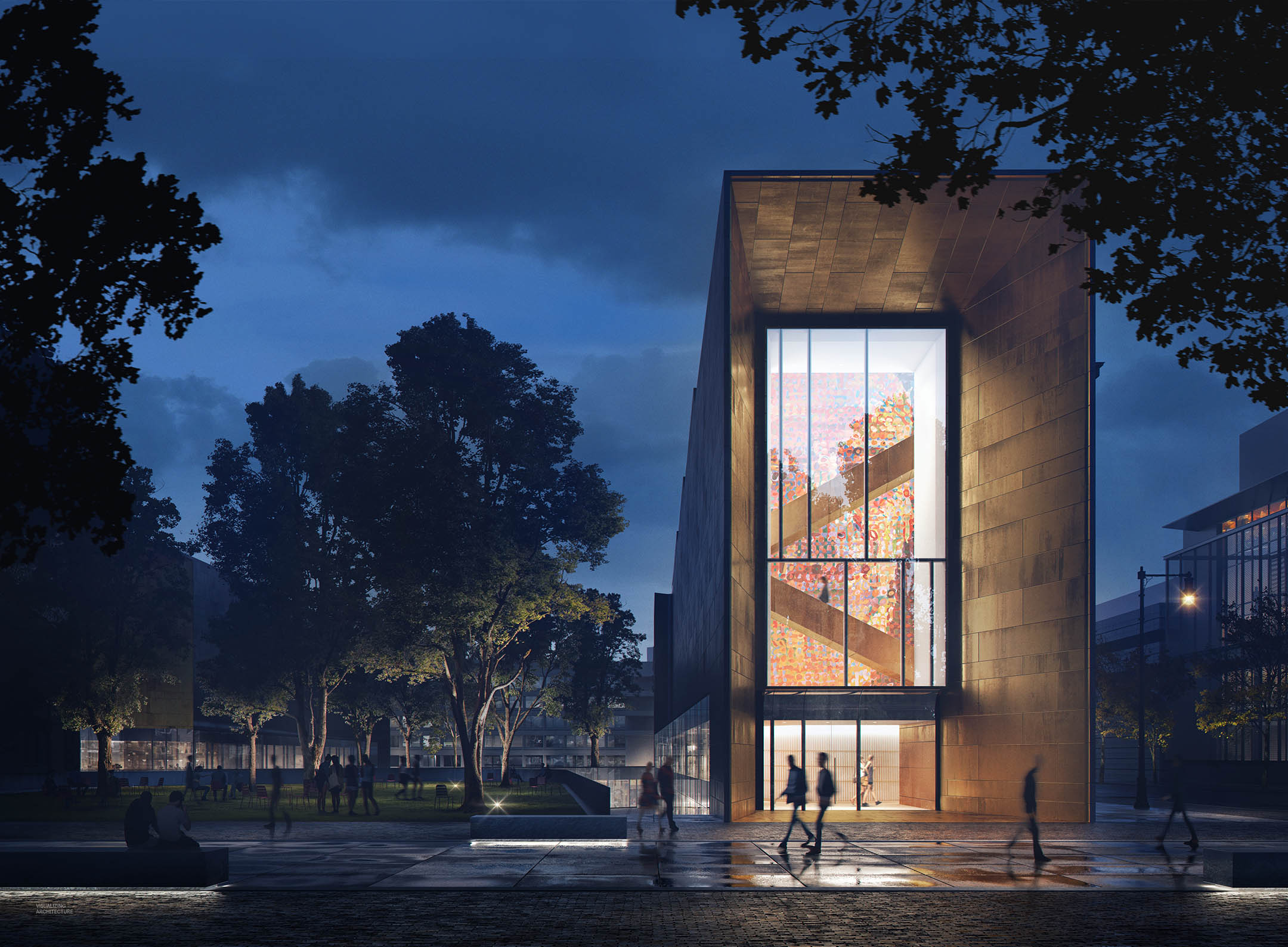
To finish up the images, I increased the saturation for both views and adjusted the levels. I also added foreground trees to balance out the image compositionally and to be a little more accurate to the site design.
Ok, Alex another extreme work…Can I ask you, How did you make reflections in photoshop?Because, rendered reflextions are different.I saw it in your many works.Please, Can you answer it?
@Jean Lena, For these images, everything was just about all 3d, but enhanced in Photoshop with toning and color. However, I did have to photoshop the people reflections in which I just flipped the cutout person and use the smudge tool to blur it a little.
Beautiful work as always Alex. Curious what the Vray workflow is for the brass portal tiling. From the Sketchup model it doesn’t look like the spacing between tiles was modeled, but I also don’t see any tiling occurring at all. How did you end up achieving this along with the nice wear details?
@Jack, The brass was all texture including the joints. I avoided the tiling by just building a huge texture from scratch in Photoshop. If you look closely, you may see it tile vertically once over the height of the building. I also built the reflection and bump maps in Photoshop which helps give the brass the aging that you see.
Very interesting. Would you ever consider providing a tutorial of creating your own maps in Photoshops? I think I’ve seen you use the technique a couple times with some other projects, but I’m curious what the in depth process looks like. Thanks for the reply!
There’s a little something of Edward Hopper in your night lighting ambience, it’s very interesting.
Alex is again an excellent work. I just want to ask you: How did you make these reflections in the foreground glass reflections not in the raw rendering.