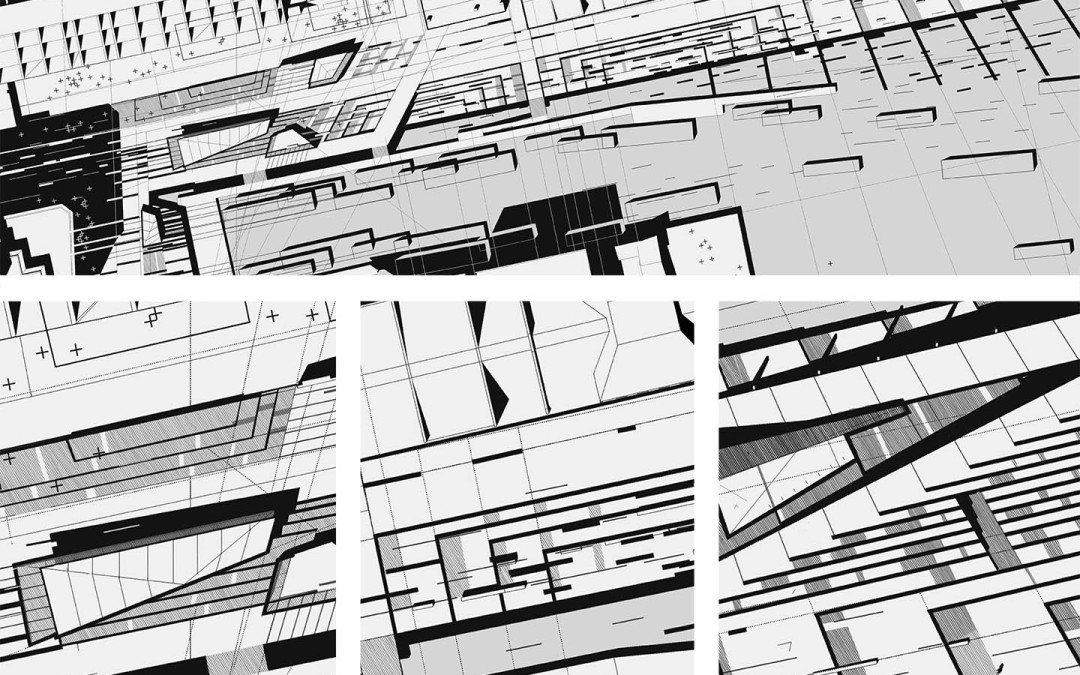
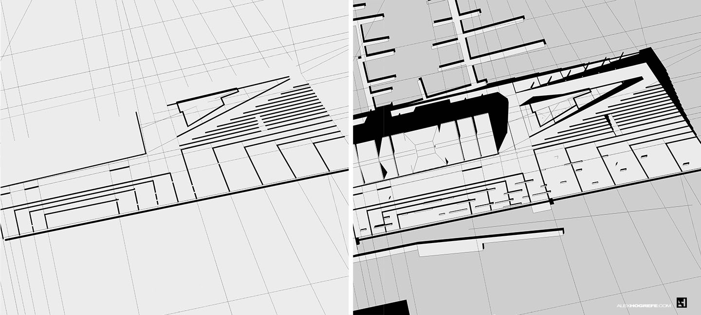
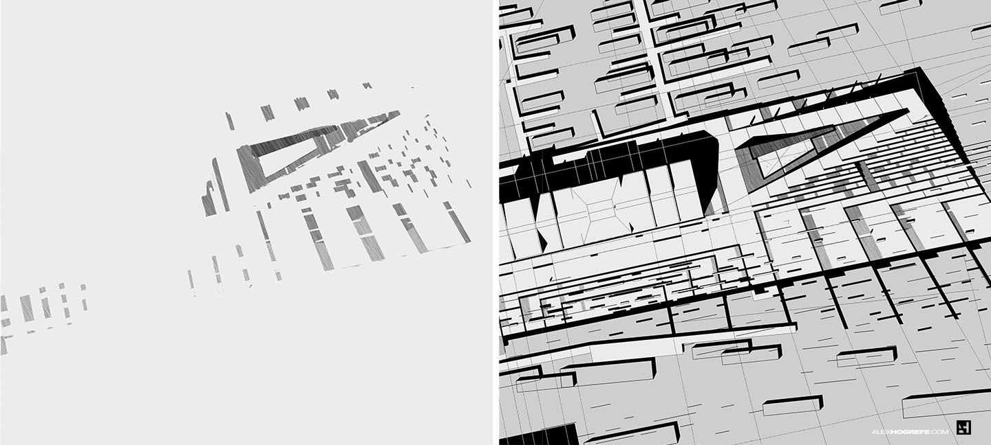
The last few posts have been focused on diagramming the existing conditions of the site. In this latest post, I have shifted to studies for the new design. The overall concept and form of the Sketchup model is established, but now I am interested in exploring texture. I trid to keep things abstract before getting too specific with thoughts of actual materiality and color. The above black and white approach was one way for me to keep thinking conceptually without losing myself in the details. As much as this image looks “finished”, the workflow was very much a loose and explorative process. Many iterations and ideas were tested. Changes in line weights, shadows, and hatches helped define hierarchy and texture qualities.
From here, I expect the illustration to continue to evolve as the project is refined and more decisions on form and material are made. The process of creating an image like this in Photoshop is “sketchy” in nature which lends itself well to exploring ideas along side 3D modeling. Later on down the road, I may begin introducing color as ideas of materiality become more concrete.
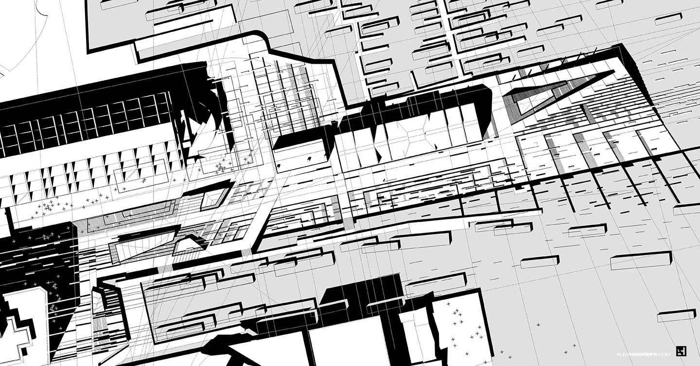
Below is a quick breakdown of how the image was created. Everything was made in Photoshop except for the initial line work and shadows which were exported from my Sketchup model. For the most part, I used the Brush Tool to create most of the elements. I also applied drop shadows and strokes to the elements when needed.
1. Sketchup Line Work
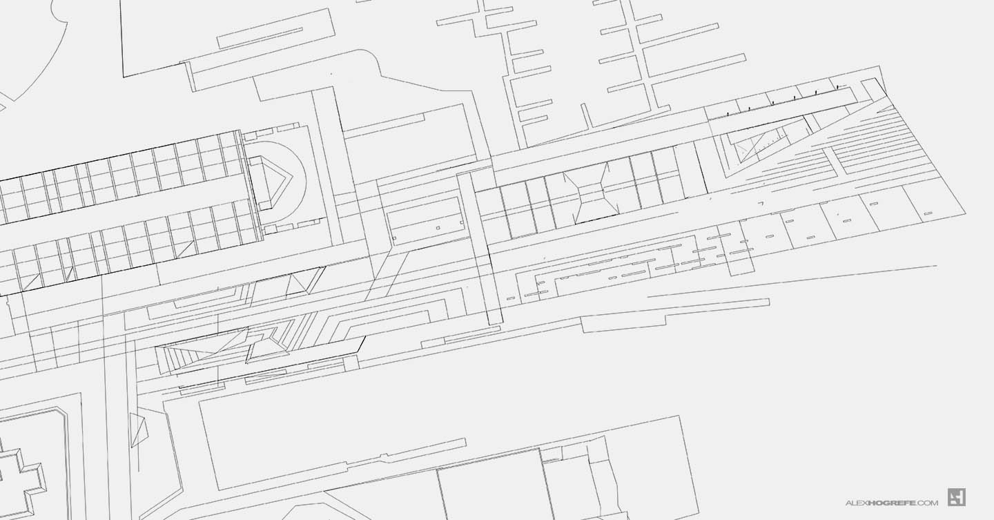
2. Shadows Exported from Sketchup.
I adjusted the levels to take the shadows from grey to black.
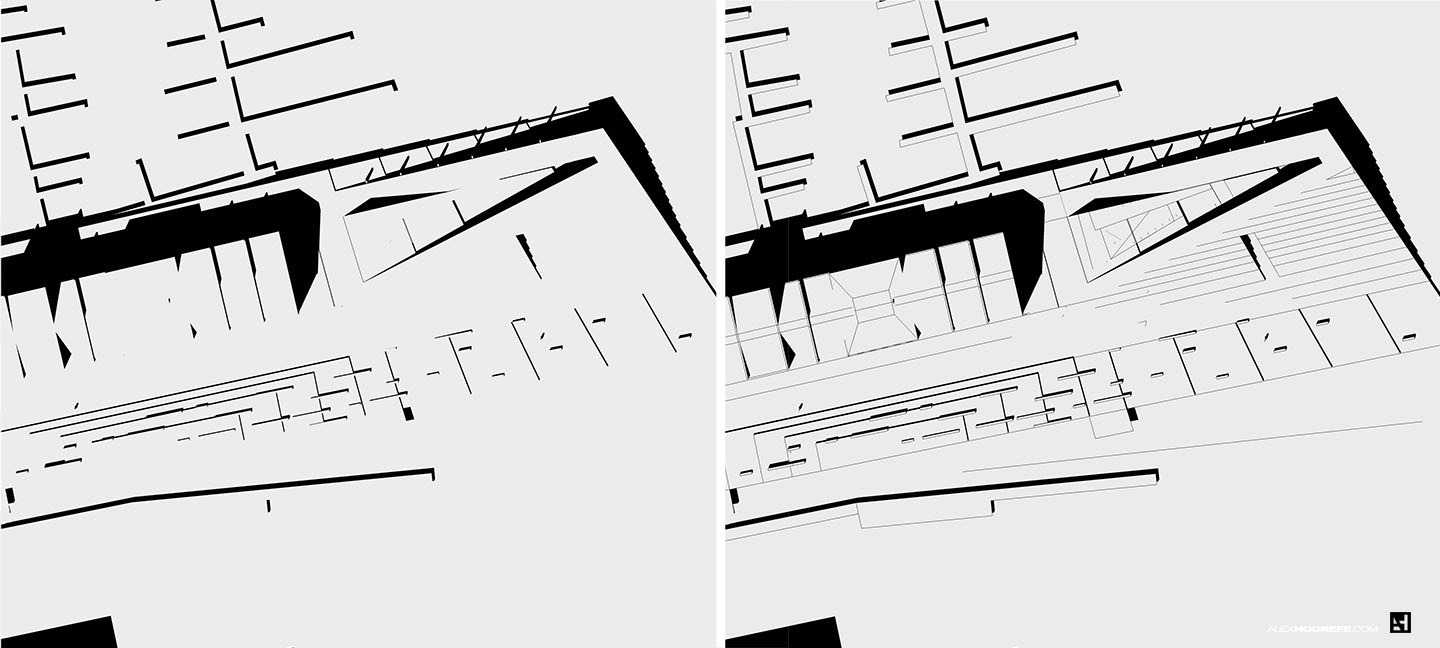
3. Water Poche
I darkened the water slightly to better clarify the relationship of water to land.
4. Profile Lines and Guide Lines
Thick profile lines were added to punch up important elements of the design.
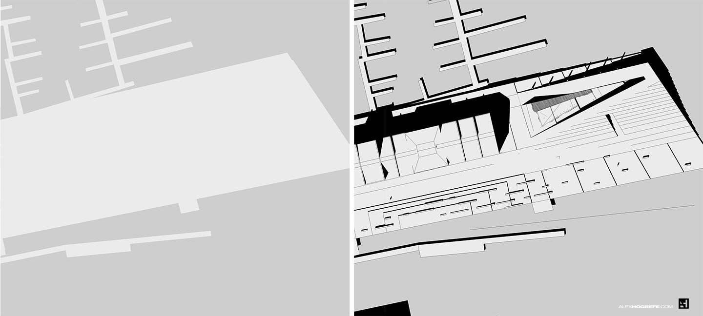
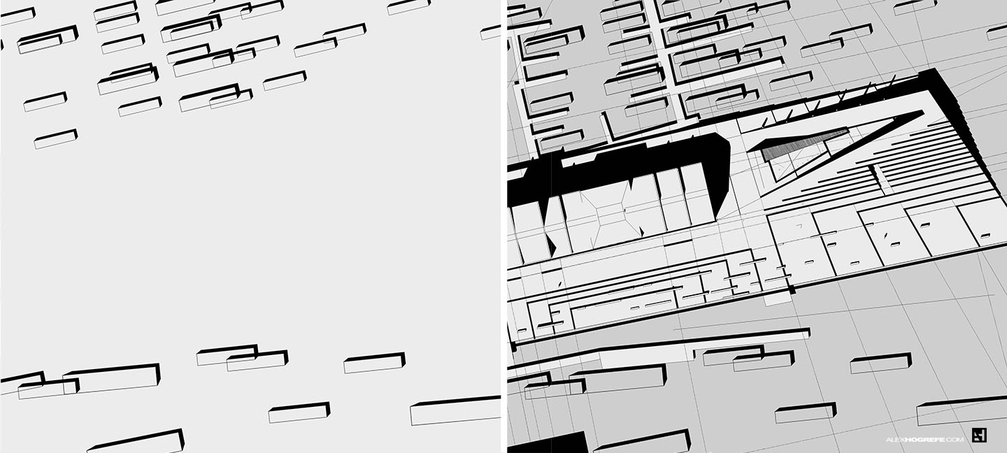
5. Abstract Boats
Simple rectangles with shadows were used to represent the boats in an abstract manner. These were then copied many times to imply movement.
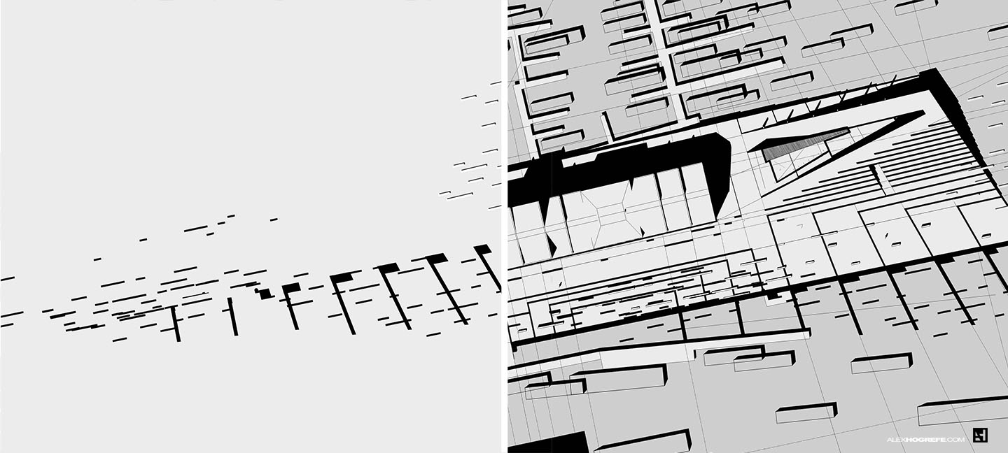
6. Thick Dashed Line Work
The thick dashed lines represent an abstraction of several elements of the existing site. Density and location were determined by topographical changes and potential pedestrian traffic.
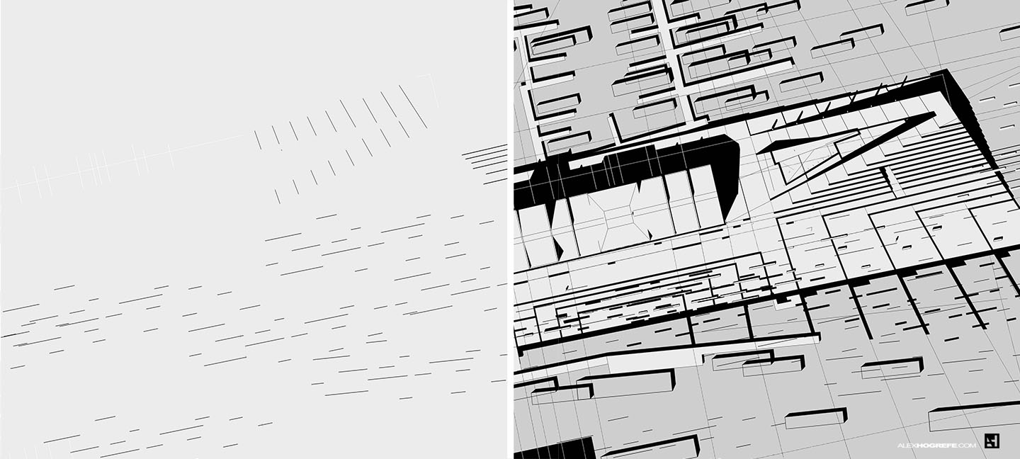
7. Thin Dashed Line Work
A second layer of thinner dashed lines were added. These are hierarchally weaker than the thick dashed lines and could represent a change in material among other things.
8. Poche
A final layer of shading was added to highlight potential locations of green space.
Though the workflow has been broken down into a very systematic explanation, the actual process of creating this image was not as clear cut. As mentioned above, it was a very iterative process where all of the element were slowly built up together through additive and subtraction means. There was a lot of copying, pasting, transforming, and scaling. Less focus was placed on craft and more on a relaxed and experimental process.


sometime its hard to determine the texture of definitely.line work and time management must be basic necessary for this work.
desertleather.com
Hi Alex,
Your blog give me many inspiration and technicaly advice. They are very useful for beginers in portfolio creation. I always look for your new project.
I was thinking about relations beetwen grapic presentation and source – architecture project. Somtimes (but only sometime) I taking opinion that this relations in Your portfolio is near or over limit – grapic effects (intensity of color) or title text size are taking first place then is project time. Mayby You trie to do some more "silently" ..hm.. subtle, refine… example of one of Your project? Hower still exist problem to tempt the eays…. But, this is my opinion, and I would to give You some litlle feedback…
Anyway Your job is still great and I waiting for more. Keep going.
Gretings (from Poland)
This tutorial is very helpful for my site diagram. Thank you.
i was looking for this information, it found only here, thanks to the author!
Magnificent writing! This is good find out for the reading and worked like a fantastic way. Thanks much
“Women can be a mans worst enemy but bible says love your villain” and addiction in any form is dreadful and while I started to gain power in my professional life my mind started to lean over to the women the pretty women in Bangalore.”
thanks for sharing this tutorial with us !
love this
If he was that good, f*ck the supporting cast and find people willing to do the job. Look at Billy Corgan.
looking for, so let me just touch on…level there are a few different information. Least…for example. This just chair. I hope this general overview.
Thank you for such a wonderful post!
Thank you for sharing such informative post. I really am glad that you discussed all this in your blog