A student in Chicago emailed me a while back asking how I created the back cover of my undergraduate portfolio. The image was a collage of all of my projects Photoshopped together into a single composition. As time consuming as it may look, I probably only spent 2 or 3 hours on the page. I didn’t use any Photoshop “tricks” to get the final look, but instead just used the eraser tool with a soft brush to remove the backgrounds. Most of my time was spent experimenting with the layout and figuring out how all the pieces would fit together. Using some type of underlying grid was my way of maintaining control of the geometry and avoiding a chaotic look.
1) I began the collage with a simple black and white background that continued the theme of my other portfolio pages.

2) I next chose a few images that would act as organizing elements of the collage. To avoid harsh edges, I chose the “Eraser Tool”, selected a soft brush, and lowered the opacity of the brush just under 50%. I then simply erased around the edges to allow the images to bleed into one another. For experienced Photoshop users, I would suggest using a layer mask instead of the eraser tool to maintain more editability.
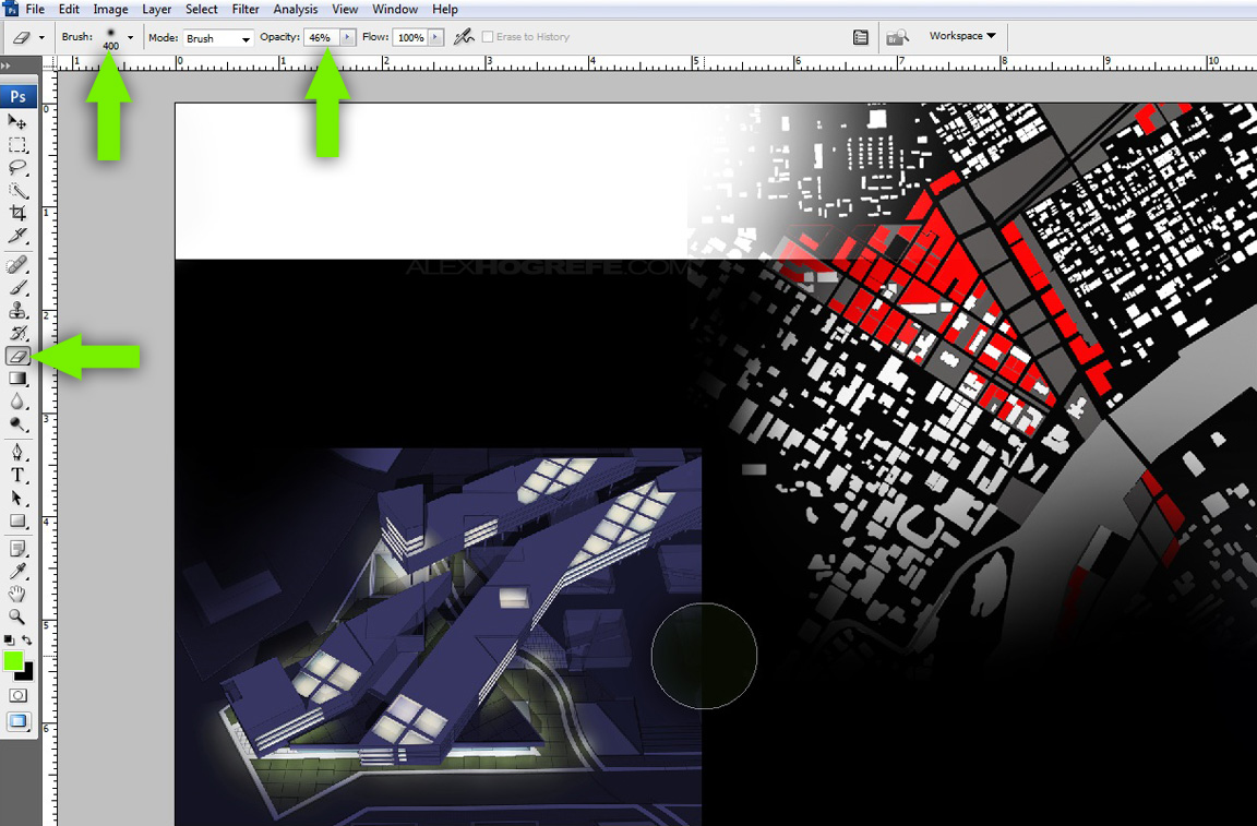
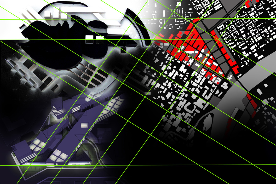
3) The three images where arranged to cover much of the page and act as a texture for the collage. I overlaid a grid to show how the images related to one another and how they act as an organizational foundation for the rest of the collage.
4) I next added very neutral black & white images to infill around the edges. These images again add texture to the background but won’t grab too much attention.

5) With the background in place, I then begin placing in foreground elements. The same method of using a soft eraser brush was used to help blend the different images together. I also lowered the overall opacity of some of the foreground elements to help set them into the background.
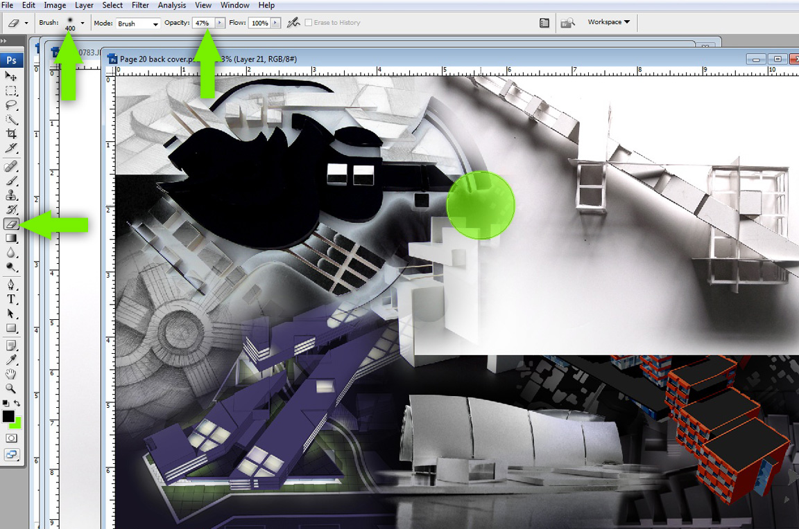
6) Again, many of the foreground elements still relate to the grid created by the background elements. As subtle as these relationships may be, they make a big difference in the success of the overall composition.

7) I created icons for each project throughout the portfolio. I wanted to find a way to add these icons to the back cover without them getting lost in the geometry of the other elements. I solved this problem by adding a streak of shadow behind the icons giving them depth. The shadow is barely noticeable, but really makes the icons pop. In the image below, I have separated the shadow and icons from the collage to better show the shadow shape.
![]()
Below is the final composition that was used for the back cover of my undergraduate portfolio. Most people probably won’t even see the back cover, however, I wanted to do something a little different rather then just leaving it blank. It hardly took any time to create, and is one more thing that could stick in someone’s mind when applying for schools and jobs.


ALEX I'm look forward your new tutorials for a long time.I'm grad could learn some new skill for performance.But I have some problem to performance some analysis diagram.Can you show some tutorials about how to performance the analysis.Thanks!!!
PS:I'm from China,live in Shao Xing.Zhe Jiang Province.I see some ShaoXing's Pictures.If you come ShaoXing again.I'm be honoured to invite you visite my family. 🙂
the use of the grid is really effective!! thanks for sharing!!!!
how do achieve high enough quality images to use through out your portfolio but mainly on your presentation boards??? some of the boards you show at your thesis show look huge but still very high quality… is it just a case of rendering at very large sizes and high resolutions??? for every stage of the image production, e.g. lineworks, renders etc….
any advice would be appreciated,
best regards
Great!!
@ Steve,
A lot of my renderings I do are at really low resolution. One way I get around that is like you said, upping the resolution later in Photoshop. I export high res SU linework and scale the Kerkythea renderings up to match the high res exports. Then after photoshopping high res textures on top of everything, I end up with decent resolution final illustrations.
thanks alex, again appreciate the response,, and yet again amazing work and tutorials
Photoshop is great tool to make cover pages, I think indesign also one more tool make cover pages. 🙂
Sanitaryware in Mumbai