My last post discussed some architectural presentation boards that were, for the most part, poorly organized. I wanted to go into this week’s post discussing some presentation boards that were almost up to par, but just needed some tweaking. I also noticed some comments asking me to revisit the boards, editing them based on my critiques which I thought was a good idea and therefore tried to do in this post.
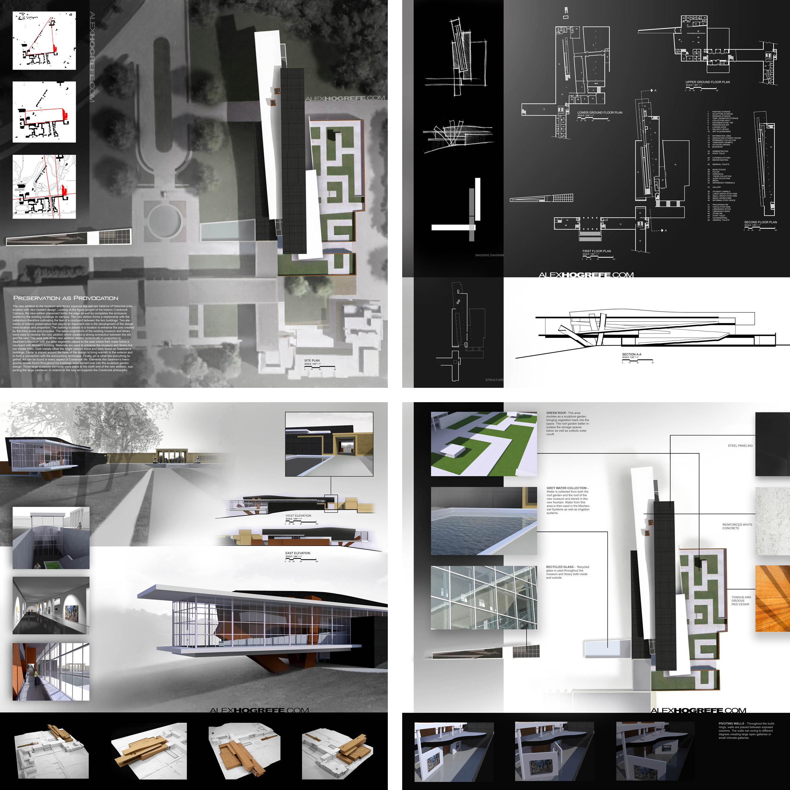
To begin, this group of presentation boards was created in my final year of undergraduate school for a competition held by the Cranbrook Academy in 2007. The competition asked for four 20”x20” boards. For the amount of work that went into this project, cramming so much information into four boards turned out to be more difficult than I anticipated. On top of that, I have always found it challenging to organize graphics on a square format. The four boards were designed to read well by themselves, but also relate to one another when placed side-by-side. This was done by setting up a simple grid and creating relationships from board to board such as using the same size windows or overlapping background elements.
ARCHITECTURAL PRESENTATION BOARD 1- INTRO BOARD
The first board that I revisited was the top left layout with the large illustrated site plan. There are a couple of things that jump out at me right away.
1. First, the diagrams on the left feel like they are out of place and don’t belong on the page. They seem like they were stuck there because I didn’t know where else to put them. There are probably a few tricks I could do to set them better into the page, however, I feel that they just don’t belong.
2. The main background image is too cold. I was in a phase back in the day where I avoided color at all costs. You can see this in my undergraduate portfolio where the whole thing is black and white. The problem with the mostly desaturated site plan is that it comes off as lifeless. While at the time, I saw it as being artistic, in reality, it’s not projecting the design in a positive light.
3. The text gets lost in the background. I remember doing this because I was afraid of the text distracting too much from the large site plan image. But, because I faded it out and threw it on top of a busy part of the site plan, the text becomes very difficult to read and almost becomes more distracting to the overall composition.
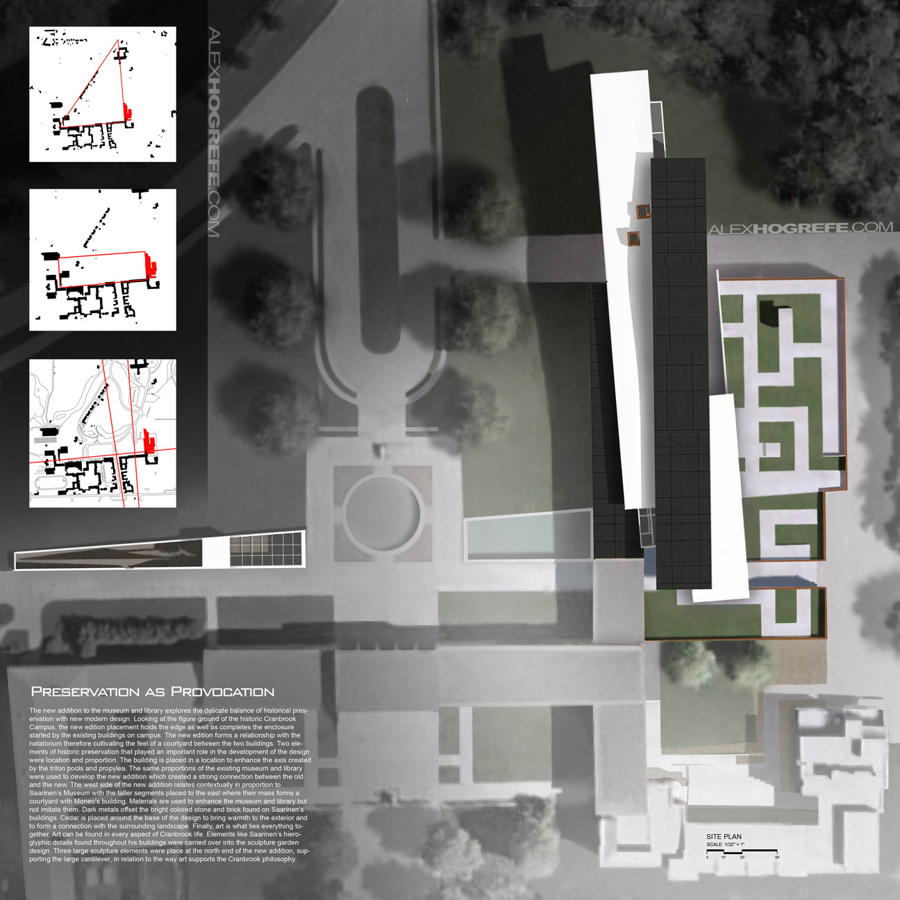
Above: The original board
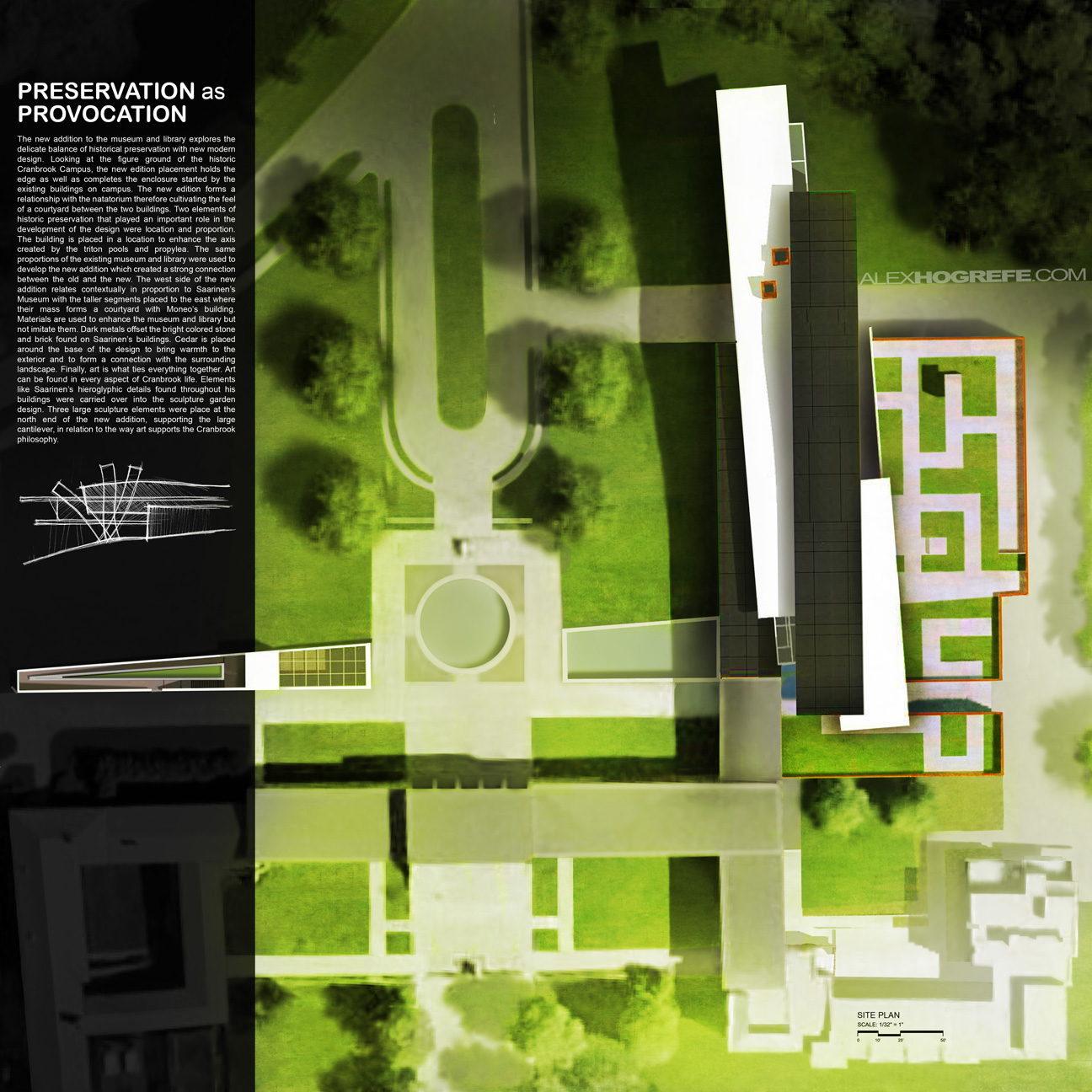
Above: The new board
What I did to solve the issues mentioned above was to simplify things. Typically with the intro boards, I like them to be simple but powerful. The site plan I felt, could be a powerful image if tweaked. I pulled back the destaturation a little, and added a green overlay. This took all but 10 minutes but really made a big difference. I also moved the diagrams off of this page and onto a different board. This cleared up some space to move the text around. I darkened the black transparent box to help separate the text from the background, so that the two didn’t compete. I also placed a scanned sketch just below the text as a way to end the paragraph.
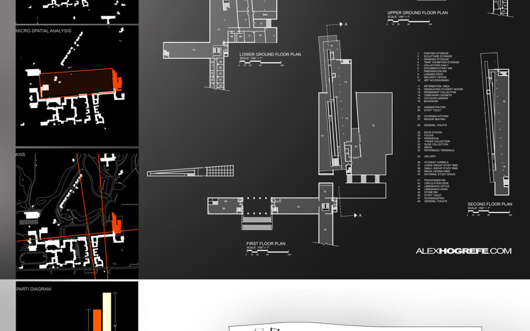
ARCHITECTURAL PRESENTATION BOARD 2- DIAGRAMS & PLANS
I think this second original board has a decent layout. There is a lot of information on this layout, but much of it is difficult to read.
1. The floor plans are hard to understand. This was a tricky part of the layout because the floor plans themselves are an odd shape. Therefore, I had to fit them on the page the best I could without making them too small. There is also so much line work that it is hard to decipher what is inside, what is outside, what are ramps, what are corridors, etc.
2. Along with the floor plans, the section at the bottom is next to impossible to understand at a quick glance. Understanding the section is key to understanding the design of this project, therefore, the section must read better than it currently does.
3. The sketches on the left don’t belong on this page. It’s always important to integrate process work, but finding a place to include it can be challenging.
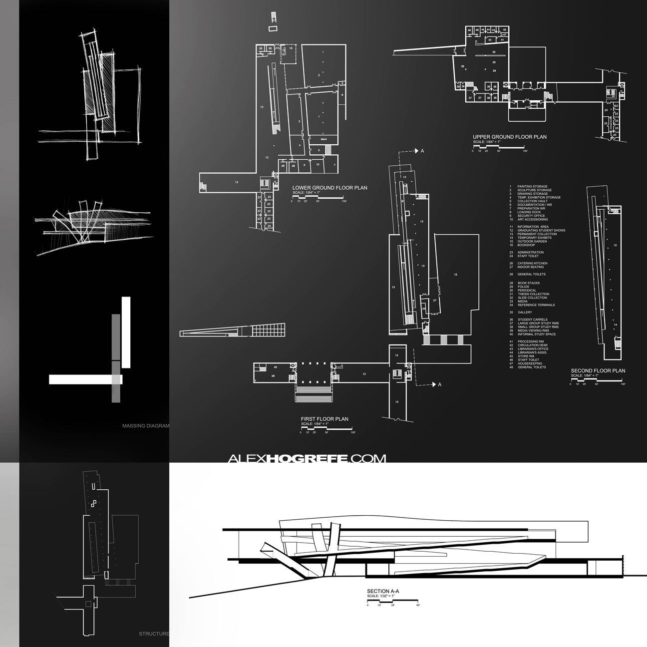
Above: The original board
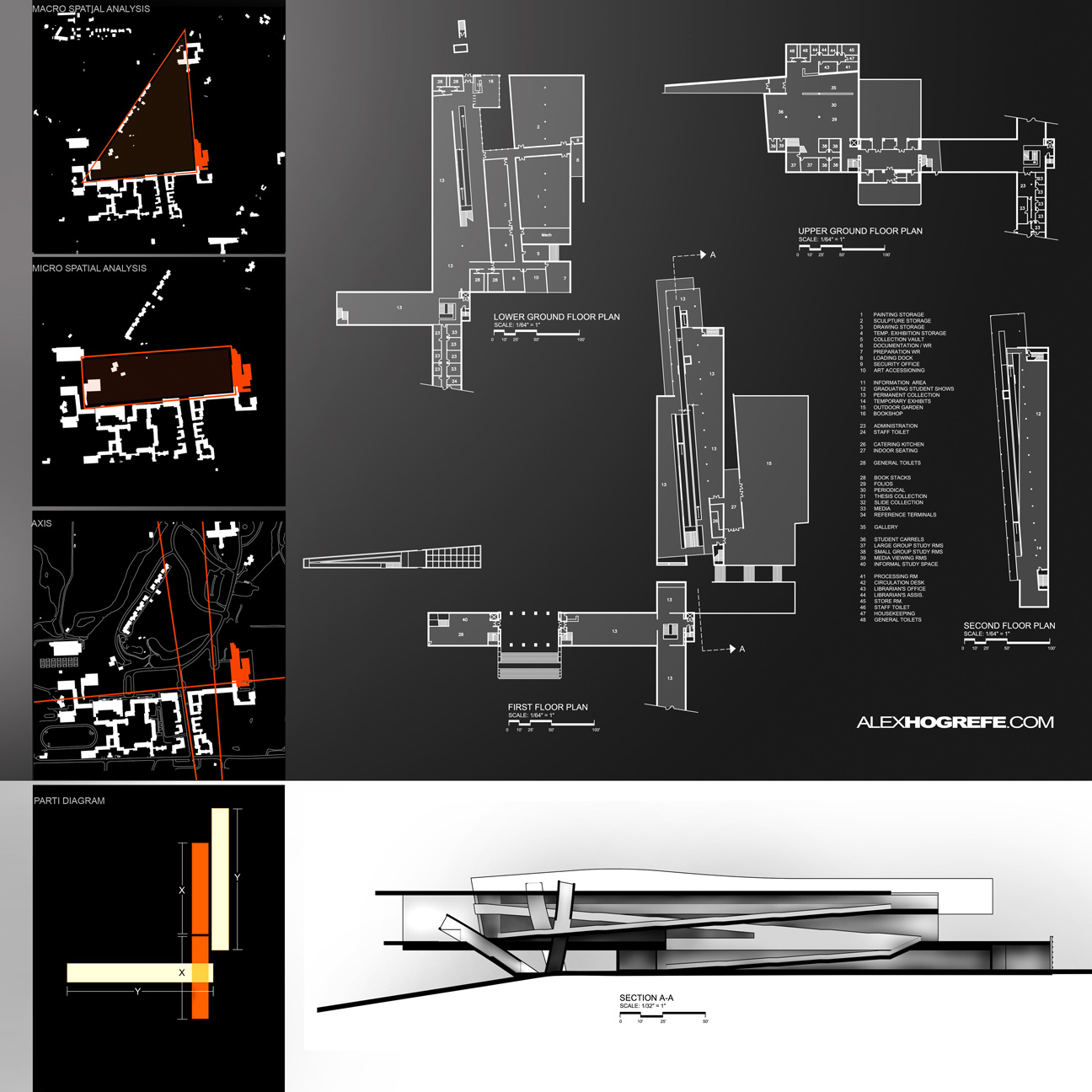
Above: The new board
The first thing you may notice is that the diagrams from the first board were switched with the sketches on the second board. This tells a more organized story of the project. Next, I faintly shaded the floor plans. As subtle of a move as this is, it makes a big difference on how fast one can read and understand the floor plans. Now, items such as inside vs. outside, openings in the floor, vertical circulation, etc. can be understood at a glance. Finally, I revisited the sections, and applied a technique popular on this site to add depth and clarity to the line work. While I like the simplicity of just the line work, adding a little shading goes a long way.
Be sure to check back next week. I will revisit the last two boards and discuss how to unclutter a overly busy layout as seen in the third rendering board.


Excepcional !
Hey Alex, love the site – I've found it really useful.
Since you're currently on the subject of presentation layouts and graphic design, would it be possible for you to make a future tutorial on how you create you're design documents and brochures (I know you've done something similar with the portfolio tutorials, but it would be great if you could show us how you go about designing those sort of multi-page documents graphically in a bit more detail.)
Again love the site; keep up the good work.
another nice tutorial thanks. one thing though- when using firefox on a mac and you click on the images they open in a new window but don't scale to fit and there's no scroll bars. So at full size you can only view like the top half of the boards.
Hi Mark,
I am aware of the problem. If you hold "Ctrl" and hit the plus or minus keys, the browser images and text will scale allowing you to see the hole image..At least that works for PC's, not sure if it is the same form Macs.
Very nice!
Hi, I've been following your blog for a few weeks now…. Something bugging me about the section – there really needs to be someone in the cantilevered section looking out! This seems like the key area of the design so why not draw a bit more attention to it! Sections should always include people for scale.
@Alex
Good point and I agree. The reason I didn't on that particular section was because the scale of the people would have been so small that I was afraid they would be hard to read. Looking back though, I think it probably would have been fine and like you said, would add a better sense of scale.
hi alex plz share te tuterial video of them i want to know how you add this realy amazing green effect to your sheet you are great man! thx